Data infrastructure and tribal sovereignty can help break down barriers for Native Americans to build wealth

""

Overview

For centuries, Indigenous communities in the United States have faced devastating poverty. American Indians and Alaska Natives today experience the highest rate of poverty, at 25 percent, of any major racial or ethnic group in the United States.

The current economic hardships faced by AIAN communities can be traced back to centuries of colonization and discriminatory policies, such as the Homestead Act of 1862, which took land and resources away from Indigenous tribes. In recent decades, tribal governments and community organizers have worked to rebuild their populations and promote educational and economic prosperity both on and off reservation lands.

Data on the economic state of American Indians and Alaska Natives across the country is limited, however, making it difficult for researchers and policymakers alike to assess the needs of individual tribes and communities. Additionally, while those living on and off reservation lands may experience similar socioeconomic disparities, they differ when it comes to the barriers they face to building wealth.

Housing on reservation land, for example, is scarce and poor quality, compared to nonreservation rural housing. This means that potential AIAN homeowners trying to purchase a home on tribal land might experience issues with low housing supply and quality, though they do have access to tribal-specific lending options. Yet potential AIAN homeowners looking to purchase homes outside of tribal boundaries might experience a competitive housing market and be excluded from receiving tribal grants and loans, meaning their options for homeownership might be limited.

This issue brief focuses on the unique challenges that face Native Americans trying to build wealth while living on reservations, including the lack of banking accessibility, housing supply, and high-quality jobs. It also covers a series of potential policy solutions to address these challenges and make wealth building more accessible for Native Americans.

But first, we look at the existing data on Native American wealth and what it can tell us about the disparities these communities face in the United States.

What the data say about Native American wealth

The primary source of wealth data in the United States is the Federal Reserve’s Survey of Consumer Finances. Although this survey allows respondents to identify as American Indian or Alaska Native, published results from the survey only offer summary data for White, Black, and Hispanic respondents, with all other races and ethnicities included in an “Other” category.

This level of data aggregation reflects the relatively small sample size of the Survey of Consumer Finances, which does not support disclosure of summary statistics for smaller groups. Asian Americans, Native Hawaiians, Pacific Islanders, American Indians, Alaska Natives, and people of two or more races are all included in this aggregate “Other” group, yet the economic experiences and conditions of each population and subpopulation are vastly different—meaning the data for this group have little analytical value.

State and federal statistical agencies are unable to provide disaggregated data on AIAN socioeconomic experiences and challenges, and they primarily cite small sample sizes in government surveys as the reason. One potential solution, put forth by Blythe George, an Equitable Growth grantee and professor at the University of California, Merced, is for state and federal governments to work with tribal leaders to honor tribal sovereignty and build data infrastructure designed to capture vital information about tribal citizens and the state of their reservations.

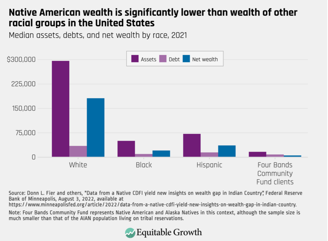
Because these gaps in the data persist, researchers also are looking into alternative metrics that can give some insight into AIAN household wealth. For instance, economists at the Federal Reserve and the Four Bands Community Fund—a community development financial institution, or CDFI, with primarily AIAN clients—looked at the assets and debts held by Native American clients living on the Cheyenne River Sioux reservation in South Dakota. Comparing these data with the wealth metrics in the Survey of Consumer Finances, the study finds that the wealth gap ratio between White Americans and American Indians and Alaska Natives is 32-to-1. The authors also find that while the median net worth of a White household is $181,440, the median net worth of the Four Bands clients is only $5,524. (See Figure 1.)

Figure 1

Median assets, debt, and net wealth by race, 2021

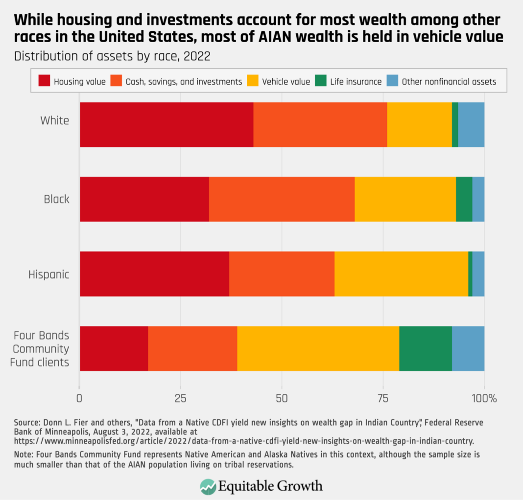
Additionally, while most U.S. households hold their wealth in homeownership, the researchers find that the value of their motor vehicles accounts for the largest component of wealth for AIAN households. (See Figure 2.)

Figure 2

Distribution of assets by race, 2022

While these findings are based on a limited sample of Native Americans, they indicate the difficulty that AIAN households have in building wealth.

Next, we turn to the various sources of wealth among U.S. households and the barriers to access that AIAN households face within each specific category.

Barriers to housing and homeownership wealth

Homeownership is the primary source of wealth for most U.S. households. Yet AIAN homeownership rates are considerably lower than White, non-Hispanic homeownership rates, at 50 percent, compared to 71 percent, according to the 2021 American Community Survey.

For Native Americans living on reservation land, homeownership comes with many challenges. Reservations across the country are experiencing a worsening housing crisis due to growing populations, overcrowding, limited supply, and poor-quality housing. Indeed, between 2010 and 2020, the Native American population increased by 160 percent, with a significant portion of this growth taking place on tribal reservations.

Additionally, despite funding and resources from state and federal governments, building housing on tribal land is a complex and expensive matter due to the unique challenges that their geography poses. Reservations in isolated and rural areas or those with limited infrastructure, such as roads and bridges, cannot easily receive the necessary resources to develop housing. In a 2018 U.S. Senate hearing on overcrowding in Alaska Native houses, a regional housing authority official testified that developing housing on Alaskan tribal land is expensive because every piece of hardware and materials must be flown into rural and isolated regions of Alaska.

Systemic discrimination has been a major contributor to the lack of necessary infrastructure on reservation lands. While most state and local governments can use tax-free debt obligations to build public resources, such as roads, parks, and bridges, tribal governments are blocked from using such financing due to The Indian Tribal Government Tax Status Act of 1981. This act limits the use of nontaxable tribal government bonds to “essential government functions,” which does not include road and highway infrastructure.

As part of the Great Recession stimulus package of 2009, however, a pilot program gave federally recognized tribes the authority to issue tax-exempt bonds to incentivize infrastructure development. The program was so successful that the U.S. Treasury Department has since recommended a permanent waiver to the essential government functions mandate to spur social and economic growth on reservation lands.

Because housing is so limited in supply and new housing developments are a rarity on tribal reservations, prospective AIAN homeowners currently face waiting times of 3 or more years for an available housing unit. These long waitlists mean that properties tend to face overcrowding, or situations in which there is more than one person per room in a single housing unit. In 2018, 16 percent of AIAN households on reservations experienced overcrowding, compared to the overall U.S. rate of 2 percent. Some AIAN households even report having 12 to 15 people in units measuring less than 900 square feet. 

To make matters worse, many of these overcrowded housing units are low quality. Those living on reservations are “5 times more likely to live in homes that lack basic plumbing, nearly 4 times more likely to live in homes without a sink, range, or refrigerator, and 1,200 times more likely to live in homes with heating issues,” according to the National Low Income Housing Coalition.  

Lack of necessary resources, such as plumbing and heating, coupled with the issues posed by overcrowding, can mean AIAN individuals face two related hurdles in their efforts to build wealth: The value of existing properties on reservations is exponentially lower than the U.S. housing market, and resulting health issues from poor-quality housing can prevent AIAN workers from entering laborious, good-paying jobs. During the previously mentioned Senate hearing on overcrowding and its impact on Alaska Natives, witnesses cited research finding that overcrowding causes decreased sleep, increased stress, increased cases of mental health crises, and the elevated spread of illnesses. Likewise, amid the COVID-19 pandemic, researchers from Duke University found that overcrowded housing increases the risk of COVID-19 mortality.

Another element in the reservation housing crisis is the structure of property ownership on reservation lands. In an effort to reduce tribal governments’ control over the land they resided on, President Grover Cleveland signed into law the General Allotment Act of 1887, which allowed the president to “survey Indian tribal land and divide the area into allotments for individual Indians and families” and forced tribal governments to sell any land that exceeded the allotment restrictions to homesteaders or the government. From 1887 to 1934, Native American land ownership plummeted from 138 million acres to just 48 million acres.

Additionally, under the 1887 law, these allotments could be transferred to fee simple land, which gives property owners full rights over their property. Yet this transfer was only allowed on a case-by-case basis at the discretion of the U.S. Bureau of Indian Affairs. The federal government ended the allotment program in 1934, but even today individuals who own trust land still need to get approval from the agency to sell or develop their land. Having to navigate bureaucratic approval processes means that trust landowners may experience difficulties building or updating housing on their properties, which results in diminished property values. 

Barriers to banking and access to capital

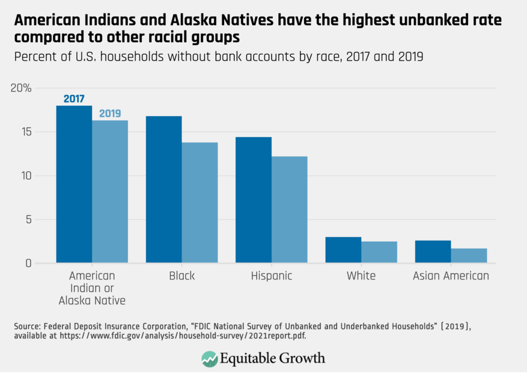
According to the Federal Deposit Insurance Corporation, Native Americans are the most underbanked racial group in the United States, with approximately 16 percent of AIAN households being unbanked as of 2019. (See Figure 3.)

Figure 3

Percent of U.S. households without bank accounts by race, 2017 and 2019

Of those U.S. households that are banked, AIAN families had the lowest rate of bank branch visits, at 15.5 percent. Physical proximity and general lack of necessary services are the two main reasons AIAN banking rates are so low.

The average distance between Native American reservation lands and the nearest bank is approximately 12.2 miles, almost 20 times the distance between rural city centers and nearby banks. Even if a national bank is within a reasonable distance to tribal land, residents find that such banks neither have an adequate understanding of tribal finances nor provide the necessary financial resources and credit that AIAN households need to navigate investment and housing complexities.

To overcome these challenges, tribal nations have established tribal community banks and CDFIs that support tribal residents as they navigate the nuances of tribal laws and state and federal funding limitations. These financial institutions, often run by tribal nations or tribal entities, provide residents with the tools and services they require to access capital for homeownership or property improvements and other financial needs.

Additionally, researchers find that over the past two decades, Native American Financial Institutions on reservation lands are closing the gap in credit access in tribal regions and providing underserved citizens with much-needed banking resources and knowledge unique to tribal society. Native-owned banks are also seen as more trustworthy and are generally more supported by Native American tribal residents.

Barriers to income growth

At the onset of the COVID-19 pandemic, 28.6 percent of AIAN workers were unemployed, a devastating joblessness rate that is only comparable to the general rate of unemployment seen during the Great Depression nearly 100 years ago. Part of this is because Native American workers are often overrepresented in service and front-line occupations, which have experienced long-lasting disruptions since the start of the pandemic.

Yet employment challenges for Native Americans predate the pandemic. In 2020, 21 percent of single-race AIAN people were earning incomes below the federal poverty line due to the many structural barriers to employment—an improvement from almost 29 percent in 2015. Likewise, research from 2013 finds that when controlling for a number of factors, such as age, education, reservation residency, and state of residence, Native Americans had lower odds of gaining employment, compared to White workers.

These findings supplement evidence that almost one-third of Native Americans face racial discrimination when applying for employment or being considered for a promotion, while 54 percent of Native Americans living in areas with a Native majority experience institutional discrimination.

Some researchers point to educational quality and attainment as an explanation for the employment divide between AIAN workers and White workers. A 2018 study on occupational dissimilarities between AIAN and non-Hispanic White workforces, for example, finds that while AIAN workers are overrepresented in low-skilled occupations and underrepresented in high-education occupations, compared to White workers, much of that gap is closed when accounting for differences in educational attainment.

Research also shows that lower educational attainment rates among AIAN students is due to lack of wealth. In 2016, approximately 90 percent of Native American higher education students received some form of grant aid, compared to 77 percent of all students. Another survey on Native American education finds that only 36 percent of Indigenous college students completed their degree within 6 years, compared to 60 percent of all U.S. college students. Participants of the study who did not complete their degree within 6 years cited college affordability as the primary barrier to completing their degree. 

Yet differences in educational attainment do not fully explain the workforce gaps between AIAN workers and White workers, suggesting there are other factors that contribute to this occupational sorting. The 2018 study does find that occupational dissimilarities between AIAN men and AIAN women exist, but also finds that when comparing AIAN women to White women and AIAN men to White men, there were not more significant differences in occupational choices than in the comparison of the two racial groups collectively.

Despite these barriers, over the past 30 years, there have been significant improvements in economic well-being among Native Americans living on tribal lands. Randall Akee of the University of California, Los Angeles credits advancements in tribal sovereignty over the past three decades for this economic growth—the best that Native Americans living on tribal land have experienced in the 500 years since contact with European colonists. His research finds that the businesses and industries that survived during the Great Recession of 2007­­­–2009—including arts, entertainment, public administration, food, and lodging—were able to do so because establishments that were tribally owned and operated prioritized maximum employment of tribal citizens and residents over profits.

Policies to reduce barriers to AIAN wealth building

Several options exist for policymakers seeking to reduce the barriers to wealth building for Native Americans, including collecting more and better data, improving physical infrastructure on reservation lands, boosting AIAN homeownership rates, and making banking more accessible for Native Americans, among others. Below, we detail several proposals that policymakers can undertake to boost Native American wealth.

Build better data infrastructure for tribal populations and areas

Before tribal governments can tackle the barriers to building wealth, they need the necessary data to accurately assess the status of wealth and debt held by tribal citizens and residents. The Federal Reserve Board collects information on Native American wealth, but with a limited sample size, it’s difficult to confidently make any statements on AIAN wealth.

Additionally, not all tribes are alike, and their experiences navigating the labor market and the broader economy are different, too. While one tribal government may benefit from comprehensive data on fishing revenue, for example, other tribes may prioritize data on gaming profits.

In a recent phone conversation with UC Merced’s George, she proposed that individual tribes work to build their own data infrastructure that captures their citizens’ unique economic experiences and conditions. Similarly, Desi Small-Rodriguez, an expert in Indigenous data infrastructure and sovereignty at the University of California, Los Angeles, argues that Indigenous people have the most insight into their tribes’ data, and by ensuring their own data sovereignty, tribal governments are able to reclaim their tribal sovereignty.

These tribe-specific data can assist state and local governments with understanding the individual needs of each tribe and creating funding opportunities that tackle the unique problems each tribe faces.

Develop physical infrastructure to boost housing supply on reservation lands

Tribal leaders and policymakers should look toward improving AIAN homeownership to boost Native American wealth. One way to do so is for state and federal governments to establish funding opportunities for tribal governments to incentivize infrastructure development on reservation lands. Better roads, irrigation, and other public-access projects will establish the necessary infrastructure to build higher-quality housing, and more of it.

Similarly, waiving the limitations of the Indian Tribal Government Tax Status Act and issuing tax-exempt bonds to develop roadway infrastructure would make rural and isolated tribal land more accessible, facilitating the delivery of the materials that are essential to housing development. 

Establish funding for home upgrades and clean energy retrofits

Research shows that overcrowding and poor housing quality impact tribal residents’ quality of life and employment stability. State and federal funding to help upgrade residences and infrastructure, such as resilient electricity, plumbing, and insulation, can improve home values while also reducing the health risks associated with overcrowding on reservation lands.

The recently passed Inflation Reduction Act allocated funding to tribal nations and Native American communities to support climate resilience and adaptation, build stable clean energy systems, and make home efficiency upgrades cleaner and more affordable. With a reliable energy system and low-cost options for home improvements, AIAN households will have an opportunity to live in safe and high-quality housing.   

Improve accessibility to lending and banking

Several federal agencies have launched programs and grants specifically to promote homeownership for AIAN people. The U.S. Department of Housing and Urban Development’s Section 184 Indian Home Loan Guarantee Program gives AIAN borrowers loans with low down payments that can be used to purchase existing homes, construct new homes, or rehabilitate older properties.

The U.S. Bureau of Indian Affairs’ Housing Improvement Program also provides grants to AIAN households “who have no immediate resources for standard housing” in an effort to tackle rampant homelessness on tribal land.

Support Native American Financial Institutions

While home loan programs exist to improve AIAN communities’ access to homeownership, many households have difficulty accessing these programs due to limited banking operations on reservation lands.

Federal and state governments can work with tribal authorities to establish and support Native American Financial Institutions or any financial institutions that cater to tribal residents specifically. These specialized banks are generally more trusted than national banks because they educate tribal citizens about the designated government programs for which they are eligible that can help them on their path to homeownership and wealth building. They also tend to have specialized knowledge about the tribes and areas they are serving, which allows them to better serve their communities.

Elevate tribal sovereignty to foster additional labor market growth

Academics studying AIAN labor market barriers all point to tribal sovereignty as the key factor leading to the economic growth on reservation lands since the 1980s. For instance, a 2006 paper on economic development on tribal land finds that when tribal governments have more control over community resources, it positively impacts economic growth.

Similarly, a review of academic literature on Native American credit access finds that while improved educational attainment and market access can improve economic growth, “they tend to pay off after a Native nation has been able to bring decisions with local impact under local control and to structure capable, culturally legitimate institutions of self-government that can make and manage those decisions.”

In his essay for Equitable Growth’s Boosting Wages book, UCLA’s Akee proposes tribal sovereignty and innovation of the industries currently operating on reservations as solutions to improving the employment conditions of Indigenous people living on tribal land. The Indian Gaming Regulatory Act of 1988 gave tribal governments the guidelines for developing gaming establishments on tribal land, and since then, the fast-paced boom in tribal gaming operations has been a prosperous endeavor for most tribal communities. In 2015, the tribal gaming industry brought in almost $30 billion in revenue, compared to the nontribal gaming industry’s annual revenue of about $38 billion.

The establishment of tribal sovereignty over the gaming industry is a clear example of how tribal governments’ control over economic regulations directly improves employment and economic conditions of tribal citizens for the better. Building off these successes, Akee’s research finds that federal policies that support industry innovation, restore land bases to tribal governments, and grant authorization to tribal citizens who seek to earn a living through “traditional subsistence activities” can improve employment and earnings opportunities.

As an example, he cites the Columbia River Inter-Tribal Fish Commission, a modern coalition of four tribes dedicated to promoting salmon spawning in the upper regions of the Columbia River. Efforts to improve fish passes at dams along the river and the return of water to smaller offshoots of the river have had positive impacts on the environment, society, and the economy in the region. These changes have restored water and salmon to areas once blocked off through dams, improved the availability of salmon to inland communities, and brought in new fishing revenue to tribal communities.

Conclusion

After centuries of systemic racism and discrimination, Indigenous communities on and off tribal land deserve the right to economic growth and development. Federal and state governments have been working toward this goal through a series of grants, loans, and funding programs that aim to rectify the wrongs committed against Indigenous communities. These programs, in tandem with efforts to boost housing supply and quality and access to banking and financial institutions, will go a long way to reducing the Native American wealth divide in the United States.

Yet academics and advocates find that tribal sovereignty, self-governance, and better data infrastructure also are necessary to further develop economic growth and prosperity for AIAN communities. Expanding upon three decades of tribal sovereignty by introducing tribal data infrastructure can only help AIAN groups understand their unique economic conditions, allowing them to break down the barriers to wealth building and provide sustainable economic growth for all tribal communities.

U.S. income and wealth inequality are no longer increasing, but a return to the equitable levels of the mid-20th century isn’t likely anytime soon

""

Five or 6 years ago, economists and pundits frequently debated whether the incomes of low- and middle-class households in the United States were stagnating. I wrote about it, and I think what I said then more or less holds up. Wage growth for these households wasn’t zero, so “stagnant” might be inaccurate in the strict sense, yet wage growth was slow at the bottom of the income ladder—and particularly so in the wake of the Great Recession, which left lower-income workers mired in a poor job market until about 2014.

At the time I wrote that column in 2018, income data from a Congressional Budget Office report was only available through 2015, so the evidence of the effects of a tightening U.S. labor market after that year were only just emerging. Moreover, income growth at the top of the income distribution was much stronger than what other households were experiencing, making “stagnant” a more apt description, relative to those households at the top. And prior to 2014, the vast majority of households underperformed the average as high-income households captured large shares of economic growth.

Now, some economists and analysts are revisiting that debate. Michael Strain of the American Enterprise Institute says that income stagnation was a myth, while the online pundit Matthew Yglesias thinks we should take more note of recent declines in income inequality. I don’t fundamentally disagree with either of these views. Income inequality does appear to have declined slightly between 2007 and 2019, but the pace of that decrease was excruciatingly slow. And while I don’t think income stagnation was a complete myth, strong wage growth from 2014 onward modestly improved the situation for low- and middle-income households up to 2019. Yglesias and Strain stop their analysis in 2019, but economic relief packages during the COVID-19 pandemic and recession significantly decreased inequality to levels we haven’t seen this century. As temporary relief from the government fades, however, those gains will probably prove fleeting.

In this column, I provide additional context on the recent trajectory of wages and income and wealth inequality in the U.S. economy. I use recent data releases from the Congressional Budget Office, which are the data Strain and Yglesias use in their separate analyses, as well as data from the U.S. Bureau of Economic Analysis and the Federal Reserve, to look more closely at these trends. The BEA data series, which I have written about frequently, is an exciting new tool for evaluating how income inequality and economic growth are related in the U.S. economy. It is similar to the Federal Reserve’s Distributional Financial Accounts, which provide a timely view of trajectories in U.S. wealth inequality.

Both Yglesias and Strain are correct to point out the strong wage recovery of the late 2010s and the resulting dip in income inequality metrics. I add three bits of context in this column. First, the decline in inequality since 2007 has been extremely slow. Second, the better part of that decline is attributable to so-called government transfers—programs such as the Child Tax Credit and the Supplemental Nutrition Assistance Program—and the way both the Congressional Budget Office and Bureau of Economic Analysis account for government healthcare spending. Third, in an encouraging sign, wealth inequality was rising through 2015 but has been mostly flat since.

Income inequality is declining really slowly

Both Strain and Yglesias focus on the period from 2007 to 2019, a span of years that begins with the Great Recession. Initially, the Great Recession decreased inequality. Recessions usually take a larger toll, in percentage terms, on higher-income households due to the fall in business revenues and the value of assets, such as stocks and bonds. But shortly after the Great Recession, the stock market and top incomes came surging back, while incomes for most U.S. households languished. It’s the second half of this period, from 2014 to 2019, when the incomes for lower-income households really started to pick up. And this did reduce income inequality.

But economists and pundits alike should have some humility about the pace of that reduction because it was very, very slow. According to CBO estimates, in the 28 years from 1979 to 2007, the share of income held by the highest-income quintile of U.S. households rose from 41.7 percent to 51 percent—a 9.3 percentage point rise (I use the after-tax-and-transfer income measure for all CBO calculations). From 2007 to 2019, that share dropped 2.4 percentage points to 48.6 percent of income earned. That trend would have to continue for another 35 years to get us back to 1979 levels of income inequality.

There’s nothing magical about 1979. It’s simply the year the Congressional Budget Office started its analysis. According to the two economists perhaps most famous for identifying rising income inequality—Thomas Piketty at the Paris School of Economics and Emmanuel Saez at the University of California, Berkeley—income inequality started rising in the early 1970s, based on their own, much longer time series of data, and the more equitable distribution of income in the United States in the mid-20th century won’t return anytime soon.

It’s good to keep in mind that this recent dip in inequality is pretty small, compared to the huge run-up in income inequality experienced over the past 50 years after the prior two decades of equitable income growth and economic growth.

The CBO income measure includes realized capital gains from the sale of assets, such as stocks and bonds and property, which makes its measure of income inequality more volatile than income measures that exclude realized capital gains. It’s therefore important not to infer too much based on arbitrary beginning and end points: 2007 was the highest top quintile share of income ever recorded by the Congressional Budget Office, at 51 percent, and the top quintile share fluctuated quite a bit between 2007 and 2019. If one instead uses a 3-year average around 2007 and 2018 to smooth the volatility in realized capital gains, then the drop in the top quintile share of income is half as large, at just 1.2 percentage points.

The BEA distributing personal income dataset, which excludes realized capital gains, tells a more ambiguous story. Between 2007 and 2019, the agency reports that the share of income held by the top quintile increased, from 47.3 percent to 47.6 percent. The Congressional Budget Office’s top quintile share is probably higher in large part due to their accounting for unrealized capital gains, and this may also account for a significant portion of the drop in top incomes.

That’s not to say that the Bureau of Economic Analysis finds no reduction in income inequality. According to the agency, the Gini coefficient—a common one-number summary of inequality in an economy, where higher numbers mean more inequality—for after-tax-and-transfer income decreased 2 percent in this period. But that’s not because of losses at the top. Rather, it’s because of some compression in the middle. On average, incomes grew by 30 percent over this 12-year period. The lowest decile of income saw the largest gains, and the top decile saw the second-largest increases. The losers are upper-income households; the eighth decile saw income growth of 27 percent, the lowest among all deciles. (See Figure 1.)

Figure 1

Total after-tax-and-transfer income growth for households in 10 deciles of income, 2007 to 2019

Given these caveats, I’m hesitant to lean into the “inequality is declining” narrative. It might be more accurate for now to say that income inequality has been essentially flat since 2007.

While the CBO dataset currently only runs through 2019, the BEA data runs through 2021, and the story of the COVID-19 pandemic is pretty interesting. The massive increase in government transfers intended to help people weather the pandemic was a game-changer for income inequality. According to BEA data, the Gini coefficient fell almost 8 percent from 2019 to 2021. That’s a huge change for 2 years, and the lowest Gini coefficient in the BEA dataset, which starts in 2000.

That’s impressive, but the transfers that made this drop possible—including the expanded Child Tax Credit, enhanced Unemployment Insurance, and direct stimulus checks—have all expired now, so the Gini coefficient will likely go up again. And it will be a few years from now before the data are available to calculate the long-run impact of the pandemic on income inequality.

Wages increased, but most of the rise for low- and middle-income U.S. households was from government transfers

Policy changes during the Obama administration, particularly the Affordable Care Act, led to gradually increasing benefits for low-income U.S. households from 2014 onward, when Obamacare first began to be implemented. In the 2007–2019 window, according to the BEA data, 50 percent of the cumulative increase in income for the bottom 50 of households came from transfers, which includes government-provided healthcare in BEA’s accounting, while 36 percent came from increasing wages, and 14 percent was from other sources, such as business income, rental income, and stock dividends. (See Figure 2.)

Figure 2

Cumulative disposable personal income growth, by type of income, for households in the bottom 50% of income, 2007-2019

In 2020, the percentage of income coming from transfers went up dramatically, thanks to pandemic cash transfer programs. (BEA publishes initial data for 2021 but does not include breakdowns by type of income, so 2020 is the most recent year where income can be decomposed and we can see the impact of transfers.)

The Affordable Care Act boosted in-kind transfer income because both the Congressional Budget Office and the Bureau of Economic Analysis treat government-provided health insurance as income. That is, if a household receives Medicare or Medicaid, several thousand dollars are added to their income to represent the value of that insurance (average per-capita spending on Medicaid enrollees in 2019 was $6,556). 

Some economists object to this kind of accounting. Notably, Nobel-Prize winner Angus Deaton at Princeton University objects to valuing the inputs to healthcare instead of the outputs. That is, the amount of money the government spends on providing healthcare to a person doesn’t necessarily correlate to the value that individuals get out of that insurance because the cost and quality of healthcare varies from place to place across the country. Medicare and Medicaid are undoubtedly beneficial to those who receive it. The issue is whether and how to value the money spent on those programs when determining income inequality.

But the main reason to be concerned about a drop in inequality that is driven by in-kind transfers, and the Affordable Care Act in particular, is that it may not be sustainable. The Affordable Care Act started providing most of its benefits in 2014, and its benefits expanded over the years as more states opted into the expansion of Medicaid as part of Obamacare. There are still states that haven’t opted in, so ACA spending might grow and provide further in-kind transfer income to those at the bottom. But in states where Medicaid expansion has already occurred, ACA benefits are already included in income, so that income will stop contributing to CBO-measured income growth (and declining inequality) in those states, and low- or middle-income households will be more dependent on wage increases to raise their incomes.

Paradoxically, the only way for the Affordable Care Act to drive further income increases in states that have already expanded Medicaid is to have more people become eligible for coverage under the program because their incomes drop. That could push more people into eligibility and compensate for lower earnings from employment. But this kind of income “increase” wouldn’t exactly be good news for low-income households.

A similar situation played out in the years between the Great Recession and the implementation of the Affordable Care Act. In the aftermath of the Great Recession, federal economic stimulus and falling wages led to rising transfer income for low-income U.S. households. But by 2011, these additional transfers dried up, and these households started to receive lower transfer payments each year. In 2014, the Affordable Care Act started to provide significant boosts that continued into 2019 as states opted into Medicaid expansion. These dynamics added to the incomes for bottom 50 percent of households from 2007 to 2019. (See Figure 3.)

Figure 3

Annual increase in government transfers to households in the bottom 50% of income by year, in billions of 2012 dollars

Wealth inequality has leveled off

Finally, I took a quick look at wealth inequality in this period using the Federal Reserve’s Distributional Financial Accounts. Last year, the Federal Reserve fielded its triennial Survey of Consumer Finances. The results from that survey won’t be available until September of this year, but the Distributional Financial Accounts provide a reasonable estimate in the meantime. According to the DFA data, the share of wealth held by the wealthiest 10 percent of U.S. households increased from just more than 66 percent in 2007 to about 69 percent in 2015, and has dropped moderately since then, following a similar trajectory as income inequality. (See Figure 4.)

Figure 4

Share of all households' net worth held by the wealthiest 10 percent of households, 2007-2022

It’s probably too early to read much into the 2021 and 2022 data as wealth tends to be volatile for high-wealth households around economic recessions. Still, it’s encouraging that wealth concentration at least appears to have stalled out starting in 2015. That suggests that increased parity in income growth is also leading to more parity in wealth growth.

Wealth and income inequality don’t have to move together like this. An ongoing debate in economics centers on the extent to which rising wealth inequality is driven by either income inequality or by high-wealth households having access to investments with higher rates of return.

Don’t plan the ticker-tape parade yet

The trajectory of income and wealth inequality in the United States has changed since 2007. But it’s far too soon to celebrate. Income inequality is down very marginally and remains far from the levels seen in the mid-20th century United States. Moreover, much of the decrease in this inequality was caused by implementation of the Affordable Care Act, which will probably not provide significant income boosts going forward. That makes it possible that decreasing income inequality will not be lasting.

Absent an increase in the federal minimum wage or increased worker power, a tight U.S. labor market will be necessary to prolong the success of the post-2014 U.S. economy in terms of more equitable income growth and thus more sustainable overall economic growth. Likewise, income trends will eventually be reflected in wealth inequality, and absent strong wage growth for low- and middle-income households, the current pause in increasing U.S. wealth inequality may prove fleeting.

Canada is the first country to release subannual statistics on the distribution of income. Here’s how it was done.

""

Statistics Canada, the umbrella agency for national statistics in Canada, is the first statistical agency in the world to release subannual data on how economic growth is distributed among rich and poor households. In January of this year, it released a quarterly dataset of these distributional statistics for the first quarter of 2020 through the third quarter of 2021 called the Distributions of Household Economic Accounts, or DHEA. Then, in April, it released new statistics for the fourth quarter of 2021. Statistics Canada plans to continue releasing these quarterly snapshots on a one-quarter lag.

The production of these statistics at a quarterly frequency with relatively little lag is a watershed moment for the worldwide effort to produce more comprehensive and useful statistics on income inequality. For decades, reporting on income inequality has been dominated by the production of opaque “Gini coefficients,” which are difficult for nonspecialists to understand and are often constructed using incomplete measures of income.

This new vintage of inequality statistics will be easier for nonspecialists to interpret, while also offering more comprehensive measures of income. These data build on the pioneering work of Joseph Stiglitz at Columbia University, Amartya Sen at Harvard University, and Jean-Paul Fitoussi at the Institut d’Etudes Politiques de Paris—an expert group at the 38-member-nation Organisation for Economic Co-operation and Development on distributional national accounts—in their “Report by the Commission on the Measurement of Economic Performance and Social Progress,” as well as the many economists who have participated in the WID.world project to create comparable metrics of inequality for a large number of countries.

The U.S. version of these statistics, which does not currently offer subannual estimates and is released on a 2-year lag, provides simple answers to questions such as “What share of income is earned by middle-income Americans?” or “What percentage of annual growth accrued to the richest 10 percent of households?” The chart below shows how aggregate economic growth was divided in each year between the lowest-income half of U.S. households, the upper-income 40 percent above that, and the richest 10 percent of households. (See Figure 1.)

Figure 1

Real growth in disposable personal income from 2000 to 2019, divided by income category

A number of other countries are also beginning to produce these statistics, mostly in an experimental capacity. Reducing the amount of lag in the production of these statistics and increasing the frequency of their release is the next frontier in inequality statistics. Statistics Canada’s example could provide a template to produce inequality statistics that provide up-to-date guidance for the public, businesses, and governments to act on.

In this column, I describe how Statistics Canada produced these data and detail some remaining caveats. Notably, Statistics Canada also produces distributional statistics for consumption and wealth, but I focus only on income here.

Overview of datasets and methods used to create Canada’s DHEA

A key advantage Statistics Canada has over the U.S. statistical agencies is that they start with their Social Policy Simulation Database. The SPSD is a high-quality synthetic dataset based on a blend of survey and administrative data that Statistics Canada has maintained in some form since 1990. It is primarily based on four data sources:

These data sources are blended, and disclosure avoidance techniques are applied to ensure privacy.

The SPSD is publicly available and comes packaged with a simulation program that can be used to look at the impacts of various policy options on Canadian households. Analysts can simulate different kinds of tax changes, for example, or changes in levels of social spending using the simulation program.

This database is fairly different from what the U.S. Bureau of Economic Analysis has access to in the United States. There is no current synthetic dataset that blends administrative and survey data that is widely available to agencies and other researchers. This may change soon, as the U.S. Census Bureau is currently working on some large data blending projects, as well as disclosure avoidance strategies that may make blended synthetic data files available.

Nor can BEA start with confidential administrative data, such as IRS tax returns, because the tax code specifically prohibits this sharing. It is a serious flaw in the U.S. tax code that our economic statistical agencies are prohibited access to these data, which would allow them to construct more innovative and ambitious statistical products that could be informative for the public. Consequently, BEA starts with one part of the Census Bureau’s Current Population Survey, the Annual Social and Economic Supplement, which is somewhat comparable to the Canadian Income Survey.

Statistics Canada follows the lead of the OECD expert group on distributional national accounts, as does BEA in the United States. The aggregate income concepts targeted by each agency are a bit different, but both come relatively close to reproducing the System of National Accounts’ definition of disposable income (BEA’s statistics are available for both personal income and disposable personal income).

Because both methods are grounded in the OECD approach, they have some core similarities. Both make some use of a technique called scaling, for example, to ensure that aggregate income in the microdata match aggregate income in the national accounts. This approach has been criticized, but more research is necessary to determine exactly why these aggregates disagree and how to correct for discrepancies. For now, scaling is the best answer we have. Statistics Canada also makes adjustments to the SPSD data to ensure compatibility with System of National Accounts’ income definitions. These include deriving imputed rent estimates and adjustments for tax-sheltered income.

Methods used in the subannual DHEA

Statistics Canada goes beyond any other country in offering subannual distributions. The agency began producing these in response to demand from the public and government officials to better understand the effects of the COVID-19 pandemic. For the most part, the datasets used to create the SPSD are available only at annual frequency, so statisticians had to get a little creative to provide subannual measures.

An easy way to create subannual distributions is to take existing distributions of income in wages, business income, and other income categories and simply apply them to new national accounts aggregates. This can be an inaccurate approach. In this approach, if the first quintile of households by income earned 10 percent of wage income in the previous year, statisticians would simply assume this distribution continues to apply in current-year quarters, but economists know that these distributions change, so this is not generally going to produce very accurate results.

If agencies want to construct accurate subannual estimates of household income, then it is important for them to try to redistribute at least some income sources on a subannual basis. In other words, they must find a data source that can be used to make a new estimate of how some sources of income are spread across the income distribution. As I have previously explained, the vast majority of income for the lower 90 percent of households comes from wages and government transfers. So, these are the most important categories of income to redistribute.

Statistics Canada’s solution is very close to the one adopted by the website Realtime Inequality. Realtime Inequality is a project from University of California, Berkeley economists Thomas Blanchet, Gabriel Zucman, and Emmanuel Saez that reports distributional measures of growth in the United States on a quarterly cadence. Both Statistics Canada and Realtime Inequality redistribute government transfers using rules-based simulation. That is, they look at known data on households, such as income, household size and composition, and other relevant information, and use those criteria to determine whether or not the household is eligible for government transfers, such as the stimulus checks issued by the U.S. government during the pandemic.

For wages, another data source is necessary. Statistics Canada uses the monthly Canadian Labour Force Survey. This survey asks respondents a number of questions about employment status and earnings from employment. Statistics Canada uses the responses to these questions to simulate the number of weeks worked and wages for individuals each quarter.

Additionally, the Labour Force Survey asks questions about respondents’ business income. This allows Statistics Canada to redistribute that category of income as well. Unfortunately, in the United States, there are no similar sources of high-frequency business income data to draw on.

Realtime Inequality distributes wages using the Quarterly Census of Employment and Wages. The QCEW does not provide disaggregated data on the wages of particular employees, but it does report out the total money spent on wages in highly disaggregated cells. Pioneering work by Byoungchan Lee of the Hong Kong University of Science and Technology demonstrates that the QCEW can be used to proxy for the distribution of income.

For other sources of income, among them interest and dividends, both Statistics Canada and Realtime Inequality use old, known distributions mapped onto current quarter aggregates. These sources of income account for relatively small percentages of household income outside the top 10 percent of households, making them less important as contributors to inequality.

Implications for the methods of disaggregating U.S. economic data

One significant caveat is necessary. To date, Statistics Canada has not released a public analysis of the accuracy of their method. Subannual estimation of inequality necessarily relies on a modeling approach that may make these estimates less accurate. So-called nowcasting techniques, such as the one described above, require revisions when more accurate annual data are released.

Until that analysis is released, some caution is warranted. The Realtime Inequality website, which uses a similar approach to nowcasting, has shown that the approach can be relatively accurate. In their methods paper, the creators of Realtime Inequality show that they only rarely make errors in the direction of growth. That is, they very rarely find that income for a particular income group—say, the bottom 50 percent—is shrinking when it is, in fact, growing. This is an encouraging sign for the methodology, but more error analysis is necessary.

Statistics Canada may have some advantages that are unavailable to the U.S. Bureau of Economic Analysis. Canada’s Social Policy Simulation Database provides blended administrative and survey data to use as a base for the statistics. The U.S. Bureau of Economic Analysis has no similar starting point and begins instead with the Annual Social and Economic Supplement to the Current Population Survey. The Realtime Inequality team starts with IRS tax data. It is not entirely clear how these differing data sources affect accuracy. More work is necessary to better understand why all these data sources fall short of national income aggregates.

In short, considerable research is still necessary. In 2021, BEA issued a report on the feasibility of creating quarterly distributions. At the time, no one had demonstrated a working prototype of quarterly reporting using current distributions of government transfers and earnings. BEA did not investigate the possibility of using the QCEW data or another dataset to make those redistributions.

In light of continued interest from policymakers and proof of concept from both Realtime Inequality and Statistics Canada, it would be appropriate for BEA to revisit this decision. A prototype dataset blending existing BEA data with QCEW data would provide an opportunity to test the accuracy of more timely predictions and decide whether they meet the necessary standards of national statistical reporting.

Six charts that explain how inequality in the United States changed over the past 20 years

""

The U.S. Bureau of Economic Analysis, in late 2021, updated its data series on income inequality in the United States. This update adds data for 2019 and extends the data back to 2000, making this a very useful series for understanding how economic inequality evolved over the past two decades.

Below, we’ve assembled six charts that show how high-, middle-, and low-income households experienced inequality over the first two decades of the 21st century.

Inequality is rising

The new data show that economic inequality continues to rise. Our first chart shows growth in disposable personal income in each year between 2001 and 2019. Each bar is subdivided to show where growth went. The blue sections indicate growth that went to households in the bottom half of the U.S. income distribution. That is, blue bars represent all households in the country that earn less than the median household income. The warmer colors—yellow, red, and orange—represent groups with higher incomes. Notably, significant percentages of growth in every year flow to the top 10 percent of households, which are represented on the graph by the yellow and red sections of each bar. (See Figure 1.)

Figure 1

Real growth in disposable personal income from 2000 to 2019, divided by income category

One easy way to see that inequality is increasing is to compare average personal income growth—which is the number most commonly reported by the media—to growth for particular groups of U.S. households. Our second chart breaks the population into deciles of income, with the lowest-income households on the left side of the graph, showing that for the vast majority of Americans, “headline” growth in disposable personal income overstates income growth for households in their decile. Only the very highest decile beats average income growth, and those in the top 5 percent and top 1 percent of the distribution beat it by large margins. (See Figure 2.)

Figure 2

Average annual growth in disposable personal income for each decile of income, 2000-2019, in 2012 dollars

Inequality rose at a similar rate in the two most recent economic expansions

The next chart shows how growth was subdivided in the 2002–2007 economic recovery from the dot-com bubble of 2001 and the 2009–2019 recovery from the Great Recession of 2007­–2009. In both of these expansions, growth patterns were similar.

In both recoveries, the bottom 50 percent of households received around 20 percent of economic growth in the expansion, despite representing 50 percent of the population. The “upper 40” group, which includes households above the 50th percentile of household income and below the 90th percentile, received about 42 percent of total growth in both periods, suggesting that this group is receiving a relatively fair share of growth. (See Figure 3.)

Figure 3

Percent of growth during each economic expansion that accrued to the bottom 50% of earners, the upper 40%, and the top 10%

Low-income households had poor wage growth while high-income households registered strong business profits and asset-price rises

Next up are three charts that show how specific components of income contributed to the economic fortunes of the bottom 50 percent of households, the upper 40 percent, and the top 10 percent by income.

In the bottom 50 percent of households, wages and government transfer programs—economic parlance for social infrastructure programs, such as Unemployment Insurance, that underpin the economy during downturns—make up the vast majority of all income. Accordingly, these categories matter far more than others for determining income growth in this group.

Wage growth was relatively weak for the bottom 50 percent of households in the first two decades of the 21st century. The vast majority of income growth for this group came thanks to government transfers, such as the Affordable Care Act, more commonly called Obamacare and more formally known as the Patient Protection and Affordable Care Act of 2010. Obamacare boosted this group’s income significantly when it was implemented in 2014 and 2015. Health insurance provided what is known as a social transfer in-kind, meaning it doesn’t give money but gives a valuable service to people that they would otherwise have to pay for. That’s why Obamacare was a boost to incomes overall. (See Figure 4.)

Figure 4

Annual growth in U.S. household income for the bottom 50%, broken out by type of income

The story for the upper 40 percent of households is similar. Households in this group also get most of their income from wages, but they still receive some government transfers.

Unlike the bottom 50 percent of households, the upper 40 percent holds assets, and interest and dividend income from these assets represents about 8 percent of their total income in 2019. This group experienced robust wage growth in most of the expansionary years, providing the bulk of income growth for this group. (See Figure 5.)

Figure 5

Annual growth in U.S. household income for the upper 40 percent, broken out by type of income

Then, there’s the top 10 percent of households, which boasts diverse sources of income that include wages, interest and dividends earned on assets, and business income. Notably, too, the BEA data series does not include capital gains, which would significantly increase the incomes of the top 10 percent of households by income. So, this should be considered a low estimate of top 10 percent income growth over the period.

This group enjoyed very strong wage growth, which was further supplemented by sources of capital income that are mostly concentrated in this group, even when capital gains are excluded. (See Figure 6.)

Figure 6

Annual growth in U.S. household income for the top 10 percent, broken out by type of income

The U.S. economy is in its fourth decade of rising inequality amid the need for more accurate data on its consequences

""

Overview

Economic inequality in the United States continued to rise over the first two decades of the 21st century, according to new data from the U.S. Bureau of Economic Analysis—a trend that builds upon the sharp divergence between the fortunes of the truly rich and the rest of society that began around 1980. As we enter the fourth straight decade of rising income and wealth inequality and their attendant social inequities—such as the widening gulfs in college attendance and life expectancy—U.S. policymakers, now more than ever, need more accurate data to deal with the baleful consequences of inequitable growth.

Most of this rise in inequality occurred before 2000, but the latest data show that U.S. households are still slowly drifting apart from one another. December’s BEA data release expanded the bureau’s distributional data series to cover 2000 through 2019, where it previously only covered 2007 through 2018. These more complete data encompass the entirety of two business cycles: the dot-com bubble-induced recession of 2001 and subsequent expansion, and the Great Recession of 2007–2009 and subsequent expansion, before the arrival of the coronavirus pandemic and ensuing recession in 2020.

Until the Bureau of Economic Analysis extends the series backward further, it’s difficult to say how increases in inequality now compare to those that happened in the 1980s and 1990s—but two things are clear. First, inequality continues to rise. Second, these data are critical to understanding the consequences of economic inequality in the United States.

This issue brief provides analysis of the most recent release. The evident utility of the data series, as shown here, demonstrates why the Bureau of Economic Analysis should request more resources from Congress to expand and improve this dataset, especially by adding more current data that would allow us to analyze trends now, rather than 2 years in the past.

What the latest economic data show about rising economic inequality

The U.S. economy is in its fourth decade of expanding inequality. One way to see this is to compare average growth in incomes to the growth realized within particular income brackets. Average growth in disposable personal income over the period from 2000 to 2019 was about 2.3 percent but ranged as high as 2.7 percent for those in the top 10 percent of household income and as low as 1.6 percent for the lowest-income households. Even within the top 10 percent, there is significant dispersion: The top 1 percent had an average growth rate of about 3.3 percent. (See Figure 1.)

Figure 1

Average annual growth in disposable personal income for each decile of income, 2000-2019, in 2012 dollars

As Figure 1 shows, “headline” personal income growth figures—those that are most commonly reported by analysts, the media, and other sources—overstate the actual growth experienced by virtually all U.S. households. Only the top decile exceeds headline growth. Headline growth is simply an average, and in an age of inequality, the average is largely determined by very rapid income growth for the highest incomes.

These differences add up over a 20-year window: A household experiencing the same income growth rate as top 1 percent of households would end the 20-year period with income 20 percent higher than if they had instead experienced just average growth. The difference between experiencing the income growth of a bottom 10 percent household in this period or experiencing average growth is a 15 percent income premium over the period. And this represents just a small part of the run-up in inequality that started sometime around 1980. The Bureau of Economic Analysis should continue to extend the series back in time, so comparisons to this period can be made.

The federal statistical system needs to be resourced to expand and continue reporting on inequality

Four decades of rising inequality calls for a more robust policy response to ensure broad-based growth in the U.S. economy. An important first step is to develop the data infrastructure to track growth in inequality over time, so that policymakers can monitor and respond to the problem, and voters can hold them accountable to producing strong growth for all U.S. households.

Existing data series are insufficient. One of the few reports by the federal government on economic inequality is the U.S. Census Bureau’s September Income and Poverty Report. The Bureau of Economic Analysis has already significantly improved on this report by using a more comprehensive income concept, releasing more granular income groups (the Census Bureau releases quintiles), and fully accounting for income in one national account (the Bureau of Economic Analysis fully accounts for all Personal Income). But there is much more to do.

Congress must give the Bureau of Economic Analysis the resources to continue developing this work. There are three important avenues for further development of this product. First, the current BEA product underestimates top incomes because it does not account for capital gains. This is not an intentional omission but rather a reflection of the fact that capital gains are not included in any national accounts.

Economists Thomas Piketty at the Paris School of Economics and Emmanuel Saez and Gabriel Zucman at the University of California, Berkeley, in their pathbreaking 2018 article on distributional national accounts, attempted to mitigate this omission by using National Income as their income concept. National Income includes retained corporate earnings, which Piketty, Saez, and Zucman argue can act as a proxy for unrealized capital gains.

Distributing retained corporate earnings, however, requires making several simplifying assumptions that may be prone to error. Statistical agencies should research a separate series of the distribution of capital gains that is compatible with the distributional personal income data. Economist Jacob Robbins at the University of Illinois at Chicago defines a measure of Gross National Capital Gains that could be a model for such a data series.

Second, these data must be released on a shorter delay. Currently, the Bureau of Economic Analysis plans to release these data once a year in December, adding data for the period 2 years prior. This is what happened last month—2019 data were released in 2021. This is a useful tool for understanding the near past, but it will not help policymakers make real-time decisions, and it will not help households understand and respond to the economic conditions they currently face.

There are challenges with publishing more current data, but they are surmountable. With proper resources and a willingness to impute and model current data, BEA staff can release this data series at a higher frequency and with less latency.

Finally, expanding this new data series back in time to include the 1980s and 1990s would enable policymakers to have an even better grasp of rising economic inequality trends over generations. This year’s data release demonstrates how much policymakers can learn about inequality in the U.S. economy—and how much more they could learn if the data were released more frequently and collated over longer periods of time.

Examining U.S. income inequality over the past 20 years

U.S. households at different levels of earnings had significantly different experiences of the past 20 years, with the top 1 percent experiencing more income growth. Those with high incomes saw more immediate and deeper drops in income during recessions, while those with lower incomes were partially supported by government “transfers,” economic parlance for social infrastructure programs such as Unemployment Insurance that underpin the economy during downturns. But the flip side is that low-income households experienced years of stagnation after recessions had subsided, with very little of overall economic growth accruing to those in the bottom half of the income distribution despite moderate headline growth. (See Figure 2.)

Figure 2

Real growth in disposable personal income from 2000 to 2019, divided by income category

Figure 2 shows income growth in each year subdivided into four groups that some researchers and academics commonly use. They are the bottom half of all income earners in the distribution, the next 40 percent of earners (50th to 90th percentile), the next 9 percent at the top (90th to 99th percentile), and the top 1 percent. The blue portion of each bar shows the amount of growth that benefitted earners in the bottom half of the distribution. Warm colors—yellow, red, and orange—show the amount of growth in each year that accrued to the top.

U.S. households move between deciles frequently. The Bureau of Economic Analysis does not follow people over time, so those in the bottom 50 percent of income in one year may not be there the next year. This means these data do not chart economic mobility, only the shape of the overall income distribution. But the overall shape of the distribution is important. When wages for the bottom 50th percentile aren’t increasing, it means that there is little wage growth in the kinds of jobs occupied by those with low educational attainment, young workers, and those in vulnerable populations. The U.S. economy used to deliver real growth to this end of the distribution, but for the past four decades, it has been increasingly stingy.

Households in the bottom 50 percent of the income distribution experienced relatively little growth in incomes over the past 20 years: Over that entire period, the bottom 50 percent of the distribution captured just 20 percent of all growth, even though they represent half the population. Meanwhile, the top 10 percent—a group just one-fifth the size of the bottom 50th percentile—captured 37 percent of overall growth. (See Figure 3.)

Figure 3

Percent of growth during each economic expansion that accrued to the bottom 50% of earners, the upper 40%, and the top 10%

This pattern was stable across the two economic expansions in this time period. The expansion after the Great Recession was slightly more equal, with the top 1 percent of income earners benefitting less, compared to other groups, but differences were slight.

The BEA data series also provides detail on how particular components of income, such as wages, transfers, or business income, changed for households in each decile of income. Looking at fluctuations in these components is a useful way to understand how the economy works for U.S. households at different points on the economic ladder.

Households in the bottom half of the income distribution, for example, are largely dependent on wages and government transfers. In 2019, wages represented 49 percent of positive income for this group, and government transfers made up another 40 percent (you can see all the components that make up personal income here), with most other components contributing very little to incomes of the bottom 50 percent of income earners. So, fluctuations in overall income for this group are largely due to wages and transfers. (See Figure 4.)

Figure 4

Annual growth in U.S. household income for the bottom 50%, broken out by type of income

The top panel of Figure 4 shows annual growth in each component, while the bottom panel shows cumulative growth. The majority of all growth for this group came from growth in government transfers. Wage growth contributed 30 percent of all growth for the group, while the contribution of all other income sources was negligible.

The “upper 40” group of households derive most their income from wages, but government transfers still provided about 13 percent of income for this group in 2019. Unsurprisingly, the relative importance of these two categories for income growth is flipped for this group of households, compared to “bottom 50” households. Over the 2000­–2019 period, 64 percent of income growth for this group came from growth in wages, but the Great Recession hit the wages of this group particularly hard. Subsequent years saw a rapid recovery. Transfers accounted for about 26 percent of all growth for this group over this time period. Yet this group did earn some interest and dividend income, accounting for about 8 percent of income. (See Figure 5.)

Figure 5

Annual growth in U.S. household income for the upper 40 percent, broken out by type of income

The top 10 percent of households by income have the most diverse sources of income. Although wages are still important for this group, making up about 51 percent of positive sources of household income, these households also have significant amounts of business income and interest and dividends income. About 27 percent of all growth over the period came from interest and dividends, while about 20 percent of growth came from business income. (See Figure 6.)

Figure 6

Annual growth in U.S. household income for the top 10 percent, broken out by type of income

Conclusion

The BEA distributing personal income data series has progressed rapidly in just a couple of years. Every year has seen significant improvements in the statistical methodology and the amount and types of data available.

The current product allows for useful analysis of the recent past, with important applications to current policy debates. Knowing how growth in the economy is distributed is just as important as knowing how much the economy is growing. Congress must resource this effort, so the Bureau of Economic Analysis can expand the data series. This should include:

  • Improve frequency and latency: The bureau should investigate ways to decrease the lag in the release of estimates. Right now, data are released in December for 2 years prior. In December 2022, we will get data for 2020, giving us our first glimpse of the coronavirus pandemic, yet this lag is too long. Ideally, estimates would be released quarterly, putting this product on the same footing as GDP growth.
  • Extend the time series back: There also is significant value in having a complete history of inequality in the modern U.S. economy. The bureau should make efforts to extend the data series back in time to allow comparisons with earlier eras.
  • Account for capital gains: Although this has traditionally not been the purview of the bureau, capital gains are increasing and contribute significantly to economic inequality. The Biden administration or Congress should consider tasking the bureau or another agency with tracking this trend.

Together, these three steps would vastly improve our nation’s economic statistics and enable policymakers to act on the harmful consequences of four decades of rising economic inequality.

New Great Recession data suggest Congress should go big to spur a broad-based, sustained U.S. economic recovery

""

Overview

As federal policymakers debate President Joe Biden’s proposed $1.9 trillion American Rescue Plan, critics now argue that it will “overshoot,” meaning it would boost economic activity beyond the desired level. The economic track record of the past 10 years shows these concerns are misplaced. Undershooting the policy response would be a far more dangerous prospect and could lead to a repeat of the slow and inequitable economic growth that followed the previous U.S. recession.

After the Great Recession of 2007–2009, then-President Barack Obama and the U.S. Congress passed an insufficient stimulus, then pivoted too quickly to debt reduction. This was a crushing mistake that left many U.S. workers and their families stuck in the doldrums for years, facing stagnant, or even declining, incomes. The slow and uneven recovery was the direct result of these policies. This time, federal policymakers would be wise to err on the side of doing too much rather than too little.

A new data series from the U.S. Department of Commerce’s Bureau of Economic Analysis—its Distribution of Personal Income series—shows just how devastating this pattern was for most U.S. workers and their families. The agency’s new data series charts the distribution of aggregate growth in Personal Income and Disposable Personal Income, and reports how much growth accrues to the bottom, middle, and top of the income distribution. A new release in December 2020 updates the dataset through 2018, capturing most of the recovery from the Great Recession.

The lesson from the data is clear. The policy response to the Great Recession left millions of low- and middle-income families struggling while wealthy families saw significant additions to their incomes. Consider the cumulative growth in disposable personal income of high- and low- or moderate-income Americans. High-income households in the top 10 percent initially suffered a steep drop in income at the onset of the Great Recession due primarily to the collapse of income from assets such as stocks and bonds, which cratered early in the economic downturn, alongside business income losses. Low- to middle-income households in the bottom half of the income distribution did not initially suffer as dramatic a fall. (See Figure 1.)

Figure 1

One reason for the less dramatic shock to income seen in Figure 1 among households in the bottom 50 percent was because disposable personal income incorporates transfers from the federal government to households, so losses in this group were partially compensated for by rising Unemployment Insurance payments, Supplemental Nutrition Assistance Program benefits, and other government benefits. But this group then became mired in years of stagnant, or even declining, income as these benefits ended amid a still-tepid economic recovery, and did not experience substantial income gains until 2015.

By comparison, households in the top 10 percent of income recovered almost immediately after the end of the Great Recession and ended 2018 up 22 percent, compared to 2007. Importantly, the jump in top incomes in 2012 and steep decline in 2013 seen in Figure 1 does not represent a real decline, but rather is the result of households retiming their income to occur in 2012 so they could avoid rising top-income tax rates in 2013 as a result of the expiration of high-income tax cuts first enacted during the George W. Bush administration.

This issue brief breaks down the new BEA data series to discern why the U.S. economic recovery from the Great Recession was so weak and uneven, and what lessons can be learned from the policies of economic austerity enacted by Congress too swiftly after the end of the previous recession. Those lessons, briefly, are that policymakers should enact strong fiscal stimulus today and should invest in the development of distributional data so they can understand in real time how broadly shared the coming economic recovery is.

What happened to families’ income during the Great Recession?

The Bureau of Economic Analysis’ new data series provides a holistic look at how incomes changed for households in the bottom 50 percent of income during the Great Recession and the subsequent recovery. Personal Income consists of wages, transfers from the government, rent income, interest and dividends, and income from individually owned businesses and businesses organized as partnerships. Americans at the bottom and middle of the income distribution derive a significant amount of their income from the first two of these, wages and government transfers.

Government transfers initially blunted the impact of the 2007–2009 recession for low- and middle-income Americans. But once the initial stimulus wore off, transfers declined, and wages languished, providing positive but small contributions to income. (See Figure 2.)

Figure 2

Real growth in household income from 2008 to 2018, divided by type of income

Households were bolstered in 2014 by the implementation of the Affordable Care Act. But wages continued to stagnate until around 2016. It wasn’t until the tail end of the recovery from the Great Recession that the labor market started to really work for people in this group.

By contrast, households in the top 10 percent by income recovered quickly and were helped along by a mix of income sources, such as dividends from stocks, interest from bonds, rising business income, and much stronger wage growth, than what other Americans experienced. (See Figure 3.)

Figure 3

Real growth in household income from 2008 to 2018, divided by type of income

The result is that the top 10 percent of households routinely flirted with 6 percent income growth in the years after the Great Recession because they did not rely on any single source of income, but rather combined good wage growth with resurging business income and returns on their financial assets throughout the recovery period.

What’s more, this data series may understate the resurgence of top incomes after the Great Recession. The dataset-based definition of Personal Income notably excludes capital gains—the profits made by selling financial assets such as stocks. Income from capital gains is notably concentrated at the top of the income distribution.

The lesson: More economic stimulus is needed today to spur a more sustained economic recovery

What happened after the Great Recession that led to 5 years of mediocre economic progress for most Americans? Many factors may have contributed, but 2010 was famously the year that the United States—and most of the rest of the world—pivoted to austerity politics, slashing budgets in response to the supposed largesse of economic stimulus enacted in 2009. And that stimulus was comparatively small; lawmakers in 2020 spent more money over a much shorter span of time to prop up the economy.

Beginning in 2010, federal budgets declined significantly for the first time in decades. State and local budgets likewise declined significantly, and the public-sector workforce shrunk all the way through early 2014. (See Figure 4.)

Figure 4

Percent change in real per capita federal government outlays, 2006–2020

The lesson for the Biden administration is clear: Don’t let the foot off the gas. The slow recovery from the previous recession was a disaster for tens of millions of U.S. workers and their families. Although incomes eventually started to grow, the net result over a record-long expansion was that most families just barely recovered levels of wealth they had before the Great Recession. And young workers who graduated into the Great Recession economy may be dealing with the scarring effects for years to come.

Fast forward to today. The ongoing coronavirus recession is punishing for most families. Unemployment remains high, and it is concentrated among low- and middle-income earners. Yet, according to Opportunity Insights, high-wage employment is actually rising. And just like during the Great Recession, financial assets initially suffered but are now going up. The stocks that comprise the S&P 500 index are now up about 14 percent over their pre-pandemic high in February 2020, providing a significant boost to high-wealth households. More than half of all stocks are owned by the wealthiest 1 percent of U.S. households, and the top 10 percent own more than 80 percent of all stocks.

In recent months, aggregate job growth slowed considerably and has been especially weak for women and workers of color, strongly suggesting the initial signs of recovery amid the coronavirus recession may not last, absent more government intervention. And federal policymakers don’t yet know how low- and middle-income households will fare when eviction and foreclosure moratoriums are lifted—two economic cliffs that could impose sudden hardships on a large number of Americans. Nor is there a full picture of how this pandemic is impacting incomes yet.

The $1.9 trillion stimulus package that is currently working its way through Congress would provide significant support to incomes for low- and middle-income families. President Biden’s package includes enhanced Unemployment Insurance that will help sustain these families through the recovery, stimulus checks that will help them pay their bills now and will boost aggregate demand, and aid to states that will help them retain essential workers and open schools. These programs, and others included in the bill, will boost the incomes of workers outside the top 10 percent and help the economy avoid the pitfalls of the Great Recession recovery.

The BEA data on the previous economic recovery show the dangers of an inadequate policy response. Indeed, there are two specific lessons policymakers should take from the new BEA data.

First, Congress needs to pass a strong relief package and should continue to spend if economic indicators suggest that the U.S. labor market is not recovering quickly enough. After all, the overarching goal of federal policy is to get back to a tight labor market as quickly as possible and to avoid economic scarring that will permanently impact the economic prospects of the young and the economically vulnerable.

Second, these new distributional data provide actionable insights on how families fare during recessions and recoveries. To manage an effective recovery, Congress and the Biden administration need to understand how the economy is functioning in real time.

Right now, we are largely reliant on imperfect indicators that only hint at how families are faring. Policymakers know unemployment is up and aggregate Gross Domestic Product is down. But if the administration and Congress had access today to the kind of disaggregated statistics from the BEA running through 2018, then they could act with full knowledge of who was hurt most by the recession and who is being left out by the recovery.

Just imagine if federal policymakers could know in detail now just how incomplete the recovery from the current recession is today. If they did, then they could consider further economic stimulus with a clear target for how much stimulus is needed and how it should be targeted. Alas, policymakers are always seeing the economy imperfectly because data are often not available until long after the fact.

Piloting the U.S. economy through recessions and recoveries will be easier if policymakers know how the economy is faring for different kinds of families across levels of income, geography, race and ethnicity, and gender. Work by the BEA, the U.S. Department of Labor’s Bureau of Labor Statistics, and the U.S. Census Bureau to provide more granular economic data series should be considered an essential part of our economic crisis toolkit and funded accordingly.

Appendix

A note on data-analysis methods

The BEA data series provides total shares of Personal Income for each income decile of U.S. households. It reports, for example, that the bottom decile held 2.17 percent of all Personal Income in 2018. From this, it is easy to calculate growth rates for the various deciles, but there is no population adjustment. Because the dataset uses households as the unit of analysis (BEA starts with the Current Population Survey, which surveys households), I adjusted for the number of households in the economy to create Figure 1.

This “population” adjustment does not necessarily lead to a data series that closely tracks the per capita Personal Income series. Households sometimes grow faster or slower than the overall U.S. population does. Over the years analyzed in this issue brief, households generally grew faster than the population, leading to lower rates of growth across the board. Per capita Personal Income shows much stronger income growth in the aftermath of the Great Recession than my per household measure does, for example. In other years, the effect is reversed: The Great Recession was deeper in per capita Personal Income than in per household Personal Income.

To create Figures 3 and 4, I used Household Income rather than Disposable Personal Income, because it is easier to reconcile this measure with the distributional tables that the Bureau of Economic Analysis provides. At the recommendation of the agency, I did not adjust for household growth in these figures.

Notably, the BEA dataset is cross-sectional rather than panel. That is, when it refers to the top 10 percent, it does not mean the same group of people in each year but rather the 10 percent of people in the U.S. economy who happen to have the highest incomes in that particular year. In a given year, a large number of people may move up or down the distribution and find themselves in new groups.

What if we took equity into account when measuring economic growth?


Featured image from Flickr user Charles & Hudson. Image has been cropped.

Jason Furman’s provocatively titled new paper, “Should Policymakers Care Whether Inequality is Helpful or Harmful for Growth,” poses important questions about how we should think about the relationship between economic inequality and growth. Furman, the former chairman of the White House Council of Economic Advisers in the Obama administration (and new member of Equitable Growth’s steering committee), examines a key concept in economics dating back to the 1975 publication of Arthur Okun’s book Equality and Efficiency: that there is a tradeoff between an efficient, growing economy and an equitable economy. Furman questions several aspects of this basic premise.

Most subversively, Furman asks if economists are even measuring growth correctly. Forget the whole idea of “growth” for a moment and imagine instead that the question is simply “is inequality good or bad for society?” How can economists evaluate the good or bad part of this statement? Should they be interested in total economic output or something more granular such as wage growth for the middle class? Should they include noneconomic phenomena such as the health of citizens? Furman believes that insufficient thought has been given to this question as it relates to the study of inequality.

Traditionally, economists and policymakers measure the success of the economy using growth in Gross Domestic Product, which is a measure of all the goods and services produced within the United States. Growth in GDP means that there is a rise in the total economic output of the nation. But while journalists and policymakers alike often treat GDP growth as a sacred, inviolate marker of the health of our economy, economists know that GDP is just one measure among many that can be used to measure success. There is a vast universe of such possible measures, ranging from those that merely tweak the idea of GDP growth to those that upend it entirely. Those measures give us a very different picture of the economic progress of the nation. Importantly, the more these measures account for what economic growth looks like up and down the income spectrum, the less rosy the economic picture is in recent years.

How else can we measure success?

The question of how to measure success has been the subject of many book-length treatments and landmark reports. Some sociologists and economists have long taken the view that GDP isn’t measuring much of use.1 GDP does not measure the work of homeworkers, for example, or care about environmental quality or health outcomes. A country with high and increasing GDP could nevertheless be quite an unpleasant one to live in.

Furman focuses on one particular facet of this debate by noting that GDP growth places the same value on $1 of new income earned by the richest member of society as it does on $1 earned by the poorest member of society. But surely society would prefer to value more highly the $1 for the poor person because society values equity to some degree and because the rich person presumably values an additional dollar much less than the poor person does. And it might be better for growth too: The poor person is more likely to spend that $1, contributing to overall demand in the economy, while the rich person is likely to save it in ways that protect wealth but may not necessarily improve growth down the line. We can capture this moral and economic preference for equity by adjusting our measures of success. Furman gives three suggestions.

Median income

GDP growth is based on mean income—a simple average calculated by dividing total income (measured by GDP) by the number of people in the economy. When an economy includes many very rich people, this will pull up average income. Median income, which would be the income of the person in the exact middle if you lined up all the people in the United States from poorest to richest, doesn’t change if an already rich person gets significantly richer. It’s just the person in the middle. Thus, it’s an accurate indicator of success for someone in the middle of the income distribution. (See Figure 1.)

Figure 1

Growth for some particular slice of the income distribution

Furman suggests that economists and policymakers might simply look at only the slice of the income distribution they care about most. He suggests the bottom fifth of income earners, meaning the poorest 20 percent of society. While this is important, we focus in this analysis on what we call the upper 40 percent—that is, adults with incomes between the 50th and 90th percentile. This group represents the middle class and upper-middle class. Research shows that this group, though affluent, is losing ground relative to society’s truly rich in the top 1 percent of the income distribution. If overall growth outpaces growth in this group, then it suggests that growth is high for either the poorest earners or the very richest. This measure ignores other parts of the income distribution and cares only about growth in this slice. Income gained by someone in the top 10 percent—or the bottom 10 percent—will not impact this measure at all.

Mean log of income

This is an economic concept that requires a little explanation. Economists use this measure because it stretches out the bottom of the income distribution. For this measure, we transform the income of each person in the economy by taking the natural log of their income—we’re not going to explain here what a log is, but the figures below show how logging income affects its distribution. This will inflate small numbers and shrink large numbers relative to the rest of the numbers in the series because the log curve stretches the bottom of the chart out, increasing the importance of the gap between the poor and the middle class, and compresses the top of the curve, decreasing the importance of the gap between the middle class and the very rich. (See Figure 2.)

Figure 2

The graph on the left side of Figure 2 shows the 2014 U.S. income distribution logged. Notice how the incomes of the top 10 percent, which dominated the scale of Figure 1, are compressed. To show how mean log of income works, we massively inflated incomes of the top 10 percent in the second panel of Figure 2. Our manipulation represents a massive increase in total economic output: By traditional measures, we have increased economic output by 56 percent. But notice how little the mean moves in the second panel. The log of mean income increases just 7 percent in this scenario. Because this change in income was so inequitable, it had very little impact on the mean log of income.

Using mean log of income means that income changes for the poor will have a large impact on growth, whereas income changes for the rich will matter very little for growth. An additional $1 in the hands of a rich person matters less for overall growth than $1 in the hands a poor person, reflecting the intuition Furman advances about equal amounts of growth having different values to different people and to the economy as a whole.

Examining different measures of growth

How would economists and policymakers’ view of growth in the United States change if they looked at some of these alternate measures? We used the Distributional National Accounts dataset created by economists Thomas Piketty at the Paris School of Economics and Emmanuel Saez and Gabriel Zucman at the University of California, Berkeley to evaluate each of the alternative growth measures mentioned above. The Distributional National Accounts dataset takes aggregate GDP—about $19 trillion in the United States right now—and estimates how it is distributed between all adults in the economy.2 By disaggregating economic growth in this way, economists can use it to construct various national income measures from the dataset that might otherwise be difficult to observe and that are directly comparable to total output growth.

Distributional National Accounts is based on Net National Income, which is a bit different from GDP but exhibits similar patterns of growth.3 All the measures we have calculated here are for income after all government taxes and transfers are accounted for—think government programs such as Supplemental Nutrition Assistance or the Earned Income Tax Credit—which tend to reduce inequality in the United States.

1963–1980

Figure 3 shows the trend in overall Net National Income growth and our three alternative measures of NNI growth from 1963 to 1980. The thick green line shows overall NNI growth. For most of this period, all four lines are very close to one another. This suggests that growth was relatively even across all income groups. (See Figure 3.)

Figure 3

The one exception is in the mid-1960s, when growth in the mean log of income is much higher than growth in the other three measures. Remember that mean log of income will tend to highlight gains at the bottom much more than gains at the top. This discrepancy between 1965 and 1967 indicates that growth in those years was very strong for those below the median income.

1980–1990

In the 1980s, we start to see some real divergence in our measures of growth. Most notably, Figure 4 shows that at three growth peaks in 1981, 1984, and 1988, overall growth is higher than any other measure of growth. Those in the upper 40 percent of the income distribution registered growth running a little behind headline growth, with both running several percentage points ahead of the mean log of income. Income inequality started to take off in the 1980s. In 1984, for example, growth for the top 1 percent was a stunning 19 percent, while growth for the bottom 90 percent was just 4.2 percent. (See Figure 4.)

Figure 4

Our alternate measures of growth also solve the mystery of the “double dip” recession of the early 1980s highlighted in Figure 4. The recovery in 1981 was really only a recovery for those with high incomes. Any other measure of growth would have shown that the economy was still in recession during this period.

Compare Figure 4 to Figure 3. Notice that the booms of the 1980s that appear to surpass or equal those of the 1960s and 1970s would be much less impressive if economic growth were measured using the mean log of income or median income. The 1984 peak would be comparable to the 1973 and 1976 peaks, while the peak of 1987 and 1988 would be seen as quite weak in this historical context.

1990–2014

In the 1990s, the various measures once again move into relative alignment. As Figure 5 shows, however, overall growth continues to be about half a percentage point larger than growth by our alternative measures in most years. (See Figure 5.)

Figure 5

Of particular note in this time period is the Great Recession, spanning from the end of 2007 to mid-2009, when overall growth was significantly less negative than mean log of income growth. Although the Great Recession hit all income brackets hard, it was particularly damaging for those at the bottom of the income ladder. Earners in the bottom 50 percent of the income distribution saw income growth almost 3 percentage points lower than those in the top 1 percent.

What is the right measure of growth?

The four measures shown in the graphs above could all be reasonable ways of thinking about measuring progress in the U.S. economy. Each requires making a value judgement about what kind of growth we value. This is no less true of GDP growth. As Figure 4 demonstrates, GDP growth can paint a very misleading picture of the health of the economy, suggesting that we are in a robust recovery when, in fact, only a small number of households are benefitting.

Furman is right to suggest that this is a debate economists and policymakers should have. Unfortunately, the economic indicators reported by the U.S. Bureau of Economic Analysis do not provide sufficient detail to calculate, for example, the mean log of income. In fact, the quarterly GDP indicators, called the National Income and Product Accounts, provide no distributional information at all. The task of decomposing growth by income quantile has fallen to academic economists. Until the BEA takes up the task of reporting distributional income totals, decisionmakers will continue to lean on GDP growth, and they will continue to be misled by it.

New report on evidence-based policymaking boasts recommendations that Congress must take seriously

The Commission on Evidence-Based Policymaking was formed in response to a bill sponsored by Speaker of the House Paul Ryan and Senator Patty Murray (AP Photo/ Scott Applewhite, File)

The bipartisan, congressionally mandated Commission on Evidence-Based Policymaking released its final report today, advocating for a number of sound changes to the way the federal government collects, manages, and makes use of federal data. The Washington Center for Equitable Growth, a grant-giving organization that works closely with academic economists to expand our understanding of inequality in the economy, knows firsthand the challenges posed by current federal data-stewardship practices and applauds the Commission for making a number of smart recommendations for modernizing this infrastructure.

The work of the Commission is complete and it is now incumbent on Congress and the Trump administration to implement these recommendations. We address some of the Commission’s recommendations below, but we must emphasize that without congressional action, the Commission’s report will do nothing. Unfortunately, Congress has not been kind to statistical agencies in 2017, raising the question of whether there is political will to provide the resources that the commission’s plan will require.

Will Congress provide the necessary funding?

The Commission’s report does not address funding levels for existing statistical agencies, but funding for these agencies is not a luxury—it is critical to the functioning of a modern government. The commission was told time and again during hearings that funding for agencies is too low and that data quality is at risk. As we have highlighted before, the House of Representatives is currently on track to cut budgets for important statistical agencies. If Speaker of the House Paul Ryan (R-WI) truly believes in the importance of this Commission’s work then his first priority should be to reverse these cuts.

Despite presenting himself as a strong champion of utilizing data in the governmental process, Speaker Ryan has given little indication that he is willing to pay for such efforts. In a 2014 policy document that first raised the possibility of the Commission, the Speaker proposed a clearinghouse for federal program and survey data. In that document he suggested that such a clearinghouse should be funded by user fees to keep it revenue neutral. Prioritizing revenue-neutral funding mechanisms in an early conceptual document is another discouraging sign that the Speaker may be unwilling to make the necessary investment to turn the commission’s recommendations into a reality.

Statistical agency budgets are measured in millions of dollars, a drop in the bucket in terms of annual government spending. To make the Trump administration’s fiscal year 2017 budget target, the U.S. Bureau of Economic Analysis is proposing to halt programs to track the impact of small businesses, collect better data on trade, and measure health care more accurately for incorporation into quarterly gross domestic product calculations. The savings from cutting these three programs, which would help us understand regional variations in our economy and improve economic decisionmaking, is a mere $10 million. By way of comparison, cutting the top tax rate and reducing the number of tax brackets—part of the House Republican tax plan that Speaker Ryan endorses, would cost $94 billion next year and $1.4 trillion over the next decade.

Increasing access to administrative data is critical for modern governance

Administrative data—data collected in the regular course of a federal agency performing its designated function—has already revolutionized our understanding of several economic phenomena. Most notably, the use of tax data has allowed economists to study income inequality at the top 1 percent of the income distribution and show that this group of earners is taking a much larger share of total income in the economy than they did 30 years ago. One of the first researchers to use tax data to study incomes noted that for the economics profession, “the economic lives of the rich, especially the rich who are not famous, are something of a mystery.”[1: Feenberg, Daniel R. and James M. Poterba, “Income Inequality and The Incomes of Very High-Income Taxpayers: Evidence from Tax Returns.” In Tax Policy and The Economy, edited by James M. Poterba. MIT Press. 2003. ] That has changed: The New York Times recently published a chart created by academic researchers that showed massive income growth in the top 0.001 percent of all earners, all thanks to the availability of tax data to researchers. These data continue to be hard to obtain, even for researchers in other sections of the federal government. If policymakers want to identify and address modern economic challenges, data such as these need to be more widely available to researchers.

The Commission proposes a new agency, the National Secure Data Service, to provide data anonymization and linkage as a service to researchers. It would not be a data warehouse, as is sometimes proposed, but would instead be an intermediary between researchers and federal agencies to facilitate access to data. This is a reasonable approach to the problem of data access. It means that existing agencies can continue to store data as they have while this new agency would concentrate on developing the methodological capacity to evaluate projects, assess privacy concerns, and merge survey and administrative data.

The Commission’s report also calls attention to an under-appreciated challenge for federal researchers: often even federal researchers cannot obtain data if it is generated in another department. This prevents the Bureau of Economic Analysis, for example, from accessing individual tax data, which could be used to improve some of their current statistical processes. The commission suggests revisiting parts of the U.S. Code that erect these barriers between agencies.

Old sources of data shouldn’t fall by the wayside

As the girl scouts say “make new friends, but keep the old.” Administrative data is new to the scene and much in demand among researchers, but for decades policymakers, academic economists, and pundits have relied on economic surveys such as the Current Population Survey. The Commission clearly understands the value of these surveys and notes that they are now suffering from decreased participation and reluctance of respondents to answer particular questions. It may be tempting to see administrative data as a wholesale replacement for these older tools. This is a mistake.

First, these surveys do capture some dynamics that administrative data does not. The Current Population Survey, for example, tells us about the income of low-income Americans who are not required to file a tax return because they owe no taxes. Researchers frequently merge that data to the tax data to obtain a complete universe of individuals.

More importantly however, survey data comes with far fewer privacy concerns than administrative data, making it possible for the government to freely distribute the raw data. This in turn means that analysis is not limited to federal employees or researchers at elite universities. Journalists, bloggers, policy analysts, and casual enthusiasts all have access to the full data set. This truly democratizes the data and contributes to the discourse over economics by incorporating a diverse set of voices.

Balance privacy and access

Per its congressional mandate, the Commission also engaged at length with the issue of privacy in data. Administrative data raises new privacy concerns and it is reasonable to approach this issue with caution. Researchers who work with administrative data are generally receiving data where obvious identifiers, such as names, birth dates, and addresses have been removed. It may still be possible, however, to identify individuals in the dataset by looking at the data. There are many ways that agencies can approach this problem, and recent advances promise new possibilities. Some agencies, for example, are researching the creation of synthetic data sets that use generated data but retain the statistical properties of the original data set.

While Equitable Growth agrees that privacy is important, it should be balanced against the benefits of access for researchers. The Commission notes this tension as well: “It is equally important, however, to calibrate the need for privacy with the public good that research findings based on such data can provide.” At Commission meetings, presenters in charge of sensitive datasets were frequently asked if they had experienced data breaches. In each occasion, the answer was no (although a few reported minor rules violations). It appears that existing safeguards and those used by state and foreign entities are sufficient to the task of maintaining privacy, so further restrictions on dataset use should be approached with care.

No one measure of inequality tells the whole story–income, wealth, and consumption should be considered together

A shopper reaches for a milk product at a supermarket.

The Bureau of Labor Statistics, or BLS, releases the results of its annual Consumer Expenditure Survey, or CEX, today. This survey asks people to report their spending in dozens of categories, giving us a rich picture of what goods people are spending their money on. It is the only official source of data that allows us to track consumption inequality in the economy. Most of the public attention on inequality has been focused on income inequality: the distribution of what people earn. But economists actually consider two additional types of inequality—consumption inequality and wealth inequality.

Considering all three types of inequality holistically is important if we are to understand inequality in the United States. Income matters, certainly, but partisans of looking at consumption inequality argue that being able to buy essentials is a closer measure of a person’s well-being. Rising income inequality shouldn’t concern us too much, they argue, if consumption inequality is not rising with it. Stable consumption inequality suggests that the poor have no lost ground compared to the rich in overall well-being. As one proponent of this view rather memorably put it, “We eat bread, not paychecks.”

Unfortunately, consumption inequality has generally been the most difficult to measure due to the difficulty of collecting good data. Some studies based on the CEX have suggested that consumption inequality is not increasing in time with income inequality, or is increasing more slowly, while others show it increasing at the same rate. These contradictory findings are attributable to several known flaws with the survey.

Because the survey has a relatively small sample size, it can’t tell us much about the very richest earners. This is a problem with our income surveys as well. Recent studies of income inequality have remedied it by using administrative tax return data, which has let us see for the first time that the incomes of the top 1 percent are growing much faster than the incomes of the top 10 percent, for example, separating the fabulously rich from the merely rich. Beyond that, certain sections of the survey have been shown to be inaccurate, certain categories appear to match up to known aggregates much better than others, budget cuts have resulted in the survey being restricted in certain years, and the limited period of time (two weeks) that respondents are asked to keep records may bias the results.

This is a lengthy list of confounding data issues, so it’s no surprise that economists disagree about how much consumption inequality is changing. One of the most frequently cited and well-vetted studies suggests that consumption inequality is increasing at the same rate as income inequality. Recently published work, however, finds that Americans’ shopping habits may be reducing the accuracy of the survey for measuring inequality and suggests that accounting for this shows that consumption inequality has remained flat. There is one other survey that measures consumption—the University of Michigan’s Panel Study of Income Dynamics. Results from this survey tend to show increasing consumption inequality.

It may take some time for economists to adjudicate these conflicting findings. But either way, we shouldn’t consider any one measure of inequality in a vacuum. Even if consumption inequality is stable over time, that doesn’t mean it’s not a concern. The composition of spending matters. For example, if the rich are spending more on education than the poor, patterns of consumption may be reinforcing existing income differentials by decreasing economic mobility. In fact, this is what the data suggest. The richest decile of Americans spends 3.8x as much on education as the average consumer. Meanwhile, it spends just 2x as much on food and 2.1x as much on housing.

We should also consider that if income inequality is increasing while consumption inequality is not, that extra income has to go somewhere. If the rich are saving more income, their wealth must be increasing. This in turn could mean larger inheritances for the children of wealthy Americans, further cementing their status at the top and reducing economic mobility.

On a final note, we’d like to think that BLS will tackle flaws in the survey and improve our understanding of consumption, but the agency is cash strapped. The Health and Human Services appropriations bill freezes BLS funding at 2017 levels. The Council of Professional Associations on Federal Statistics indicates that BLS is $30 million per year short of what it needs to maintain present services. Without an increased investment, surveys such as the CEX are in jeopardy of being scaled back at precisely the time when we should be interested in expanding them so we can learn more about the most pressing economic issue of our time: economic inequality.