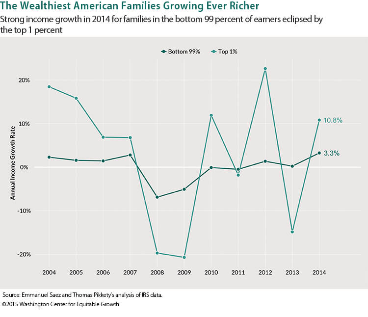
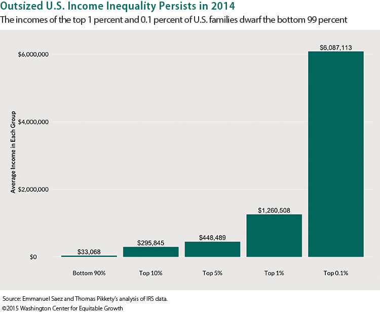
What is “equitable growth” and how do we measure it? The following essay, part of a series, asks economists, other researchers, and practitioners to explore these questions. Equitable growth means an economy that raises living standards for all families. We have seen decades of economic growth in the U.S.—commonly measured by GDP. Yet that success has not meant significant income growth for most American families. Clearly GDP doesn’t provide the full picture. How do we know we’re on the right track? There is little consensus around what specific of indicators are required to quantify whether the economy is growing on behalf of all Americans. Is it a matter of looking at different already existing measures? Should new data using existing concepts of income and well-being be created? Do our concepts of what’s important to measure need updating as well? A better understanding of equitable growth—and how to measure it—can improve our understanding, inform decisions and lead to better outcomes for all.
Researchers studying income distribution in the United States seem reluctant to acknowledge the family as an important unit of production and distribution. As a result, they often rely on statistics that provide a misleading picture of inequalities based on class, race or ethnicity, and especially gender.
Incomplete definitions of both family and income either obscure or render invisible transfers between and within households, including the value of housework and family care. Evidence from specialized surveys—such as the Health and Retirement Survey, the Panel Survey of Income Dynamics, the Survey of Income and Program Participation, and the American Time Use Survey—clearly demonstrate the quantitative relevance of these omissions.
Conventional measures
What, exactly, do economists mean by income, and what, exactly, is the presumed income-receiving unit? Usually, income refers to direct market income (labor earnings plus income from capital such as interest or dividends, and including, where feasible, indirect market income such as the dollar value of transfers from private pensions or government).
Many shortcomings of this measure are widely recognized. For instance, conventional estimates do not include any valuation of the flow of implicit service income from capital assets such as housing or the increase in wealth due to capital gains appreciation. Sources of income that take the form of in-kind benefits and/or tax expenditures such as the Earned Income Tax Credit are seldom included. These problems, however, have received more attention than those related to largely unmeasured aspects of the family economy.
Most individuals in the United States pool at least some of their income with other family members over a significant portion of their lifecycles. As a result, family income is a better indicator of material living standards than individual earnings. Family-based measures are especially relevant to the economic welfare of children, the elderly, and individuals who are sick or disabled, as well as those supporting or providing direct care for such dependents.
Many unrelated individuals live together in households without pooling income, but benefit from household public goods and economies of scale in household production. That’s why it is difficult to measure the extent to which individuals pool their income and what share of family or household income should be imputed to them. While it is often assumed that married couples equally share their market income, empirical research suggests that is not always the case. The proliferation of informal partnerships such as cohabitation further complicate the story.
Intrafamily transfers of money and time—mediated by the public-good aspects of household consumption and economies of scale in household production—potentially affect both the size and the distribution of individual income. For instance, improvements in women’s earnings relative to those of men may be counterbalanced by a decline in intrahousehold or intrafamily transfers related to nonmarriage, loss of household economies of scale, or increases in the percentage of children maintained by women alone.
Defining the family in family income
Seeking a practical solution to a complex problem, the U.S. Census Bureau enforces a clear distinction between family and household. Specifically:
A family consists of two or more people (one of whom is the householder) related by birth, marriage, or adoption residing in the same housing unit. A household consists of all people who occupy a housing unit regardless of relationship. A household may consist of a person living alone or multiple unrelated individuals or families living together.
Note, however, that the definition of family provided here is limited to family members living in the same household. In this sense, it represents a truncated and, in some respects, misleading definition. While the U.S. Current Population Survey asks some questions relating to intrahousehold family transfers, these are largely been considered a private matter, except where they represent a traditional obligation rendered visible by child support agreements.
By contrast, the Health and Retirement Survey asks respondents to report financial help, defined as:
Giving money, helping pay bills, or covering specific types of costs such as those for medical care OR insurance, schooling, down payment for a home, rent, etc. The financial help can be considered support, a gift or a loan.
This is a much broader definition of intrafamily transfers than that in the Current Population Survey, and a recent empirical analysis of the Health and Retirement Survey finds that households with an adult between the ages of 50 and 64 transferred an average of $8,350 to family members over a two-year period between 2008 and 2010. Both the probability and the size of these transfers were positively correlated with income, and the overall likelihood of such transfers increased substantially between 1998 and 2010. In other words, relatively affluent adults approaching retirement age have provided an increasingly significant economic boost to their adult children, which is not factored into conventional family-income calculations.
This analysis of the Health and Retirement Survey does not break out transfers by race or ethnicity, but other research utilizing data from the 2005 and 2007 Panel Study of Income Dynamics, as well as the Survey of Consumer Finance, shows that middle- and upper-income African Americans are more likely to provide informal financial assistance than whites with similar characteristics. Not surprisingly, black families are more likely to have needy family members and friends—what might be termed a negative network effect. This difference can account for a significant portion of the racial gap in wealth.
Overall, such transfers may have an equalizing effect because they generally flow from those with more market income to those with less. But young white adults are more likely to receive transfers from relatively affluent parents, while young black adults are more likely to transfer income to those closer to the bottom of distribution.
Equivalence scales and intrafamily transfers
Comparisons of family income are often unadjusted for family household composition or are adjusted on a per-capita basis, simply divided by the number of household members. Both approaches are misleading. A family of two is much better off with an income of $50,000 than a family of six. In contrast, a family of six does not need three times as much income to be as well off as a family of two, even though it has three times as many members.
For this reason, family income is often adjusted by an equivalence scale that assigns a different weight to children and adults, and takes economies of scale into account. The U.S. poverty line and benchmarks based upon it—such as the 200 percent of the poverty line—represents an implicit equivalence scale. Another common measure divides family income by the square root of family size. Such scales represent an approximation of what might be termed an intrafamily transfer.
Virtually all conventional equivalence scales assume that children are less costly than adults because the cost of feeding and clothing them is lower. Further, virtually all applications of equivalence scales to family income in the United States apply the same scales at every point in time. Since the mid-1960s, however, children have become more costly relative to adults, and family budgets have shifted away from food and clothing toward services such as childcare and education.
A major factor behind increased childcare costs is the significant increase in the labor-force participation of mothers between 1975 and the mid-1990s. Another is the steady climb in the percentage of children living in families maintained by a mother alone, since mothers are required to engage in paid employment in order to even qualify for public assistance.
While longitudinal data are scarce, a recent Census Bureau report based on the Survey of Income and Program Participation estimates that overall expenditures on childcare doubled between 1985 and 2011, from $84 to $143 per week in constant dollars. In the most recent year, families with incomes below the federal poverty line spent about 30 percent of their income on childcare, compared to 8 percent for families not in poverty.
Parental spending on higher education has also increased, the combined result of increasing college enrollments (despite relatively stagnant graduation rates) and significant increases in tuition and fees, particularly over the past 15 years. Research also shows that home buyers and renters pay a significant premium for houses in high-quality school districts, indirectly increasing the cost of children.
These factors have important implications for considering the distribution of adjusted family income today. Whites in general are less likely than African Americans or Hispanics to live in households with children, and college-educated women are significantly less likely than other women to become single parents. Current equivalence scales significantly understate the economic significance of these demographic differences. Yet many dual-earner families with children sit squarely in the middle of the (conventionally measured) family-income distribution.
In current economic parlance, disposable income is typically defined as income after taxes. One could conceptualize “adult disposable income” as the net of taxes and benefits and transfers to children and other dependents. Instead, current assumptions treat spending on children or other needy family members merely as another form of consumption, no different than spending on restaurant meals or automobiles.
The value of nonmarket work
Housework and family care are now widely recognized as forms of work that yield economic benefits. Recent data from the American Time Use Survey show that productive activities that someone else could, in principle, be paid to perform constitute roughly half of all time devoted to work in the United States.
A number of studies impute a market value to this work on the aggregate level, simply multiplying the number of hours by an estimate of quality-adjusted replacement cost. This exercise suggests that the contribution of nonmarket work to an expanded definition of Gross Domestic Product in the United States lies somewhere between 30 percent and 40 percent. Yet, with a few notable exceptions, the value of nonmarket work is largely ignored in estimates of family income on the microeconomic level.
Consider two family households of identical composition consisting of two adults and two children under the age of 5, both with a family income of $50,000 (ignoring both taxes and benefits, for the sake of simplicity). Conventional measures would place both of these families at exactly the same place in the distribution of income. But what if the first family includes two wage-earners, both working 40 hours per week and earning $25,000 per year, and the second family includes one wage-earner, working 40 hours per week and earning $50,000 per year, along with one stay-at-home parent who prepares meals, does shopping, and provides childcare.
Surely the second family is significantly better off than the first, if only because it does not incur the childcare costs alluded to in the section above.
What effect does imputation of the value of nonmarket work have on estimates of the distribution of family income in the United States? Empirical work today suggests that it has an equalizing effect in the cross-section, not because low-income families devote more time to it, on average, but because any imputation of the value of that work represents a larger percentage of their market income.
The implications for trends over time are quite different. The equalizing effect of valuing nonmarket work was almost certainly greater in the 1960s, when a relatively large percentage of married women were full-time homemakers. As women entered wage employment and substituted market employment for at least some of their nonmarket work, this equalizing effect diminished. Inequality in women’s earnings is also far greater today than it was in the 1960s, with high-earning women likely to marry high-earning men.
Whatever the gender implications of the traditional breadwinner/homemaker family, it may well have mitigated some aspects of class inequality among whites (it was never widespread among blacks). But most studies of the impact of women’s increased labor-force participation on income inequality completely ignore the value of nonmarket work, essentially assigning homemakers a contribution of “zero” in their empirical analysis.
Implications
Changes in the family economy of the United States have probably had only small effects on the relative income of the top 1 percent or the top 5 percent. They have larger implications for both the reality and the perception of relative income among households with divergent patterns of female labor-force participation and family responsibility.
Many public benefits in the United States—from the Supplemental Nutrition Assistance Program to financial aid for college—are conditioned on conventional measures of family income. Because these measures provide an incomplete and misleading picture of relative well-being of families, reliance on them may breed frustration and resentment.
Many of the policy proposals emerging from both political parties speak to concerns about the costs of family care: increased public provision of care and education, as well as child and dependent care tax credits. The potentially equalizing effect of such policies deserves serious consideration. In principle, many of the data sources cited above offer the potential to enlarge appreciation of the family in family income.
—Nancy Folbre is the director of the program on gender and care work at the Political Economy Research Center at the University of Massachusetts, Amherst.