Every month the U.S. Bureau of Labor Statistics releases data on hiring, firing, and other labor market flows from the Job Openings and Labor Turnover Survey, better known as JOLTS. Today, the BLS released the latest data for August 2020. This report doesn’t get as much attention as the monthly Employment Situation Report, but it contains useful information about the state of the U.S. labor market. Below are a few key graphs using data from the report.
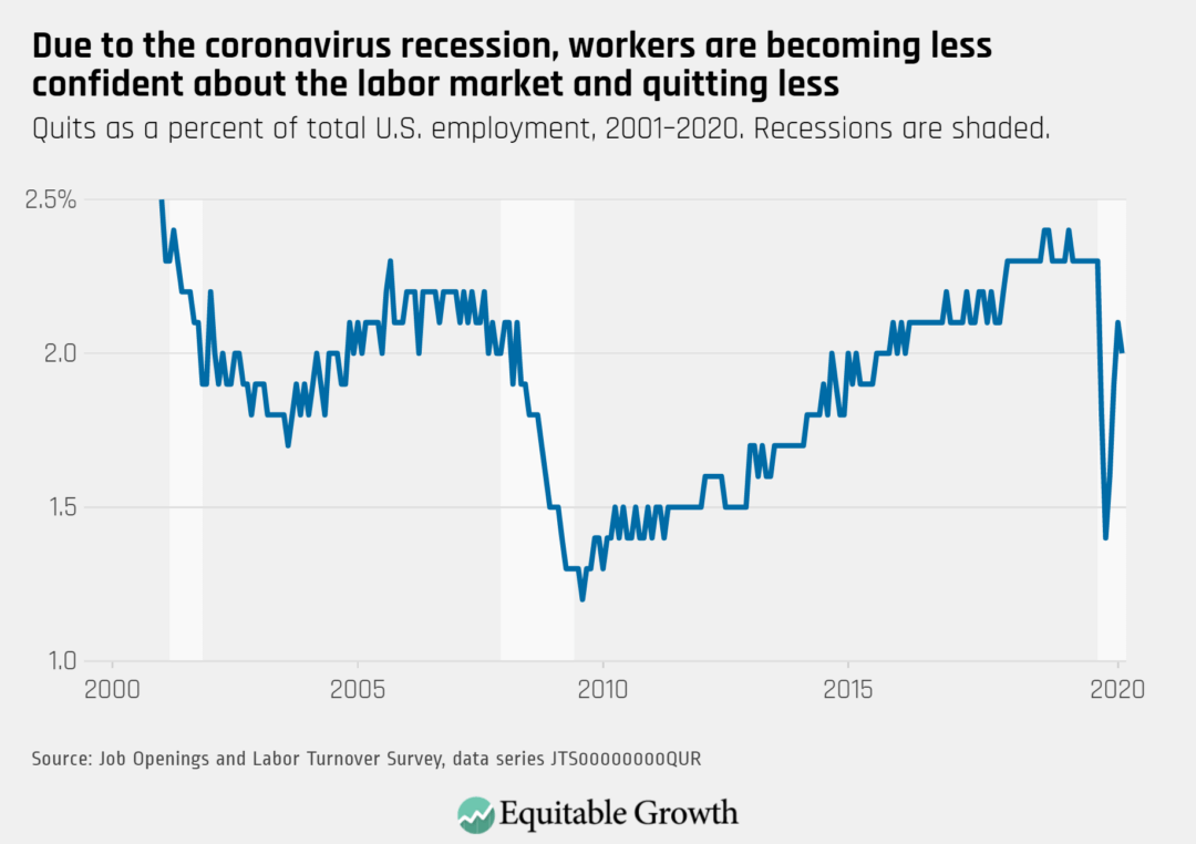
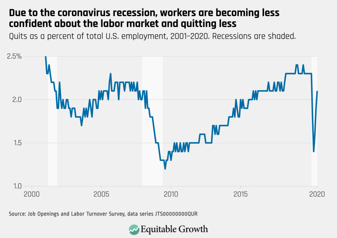
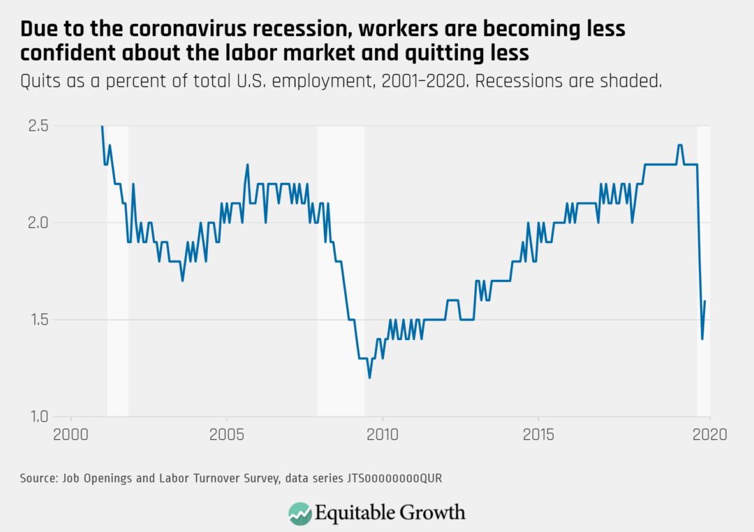
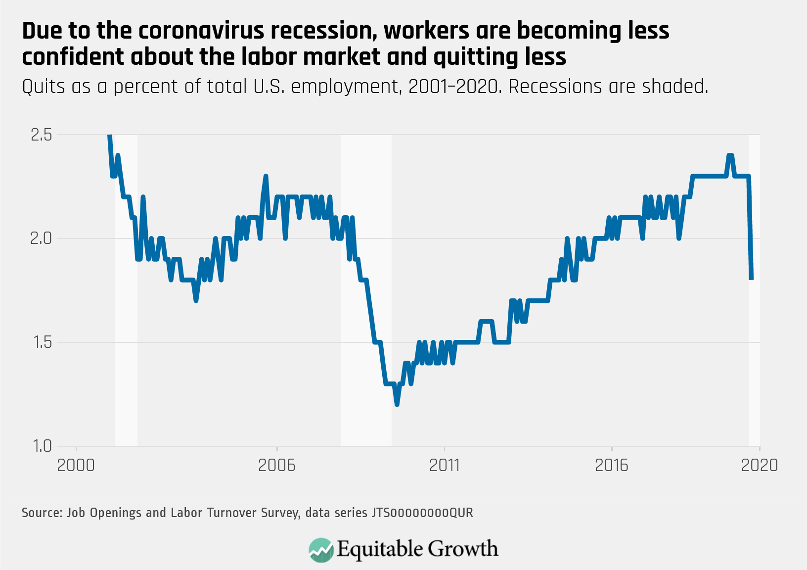
The quits rate declined slightly to 2.0% in August as the tenuous recovery stalled.
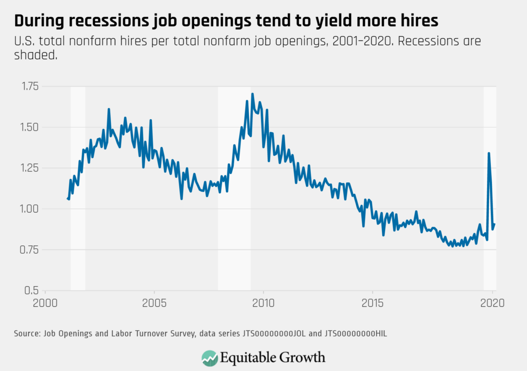
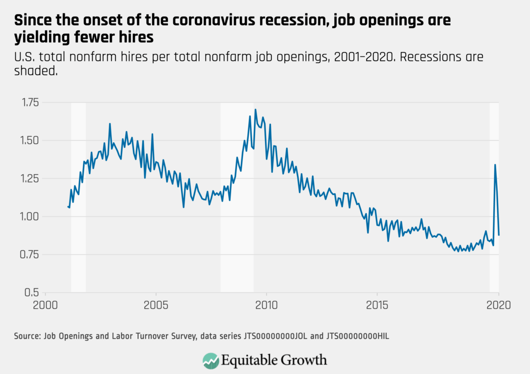
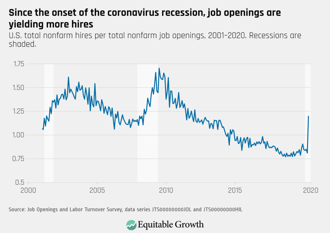
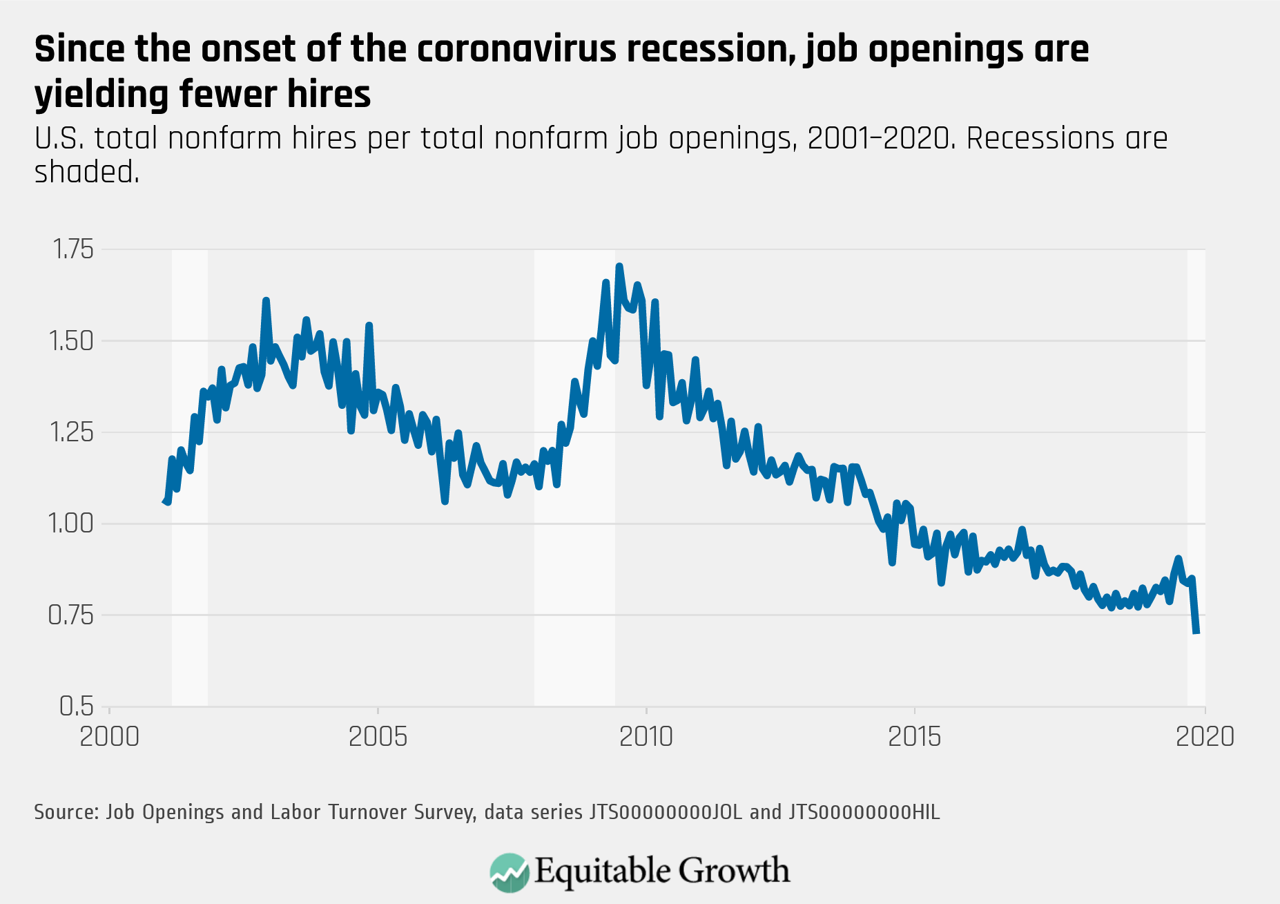
The vacancy yield edged up slightly as job openings declined and hires were unchanged. The steady hires rate was a result of increased government temporary hiring for the Decennial Census balanced by decreased hiring in accommodation and food services and healthcare and social assistance.
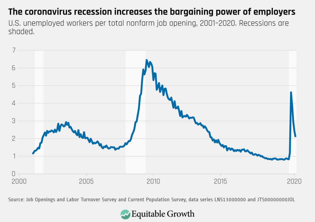
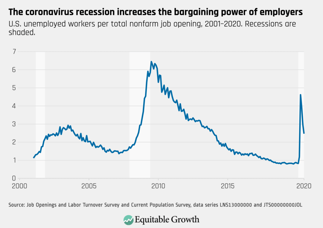
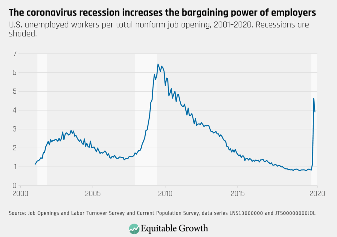
The ratio of unemployed-worker-per-opening dropped to nearly 2:1 as the slight decrease in job opening rate was offset by a greater decrease in the unemployment rate.
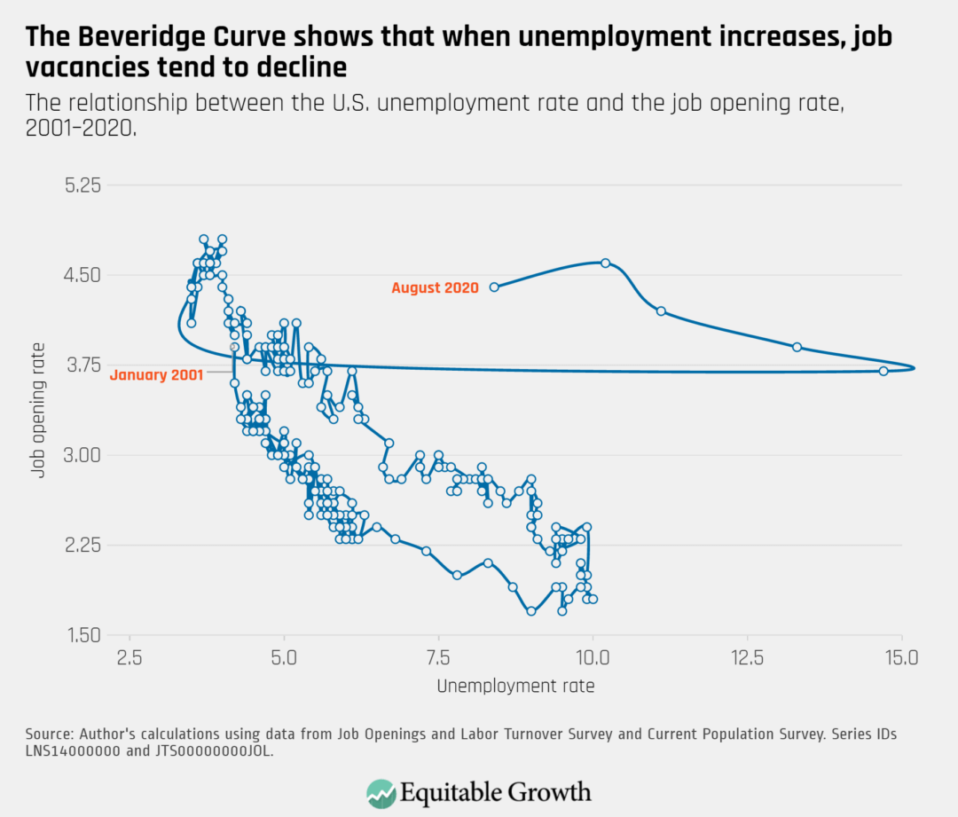
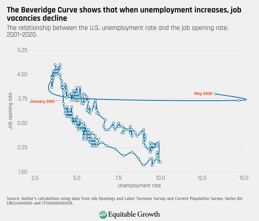
The Beveridge Curve moved closer to its position prior to the pandemic, but remains in unprecedented territory as the unemployment rate remains elevated, alongside a job opening rate that has returned to its lower early 2020 levels.
On October 2nd, the U.S. Bureau of Labor Statistics released new data on the U.S. labor market during the month of September. Below are five graphs compiled by Equitable Growth staff highlighting important trends in the data.
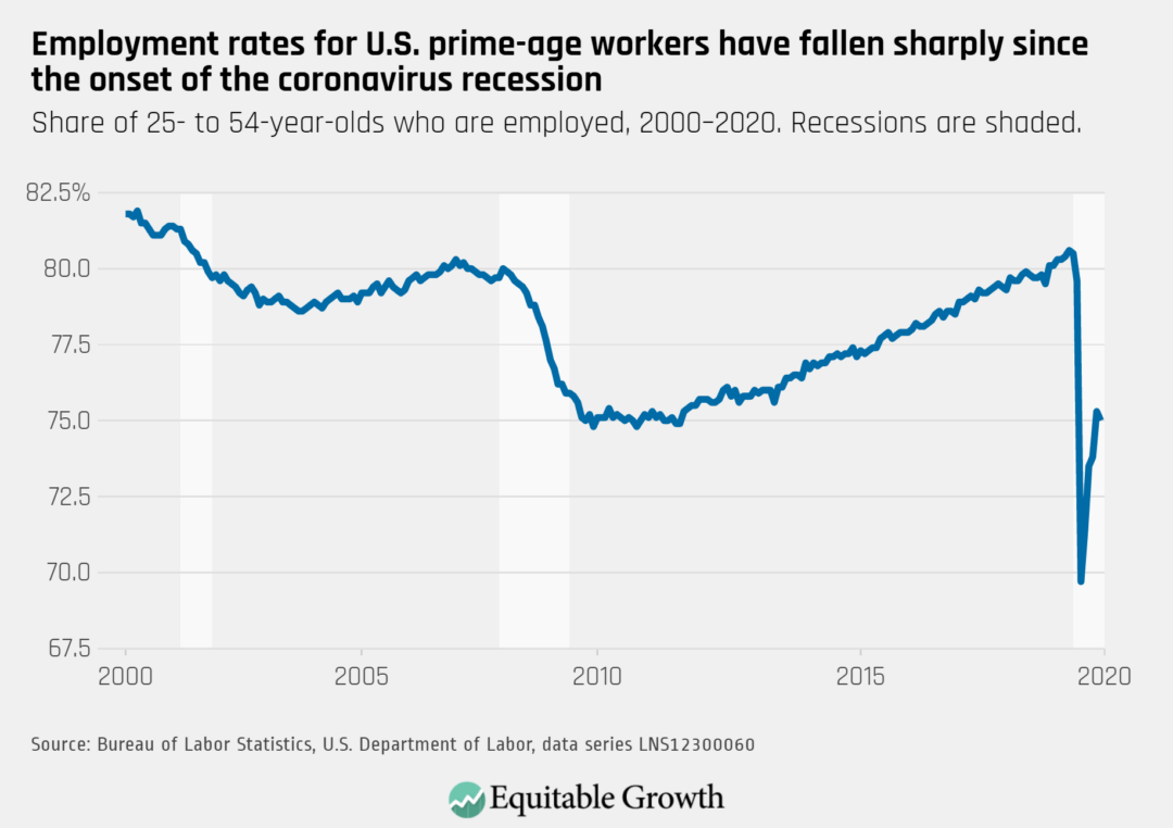
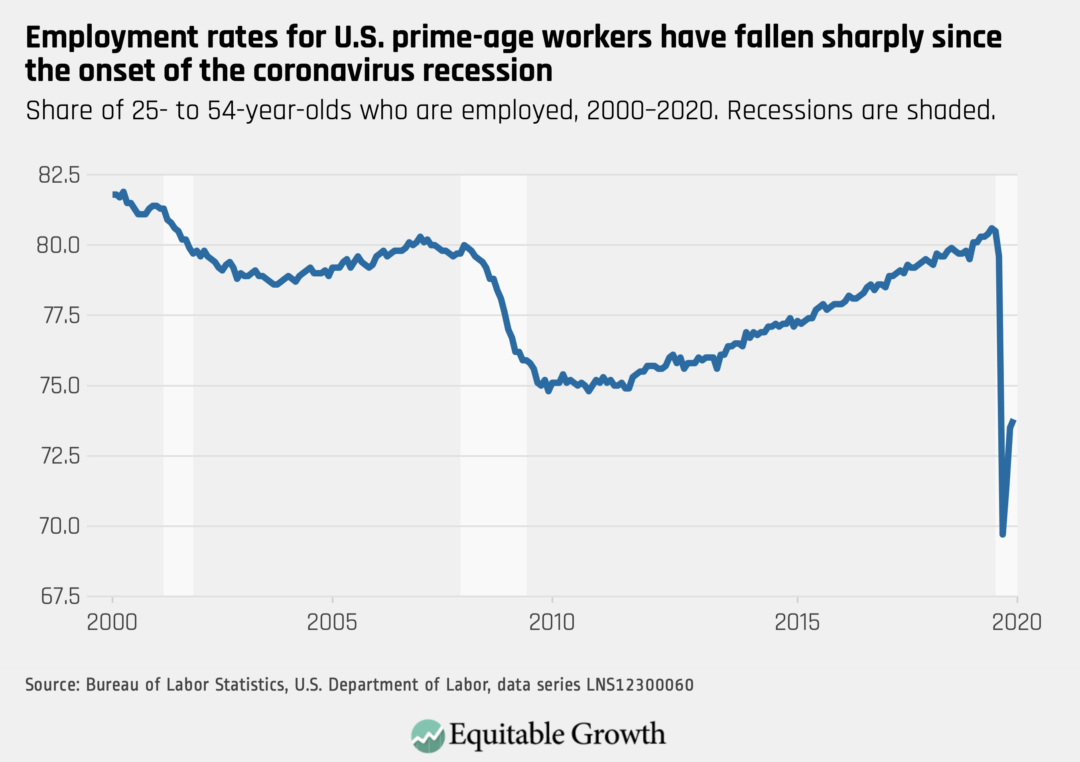
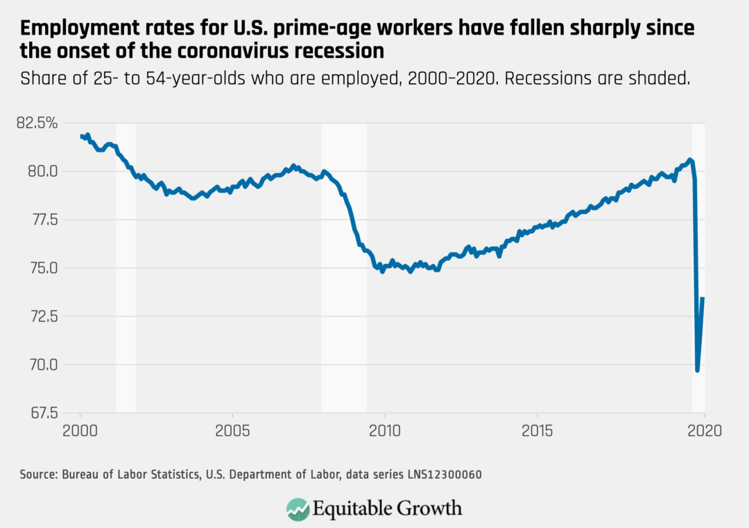
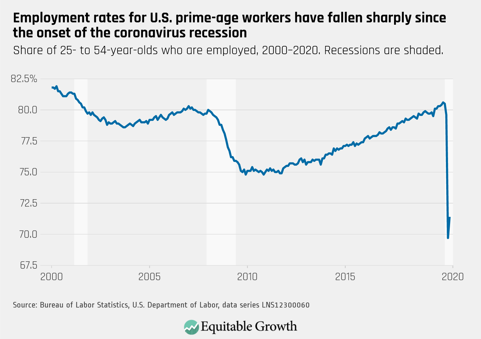
The employment-to-population ratio for people in their prime working years fell slightly from 75.3 percent to 75.0 percent in September, signaling a stalling recovery for the labor market.
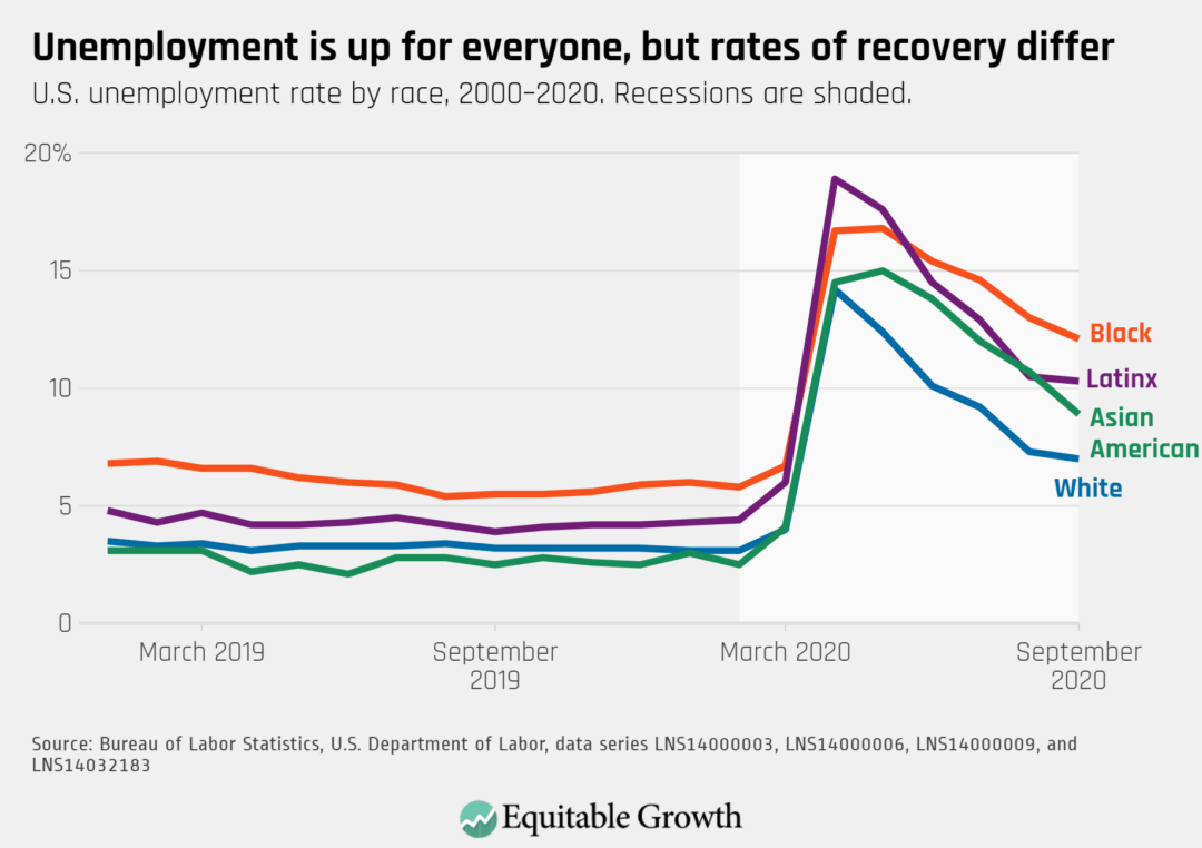
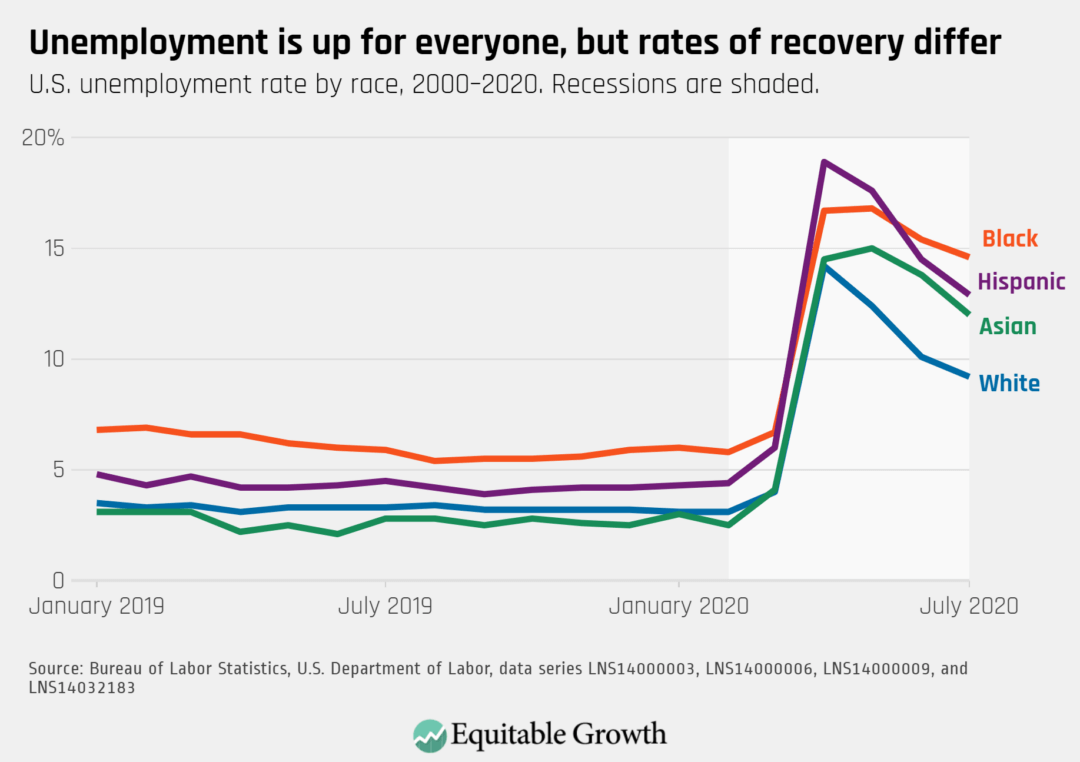
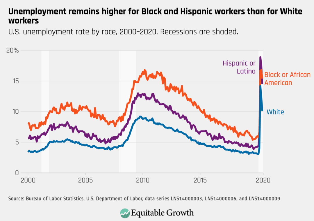
The unemployment rate for Black and Latinx workers remains in double digits at 12.1 percent and 10.3 percent, respectively, remaining significantly higher than White and Asian American workers. In May, Asian American workers saw an unprecedented increase in unemployment, which later fell but remains elevated above White workers.
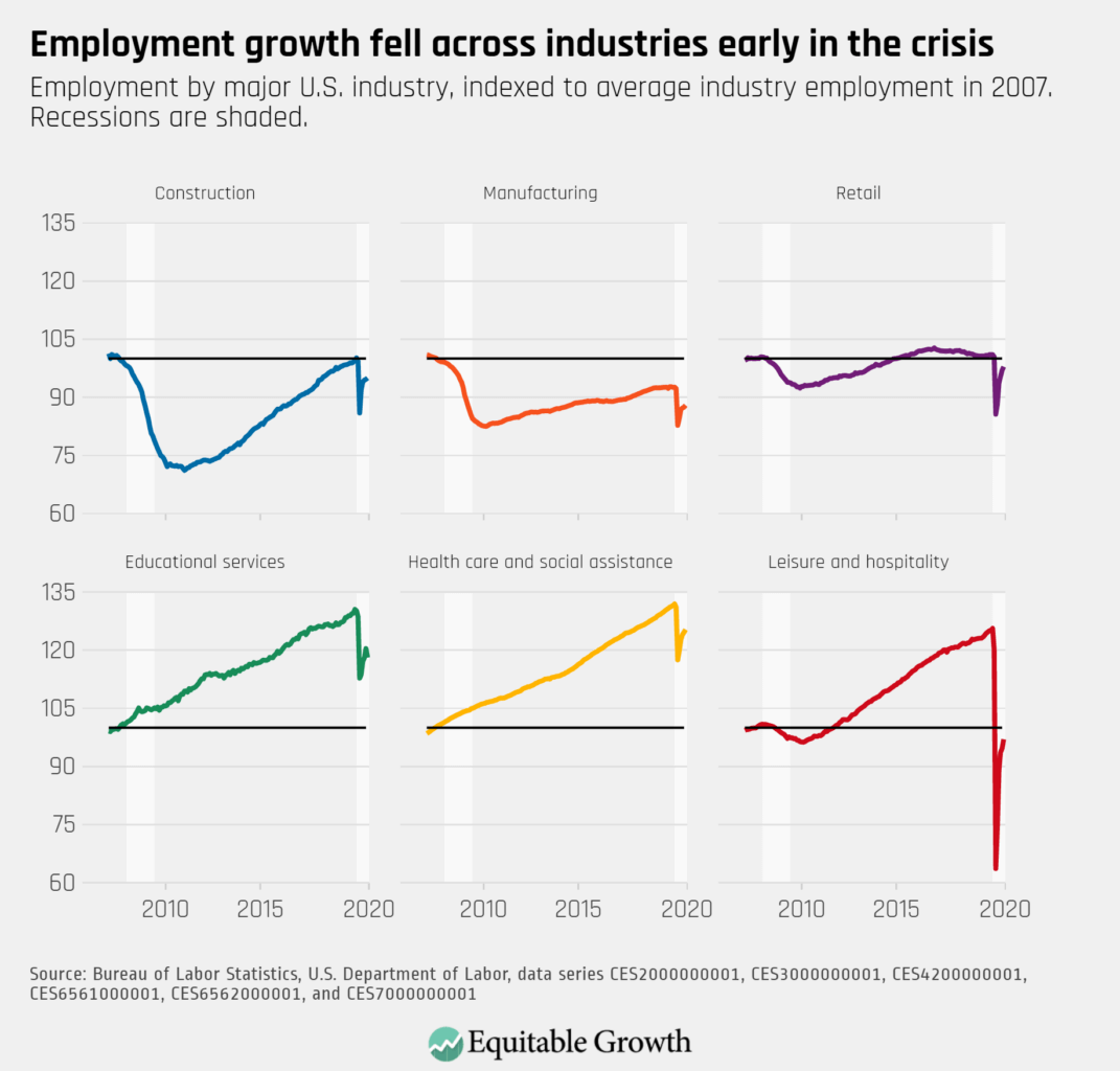
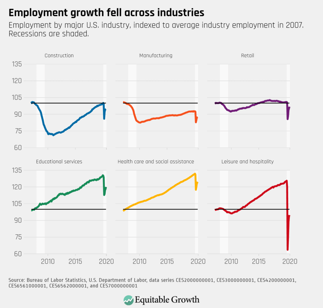
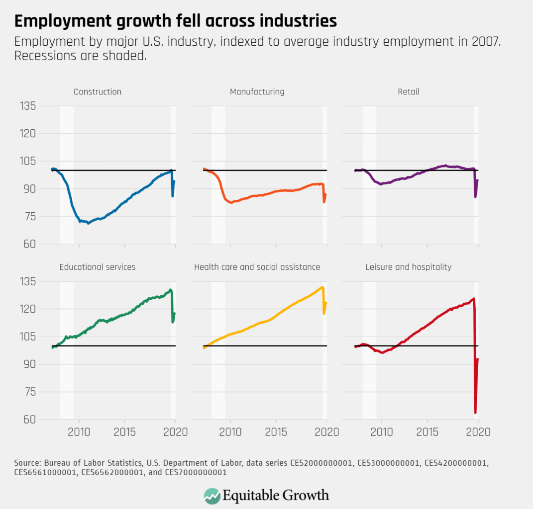
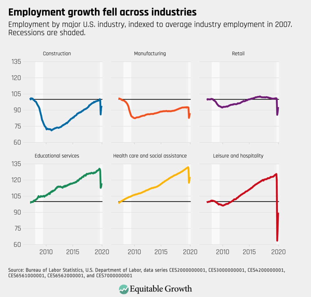
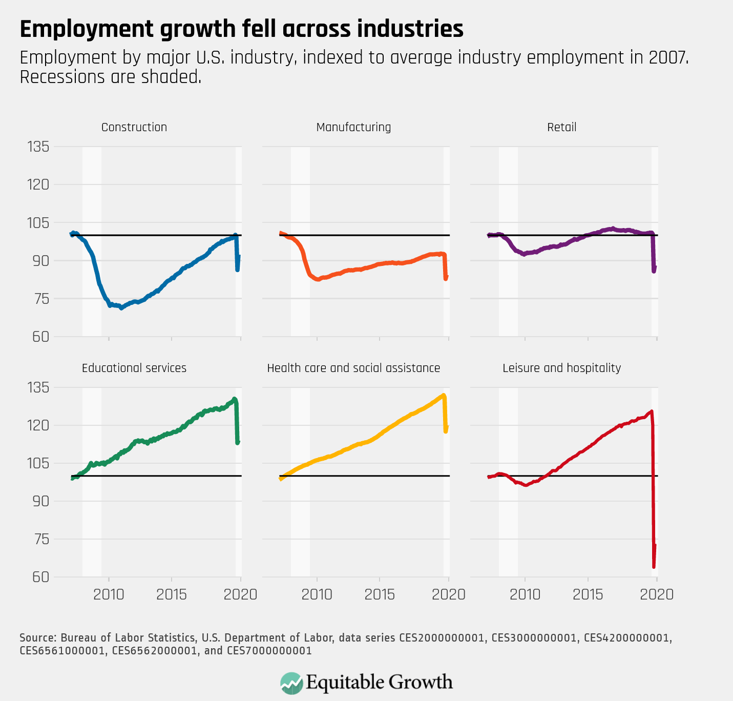
Employment growth slowed across all industries and fell in education services.
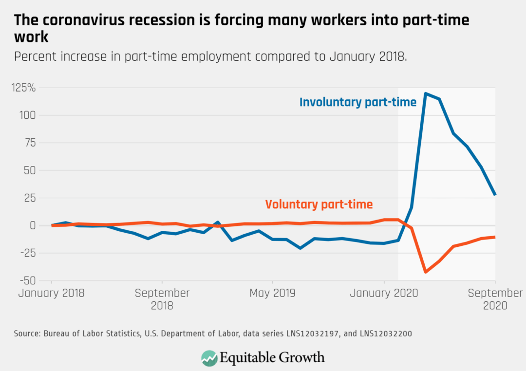
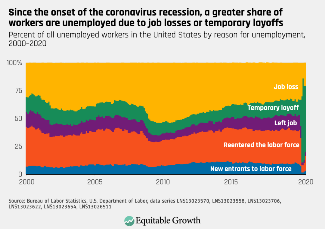
Involuntary part-time work fell by 1.3 million jobs, but still remains 2 million higher than in February before the crisis.
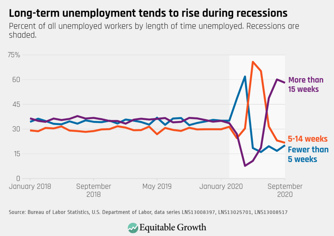
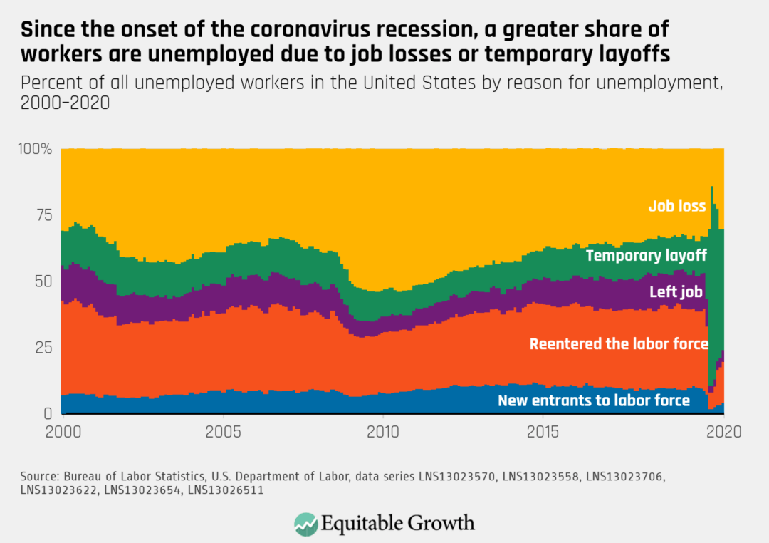
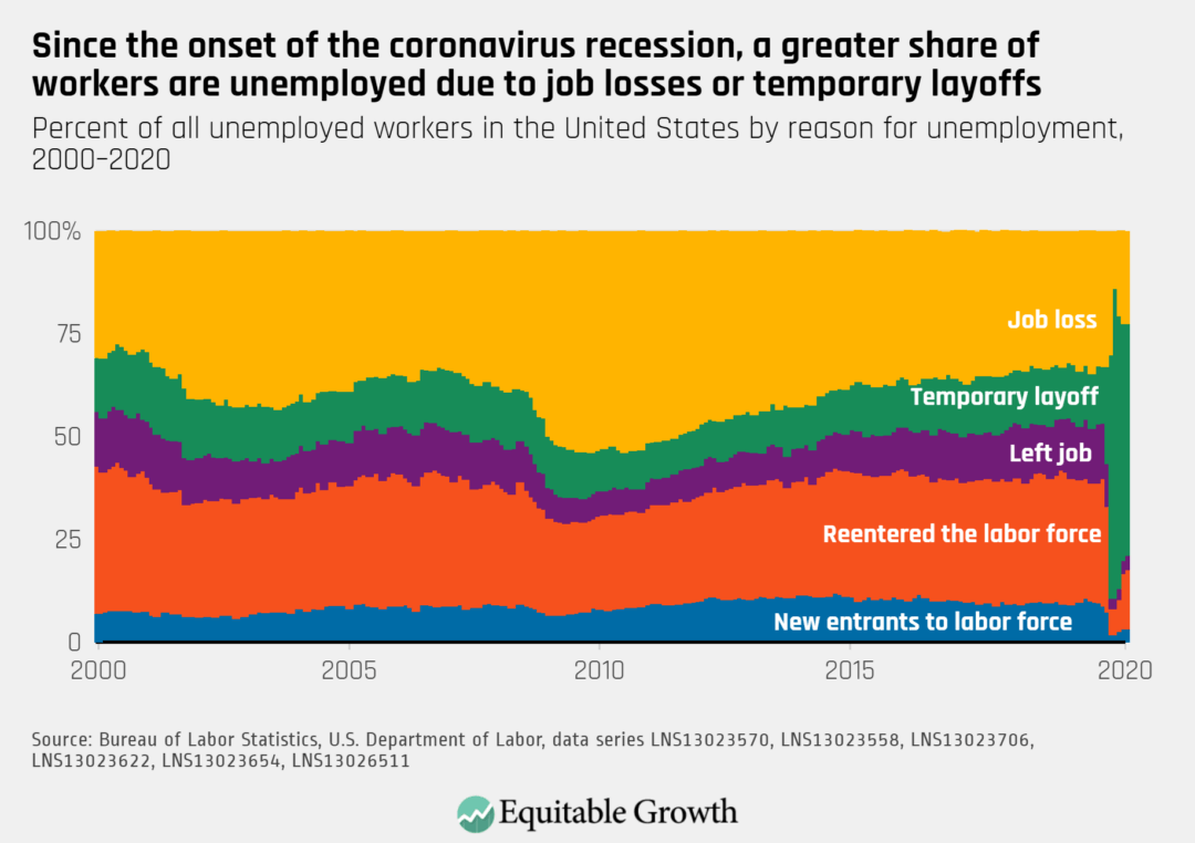
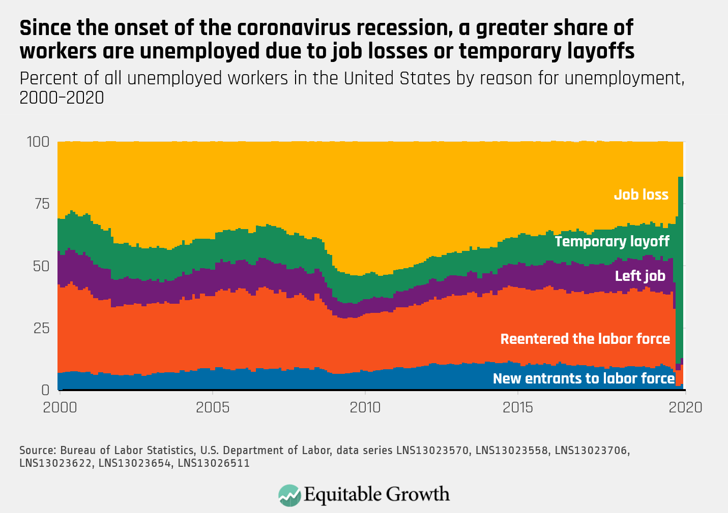
The proportion of those unemployed who have recently lost a job rose by 271,000 in September, reflecting new layoffs as the coronavirus recession continues.
Every month the U.S. Bureau of Labor Statistics releases data on hiring, firing, and other labor market flows from the Job Openings and Labor Turnover Survey, better known as JOLTS. Today, the BLS released the latest data for July 2020. This report doesn’t get as much attention as the monthly Employment Situation Report, but it contains useful information about the state of the U.S. labor market. Below are a few key graphs using data from the report.
The quits rate continued to increase in July as the economy began to recover from early shutdowns, rising to 2.1% after falling to a low of 1.4% in April.
There was less than one hire per job opening in July as openings increased to 6.6 million and hires fell to 5.8 million, a decrease of over 1 million hires compared to the prior month.
The job openings rate increased to 4.5% in July, but there were still more than two unemployed workers per opening and the unemployment rate was 10.2%.
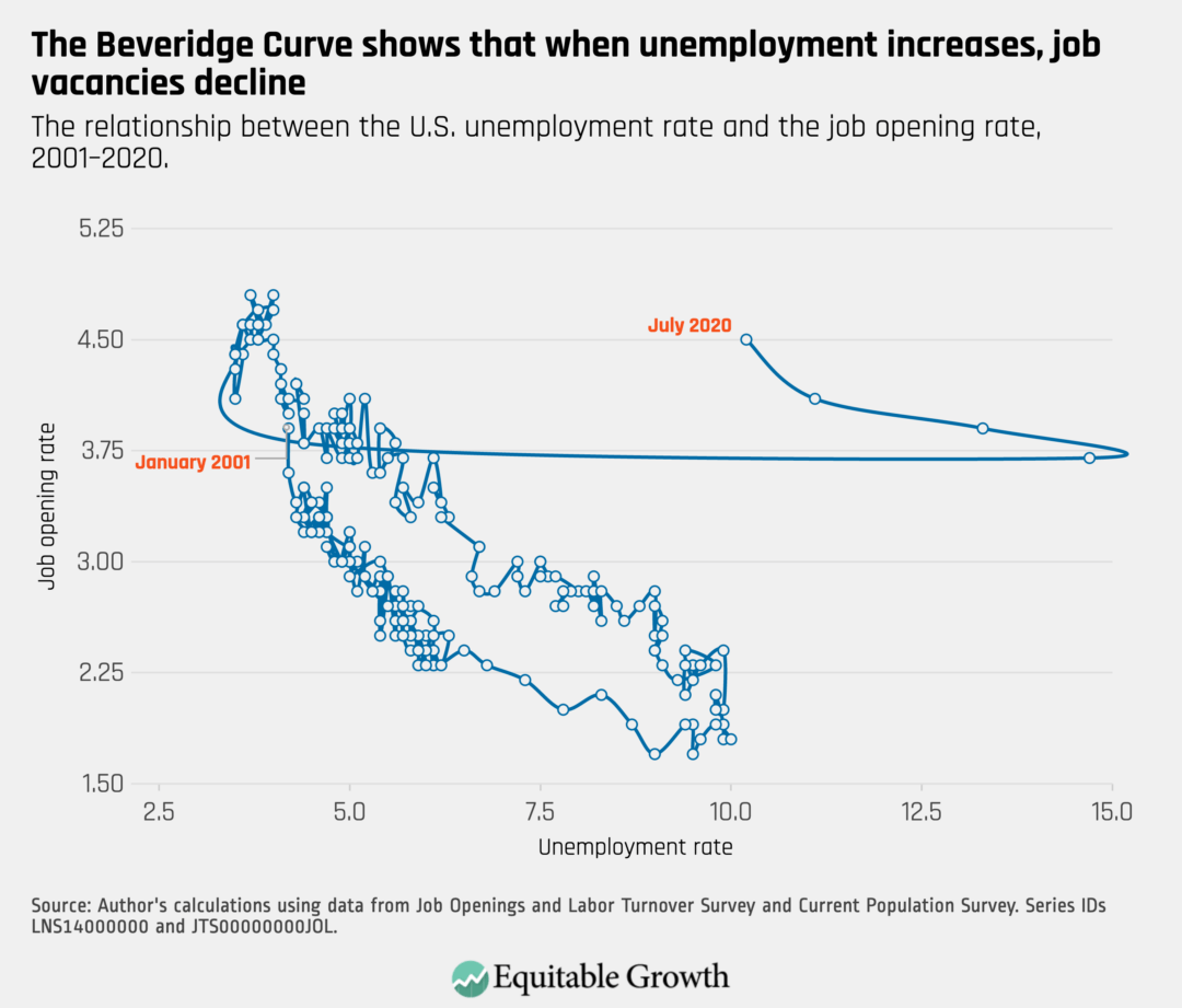
The Beveridge Curve reflects the unique circumstances of the coronavirus recession, with an elevated openings rate alongside high unemployment.
On September 4th, the U.S. Bureau of Labor Statistics released new data on the U.S. labor market during the month of August. Below are five graphs compiled by Equitable Growth staff highlighting important trends in the data.
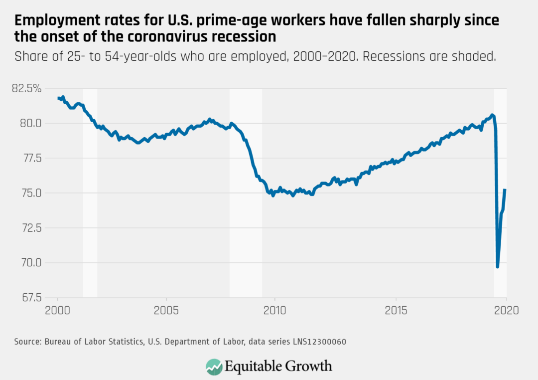
While still well below its pre-coronavirus level, the employment rate for prime-age workers rose to 75.3% in August, having regained half of the losses since its low in April.
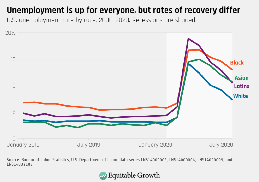
Unemployment rates remain highest for Black workers at 13.0%. Latinx unemployment fell to 10.5%, just below the Asian American unemployment rate of 10.7%. White unemployment declined to 7.3%.
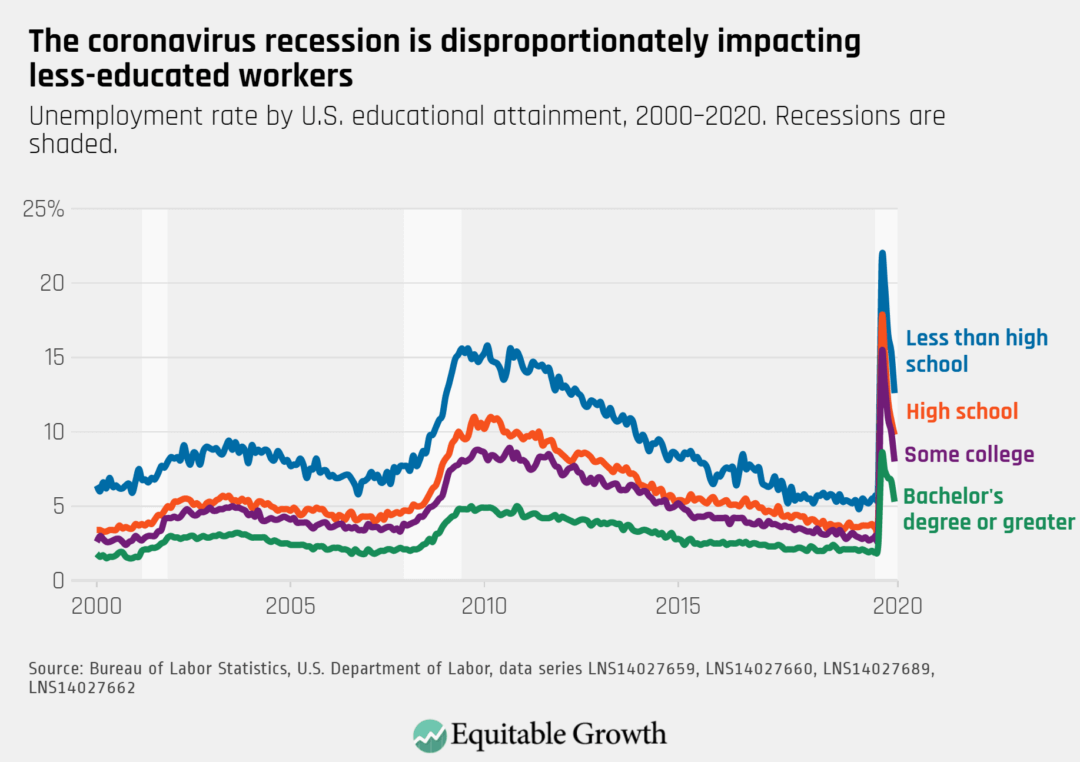
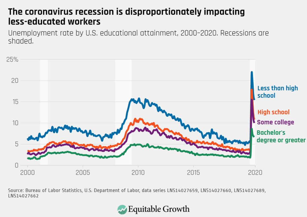
While unemployment rates continue to decline for all education levels, the unemployment rate for workers with less than a high school education is still more than twice as high as for those with a college degree.
Employment rose across all sectors in August, and in leisure and hospitality has rebounded to roughly half of its lowest levels.
The proportion of unemployed workers who were on temporary layoff fell to 45.5% in August, while the share of permanent job losers rose to 30.6%.
On August 7th, the U.S. Bureau of Labor Statistics released new data on the U.S. labor market during the month of July. Below are five graphs compiled by Equitable Growth staff highlighting important trends in the data.
While the labor market added a relatively robust 1.8 million jobs in July, the prime-age employment-to-population ratio only increased slightly from 73.5% to 73.8%.
While unemployment rates have been declining for White, Hispanic, and Asian workers since May, the decline has been slower for Black workers, whose unemployment rate was at a high level of 14.6% in July.
Unemployment rates continue to be higher for those with lower levels of education, but workers with a college degree experienced the smallest decline in unemployment in July at 10%, down from 10.9% in June.
Despite the surge in coronavirus cases across the country, employment in leisure and hospitality led the increase in payroll employment, accounting for nearly one-third of jobs added in July.
As unemployment decreased in July, the proportion of unemployed workers who have permanently lost their jobs remained steady, while the share of re-entrants to the labor force increased.
Every month the U.S. Bureau of Labor Statistics releases data on hiring, firing, and other labor market flows from the Job Openings and Labor Turnover Survey, better known as JOLTS. Today, the BLS released the latest data for May 2020. This report doesn’t get as much attention as the monthly Employment Situation Report, but it contains useful information about the state of the U.S. labor market. Below are a few key graphs using data from the report.
The quit rate rebounded slightly to 1.6% in May, but remains far below its high of 2.3% in February.
As state economies began re-opening, the vacancy yield increased, reflecting a series of 6.5 million new hires in May.
Despite an increase in job openings and a decrease in unemployment, there were still nearly four unemployed workers for every job opening in May.
The Beveridge Curve moved slightly back toward normal cyclical territory in May, as the job opening rate changed little and the unemployment rate decreased more significantly.
On July 2nd, the U.S. Bureau of Labor Statistics released new data on the U.S. labor market during the month of May. Below are five graphs compiled by Equitable Growth staff highlighting important trends in the data.
The prime-age employment rate continues to rebound from its stark drop in March, but only recovering about 1/3 of its drop as the pandemic surges again and necessitates further lockdowns.
Unemployment rates decreased across racial and ethnic groups, but significantly less so for Black workers compared to White and Hispanic workers. Hispanic workers’ unemployment rate continues to be elevated against historical trends.
All industries gained employment in June, with 2/5 of new jobs being added in leisure and hospitality, after facing the steepest job losses among industries in March.
The unemployment rate declined for workers of all education levels. Workers with a college degree or higher experienced a lower rate of decline but still have lower unemployment rates compared to other groups.
As the labor market partially rebounded in June, a smaller share of unemployed workers were temporarily laid off and an increasing proportion have reentered the labor force.
Every month the U.S. Bureau of Labor Statistics releases data on hiring, firing, and other labor market flows from the Job Openings and Labor Turnover Survey, better known as JOLTS. Today, the BLS released the latest data for April 2020. This report doesn’t get as much attention as the monthly Employment Situation Report, but it contains useful information about the state of the U.S. labor market. Below are a few key graphs using data from the report.
1.
The quit rate continued to fall in April, declining to 1.4% from 1.8% in March, down from a steady 2.3% in the months prior to the recession.
2.
As hires reached a low of 3.5 million (since the data began collection in 2000) and openings declined to 5.0 million, the vacancy yield continued to trend downward in April.
3.
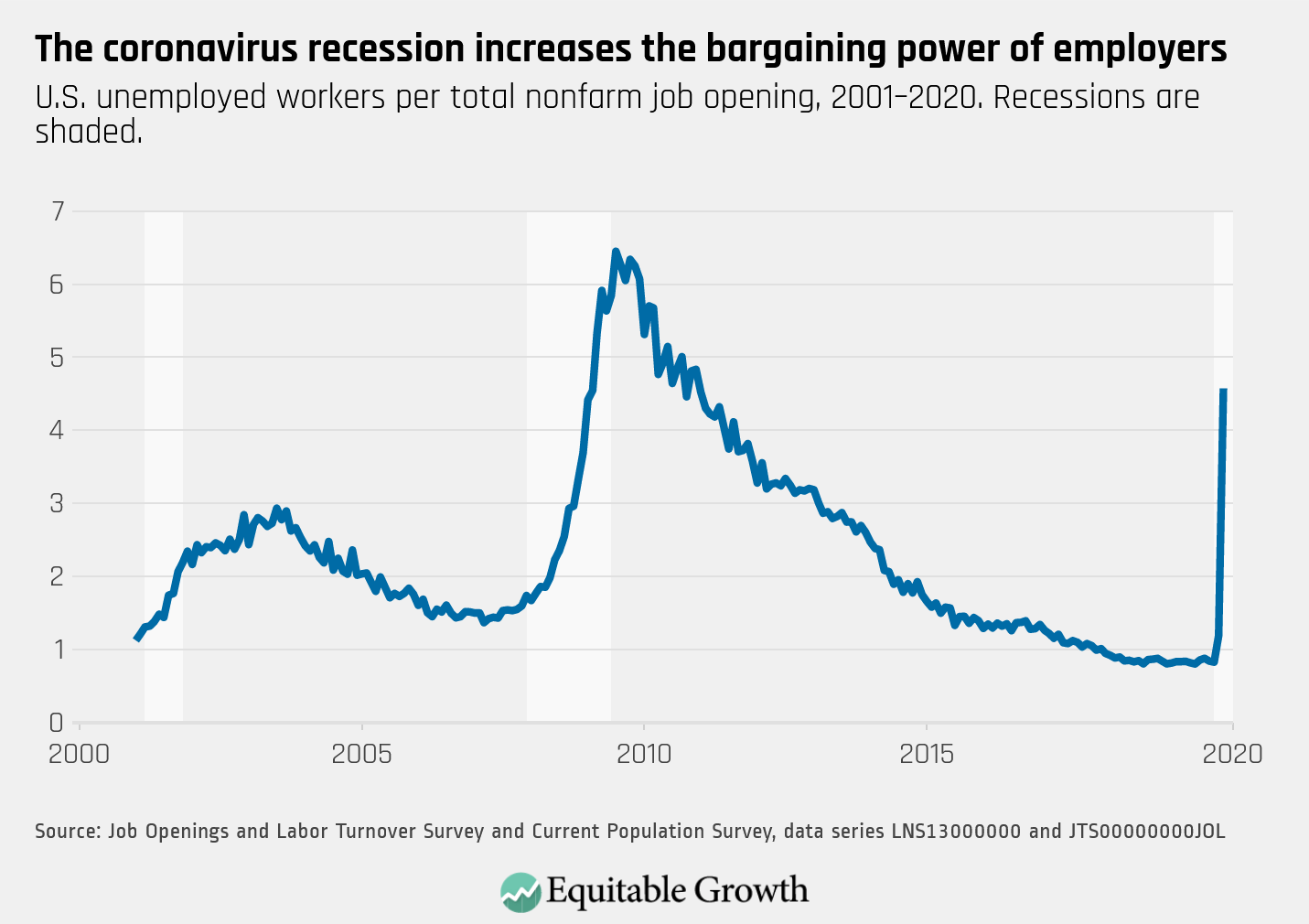
There are more than four unemployed workers for every job opening, as unemployment skyrocketed in April and openings decreased.
4.
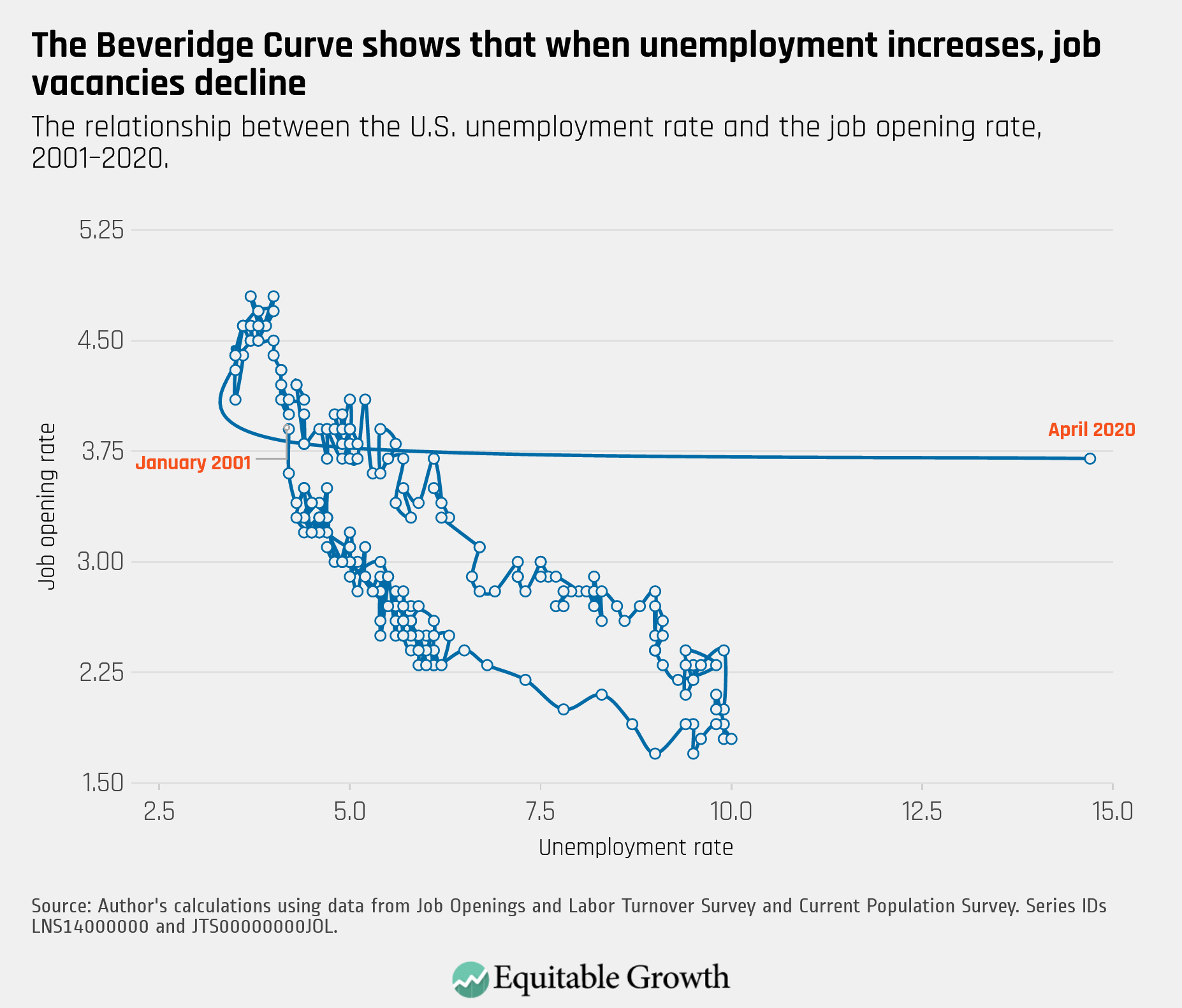
The Beveridge Curve made an unprecedented rightward shift–and at a rapid pace of increase–as unemployment reached its highest level since the Great Depression.
On June 5th, the U.S. Bureau of Labor Statistics released new data on the U.S. labor market during the month of May. Below are five graphs compiled by Equitable Growth staff highlighting important trends in the data.
1.
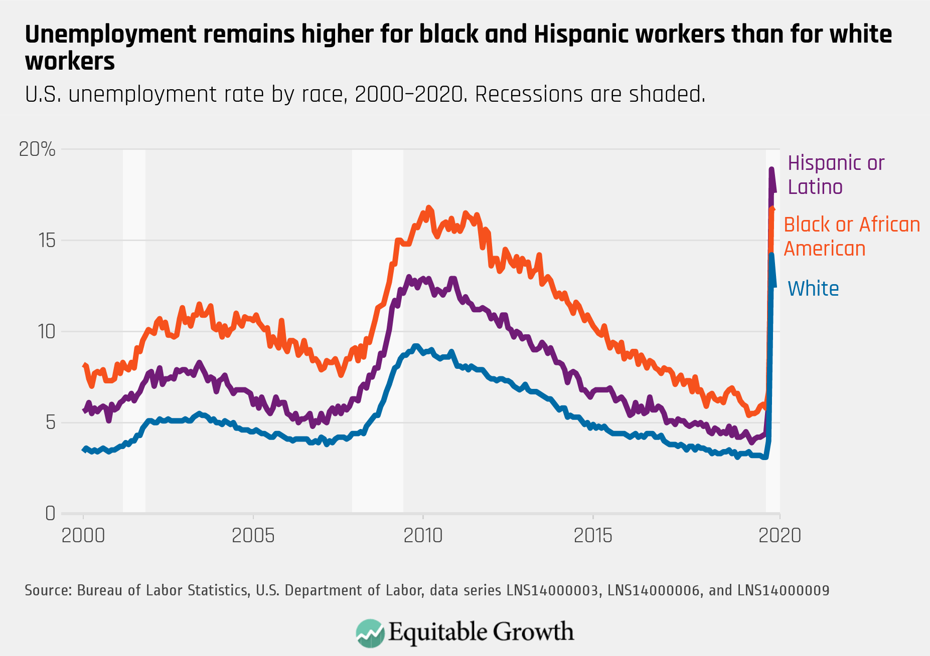
As the overall unemployment rate declined to 13.3%, this was led by a decline in white unemployment from 14.2% to 12.4%. Meanwhile, Black unemployment increased slightly from 16.7% to 16.8% and Hispanic unemployment declined from a historic high of 18.9% to 17.6%.
2.
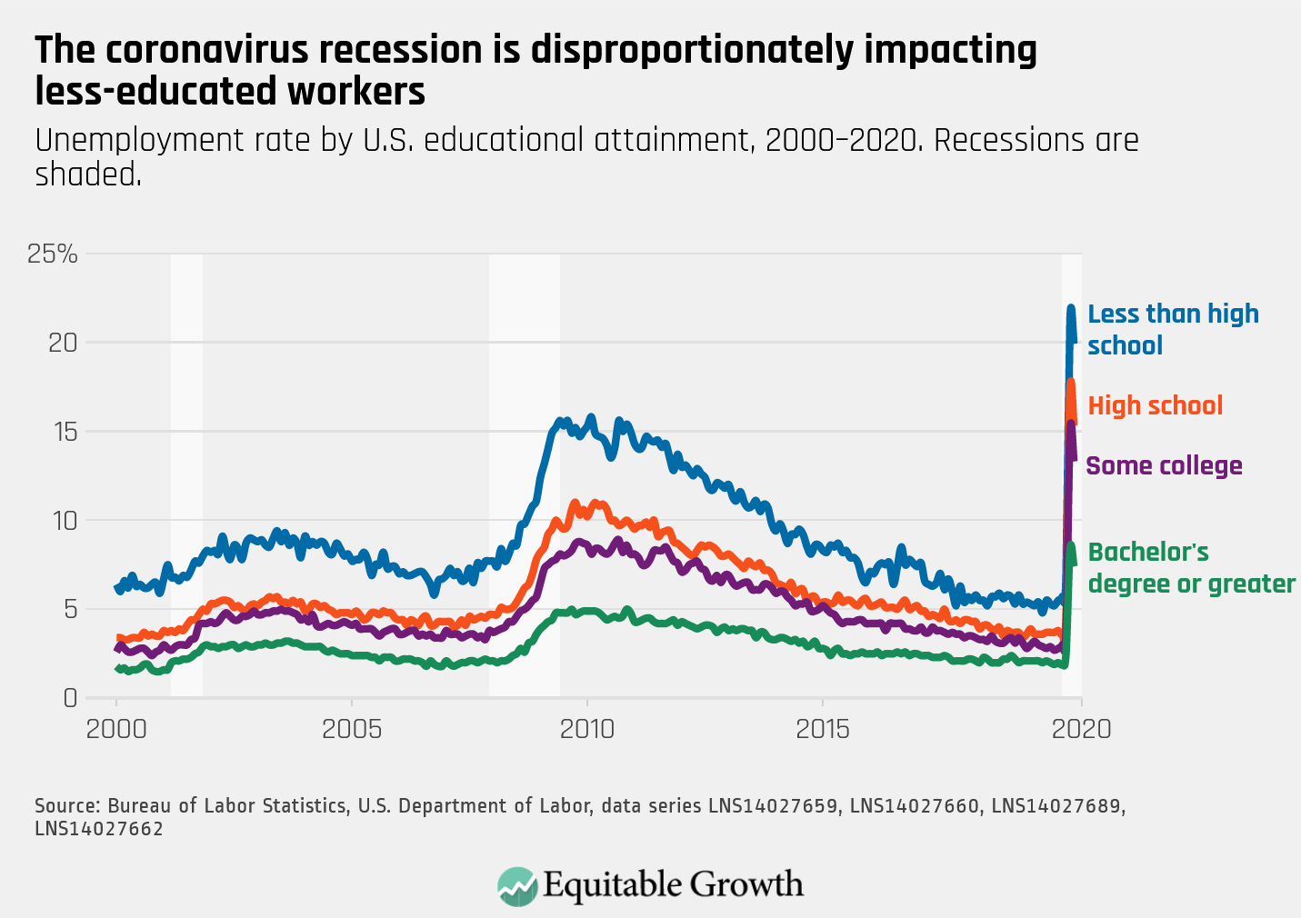
The unemployment rate declined for all education levels, while maintaining higher rates of unemployment for less educated groups.
3.
Employment across sectors began to rebound in May, and growth was led by leisure and hospitality after this industry lost nearly half of all employment in the prior month.
4.
The proportion of unemployed workers who were on temporary layoff declined in May, while permanent job losers, re-entrants, and new entrants to the labor force all increased.
5.
After the most extreme decline in employment levels in history in April, the prime-age employment rate moved upward in May to 71.4%
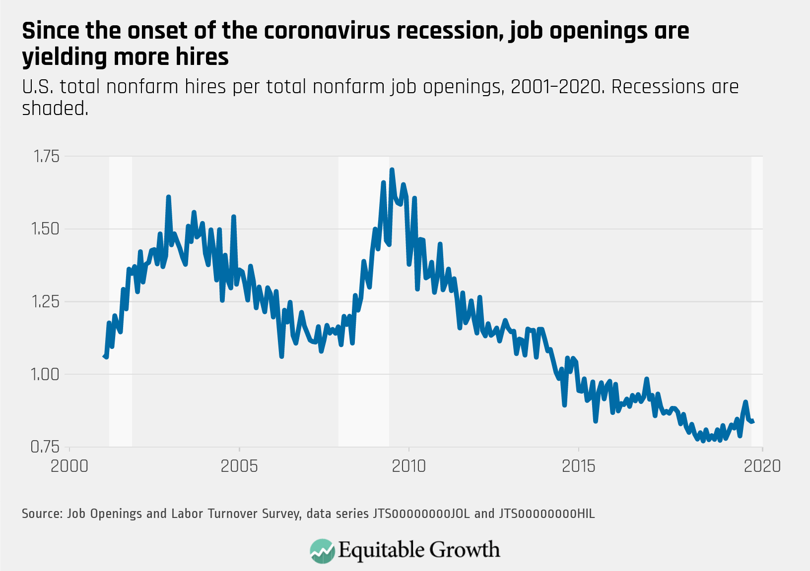
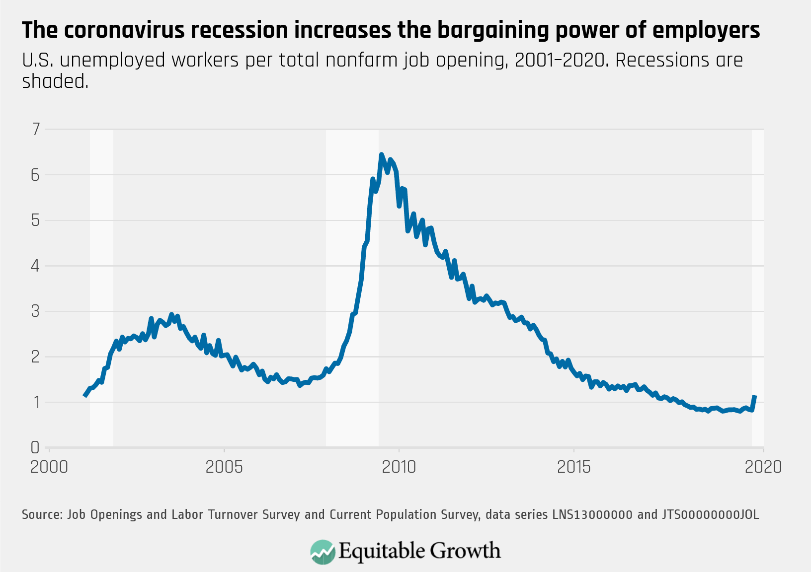
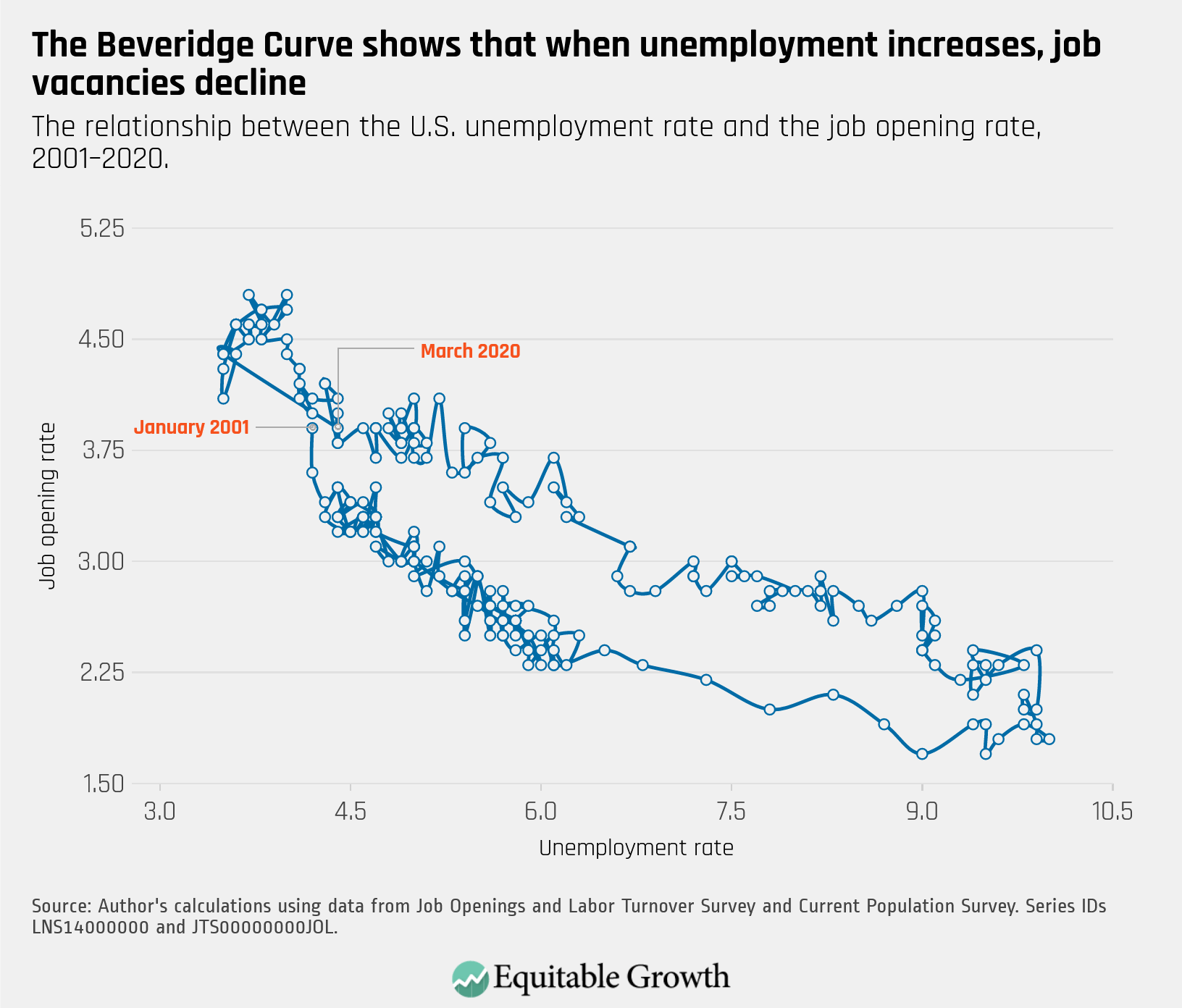
Every month the U.S. Bureau of Labor Statistics releases data on hiring, firing, and other labor market flows from the Job Openings and Labor Turnover Survey, better known as JOLTS. Today, the BLS released the latest data for March 2020. This report doesn’t get as much attention as the monthly Employment Situation Report, but it contains useful information about the state of the U.S. labor market. Below are a few key graphs using data from the report.
1.
The quits rate decreased sharply from 2.3% in February to 1.8% in March, as workers’ confidence about job prospects declined amid the public health crisis and requisite state shutdowns.
2.
While both the rates of job openings and hires decreased in March, openings did more so, leading to a slight increase in the vacancy yield.
3.
As the unemployment rate began to increase in March, the ratio of unemployed-worker-per-job-opening rose above 1.0 for the first time since December 2017.
4.
The Beveridge curve dove down rightward in March as the unemployment rate increased and job opening rate decreased, suggesting the labor market downturn in the early coronavirus recession.