Category: Labor Markets
Hoisted from the Archives from Five Years Ago: Department of “HUH?!?!?!?!?!?!
Every once in a while I think that our austerian intellectual adversaries could not have been as clueless in the aftermath of 2008 as I remember them being. But then I go back through my archives, and find things like this:
Department of “HUH?!?!?!?!?!?!”: Does David Andolfatto really think that the speed with which unemployed workers found jobs sped up as the recession hit?
Apparently so:
In a typical quarter, roughly 2,000,000 workers per month exited unemployment into employment. When the recession hits… look at what happens to the UE flow. While it does not rise as sharply as the EU flow, it rises nevertheless… and continues to remain high even as the EU flow declines. Is this surge in job finding rates among the unemployed consistent with the deficient demand hypothesis?
Wow. Just wow.
The pace of new hires falls by 30% as the recession hits. Firms just don’t see the demand to justify hiring at the normal pace.
But when firms hire, they hire from employed and the not-in-the-labor-force as well as the unemployed. With more than twice as many unemployed, a greater share of new hires now come from the currently-unemployed than used to, and so a greater number of people make the unemployment-to-employment transition.
But that is not any “surge in job finding rates among the unemployed.”
Your average unemployed person has a harder time and a lower chance of finding a job when the recession hits. Andolfatto has forgotten–or never bothered to learn–that a “job-finding rate” has a denominator as well as a numerator. There is no surge in the job finding rates among the unemployed–rather, the reverse.
This really is not rocket science, people…
An introduction to the geography of student debt
Today, the Washington Center for Equitable Growth, with Generation Progress and Higher Ed, Not Debt, released its interactive, Mapping Student Debt, which compares the geographic distribution of average household student loan balances and average loan delinquency to median income across the United States and within metropolitan areas. The stark patterns of student debt across zip codes enable us to begin to analyze the role that debt plays in people’s lives and the larger economy.
Delinquency and income
One element of the student debt story that has already been explored is that borrowers with the lowest student loan balances are the most likely to default because they are also the ones likely face the worst prospects in the labor market. Our analysis using the data displayed in the interactive map is consistent with these findings.
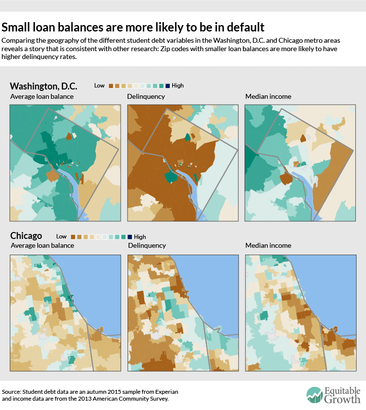
The geography of student debt is very different than the geography of delinquency. Take the Washington, D.C. metro region. In zip codes with high average loan balances (western and central Washington, D.C.), delinquency rates are lower. Within the District of Columbia, median income is highest in these parts of the city. Similar results–low delinquency rates in high-debt areas–can be seen for Chicago, as well. (See Figure 1.)
Figure 1
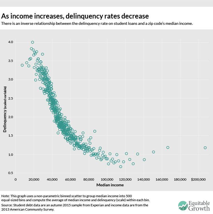
For the country as a whole, there’s an inverse relationship between zip code income and delinquency rates. As the median income in a zip code increases, the delinquency rate decreases, corroborating findings that low-income borrowers are the most likely to default on their loan repayments. (See Figure 2.)
Figure 2
What explains this relationship? There appear to be two possible, and mutually consistent, theories. First, although graduate students take out the largest student loans, they are able to carry large debt burdens thanks to their higher salaries post-graduation. One study of student loans by institution type reports a three-year cohort default rate for graduate-only institutions of 2 percent to 3 percent.* Second, the rise in the number of students borrowing relatively small amounts for for-profit colleges has augmented the cumulative debt load, but because these borrowers face poor labor market outcomes and lower earnings upon graduation (if they do in fact graduate), their delinquency rates are much higher. This is further complicated by the fact that these for-profit college attendees generally come from lower-income families who may not be able to help with loan repayments.
The inverse relationship between delinquency and income is not surprising, especially when considering that problems of credit access have disproportionately affected poor and minority populations in the past. In the 1930s, for example, the government-sanctioned Home Owner’s Loan Corporation labeled maps of American cities by each neighborhood’s worthiness for mortgage lending. Neighborhoods outlined in red were considered the least worthy, purposefully coinciding with their black and poor white populations. Banks and insurance agencies also adopted these discriminatory “redlining” practices, further cutting off communities from the essential capital that is needed to develop neighborhoods and invest in sustainable infrastructure. Though redlining was outlawed in the 1960s, its pernicious effects still persist, as seen in Figure 2 as well as in maps of the subprime mortgage crisis that began in 2006.
It might seem counterintuitive that lack of access to credit results in delinquency—seemingly a problem of “too much debt.” But in fact, lack of access to credit and delinquency are two sides of the same coin. Nearly everyone needs access to credit markets to meet basic economic needs, and if they can’t get loans through competitive, transparent financial networks, poor people are more likely to be subjected to exploitative credit arrangements in the form of very high rates and other onerous terms and penalties, including on student loans. That disadvantage interacts with and is magnified by their lack of labor market opportunities. The result is exactly what we see across time and space: high delinquency rates for those with the least access to credit markets.
Student loan balances and debt burdens
When we look at average loan balance and median income, we find a stark positive relationship, at least below a certain income threshold. As median income increases in a zip code, so does the average loan balance, until income reaches approximately $140,000. After that, the relationship becomes flat. (See Figure 3.)
Figure 3
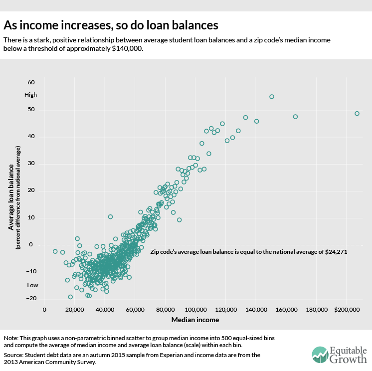
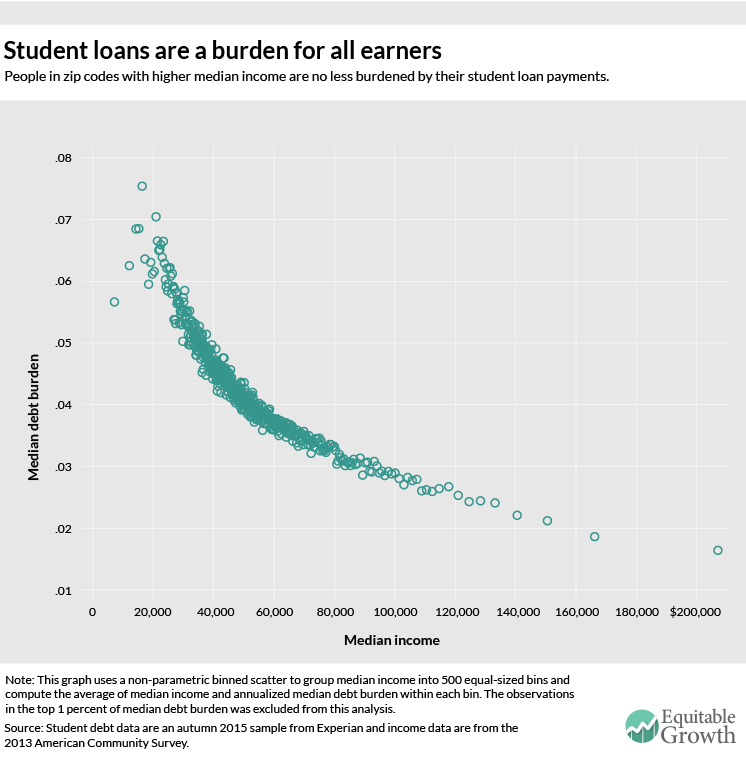
Figure 4 shows the relationship between the “burden” of student loan payments and zip code median income. Using the “average monthly payments on student loans” variable, we calculate that student debt absorbs around 7 percent of gross income in zip codes where median income is $20,000, declining to 2 percent in the highest-income zip code
Figure 4
These graphs show us that the burden of student debt isn’t just shouldered by the young. As borrowers age, servicing their student debt hinders their ability to accumulate wealth. In fact, the Pew Research Center found that college-educated householders with student debt have one-seventh the wealth of people without debt, in part because the wealthiest students don’t need to go into debt to pay for college. Student debt repayment may also delay expenditures that are associated with the traditional economic lifecycle, such as owning a home or a car or even getting married. Altogether, this new expense associated with attaining a middle-class income contributes to the erosion of middle-class wealth across generations.
As cumulative student debt continues to grow and we learn more about its role in the nation’s many economic problems, it is clear that a reconsideration of the policies that treat student debt as “good debt” because it finances valuable human capital is in order, especially in light of the problems that even young college graduates have in the labor market.
Methodology
This geographic analysis uses two primary datasets: credit reporting data on student debt from Experian and income data from the American Community Survey.
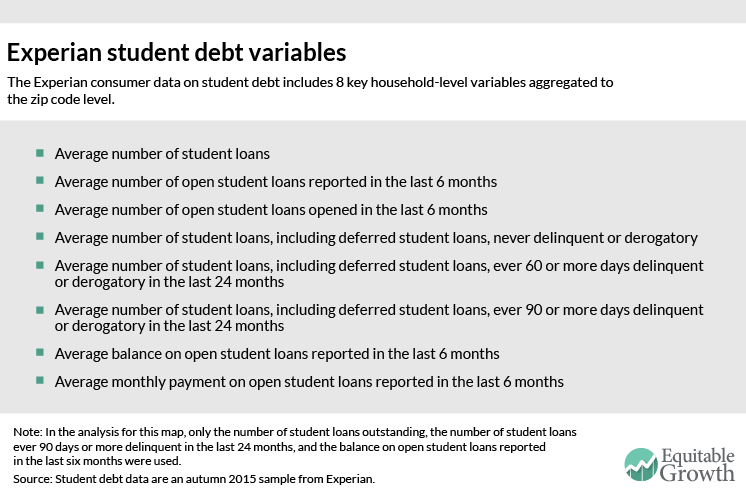
The Experian data includes eight key student debt variables (see Figure 5) aggregated from household-level microdata to the zip code level. The underlying household data are a snapshot of the entire U.S. population at a single point in time—in this case, the autumn of 2015.
Figure 5
There are a number of caveats regarding the Experian data file that have guided our methodology for constructing variables and analyzing results:
• The universe of households contains only those with “any type of credit” and which, therefore, have a credit report. Relative to the population as a whole, this likely excludes the poorest households without any official credit access whatsoever.
• It is unclear how Experian constructs “households” since credit reports pertain to an individual’s credit history.
• If the same student loan has more than one signatory, then the loan may be assigned to multiple households and hence to multiple zip codes or even counted more than once within the same household.
• Experian claims that the universe of their geographically-aggregated data is all households with credit, but the levels of the data on loan balance and delinquency are more consistent with the idea that the universe is only households that have student loans. In other words, Experian claims their data include households that have credit but no outstanding student loans, but if that is the case the reported levels for both average loan balance and average delinquency are much higher than other sources would suggest. Average loan balance and average delinquency rates, however, are comparable to reliable outside estimates if interpreted as loan balance and delinquency among only those households with student debt.
For these reasons, we do not report any student loan data in dollar amounts. Instead, we have used two of the Experian variables to construct analogs to relative average household loan balance and relative delinquency.
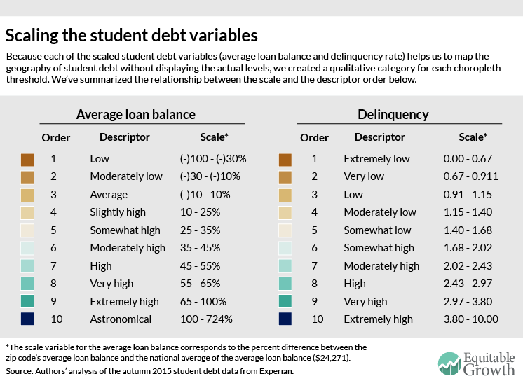
To create the average household loan balance variable in the interactive map, we calculate an “average of the average” zip code-level student loan balance for the entire country, then code zip codes by percentage above or below that average-of-averages. For delinquency, we calculate a “delinquency rate” for each zip code by dividing the average number of 90-or-more-days-delinquent loans per household by the average number of outstanding loans per household. Then, after winsorizing the top one percent of observations to the 99th percentile value, we project the “delinquency rate” onto a scale that ranges from 0 to 10.
For user-friendliness, we assign each of these student debt scale variables a qualitative category. If average loan balance on the map is “somewhat high,” for example, then it means that a zip code’s average loan balance is between 25 and 35 percent higher than the national average of $24,271. Similarly, if the delinquency reads “very low,” it corresponds to a scale level between 0.067 and 0.091. Figure 6 summarizes the relationship between each of the scale variables’ levels and their qualitative description.
Figure 6
Next, we merge zip code-level median income data from the 2013 American Community Survey with our imputed scaled student debt variables in order to construct choropleth maps.
The actual map uses three different techniques to display the variables on a choropleth scale. For the average loan balance, we artificially set ten cutpoints to enhance the geographic variation in metropolitan areas; to do this, we maximized the breadth of the color categories for values higher than the average-of-averages loan balance. For delinquency, we created ten quantiles (or equal counts) to account for the right-skewed data. Finally, for median income, we used ten jenks (or natural breaks in the data) to assign the color scale. Higher numbers and darker shading correspond to higher household average student loan balances, higher shares of outstanding loans that are 90 or more days delinquent in the previous 24 months, and higher median incomes. We think that the geographic variation in the Experian data (and as seen in the maps) is believable, but not the levels reported by Experian.
Download the “Mapping Student Debt” presentation from the December 1, 2015 release (pdf)
*Correction, December 8, 2015: A previous version of this column cited a Department of Education projected graduate student default rate of 7 percent, but the Department has removed that projection from its website and we now think the 2 percent to 3 percent realized default rate is a better estimate.
Must-Read: Branko Milanovic, Peter H. Lindert, and Jeffrey G. Williamson: Pre-Industrial Inequality
Must-Read: And the ‘winner’ for all time–in terms of success at extracting as much wealth from the workers as possible given resources, population, and technology–is Mughal India in 1750!
: Pre-Industrial Inequality: “Is inequality largely the result of the Industrial Revolution?…
…Or were pre-industrial incomes as unequal as they are today? This article infers inequality across individuals within each of the 28 pre-industrial societies, for which data were available, using what are known as social tables. It applies two new concepts: the inequality possibility frontier and the inequality extraction ratio. They compare the observed income inequality to the maximum feasible inequality that, at a given level of income, might have been ‘extracted’ by those in power. The results give new insights into the connection between inequality and economic development in the very long run.
Is the lack of paid leave partly to blame for declining U.S. labor force participation?

While once seen as an obscure “women’s issue,” policymakers and celebrities alike are increasingly arguing that paid family leave in the United States is a necessity in the 21st century.
Many businesses agree, with everyone from Netflix to Spotify jumping on the bandwagon and providing some of their employees with paid leave. Yet these are partial, private-sector solutions that, while a good first step, do not necessarily address the national problem. A new working paper released by the Organisation for Economic Co-operation and Development suggests that the United States’ failure to implement such policies on a federal level—as opposed to the other OECD countries—is generating consequences for our economy that go far beyond a single family.
While various types of paid leave have become standard practice in almost all OECD countries, the United States is the only developed nation that does not have any legal right to take paid leave to care for a new child. Some U.S. businesses do offer paid leave as a benefit, but only 12 percent of private-sector workers are employed at such places. U.S. federal law does mandate 12 weeks of unpaid leave through the Family and Medical Leave Act, but only 60 percent of workers are eligible for this benefit because of various restrictions. And, among those who are eligible, many cannot afford to go without pay for that period of time.
For individual families, this is clearly problematic. Without the kinds of income support and subsidized child care that workers in other OECD countries rely on, many American parents are forced to go back to work too soon after the birth of their child. This has consequences for parent and child alike. Parents, especially women, are more likely to experience poor health and depression when they return to work too soon. And poor care early in life can hurt children’s health and development, which can affect their well-being far into the future. On the other hand, as the cost of childcare continues to increase, many parents—and women in particular—find that continuing to work is not necessarily the most economically beneficial choice.
But these consequences create ripple effects that go far beyond an individual child or family. The working paper points out that as other OECD countries began implementing a suite of policies designed to help working parents over the past three decades, the United States did very little. At the same time, the United States has seen its labor force participation rank screech to a halt since 2000, with the nation dropping from 7th among 24 OECD nations to 17th today. While the aging Baby Boomer population is a major driver of the declining participation rate, the paper also points to our inability to help workers balance their home and work lives as a contributing factor.
U.S. women’s ability to continue working has suffered in particular. A study by Cornell University’s Francine D. Blau and Lawrence Kahn found that work-life policies explain about 28% of America’s declining female labor force participation rate relative to other OECD countries. This trend is not likely to reverse. In fact, the OECD predicts that, if all stays as it is, substantial labor force declines will continue for the next few decades, which could come at a considerable cost to U.S. economic performance. In contrast, the OECD found that eliminating the gender gap in workforce participation by 2025 could boost U.S. GDP per capita by 0.5 percentage points.
California, Rhode Island, and New Jersey have all implemented paid leave programs. While Rhode Island and New Jersey’s programs are fairly recent, California’s paid family leave policy has been in place for more than a decade, giving researchers a sufficient timeline to evaluate the policy’s effectiveness.
Different studies all find that California’s paid family leave program has increased the percentage of women who stay in the labor market post-birth. California’s paid leave program also seems to be good for business—or at least it does not harm it. Because the program does not directly cost employers—it is funded completely by employee contribution—it does not inflict a disproportionate burden on businesses. In fact, the great majority of California businesses reported that the policy had positive or neutral effects on employee turnover, absenteeism, and morale according to a survey done by the Center for Economic and Policy Research’s Eileen Appelbaum and the CUNY Graduate Center’s Ruth Milkman. Initial evaluations of the program in New Jersey report similar findings.
As the OECD paper points out, implementing a national paid family leave program in the United States—along with other family-friendly policies such as subsidized child care and paid sick days—could go a long way in helping more women stay in the labor force. Doing so could help offset the slowdown in the nation’s labor force participation rate, and contribute to stronger U.S. economic growth.
Must-Read: Noah Smith: Unlearning Economics
Must-Read: Noah Smith is pushing me towards thinking that Econ 1 needs to teach a lot more than supply-and-demand plus macroeconomic externalities that can be dealt with by stabilizing monetary and maybe fiscal policy…
: Unlearning Economics: “Right now we’re in the middle of an empirical revolution in econ, and…
…unsurprisingly–a ton of standard, common theories are just not matching reality very well. For example: 1…. Minimum wages should harm employment in the short term. But the data shows that they probably don’t. 2…. A big influx of immigrants should depress the wages of native-born workers of comparable skill. But the data shows… the effect is very small. 3…. Welfare programs barely reduce observable work effort. 4…. Social norms (or morals, broadly conceived) matter to people…. The stuff… [of] Econ 101… are being smacked down by the heavy hand of new data. We’re slowly unlearning economics…. Econ 101 courses around the country probably need an overhaul…. Teachers should still teach the simple, classic theories that the new facts are beginning to kill… but mainly as a way to show how data can tell us when we’re wrong.
Must-Read: Eric Chyn: Moved to Opportunity: The Long-Run Effect of Public Housing Demolition on Labor Market Outcomes of Children
Implosion of the former Lexington Terrace housing projects near downtown Baltimore, Saturday, July 27, 1996. (AP Photo/Gary Sussman)
Must-Read: Huh. It now looks like the huge benefits that got us excited back in the “moving to opportunity” policy days may have been an underestimate:
: Moved to Opportunity: The Long-Run Effect of Public Housing Demolition on Labor Market Outcomes of Children: “This paper provides new evidence on the effects of moving out of disadvantaged neighborhoods…
…on the long-run economic outcomes of children…. Public housing demolitions in Chicago… forced households to relocate to private market housing using vouchers…. Compar[ing] adult outcomes of children displaced by demolition to their peers who lived in nearby public housing that was not demolished[,] displaced children are 9 percent more likely to be employed and earn 16 percent more as adults…
Must-View: Prime-Age Female Employment in the U.S. and Canada
Must-View: Prime-age female employment in the U.S. and Canada:
Must-Read: Jared Bernstein: Models of the Minimum Wage
Must-Read: The economics of the regulation of natural monopolies tells us that such entities reduce utility by artificially restricting what they produce in order to improve their terms-of-trade and profits–and that one tool to deal with this is rate regulation. The Card-Krueger and other evidence on low-wage employment suggests the same rationale for the minimum wage:
: Models of the Minimum Wage: “We can introduce some ideas… that comport a bit more with reality…
…In the low-wage labor market… workers/employers are not that responsive in terms of employment to changes in wages (dlog(emp)/dlog(wage)=small number like -0.1 to -0.3, or something…). When you draw inelastic supply and demand curves, you end up predicting a lot less unemployment…. If this model is more accurate, significant estimates of job loss effects are hard to pull out of the data. Which they are…. [The world is] trying to tell us something about low-wage workers and their employers’ tempered responsiveness to increases in the wage floor…. There’s [also] a model… [of a] a monopsony labor market…. The monopsony model may sound arcane—the classic example is the one-company coal town–but it may not be too much of a reach to conclude that the low-wage labor market in a given town or city works kind of like this…. The competitive model as conventionally drawn is misleading. Economic models vastly simplify… can yield some insights…. But at the end of the day… when the theory doesn’t match the evidence, trust the evidence.
Must-Read: Belle Sawhill: Where Have All the Workers Gone?
Must-Read: I really want to see what happens to these numbers in a high-pressure low-slack economy…
: Where Have All the Workers Gone?: “Among male heads of household between the ages of 25-54…
…[not at work,] 27 percent say it is because they are ill or disabled…. [But] we excluded from the sample anyone on disability…. Another 22 percent said they couldn’t find work–not too surprising in a year when the unemployment rate was still over 7 percent. The remaining half… going to school, taking care of home or family… retired (despite being under 55), or… some other reason for why they weren’t working…. These are all men in their prime working years and that their lack of work leaves them and anyone else in their household at or near the poverty line…. Women heading households are somewhat similar… with far fewer reporting that they are ill or disabled and more of them reporting that they are taking care of home or family…