Equitable Growth’s Jobs Day Graphs: April 2020 Report Edition

On May 8th, the U.S. Bureau of Labor Statistics released new data on the U.S. labor market during the month of April. Below are five graphs compiled by Equitable Growth staff highlighting important trends in the data.

1.

The employment rate for prime-age workers plummeted 10 percentage points, erasing all gains for those in their prime working years during the recovery from the Great Recession.

2.

The unemployment rates for black and Hispanic workers shot up to 16.7 percent and 18.9 percent, respectively, compared to a steep but less severe increase for white workers up to 14.2 percent.

3.

Jobs losses occurred across industries, with the greatest decline in leisure and hospitality, which shed 7.7 million jobs, or nearly half of all jobs in this sector.

4.

The unemployment rate increased for workers at all education levels, with the highest levels for those with less than a high school degree, but the greatest increases for those with a high school degree and those with only some college.

5.

The massive increase in unemployment was led by a ten-fold increase in temporary unemployment, or workers who were furloughed as the U.S. economy shut down to maintain social distancing.

JOLTS Day Graphs: February 2020 Report Edition

Every month the U.S. Bureau of Labor Statistics releases data on hiring, firing, and other labor market flows from the Job Openings and Labor Turnover Survey, better known as JOLTS. Today, the BLS released the latest data for February 2020. This report doesn’t get as much attention as the monthly Employment Situation Report, but it contains useful information about the state of the U.S. labor market. Below are a few key graphs using data from the report.

1.

Two months prior to social distancing measures, the quit rate remained steady at 2.3%, reflecting confidence about the labor market before the unexpected decline in economic activity.

2.

The vacancy yield reflected a tight labor market with more job openings than hires taking place for the month of February.

3.

February was the last month of low unemployment at a rate of 3.5%. Before March’s increase to 4.4%, there was fewer than one unemployed worker per available job opening.

4.

The Beveridge Curve reflected an expansionary labor market before heading into the economic contraction necessary to address the coronavirus public health crisis.

Equitable Growth’s Jobs Day Graphs: March 2020 Report Edition

On April 3rd, the U.S. Bureau of Labor Statistics released new data on the U.S. labor market during the month of March. Below are five graphs compiled by Equitable Growth staff highlighting important trends in the data.

1.

After finally recovering from the Great Recession in recent months, the prime-age employment rate dropped nearly a percentage point from mid-February to mid-March.

2.

As total unemployment increases, a larger share of unemployed workers have lost their jobs, rather than workers previously out of the labor force looking for work or workers voluntarily leaving their jobs.

3.

Involuntary part-time work surged in March, as an increase in part-time work is an indicator of an unhealthy labor market.

4.

Declining employment was led by the leisure and hospitality industry, which shed 459,000 jobs by mid-March.

5.

Increases to the unemployment rate in March were marginally greater for those with less education.

JOLTS Day Graphs: January 2020 Report Edition

Every month the U.S. Bureau of Labor Statistics releases data on hiring, firing, and other labor market flows from the Job Openings and Labor Turnover Survey, better known as JOLTS. Today, the BLS released the latest data for January 2020. This report doesn’t get as much attention as the monthly Employment Situation Report, but it contains useful information about the state of the U.S. labor market. Below are a few key graphs using data from the report.

1.

The quits rate held steady at a healthy rate of 2.3% in January, reflecting confidence in the labor market before a major public health and economic crisis.

2.

As jobs openings increased to 7.0 million in January, there continued to be less than one unemployed worker per opening before an expected slowdown of job postings.

3.

As the number of job openings increased in January, the vacancy yield decreased with fewer hires per available opening.

4.

The Beveridge Curve moved upward in January, reflecting a baseline healthy labor market before any potential economic slowdown as a result of the public health crisis associated with COVID-19.

Interactive: Comparing wages within and across demographic groups in the United States

This post originally published Aug. 23, 2016. It was updated July 9, 2019 to incorporate new data.

Hourly wages among U.S. workers vary enormously by gender, race, and education level. This simple interactive tool provides a way to see just how much wages vary within and across demographic groups.

The interactive begins by displaying the 10th, 50th, and 90th percentile hourly wages for people of any gender, race or ethnicity, and education level. The 10th percentile worker is a relatively low-wage worker, who earns more than 10 percent of all workers, but less than 90 percent of all workers. The 50th percentile (or median) worker is the worker right in the middle of all earners, making more than the bottom half of all workers and less than the top half of all workers. The 90th percentile worker is a relatively well-paid worker, who earns more than 90 percent of the workforce, but less than the top 10 percent. Over the period 2013-2016, the 10th percentile worker earned $9.11 per hour, the median-wage workers earned $18.22 per hour, and the 90th percentile worker earned $43.87 per hour (all wage rates have been adjusted for inflation and expressed in 2016 dollars).

Average Wages by Demographics
An interactive look at how wages vary within and between demographic groups
Use the dropdown menus to create a demographic group of your choice, and hit the add button to load it into the interactive. By clicking download image, you can save a shareable graphic.
Gender
Race/Ethnicity
Education level

To see how a certain group fares in comparison to all workers, use the dropdown menus to select a gender (all, women, men), race or ethnicity (African American, Asian, Latino, or white), and an education level (less than high school, high school, some college, four-year college degree, advanced degree) and hit the add button to display the data for this group. The interactive can create many different groups by selecting different demographic combinations and hitting add after forming each one.

To compare the earnings of white men with college degrees to Latina women with college degrees, for example, use the dropdown menus to create and add each group. The result: the lowest-paid white men with college diplomas earn $14.12 per hour, which is about 39 percent more than the $10.14 earned by Latina women with a four-year college degree. At the median, white men with a college degree make $30.00 per hour, or approximately 48 percent more than the $20.28 earned by the median college-educated Latina women. For the best paid workers in both groups—those at the 90th percentile—the pay gap is 59 percent, with white, male college graduates receiving $67.90 per hour, compared to $42.61 garnered by top-earning Latina women with college degrees.

To call out an interesting row in any group of comparisons, hover over the row and the option to highlight that row will appear to change its color. Tapping highlight again returns the row to its original color. To remove a row, the hover function also provides the option to delete a group from the chart.

To begin building a new chart from scratch, hit the red start over button

After you’ve created the comparisons, tap the download image button at the top of the interactive to save the chart, and, then, feel free to share it with the world.

Methodology

The data behind this interactive are derived from the Center for Economic and Policy Research extracts of the Current Population Survey Outgoing Rotation Group. To reduce problems with small samples, we pooled together the 2013, 2014, 2015, and 2016 CPS survey results. We limited our sample to working-age persons (between the ages of 16 to 64). Finally, our estimates of the 10th, 50th (median), and 90th percentile hourly wage are expressed in 2016 dollars and include earnings from overtime, tips, bonuses, and commissions.

Where does your state’s minimum wage rank against the median wage?

This post originally published Nov. 5, 2014. It was updated July 8, 2019 to incorporate new data.

Minimum wages and labor markets vary tremendously across the 50 states and the District of Columbia. In light of the recent introduction of the “Raise the Wage Act,” the Washington Center for Equitable Growth has updated its analysis on the minimum-to-median wage ratios across states. While state-level differences are often used as a justification for lower minimum wages in certain regions, this interactive demonstrates that a $15 minimum wage would be beneficial in the vast majority of states.

The ratio of a state’s minimum wage to its median wage measures the strength of its minimum wage, after accounting for each state’s distribution of wages. As our interactive graphic below demonstrates, most states had much stronger minimum wages more than 30 years ago than they do today, pointing to the substantial room for increases in the minimum wage across the country.

The average minimum-to-median wage ratio for the United States was 51 percent in 1979, the first year of data included in our interactive. At that time, 29 states had ratios exceeding this mark, but by 2013 the minimum-to-median wage ratios were below 51 percent for all states (with the exception of Oregon and Arizona) as well as the District of Columbia.

Over the past 39 years, the overall minimum-to-median wage ratio in the United States fell to 43 percent in 2018. Indeed, the ratio has fallen even farther but rebounded in the past five years as a result of a recent round of state minimum wage increases.

The minimum-to-median wage ratio is a measure of how much a given minimum wage will affect a specific state’s labor market. Generally, the higher a state’s minimum-to-median wage ratio, the more workers will be affected by an increase in the minimum wage.

Methodology

The state-level minimum-to-median wage ratio is the ratio of the average of the state minimum wage to the state’s median wage in that year. The median wage is the median hourly wage in the Outgoing Rotation Group of the Current Population Survey of earners who work at least 35 hours per week and who are not self-employed. The national minimum-to-median wage ratio is the population-weighted mean of state minimum wages divided by the median national wage.

Resources


Issue brief: Employers may be behind the problems with U.S. hiring

JobNewsUSA job fair in Miami Lakes, Fla.

Hiring is difficult these days. But how concerned should policymakers be? Employers in the United States are finding it more and more difficult to fill vacant jobs, as the ratio of hires-to-vacant jobs was 0.9 in January 2018, significantly lower than the average of 1.3 during the previous economic expansion of 2001 to 2007—a difference of more than 1 million newly hired workers. This decline started as the recovery from the Great Recession began—see Figure 1—but is the decline in the ratio (known as the vacancy yield) a sign of a very tight labor market, or are there other forces in the labor market that are causing a decline in the matching of open jobs to willing workers?

Download File
Employers may be behind the problems with U.S. hiring

Read the full PDF in your browser

Figure 1

A look at the data on vacant jobs and hiring shows more nuanced developments. The decline of the vacancy yield has been driven by the recovering labor market because the yield is declining as unemployment falls as well. But the vacancy yield has fallen much faster than previous experience would have predicted. Employers are increasingly reticent to hire workers already with a job—a development that is much different from the prevailing explanation that unemployed workers or workers outside of the labor force could not get hired again. In fact, the hiring of workers without jobs is in line with the current strength of the labor market.

The future path of the vacancy yield may continue to decline because the labor market ratio of unemployed workers-to-vacant jobs consistent with strong and sustainable wage growth appears to have declined. To simplify things a bit, employers could be finding it harder to hire new workers because the labor market is getting tighter; workers may be less willing to take jobs; employers may be less willing to increase wages to hire workers; or it could be some combination of the three.

If the decline in the vacancy yield is due entirely to a tightening labor market, then employer complaints about hiring would be mostly a complaint about a labor market heading toward full employment. Employers have a relatively easier time hiring workers when the labor market is weak. They have to spend fewer resources searching, as there are so many workers actively looking for work who will come to the employers. A larger supply of unemployed workers also reduces the bargaining power for each worker, pushing down the starting wage, all things being equal. Both factors make the cost of hiring a worker when the labor market is slack relatively cheap.

Graphing the vacancy yield against a measure of labor market tightness such as the ratio of unemployed workers-to-job openings would be a quick check of the validity of this cyclical development. A higher ratio indicates a weak labor market with many more unemployed workers per available job, and a lower ratio signals a tighter labor market. Figure 2 uses data from the Job Openings and Labor Turnover Survey, or JOLTS, from January 2001 to December 2017 to show that the decline in the job vacancy yield doesn’t appear to simply be the result of a tightening labor market.

Figure 2

The data show that the vacancy yield has declined as the labor market tightened, but the decline has been much stronger than just the health of the labor market would have predicted. If the relationship between the vacancy yield and the unemployment ratio from 2001 to 2007 still held, then there would have been roughly 1.1 hires per vacancy in January 2018. Instead, there were only 0.9. That might seem like a small difference, but with 6.3 million job vacancies in January 2018, an increase of 0.2 hires per vacancy would have resulted in 1.2 million more workers hired.

The difficulty in filling jobs is not simply a cyclical phenomenon but may be caused by a change in the “matching efficiency” of employers and employees. Something has changed the rate, given the health of the economy, at which vacant jobs and workers match to create a new hire. One way to see if there’s been a structural change in unemployed workers getting jobs is looking at the Beveridge Curve, which details what the unemployment rate will be for a given amount of job vacancies posted by employers.

Consider the unemployment rate as a measure of labor supply and the vacancy rate as a measure of labor demand. The data on job vacancies come from the Job Openings and Labor Turnover Survey, a U.S. Bureau of Labor Statistics dataset. When the vacancy rate declines—employers are posting fewer jobs—the unemployment rate will increase, as more workers are losing jobs and fewer unemployed workers flow into employment. When employers post more jobs and the vacancy rate increases, the unemployment rate will decline, as more workers flow out of unemployment. The result is that the Beveridge Curve is a downwardly sloping line when the unemployment rate is on the horizontal axis, and the vacancy rate is on the vertical axis. (See Figure 3.)

Figure 3

The current relationship between unemployment and job vacancies appears to be consistent with the curve before the Great Recession of 2007–2009, despite a winding road back. Therefore, a decline in the hiring of unemployed workers is not a candidate for explaining the shift in the vacancy yield.

But if the Beveridge Curve indicates that unemployed workers can just as readily get hired for jobs as in the past, then what explains the structural decline in the vacancy yield? The key distinction here is that newly hired workers who were previously unemployed are only a subset of all hiring. Not all hiring is the result of unemployed workers gaining jobs. New hires also include workers who previously had a job and jobless workers from outside the labor force who don’t register as officially unemployed. The decline in hiring might be broad-based across all these types of new hires or concentrated in one group. Understanding where new hiring declined the most may be helpful in diagnosing the cause.

Unfortunately, the data on hiring in JOLTS do not let economists look at workers’ previous employment situation before they were hired for their new job. Yet there are ways to disaggregate hires using other datasets in order to see what kinds of workers are finding new jobs. In a working paper, economists Peter Diamond at the Massachusetts Institute of Technology and Ayşegül Şahin at the Federal Reserve Bank of New York use data from the Current Population Survey to break out newly hired workers according to whether they were previously unemployed, employed, or previously not in the labor force.1

Their results are quite stark. New hires not previously in the labor force during the current recovery are in line with previous recoveries. New hires from the ranks of the unemployed are a bit out of line with previous recoveries, but their data cover only up to the first quarter of 2016. But using the same dataset as Diamond and Sahin, Figure 4 shows that new hires from unemployment are roughly in line with previous recoveries.

Figure 4

But the set of newly hired workers that’s clearly declined is new hires from employment, or job-to-job moves. As the U.S. labor market has tightened, employers are making fewer hires from workers already employed at other firms than during the past recovery. This decline is not just a product of the current recovery. The response of job-to-job hires to labor market tightness during the 2001–2007 recovery was weaker than during the economic recovery before it (from 1991 to 2001), according to Diamond and Sahin’s data. In other words, the structural decline in job-to-job moves is an almost 17-year trend.

What’s behind the decline in the matching efficiency of new hires for already-employed workers? If employers really want to fill vacant jobs with already-employed workers, then the onus is on them—employers need to increase wages in a bid to poach new employees from among the already employed. That development would be evident in the data on wages and wage growth for workers if wages and wage growth were increasing quite a bit as employers fill vacancies. Yet the data on the wage growth experienced by job switchers show the exact opposite.

The Wage Growth Tracker from the Federal Reserve Bank of Atlanta shows the long-term decline in median wage growth for workers who switch jobs. Median wage growth increases as the labor market tightens, but the peak during each subsequent recovery has been lower than the previous high.2 (See Figure 5.)

Figure 5

This trend indicates that employers are failing to increase wages or boost wage growth to fill vacancies, which, in turn, is indicative of a decline in matching efficiency on the employer side. Employers may seemingly want to hire but aren’t willing or able to pay the wages to do so. In contrast to complaints about the quality of available workers—the so-called skills gap3—the decline in matching of already-employed workers appears to be driven by changes on the employer side of the bargaining table. Exactly why companies are less willing or able to raise wages in order to poach workers deserves attention from both researchers and policymakers. Jobs aren’t getting filled, and the tightening labor market isn’t entirely behind this situation.

How much lower will the vacancy yield fall?

Given the structural forces pushing down the vacancy yield and an unemployment-to-vacancy ratio near historic lows, has the vacancy yield gotten as low as it can? Put another way: Is the historically low vacancy yield an indication that the U.S. labor market is at full employment? At first blush, there is reason to be skeptical of that claim, given the restrained rate of wage growth in recent years. Other indicators such as the prime-age employment (ages 25 to 54) rate point toward continued labor market slack.4 But returning to the Beveridge Curve, there is some more evidence that the labor market can continue to tighten.

The Beveridge Curve appears to be back in line with its pre-recession trend, which would mean that the unemployment rate for a given job vacancy rate hasn’t changed. Yet there’s also the possibility that the vacancy rate for a given unemployment rate has changed. This relationship is described by the job creation curve, which captures employers’ decisions to post a job vacancy for a given amount of labor supply. When the labor market is weak and there are many unemployed workers, the cost of filling a job is quite low and employers post more vacancies. When the labor market is tight and finding workers is difficult, the cost of filling a job is higher and fewer vacancies will be posted. The job creation curve is therefore upward sloping when the unemployment rate is on the horizontal axis, and the vacancy rate is on the vertical axis. (See Figure 6)

Figure 6

Another way to describe the job creation curve is that employers post more vacancies when they have more bargaining power and post fewer vacancies when they have less power. The economy moves along that line over the course of a business cycle, but structural shifts in the bargaining power of employers or employees could shift the whole line. An increase in worker bargaining power, for example, would shift it down and to the right, while more powerful employers would shift the curve up and to the left.

Economists Andrew Figura and David Ratner at the Federal Reserve Board argue that a structural tilt in bargaining power toward employers has shifted the job creation curve.5 They look at the relationship between the labor share of income—a proxy for employee bargaining power—and the ratio of job vacancies-to-unemployed workers. If the decline in the labor share of income is due to increased employer power, then industries and states that experienced larger declines in labor’s share of income will see a larger increase in the number of vacancies per unemployed worker.

Figura and Ratner find just such relationships in the data and argue this implies the job creation curve has shifted such that today, employers will post more vacancies for a given unemployment rate. With an unchanged Beveridge Curve, a shift in the job creation curve would mean a lower equilibrium unemployment rate, a higher equilibrium job vacancy rate, and a lower equilibrium unemployment-to-vacancy ratio. All three developments would be consistent with a U.S. labor market that has room to run.

If the U.S. labor market is really at this new equilibrium, then the current job vacancy rate might be low by historical levels but still not low enough to be consistent with full employment. The labor market looks to move further down and to the left on Figure 2, which would lead to a continued decline in the vacancy yield. It’s unclear how much further it could go—and it won’t become apparent until wage growth starts to pick up significantly.

Conclusion

The decline in the rate at which vacant jobs posted by employers are turning into hiring of new workers is one part encouraging and one part concerning. The declining vacancy yield is consistent with a tightening labor market. Furthermore, unemployed workers and workers outside of the labor force don’t appear less likely to be hired given the state of the labor market. Yet employers seem less willing to raise wages in order to poach other companies’ employees.

For policymakers, these results have three implications. The first is that the historically low vacancy yield does not necessarily mean the labor market is at full employment. Employers seem more willing to post job vacancies than in the past, meaning the yield can fall much lower without significantly pushing up wage growth. Increasing employer complaints about the difficulty of hiring may be the price of getting the labor market all the way to full employment and strong wage growth.

Secondly, a tighter labor market may not boost the bargaining power of workers as much as in the past. A higher vacancy yield for a given level of labor market tightness tilts the bargaining table toward employers. Policymakers interested in boosting workers’ bargaining power should be aware that structural reforms need to be made in addition to hitting the cyclical goal of full employment.

Finally, employer complaints about being unable to find workers to fill jobs should be taken with a grain of salt. The fact that workers are flowing out of unemployment at rates consistent with past experience in combination with relatively tepid wage growth is an indication that a viable labor supply is available, just perhaps not at the price employers would like to pay in wages. A deeper understanding of the origins of employers’ hesitation to boost wages to poach talent should inform policymakers’ efforts to increase hiring among already-employed workers.

For families, concern is not enough

Watching President Trump’s State of the Union address last month and noting his recent budget submission, I was struck by the chasm between the concern he expressed for American families and the paucity of the ideas in that speech and his recent budget for addressing their serious challenges.

“There has never been a better time to start living the American dream,” he said, and referred to our future as “one American family.” But what is his administration doing or proposing for actual American families? And does the research on the challenges they face back these ideas or an alternative path?

It is increasingly difficult for modern families to address day-in and day-out conflicts between their work and home lives. In addition to too-little wage growth for too many workers, there are specific family-related issues that must concern all of us, including workers’ lack of access to paid medical and family leave; the ever-rising cost and limited availability of quality child care; the increasing incidence of work schedule instability; and the pay gap that continues to disadvantage women, particularly women of color.

Considerable research shows that addressing these conflicts between work and life makes the U.S. economy stronger. For example, economists find that weak work-family policies in the U.S. significantly contributed to a decline in women’s labor force participation in recent years, a trend that also harms U.S. economic performance and growth.

Let’s take the above issues one at a time and consider what the President said, what is being done by Congress and the administration, and what could actually help America’s families.

To address the stubbornness of wages, the President is relying mainly on the indirect effects of slashing corporate taxes. But so far, as with past corporate tax cuts, the benefits are going largely to the wealthy in the form of higher dividends and share buy-backs. Very little has trickled down. Splashy press releases aside, it may be that the gradual tightening of the labor market is finally beginning to yield higher wages. We’ll see.

One effect of the tax cuts we have not had to wait for: the Administration is proposing reductions to domestic programs that will mostly affect working families and retirees. Why? To address the budget deficits created by their tax cuts. And then there are regulatory changes like the replacement of the Obama-era rule stating that the tips workers earn belong to them. These workers, mostly women, generally are modest earners, and research shows they generally have very low rates of employer-provided benefits and are twice as likely to live in poverty. Letting them keep their tips—tips that most of us believe we’re giving to the worker for good service—should be noncontroversial, but the Department of Labor is proposing to allow employers to control those tips and distribute them as they wish, even using the tips for capital improvements. It’s no wonder DOL has held back an analysis of how much money this would cost workers.

The modern American family desperately needs a federal paid leave program that gives workers paid time off for the birth or adoption of a child, the illness of a child or other close family member, or the worker’s own serious illness without sacrificing financial security. President Trump mentioned this, his daughter supports it, and his budget includes a barebones plan.

Sadly, that plan is wholly inadequate. It brings to mind the old complaint about a restaurant where the food is terrible – and the portions are so small. The plan takes funds from states’ already-strapped unemployment insurance funds, which should be unacceptable to begin with – to pay for a paid leave program that does nothing for workers with sick children or other family members, or for workers who become seriously ill themselves, and provides an insufficient benefit for a family with a new child.

We should look to the states and adopt what has worked there: a program that utilizes existing social insurance programs (Social Security at the federal level) and is funded by a small payroll tax paid by some combination of employers and workers. Research shows these programs support families and businesses alike. Businesses are able to retain valuable workers instead of losing them permanently because they can’t afford to pay them during their times of need.

Finding affordable, quality childcare is a problem that faces nearly every modern working family. And the cost of quality care could be having a serious impact on the U.S. economy. The current set of federal programs and tax breaks provide important help, but quality, availability, and cost of childcare are still major issues for millions of families and are affecting the U.S. labor supply. Unfortunately, this problem went unmentioned in the State of the Union. There is no shortage of ideas for strengthening the programmatic and tax support we provide to workers facing the childcare dilemma. Now is the time to act.

A growing challenge facing workers is schedule instability – unpredictable work hours that make it difficult to impossible to plan child care and family life. We need to look for ways to protect these workers, while ensuring that companies have a reliable workforce.

An important scheduling issue that the President did not mention and is actually exacerbating is excessive or uncompensated overtime. Fewer and fewer workers are covered by the Federal Labor Standards Act requirement that employers pay time-and-a-half for overtime. The Obama administration sought to restore overtime for millions of workers by increasing the salary employers must pay before they can avoid paying overtime, but the Trump administration killed that rule, thus subjecting millions of workers to continuing undercompensated overtime. These workers, and their families, need the protection the FLSA was meant to provide.

Another significant scheduling issue facing low-wage workers in the service and retail industries in particular is unpredictable schedules. For many of these workers, schedules can change day-to-day, or even hour-to-hour, without warning. New policies should, at a minimum, require that employers, not workers, bear the costs of last-minute shift scheduling decisions, and bar employers from retaliating against workers who express concern about their schedules. This is a growing problem among workers facing serious economic challenges, and we need to make it a high priority.

Finally, the administration rarely discusses the gender pay gap. Women, who make up 51 percent of the U.S. workforce, earn on average 80 percent of what men earn—and women of color tend to earn even less. While research on the causes continues, current U.S. programs, labor laws, and institutions, as suggested above, do not do nearly enough to address the various ways in which women are held back at work. Women are disproportionately affected by the shortcomings of current policies and programs that should help parents balance work and family responsibilities. Boosting women’s economic outcomes by addressing these issues would improve worker productivity and therefore the U.S. economy.

The problems I’ve outlined here are both a reflection of and causes of the growing inequality in our economy and society. Research increasingly shows that inequality is a drag on the economy – so these issues are important to all Americans. I don’t expect this administration, or this Congress, to do a 180-degree turn and begin supporting families and workers. But I hope that we can look forward to these kinds of changes in the future.

After 25 years, it’s time for paid leave

It has been 25 years since the Family and Medical Leave Act was signed into law by President Bill Clinton, providing unpaid leave for qualified workers. Now it’s time for federal paid family and medical leave legislation.

Twenty-five years ago, barely two weeks after Bill Clinton was sworn in as president, he signed his first piece of legislation: The Family and Medical Leave Act. The law provides most workers with the job-protected right to take unpaid time off from work to care for a new child, a sick family member, or one’s own health. Now, it’s time to update the law to include paid leave.

Since its passage, the Family and Medical Leave Act of 1993 has served as a lifeline for workers, having been used more than 200 million times. But the law alone is not enough to address the needs of families in today’s economy: It only covers 60 percent of workers. Those who are excluded are disproportionately low-income and less educated. And even those who are eligible for unpaid time off do not take it, primarily because of financial reasons. Lack of access to paid leave has long-term economic effects as well, such as lower labor-force participation and reduced lifetime earnings.

That is why Congress needs to pass a comprehensive federal paid family and medical leave policy and the president needs to sign it. Federal policymakers can learn from the experience of the states such as California, New Jersey, and Rhode Island, all of which boast successful state paid leave laws, to craft a policy that is based on evidence garnered in our own backyard.

Last fall, we wrote a paper for The Hamilton Project at The Brookings Institution on the updates to U.S. labor policies that are necessary to address the concerns of 21st century families. In our report, we dug into the research to outline what must be included in a federal paid leave policy that benefits workers and their families while improving broad-based economic growth. Based on the evidence, we proposed that a successful paid leave policy must include the following:

  1. Cover the range of family and medical needs that require time away from work. Much of the discussion today around paid leave centers on parental leave to care for newborn children, but an effective paid leave program must include leave for workers to address their own illness or that of a family member. As the population ages, an increasing number of workers need time off to care for an aging parent or relative. And over half of those who used unpaid leave last year did so to address a personal medical concern.
  2. Be available to all workers, men and women, equally. An effective paid leave program should cover all workers regardless of employer identity or size, or the worker’s full-time or part-time status. It should also use an inclusive definition of family. Furthermore, paid leave should be gender neutral, following the example of the Family Medical Leave Act in providing eligible men and women with the same amount of leave.
  3. Provide adequate length of leave to address care needs. Paid leave should entail at least 12 weeks of leave, allowing families enough time to deal with a serious illness or to care for a new child.
  4. Have a sufficiently high replacement rate to make a difference in people’s lives. Wages should be replaced at a level sufficient to protect families at a time when household expenses rise. We suggest that, at the minimum, a national policy mimics New Jersey’s 66 percent wage replacement with a cap that prevents benefits from being overly generous to high-income families.

Each of these principles is based on evidence from the states, as we detail in our paper. In order to avoid burdening employers, all of the state programs are based on a social insurance system. That means the state governments collect a small payroll tax from employees (and in certain states, employers as well) and then pays out benefits directly to workers. A version of these models could be easily replicated at the federal level.

These policies have been overwhelmingly successful, with these states seeing, for example, increased labor-force participation, hours worked after the birth of a child, and a decline in the use of public assistance to cope with family medical emergencies. To date, there is no evidence that firms experience higher employee turnover or rising wage costs. In fact, a study done by Pew Research Center found that paid leave makes it more likely that workers return to their original employer compared to unpaid leave.

The 25-year-old Family and Medical Leave Act is not enough for workers or the U.S. economy today. A well-designed federal paid leave program based on a social insurance model would benefit U.S. workers and the U.S. economy alike.

Just how tight is the U.S. labor market?

People head to a job fair at Dolphin Mall in Florida.

Overview

Is the U.S. unemployment rate as low as it can go? After years of a very weak labor market, during which many jobless workers gave up trying to find employment due to the lack of employer demand, many economists and analysts now believe the labor market is now as tight as it can sustainably be. The unemployment rate is close to 4 percent, and most of the participants of the policy committee of the Federal Reserve believe the unemployment rate is at or below its long-term rate.6

Download File
Just how tight is the U.S. labor market?

Read the full PDF in your browser

What’s more, recent research by economist Alan Krueger of Princeton University argues that fewer workers will actively search for jobs these days due in part to opioid addiction.7 This kind of view, also articulated by New York Times columnist Eduardo Porter, holds that the problem in the labor market now is one of supply—a lack of available workers eager to work—rather than demand for labor among employers.8

But if the current unemployment rate is indicative of a very tight labor market, then why does wage growth continue to be so tepid? If the supply of potentially employable workers is tapped out, then the price of labor—wages—should grow at an increasingly faster pace. Yet as the unemployment rate has declined and hit levels many associate with “full employment,” wage growth has yet to break out of the range of 2 percent to 2.5 percent per year. One simple explanation of this anomaly of a tight labor market with weak wage growth is that the labor market is not actually that tight.

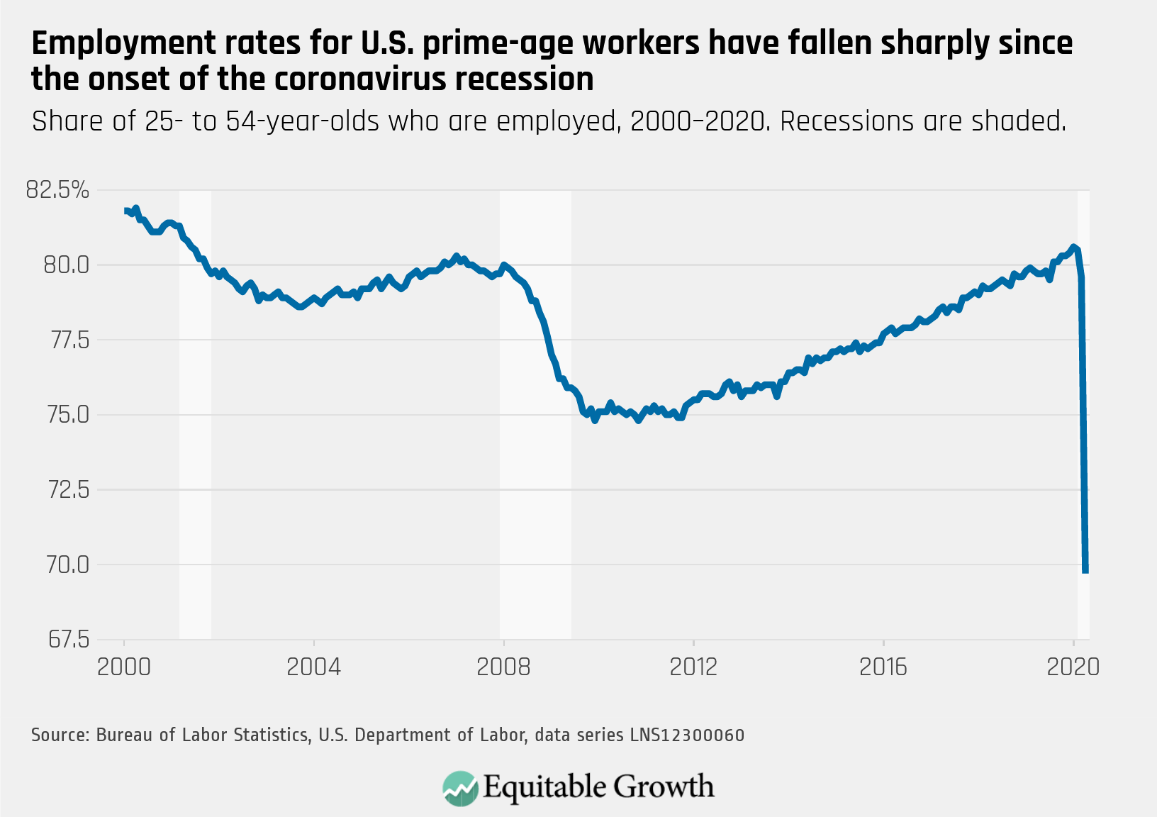
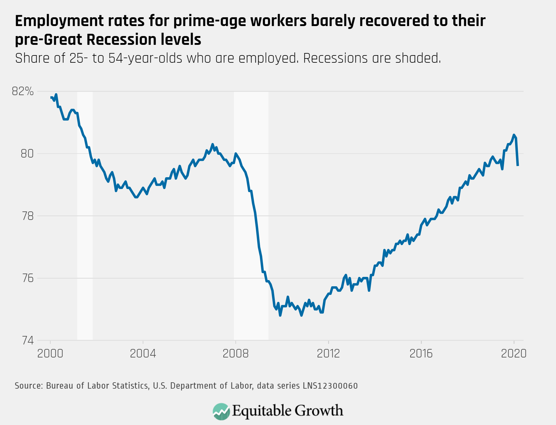
Indeed, the unemployment rate currently does not do a good job of predicting wage growth. What the data show is that a given unemployment rate can be associated with a wide range of wage-growth levels. This issue brief examines, through regression analysis, the strength of the relationships between various measures of labor market slack and wage and compensation growth. The strongest association for wage and compensation growth is with the prime employment rate, the share of workers ages 25 to 54 with a job. This statistic still stands below its pre-recession peak, suggesting the U.S. labor market is not yet at full employment.

The unemployment rate is still a useful measure of the health of the labor market. But it should be taken in the context of other measures. Even if two labor markets have the same unemployment rate, one will be tighter than the other if their employment rates vary significantly. When assessing the health of the labor market, policymakers have to look at both unemployment and employment. If the U.S. labor market still has room to run, then policymakers should look favorably at monetary and fiscal policies that would increase aggregate demand. This information is particularly important for policymakers at the Federal Reserve as they consider the pace at which they raise interest rates.

Measures of labor market tightness

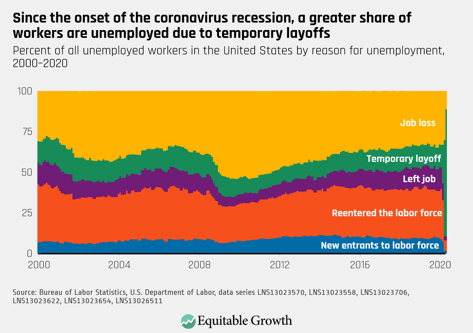
The unemployment rate is by far the most commonly cited labor market statistic. Using responses from the Bureau of Labor Statistics’ monthly Current Population Survey, workers are reported as unemployed if they do not have a job and have been actively searching for a job in the recent past. The unemployment rate is the number of officially unemployed workers as a percentage of the total labor force. The labor force is the combined ranks of these unemployed workers and workers with a job.

This is why the unemployment rate is a very appealing measure of the health of the labor market. It’s trying to capture the share of workers who want a job (the labor force) but don’t have one (the unemployed). A declining share of the labor force who are unemployed means a tighter labor market because those who want a job are increasingly finding them. It’s possible, however, that there are many workers who are not actively searching but are willing and able to take a job if they think they can find one. If there is a significant number of these workers, then the unemployment rate could be overestimating the health of the labor market.

A measure of the labor market that doesn’t have to make a judgement call about who is or is not likely to get a job is the prime employment rate. This statistic—better known as the prime-age employment-to-population ratio—is simply the share of the population ages 25 to 54 with a job. It, similar to the unemployment rate, comes from the Current Population Survey. By simply counting a worker as employed or not employed, it avoids the ambiguity of the unemployment rate. Whereas a declining unemployment rate may be due to more workers leaving the labor force, a rising prime employment rate will always mean more workers with a job.

The restriction of only looking at prime-age workers helps eliminate potential biases by looking at all workers. Lower employment rates for younger individuals and older workers are mostly for reasons society looks upon favorably: education and retirement, respectively. Looking at workers in their prime working years means the prime employment rate doesn’t see these positive phenomena as a sign of a weak labor market. Indeed, as the U.S. population ages with the baby boomer generation, more workers will retire and push down the employment rate for all workers. Again, that’s not necessarily an indication of a weakening labor market, while including these workers would bias the employment rate toward underestimating the health of the labor market.

Both the unemployment rate and the prime employment rate are “stock” measures of the labor market. They compare the total pool of employed or unemployed workers to the total pool of potential workers. Compare that to “flow” measures that look at the movement of workers between unemployed and employed, or from job to job. These flow statistics not only help us understand what’s driving changes in the two stock measures. Looking at flows can also tell us, for example, if the unemployment rate is increasing because more workers are moving from employment to unemployment or if it’s because of more flows out of the labor force into unofficial unemployment.

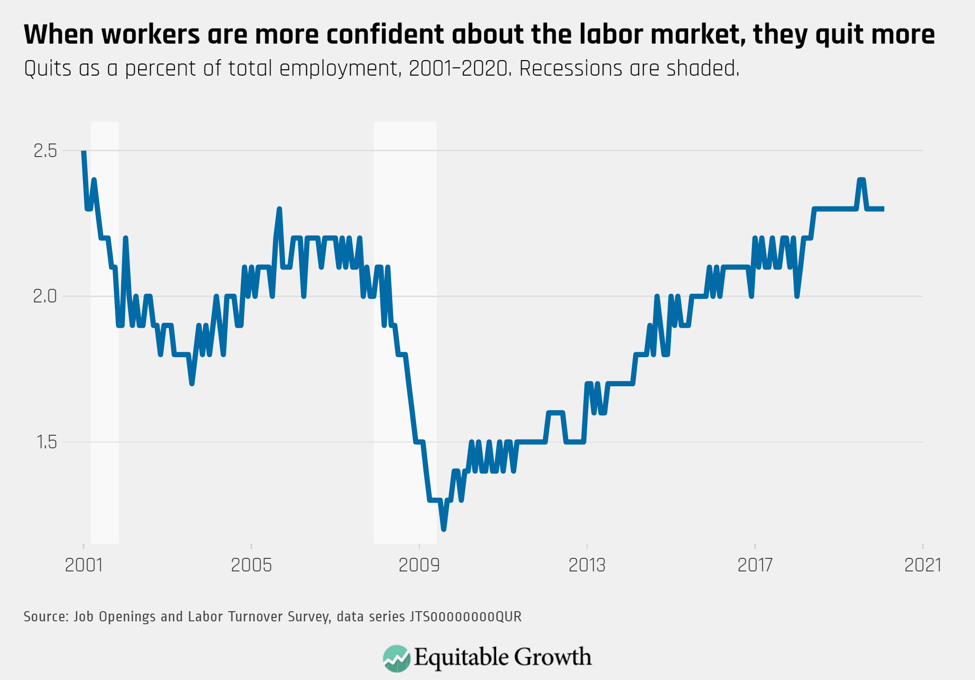
A particularly useful group of flow measures is the statistics that capture the movement of workers between jobs. An employment rate can tell us how many people have a job, but data on job switching tell us how frequently already-employed workers are moving to new jobs. Job switching moves with the health of the labor market. As the labor market strengths, employers will poach employees from other firms, adding to the amount of job switching. As more already-employed workers switch jobs, unemployed workers are likely to be hired. But because data on job switching only directly looks at the already employed, it’s useful to think about this measure as showing the tightness of the labor market for already-employed workers. The Job-to-Job Flows (J2J) data from the Longitudinal Employer-Household Dynamics complied by the U.S. Census Bureau is a good source for job switching data.

Measures of wage growth

Before we can determine which labor market indicator can best predict wage growth, we need to decide on what measure of wage growth to use. The most commonly cited measure of wage growth is the average hourly earnings series from the monthly Current Employment Statistics survey. This series measures the average hourly wage rate for workers using data from the payroll of their employers. This means the data are only for cash wages and do not include other forms of compensation such as employer-provided health insurance or employer contributions to retirement savings vehicles such as 401(k) plans.

The lack of coverage of other forms of compensation might be a concern for using the average hourly earnings series, as nonwage compensation has become a larger share of total compensation in recent decades. A data series that had comparable data for both wage growth and compensation growth would be quite useful. Alas, the Current Employment Statistics series only looks at wages.

Another potential issue with average hourly earnings is that it does not adjust for the composition of workers. Why would this matter? Consider the changes in demographics of the workforce. Let’s say a lot of jobs that are created during an economic recovery go to younger workers, who tend to get jobs in occupations with lower wages. The growth of the average wage would be reduced, as the average wage gets pushed down by the addition of these new jobs. Yet there could be stronger wage growth within occupations that gets washed out by the changes in worker composition. Again, the average hourly earnings data from the Current Employment Statistics series does not adjust for composition.

Luckily, though, data from the Employment Cost Index overcomes these limitations.9 The dataset has series for both wages and total compensation, and adjusts for the compensation of the workforce. But one downside to the series is that these data are released on a quarterly basis, so they are updated less frequently than the monthly Current Employment Survey. In this analysis, we will use the series that cover only private-sector workers.

Another question is whether wage and compensation growth should be adjusted for inflation or left in nominal terms. The argument for keeping the wage and compensation in nominal terms notes that changes in inflation that seemingly change wage growth may be transitory in the short-term. But workers care about how much their wages will be able to purchase in the future, so adjusting for inflation also makes sense. This analysis will present results for both nominal series and series adjusted for consumers’ expectations of future inflation, using data from the Survey of Consumers by the University of Michigan.

What measures best predict wage and compensation growth?

The analysis in this issue brief uses two ways of seeing how well various labor market statistics can predict wage and compensation growth. Both involve running what’s known as an Ordinary Least Squares regression analysis on the data to calculate a linear relationship between the labor market statistics and wage or compensation growth. First, the analysis looks at how much of the variation in wage and compensation growth each labor market statistic can explain on its own. Second, the exercise shows how much explanatory power each statistic has when tested in conjunction with other statistics.

A fuller description of the analysis is below, but the results are quite clear. The prime employment rate is the single strongest predictor of wage and compensation growth, both in nominal and inflation-adjusted terms. This is true both when looking at a period starting in the early 1990s, covering the past three expansions, or in early 2000s, covering the past two. When all three variables are included in a regression, a percentage point increase in the prime employment rate is associated with a larger or at least as large an increase in wage or compensation growth as the other two variables.

First, let’s run through the results for the explanatory power of each individual labor market statistic. From the end of the 1991 recession until the second quarter of 2017, the prime employment rate explains about 80 percent of the variation in nominal wage growth, about 52 percent of variation in nominal compensation growth, roughly 60 percent of variation in wages adjusted for inflation expectations, and about 43 percent for adjusted compensation growth.

Compare that to the results for the unemployment rate during that same time period. It explains 50 percent of the variation in nominal wage growth, about 25 percent of variation in nominal compensation growth, roughly 37 percent of variation in wages adjusted for inflationary expectations, and about 22 percent for adjusted compensation growth. (For full results of the regressions covering this time period, see Table 1 in the Online Appendix.)

Figures 1 and 2 below show the relative predictive power of the two different statistics. Figure 1 looks at the relationship between the unemployment rate and nominal wage growth. Not only are the dots spread farther apart, indicating a weak relationship, but the most recent data (the second quarter of 2017) also show wage growth is much lower than would be expected from the historical relationship (the red trend line). Using the trend line, we would have expected 3.2 percent nominal wage growth in the second quarter of 2017 with a 4.4 percent unemployment rate. In reality, wage growth was 2.4 percent. (See Figure 1.)

Figure 1

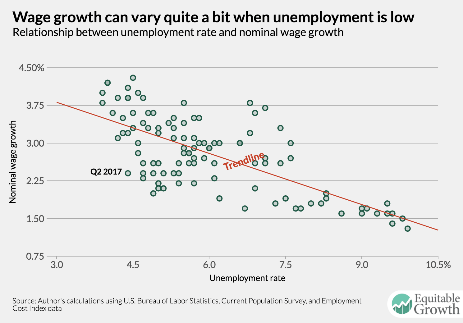
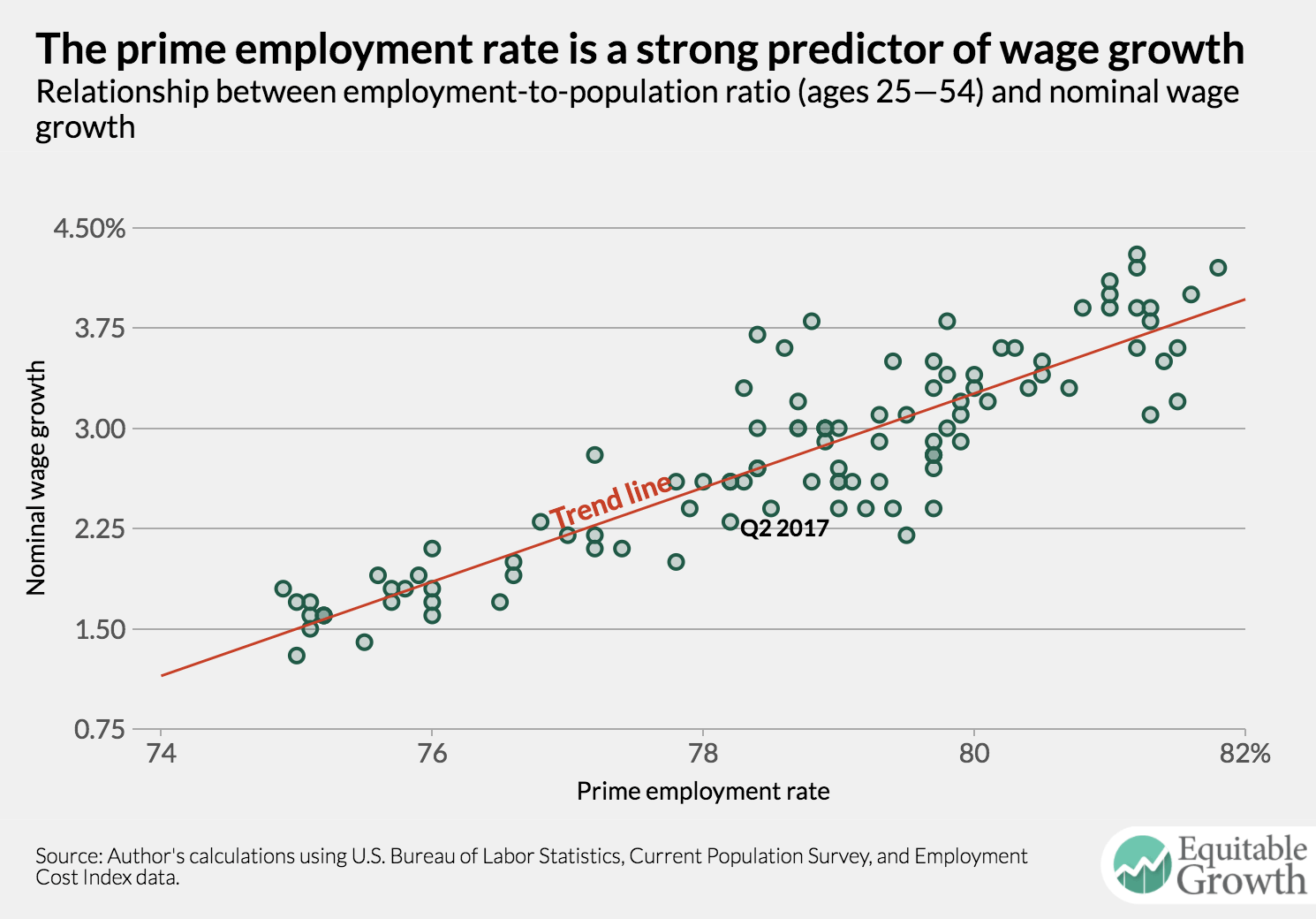
Figure 2 shows much tighter plots for the prime employment rate and a much smaller difference between the actual most recent data and the prediction from the trend line. We would have expected 2.7 percent nominal wage growth using the prime employment rate as a predictor, which was close to the 2.4 percent of reality. (See Figure 2.)

Figure 2

When we restrict the time period for which we have data from the J2J data (the second quarter of 2000 until the fourth quarter of 2015), the prime employment rate still explains the most variation. For nominal wages, the prime employment rate explains 85 percent, the unemployment rate explains 65 percent, and the job-switching rate explains 67 percent. For inflation-adjusted compensation, the prime employment rate explains 50 percent, the unemployment rate explains 31 percent, and job switching explains 37 percent.

As Tables 3 and 4 in the appendix show, when all three labor market statistics are included in the analysis, the prime employment rate is associated with the strongest increase in wage or compensation growth. Models that include both the unemployment rate and the job switching rate explain less of the variation in wage or compensation growth than the prime employment rate by itself. Interestingly, the job-switching rate seems to have about the same explanatory power as the unemployment rate, with job switching explaining more of the variation in several regressions. (See the Online Appendix for more details on the results from the regressions used in this analysis.)

The results for the unemployment rate are particularly interesting in these regressions. When unemployment is included with the prime employment rate, an increase in the unemployment rate is associated with an increase in wage and compensation growth—the opposite of what we might expect. By including the prime employment rate, these regressions are calculating the relationship between wage and compensation growth and the unemployment rate for a given prime employment rate. In other words, it’s asking how wage growth would change if the unemployment rate went up or down while the prime employment rate stayed the same.

The only way for the unemployment rate to change while the overall employment rate is constant is for either a shift of workers into the labor force from unemployment or from unemployment to out of the labor force. An increase in the unemployment rate in this case would be due to more workers joining the ranks of the officially unemployed, most likely because they are feeling optimistic about the chances of getting a job. In the flip case, a decline in the unemployment rate would be due to flows from unemployment out of the overall labor force. The association with wage and compensation growth makes more sense in this interpretation. (Though, of course, this analysis uses the prime employment rate, so there could be something else going on here. But regressions using the unemployment rate for workers ages 25 to 54 also show a positive relationship). A rising unemployment rate with a constant employment rate would likely be a sign of more labor market optimism—and conversely, a declining unemployment rate in that situation probably indicates pessimism.

Implications

The analysis in this issue brief demonstrates that the U.S. labor market is not as tight as the unemployment rate would have us believe. While this analysis does not directly look at the possibility of workers moving into the labor force, the strong relationship between the prime employment rate and several measures of wage and compensation growth suggest a number of nonemployed workers who can and may find a job are not being counted in the unemployment rate.

As of the third quarter of 2017, the prime employment rate was 78.7 percent. The level of the employment rate associated with a nominal wage growth of 3 percent—the lowest level that could reasonably be called healthy—is 79.2 percent. It would take roughly six more months to get to that level if the prime employment rate grows at the same rate as the previous year. And that would only get the labor market to the lower edge of acceptable nominal wage growth. The labor market does not yet appear to be at full employment.

Many workers who seem locked out of the labor force may, in fact, be able to get a job if the labor market continues to tighten. Research by University of California, Berkeley economist Danny Yagan finds that about three-fourths of the decline in the age-adjusted employment rate was caused by the still-reverberating shocks from the Great Recession of 2007–2009.10 It’s possible that these shocks can be reversed by increasing labor demand via monetary or fiscal policy, bringing workers back into the labor force. Overestimating the strength of the labor market and leaving these workers unemployed would be a tragedy not only for those workers, but for the U.S. economy as a whole.