New research doesn’t overturn consensus on rising U.S. income inequality
Fast facts
New research from Gerald Auten at the U.S. Treasury Department and David Splinter at the U.S. Congress’ Joint Committee on Taxation makes the counter-to-conventional-wisdom claim that U.S. income inequality has not increased significantly over the past 60 years. The two co-authors take issue with many of the assumptions made by Thomas Piketty of the Paris School of Economics and the University of California, Berkeley’s Emmanuel Saez and Gabriel Zucman in their frequently cited data series measuring levels of income inequality in the United States.
This issue brief analyzes this recent debate in the measurement of income inequality in the United States. I compare the Auten-Splinter data to the data from Piketty, Saez, and Zucman’s research. I also examine in detail three places where Auten and Splinter and Piketty, Saez, and Zucman make different methodological choices.
Based on this analysis, I argue that the Auten-Splinter data series does not overturn the existing consensus around growing U.S. income inequality. I find that:
- Auten and Splinter’s results run counter to the signals from the distribution of U.S. wealth, which has become significantly more concentrated at the top.
- The largest discrepancy between the Auten and Splinter data and the Piketty, Saez, and Zucman data is in the distribution of underreported income. The Piketty, Saez, and Zucman method better reflects recent research into tax evasion.
- The methods Auten and Splinter use to distribute government consumption and deficits in their after-tax series significantly inflates the bottom 50 percent of incomes and reduces the top 1 percent of incomes, but their methods are not guided by empirics and make assumptions that can fail in certain situations.
- The growth of so-called in-kind transfers for the bottom 50 percent of the income distribution—transfers that provide a service rather than cash income—is eroding the economic well-being of that group, independent of changes in their income share.
Introduction
The common narrative about income inequality in the United States goes as follows: Starting from astronomical levels in the late 1800s and early 1900s, symbolized by the avaricious “robber barons” of the time, income inequality started to drop in the 1940s and bottomed out in the 1970s before returning to haunt the U.S. economy in the 1980s, with high levels persisting to this day.
Now, however, economists Gerald Auten at the U.S. Treasury Department and David Splinter at the U.S. Congress’ Joint Committee on Taxation claim that this history over the past 60 years is all wrong. According to their recent study, income inequality—as measured by the share of income earned by the top 1 percent—has risen by much less than is generally claimed. They also argue that the increase in pre-tax-and-transfer income inequality has been completely wiped out by government interventions, the result being that after-tax-and-transfer income inequality has changed very little between 1960 and today. (For simplicity, I will hereafter refer to these two different income measures as pre-tax and after-tax income).
Auten and Splinter’s research is not new. Earlier versions of the paper have drawn attention in the media, but this research is now set to publish in a top economics journal, and journalists and pundits alike are taking note.
Yet their results seem to contradict signals about growing inequality that we receive from other sources. For example, top 1 percent shares of wealth, as measured by the Survey of Consumer Finances, has increased by 7.5 percentage points between 1989 and 2019. It’s not immediately clear how wealth concentration could increase so sharply without a corresponding increase in income concentration.
There is a growing gap in life outcomes as well. Individuals from all income groups in the United States are more likely to complete college now than they were in the past, yet the gap in college completion rates between low- and high-income individuals has gotten larger and there is a growing income-based achievement gap in educational outcomes. Likewise, gaps in life expectancy are growing; high-income Americans added nearly 2 years of life expectancy between 2001 and 2014, while low-income Americans saw very little increase.
The Auten-Splinter estimates also directly contradict oft-cited earlier work by Thomas Piketty of the Paris School of Economics and the University of California, Berkeley’s Emmanuel Saez and Gabriel Zucman. They find a considerably larger rise in pre-tax income inequality over the past six decades. Additionally, the Piketty, Saez, and Zucman team finds that even after taxes and transfer payments from the government are added to people’s incomes, U.S. income inequality has still risen considerably, compared to the early 1960s.
Both sides in this debate agree that inequality dipped somewhat in the 1970s and then rose, both before and after government intervention. But the two teams find significant differences in both the level of income inequality and trends through time. Generally, they diverge in the following ways:
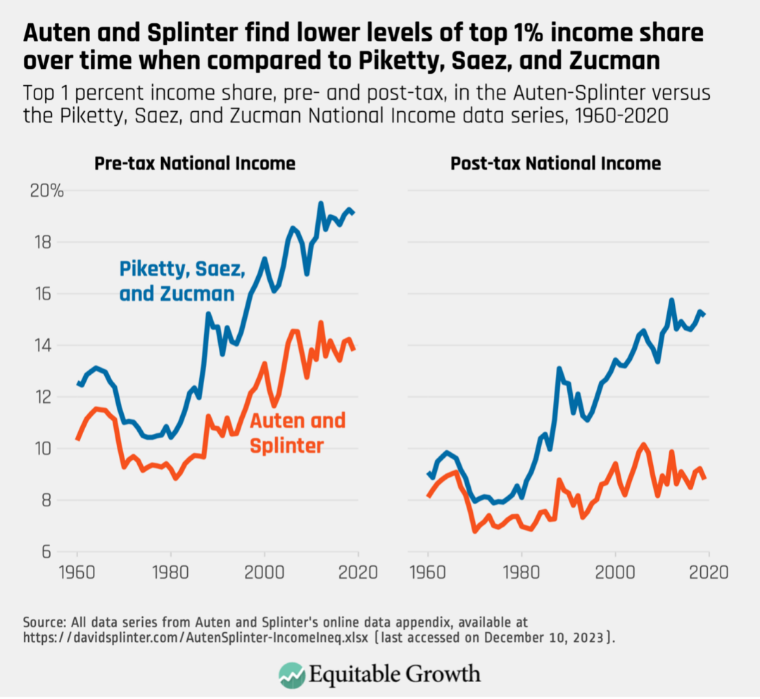
- Auten and Splinter find lower levels of top 1 percent income share in every year between 1960 and 2019. (See Figure 1.)
- Auten and Splinter find a slower upward trend in the top 1 percent share of income over time.
- Auten and Splinter find that adding taxes and transfers removes most of the upward trend in income inequality over time, with the result that top income shares in 2019 are similar to those observed in the early 1960s.
Figure 1
Auten and Splinter’s results mark a significant break with the existing literature on income inequality in the United States and could have far-reaching implications for how we understand the U.S. economy. In addition to the differences between their series and that of Piketty, Saez, and Zucman, the Auten-Splinter series is also somewhat at odds with data produced by the Congressional Budget Office, which show a significant rise in the top 1 percent’s share of income even after accounting for government taxes and transfers.
The public debate about their findings has been difficult to follow for economists and noneconomists alike. Understanding each team’s various assumptions requires deep knowledge of tax policy and the national accounts. Moreover, there have been relatively few economists outside of these two teams who feel comfortable weighing in on this very complex subject.
In this brief, I provide an overview of the key points of this debate and some guidance for how this new research fits into what we know about income inequality. Auten and Splinter have made some useful contributions to the developing field of distributional national accounts. There is more work to be done to pin down exactly how much inequality has risen. But I argue this research does not fundamentally change the familiar story of rising income inequality in the United States.
In part, my view reflects disagreement with Auten and Splinter over assumptions they make when distributing specific components of National Income. But there are other reasons to be skeptical of their estimates. The large decrease in income inequality observed in their after-tax series, in particular, is due to an ad-hoc allocation of government spending that virtually no one thinks of as income.
Below, I first provide some context on the importance of income definitions. Then, I look at three significant differences between the Auten-Splinter dataset and the Piketty, Saez, and Zucman dataset. I explain why these teams made different assumptions about the data and how it informs each one’s final product. In the final section, I offer some concluding thoughts on income inequality in the United States.
Defining income concepts
Understanding this debate over U.S. income inequality requires some basic knowledge about the different income concepts economists commonly use. There are many different academic and nonacademic attempts to measure inequality, and most are difficult to compare because they define income differently.
If you ask average people what their incomes are, they might report their wages—the income they earn from performing their jobs. Business owners may mention the profits their businesses earn that they pay to themselves. Perhaps individuals may also think to include dividend income from stocks they own or the capital gains from one-time sales of stock. These are all tangible income streams that these people will have to report to the IRS and on which they will have to pay taxes.
Yet people might not think to report some types of income that don’t ever really show up in their bank accounts. Most workers, for example, don’t include their employer’s share of payroll taxes in calculations of their salaries, and they certainly don’t think to include some portion of the corporate taxes paid by their employers.
Economists, however, often consider these to be income. Payroll taxes are split evenly between employers and employees in the United States, and the employers’ portion is a tax that workers would otherwise have to shoulder themselves. Corporate taxes are a deduction from corporate income that might otherwise be paid out as wages and returns to owners of capital.
As an example of all the income streams economists consider, let’s look at how the Congressional Budget Office’s Distribution of Household Income report, which also measures income inequality in the U.S. economy, constructs pre- and post-tax measures of income. It starts with an income concept called market income, which includes wages and salaries, contributions to retirement plans, corporate taxes, business income, capital gains, other forms of capital income such as dividends and interest, and retirement income. This is a pre-tax-and-transfer measure of income—notice that it doesn’t include transfers, such as Medicaid or the Supplemental Nutrition Assistance Program, and doesn’t deduct federal taxes (or any other kind of taxes) from people’s incomes.
To arrive at what the Congressional Budget Office calls “income before taxes and transfers,” it adds in social insurance benefits. Social insurance benefits are transfers from the government that are not means tested and are funded by payroll taxes, including Social Security, Medicare, Unemployment Insurance, and workers’ compensation. Medicare is not a cash transfer to households, but it is a service-in-kind that households would otherwise have to purchase.
How exactly an in-kind service such as Medicare should be valued as income is an active area of debate in economics. In all the income concepts discussed in this issue brief, Medicare is valued at the cost of provision. In other words, if the average per-person cost of Medicare to the government is $20,000, that amount is added to the income of each Medicare recipient.
Finally, to create its “income after taxes and transfers” concept, the Congressional Budget Office subtracts federal taxes paid, which includes individual income taxes, as well as corporate taxes and federal excise taxes on items such as gasoline and alcoholic beverages. Some individuals who receive refundable tax credits, such as the Earned Income Tax Credit, could see their income increase in this step. Once taxes are subtracted, means-tested transfers, including Medicaid, the Children’s Health Insurance Program, SNAP benefits, and others, are added.
To be sure, the CBO income concept includes some things that most people probably don’t think of as income. Medicare and Medicaid are not cash income, for instance, and corporate taxes are not something most workers consider to be part of their incomes. But, generally speaking, it is fairly clear why these items are included when studying the concentration of income in the U.S. economy.
At the same time, the CBO approach is somewhat ad-hoc. It misses some income that people earn—for example, it doesn’t include underreported income. Underreported income is income that isn’t correctly reported to the IRS, either because income earners made a mistake or because they are trying to evade federal taxes.
A more standardized approach would use an income concept that can be applied across time and countries. This is the motivation for looking at the National Income and Product Accounts, or NIPAs. These are comprehensive and consistent income concepts that are used to measure economic activity.
Most people are familiar with one of these accounts: Gross Domestic Product, or GDP. But a closely related account is National Income, a national accounts income concept that totals all income earned by people and businesses in the U.S. economy. It was worth about $22 trillion in 2022, which is about 84 percent of GDP. By distributing 100 percent of the income in the National Income aggregate, economists hope to achieve a more comprehensive distribution of income that is comparable across time and between countries.
While National Income is a more comprehensive income definition than the one used by the Congressional Budget Office, it likewise includes items that may not typically be considered as income. For instance, it includes imputed rent, which is an estimated economic return that comes from owning a house and paying yourself for occupancy of that house. Imputing rent to homeowners makes sure that renters and owners are treated similarly by the national accounts, but one might reasonably object that this doesn’t seem like actual income.
The NIPAs don’t include capital gains but do include retained corporate earnings. These are undistributed corporate profits that are, in effect, a proxy for unrealized capital gains. Retained corporate earnings will eventually be disbursed to shareholders, so distributing this money to individuals reflects increases in their income due to the appreciation of financial assets.
Both Auten and Splinter and Piketty, Saez, and Zucman are attempting to create distributions of National Income in their datasets. To do so, both teams start with income that we can see on individual tax returns. They refer to this as taxable income or fiscal income, and it includes most wage and business income, rental income, and some transfer income. There is no real contention about fiscal income, which everyone agrees has become much more concentrated over the past seven decades.
The concentration of fiscal income has increased, from 8.3 percent in 1960 to 18 percent in 2019. Although capital gains appear on personal tax returns, both teams remove it from income because capital gains are not part of National Income. Figure 2 shows the rise of the top 1 percent of income shares in fiscal income with and without capital gains.
Figure 2
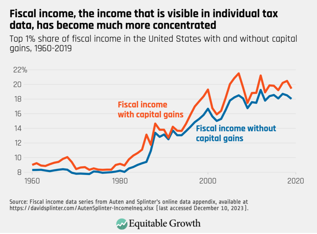
Since fiscal income is observed on personal tax returns, disagreements between the two teams stem entirely from the share of National Income that is not included in fiscal income. That includes things such as nontaxable retirement income, underreported income, employer contributions to health insurance, and retained corporate earnings. Generally, Piketty, Saez, and Zucman argue these unseen components of income are distributed similarly to observable components, while Auten and Splinter argue that many of these components are distributed much more equally across U.S. households.
Both teams also provide both a pre-tax and after-tax distribution of National Income. We might prefer an after-tax distribution of income because it will reflect the redistribution of resources through the tax-and-transfer system, in which income in the United States becomes more equal due to government intervention. But creating an after-tax distribution of income adds considerable complexity to both teams’ work because both distributions must add up to National Income.
To illustrate why this adds complexity, imagine a nation with a National Income of 100. If you distribute that income to people in its economy, you get a pre-tax measure of how income is distributed. To create a post-tax measure, though, you must subtract income taxes, sales taxes, and other kinds of taxes from people’s income. Now, the incomes in this nation’s economy don’t add up to 100; they total 100 minus aggregate tax revenues.
Tax revenues are equal to government spending plus the government’s deficit or surplus, so if you want your post-tax measure of inequality to also sum to 100, you then must add in, and distribute among people, government spending and the federal surplus or deficit. Some of that is easy to distribute—for transfers such as Medicaid or SNAP benefits, one can just add to the income of program recipients. But government doesn’t only spend tax revenues on transfers. To get back to aggregate National Income, one also has to add in government spending on things such as national defense, and then distribute defense expenditures as income among the rich and the poor.
If this seems quite odd, don’t worry—the next section of this issue brief revisits it. For now, though, it is enough to understand that both teams are trying to fully distribute National Income, and this sets their measures of inequality apart from those of the Congressional Budget Office and others. Matching National Income requires distributing some slightly odd income components that most people probably don’t think of as income.
Now, with that in mind, we are ready to tackle the differences between the datasets developed by Auten and Splinter and by Piketty, Saez, and Zucman.
Examining the differences between Auten and Splinter and Piketty, Saez, and Zucman
In Auten and Splinter’s after-tax data series, the top 1 percent’s share of income is 6.6 percentage points lower in 2014, compared to the series developed by Piketty, Saez, and Zucman at the same time. In this section, I look at three of the largest contributors to this gap—underreported income, government consumption, and government surpluses or deficits—and discuss what they reveal about each team’s approach to this inequality measurement debate.
Table 4 of the Auten and Splinter article, reproduced below as Table 1, helpfully disaggregates the differences and shows how the differing assumptions made by each team contribute to the 6.6 percentage point gap. (See Table 1.
Table 1
Differences between the Auten-Splinter and Piketty-Saez-Zucman methodologies and the resulting impacts on the top 1 percent’s shares of income
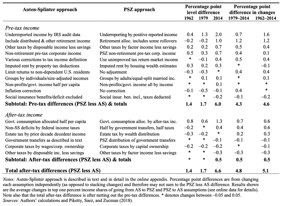
This table uses the original data series from the 2018 paper in the Quarterly Journal of Economics by Piketty, Saez, and Zucman, which the three co-authors have continued to tweak in response to new data releases and to the Auten-Splinter data series. Consequently, there are small differences between their original dataset, which Auten and Splinter use to compare to their own data, and the current Piketty-Saez-Zucman data series.
So, while Auten and Splinter report that Piketty, Saez, and Zucman find that the 2014 after-tax top 1 percent share of income is 15.7 percent, new versions of their dataset show 14.9 percent for that same data point. These differences are mostly modest but are worth noting to avoid confusion.
Recent revisions by Piketty, Saez and Zucman also address some of Auten and Splinter’s critiques. Line 2 of Table 1, for example, details an issue with rollovers in retirement income. Piketty, Saez, and Zucman acknowledged in 2020 that this issue impacted their estimates and modified their data accordingly, so this is no longer a major difference between the two teams, although Auten and Splinter claim that there is still some discrepancy here.
Putting the retirement income issue aside, in this section, I analyze the three lines from Table 1 that create the largest difference in income inequality trends, denoted in the final two columns of Table 1. First, I examine the biggest contributor to the pre-tax differences between the teams: how each team distributes underreported income (line 1 in Table 1). This is a relatively large component of income—around 3 percent of all National Income—allocated very differently. It is also the single largest contributor to the gap between their estimates of the top 1 percent’s share of income.
Next, I look at after-tax differences. I examine each of the first two lines of the after-tax income section in Table 1. The first is the distribution of government consumption. The second is the closely related distribution of government deficits and surpluses.
Underreported income
Underreported income is income that is either incorrectly reported to the IRS or that is not reported to the IRS at all, likely for the purpose of evading taxes. We don’t know exactly how much underreported income there is, since much of it is literally being hidden, but National Income includes an estimate of the amount of underreported income using IRS research audits.
In previous versions of the Auten-Splinter data series, underreported income explained nearly half of the total difference between their findings and the top 1 percent income shares identified by Piketty, Saez, and Zucman. It is less important in this most recent version of the Auten-Splinter data but remains the single largest difference between the two datasets, accounting for one-third of the total pre-tax difference of the top 1 percent’s income shares in 2014.
The debate over underreported income revolves around a couple of papers that look at how underreported income is distributed among taxpayers. Andrew Johns of the Internal Revenue Service and Joel Slemrod of the University of Michigan, as well as Jason DeBacker of the University of South Carolina and his co-authors, both use IRS audit data to try to determine how underreported income is distributed. Their results indicate that taxpayers who have high Adjusted Gross Incomes are often not the biggest tax evaders. High-income people who report their incomes accurately tend to make up the top 1 percent of the AGI distribution, but in the true AGI distribution, which is reported Adjusted Gross Income plus underreporting, around 27 percent of underreported income is earned by the top 1 percent.
These studies are based on the IRS’s National Research Program, which conducts audits of random taxpayers to inform the IRS about likely underreporting. Auten and Splinter claim that their data series better matches the NRP data. This is accurate, although after interactions with other adjustments they make, the top 1 percent by income in the Auten-Splinter data series only hold 16 percent of underreported income in 2019.
But fidelity to IRS research audits does not necessarily yield a more accurate distribution of underreported income. Indeed, Piketty, Saez, and Zucman argue that audits are not good at detecting sophisticated evasion techniques used by high-wealth individuals.
This is a commonly acknowledged possibility, but there have been significant gaps in our knowledge until relatively recently. Newer research on offshore income and income sheltered through complicated partnership arrangements, in fact, suggests that underreported income is more concentrated at the top than IRS audits suggest and that there is more underreported income than is generally assumed.
One 2016 study by the U.S. Department of the Treasury’s Michael Cooper and his co-authors, for example, finds that pass-through income is highly concentrated and difficult to trace, suggesting that complex ownership structures may be hiding a significant amount of high-income underreporting. Another study from 2019 looks at leaked customer lists from offshore financial institutions, as well as data from individuals who declared hidden assets as a response to tax amnesty policies, finding evidence that very-high-income households evade taxes far more than random IRS audits suggest. Yet another study, by the IRS’s John Guyton and his co-authors in 2021, supplements NRP audit data with data on operational audits and focused enforcement activities. They find that audits significantly understate the amount of evasion at the top of the income distribution.
Daniel Reck, Max Risch, and Gabriel Zucman, three of the 2021 study’s co-authors, have gone back and forth publicly with Auten and Splinter about these results. In their response to Auten and Splinter’s comment on their research, Reck, Risch, and Zucman use the Auten-Splinter data to graph the change in the top 1 percent’s share of income due to underreported income over time. They show a flip in how underreported income affects Auten and Splinter’s data series starting in the late 1980s and continuing through the early 1990s. Prior to that period, underreported income was increasing the top 1 percent’s income shares, but in more recent decades, it is significantly decreasing those shares. (See Figure 3.)
Figure 3
A closer look at how underreported income impacts the top 1 percent’s income shares
The Auten-Splinter data implies that the top 1 percent’s tax compliance has increased significantly since the 1980s in the United States
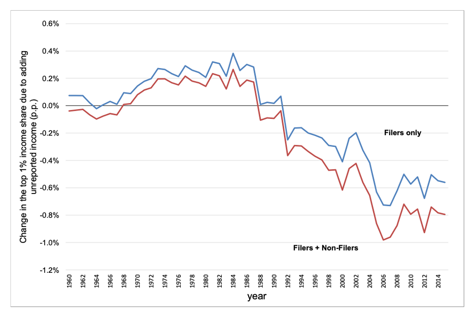
Reck, Risch, and Zucman point out that it is unclear why this flip happened and that, in view of their research and that of the Treasury Department’s Cooper and his co-authors, it might be reasonable to expect the exact opposite of what Auten and Splinter assume. Pass-through business income is more concentrated than traditional business income, and pass-throughs make tax evasion easier. The massive increase in pass-through organizations that occurred over the past 40 years implies more tax evasion at the top, not less as assumed by Auten and Splinter. This suggests that Auten and Splinter understate growth in top 1 percent’s income shares over time.
More research is needed here. Hidden income is difficult to study, and knowledge gaps remain about the exact amount and distribution of underreported income. But it seems likely that Auten and Splinter’s method of distributing underreported income is significantly understating the amount of underreported income earned by the top 1 percent of income earners.
Government consumption
As explained above, when both Auten and Splinter and Piketty, Saez, and Zucman move from pre- to post-tax measures of income, they subtract out all federal and local taxes. To make their post-tax income series add up to National Income, they must add all government spending back into their data series. Some of this is trivial. The two teams do not disagree about the distribution of Medicaid spending, for example, which they distribute to recipients. But after transfers are accounted for, other forms of government consumption remain.
Government consumption is composed of all the money spent by federal, state, and local governments to provide services. It includes spending on national defense, police forces, transportation infrastructure, public health, public education, and so on. The largest category of expenses is education, equal to about 13 percent of National Income. National defense spending by the federal government is the second-largest category.
There is no empirical guide as to how this money should be distributed. What is the in-kind value of the U.S. Airforce purchasing an F-22 aircraft for the average person? Do the rich and poor receive an equal value service from the government for that purchase?
One might simply assume that everyone benefits equally and add an identical lump sum to the income of every adult residing in the United States. That approach would greatly raise incomes at the bottom of the distribution because that lump sum would be relatively large, compared to their actual income. This approach also ignores the varying quality of government services; lower-income neighborhoods have both inferior infrastructure and worse educational outcomes.
Alternatively, you might argue that higher-income or higher-wealth people benefit more from certain kinds of spending and allocate the money proportional to income. This implies that high income earners, such as Amazon.com Inc. founder and executive chairman Jeff Bezos, benefit much more from transportation infrastructure, public education, and defense spending because, for instance, his income depends on a reliable and fast shipping network, a steady supply of skilled workers, defense contracts with his company, and protection from a wealth-destroying foreign invasion.
It’s important to remember that the rationale for distributing this money is simply that it must be distributed to match National Income—not because we generally consider it to be income for U.S. households. That consideration informs Piketty, Saez and Zucman’s method: They distribute government spending proportional to post-tax disposable income. This method is distributionally neutral—it neither increases nor decreases income inequality. So, while Piketty, Saez, and Zucman in effect take the view that higher-income people benefit more from government spending, their method also ensures that this spending doesn’t ultimately matter—it doesn’t change the level or trend of inequality.
By contrast, Auten and Splinter distribute half of government consumption in the same way as Piketty, Saez, and Zucman and the other half as a per capita lump sum to each person in the data. Auten and Splinter believe that the proportional method used by Piketty, Saez and Zucman ignores “the redistributive and public goods aspects of government consumption captured by our half per capita allocation.” The impact of this adjustment is to lower the top 1 percent’s income share by 0.8 percentage points in 1962 and by 1.3 percentage points in 2014, relative to Piketty, Saez, and Zucman’s data.
As detailed above, this money is in the form of in-kind services provided by the government, such as Kindergarten through 12th grade education. It might make sense to call this income, since people would otherwise have to spend money to buy educational services, for example. But let’s look under the hood at what this does to income shares.
In the Auten-Splinter data, 37 percent of U.S. government consumption in 2019 is assigned to the bottom 50 percent of individuals by income. The result is that 20 percent of all pre-tax plus transfers and government consumption income in this group is income in-kind from government consumption. In other words, one-fifth of the income for this group in the Auten-Splinter after-tax data comes in the form of tanks, roads, and chalkboards.
Even if one believes this should be considered income, distributing government consumption in this way is a very poor guide to economic well-being for these low-income individuals. It is widely accepted among economists that in-kind transfers are not necessarily valued at cost by their recipients. That is, if the government spends $3,000 providing healthcare to an individual, that individual doesn’t necessarily accrue the same economic well-being as if he or she instead received $3,000 in cash. In large part, this is because that individual has fewer choices and might prefer to spend that money in a different way. Indeed, recent research finds that the value of Medicaid to recipients is substantially lower than the gross cost of Medicaid to the federal government. The value of the in-kind service of national defense could be much lower still.
Government consumption, of course, is not the only in-kind income that goes into the bottom 50 percent’s income shares. Programs such as Medicare, Medicaid, and the Supplemental Nutrition Assistance Program are also in-kind. These sources of income have been growing in importance for low earners over time.
To get a better sense of the breakdown of the bottom 50 percent’s income, I add up government consumption, other noncash government transfers, and employer payments for health insurance—though not an in-kind transfer from the government, it is an in-kind service provided by employers—in the Auten-Splinter data for 2019. I find that 39 percent of pre-tax plus transfers and government consumption income for the bottom 50 percent is due to these in-kind sources. In other words, nearly two-fifths of all the income that Auten and Splinter assign to the bottom half of the distribution is not actually money they can spend to cover their needs. By contrast, these sources make up just 7 percent of the top 1 percent’s income.
Moreover, these sources of income have become much more important to the bottom 50 percent over time. In 1960, they accounted for just 23 percent of the bottom 50 percent’s income. For the top 1 percent, the proportion has not changed significantly. (See Figure 4.)
Figure 4
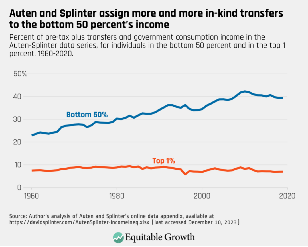
Because this shift is driven in part by the rise of in-kind transfers such as Medicaid, it is also present to some degree in the data from Piketty, Saez, and Zucman. But because Auten and Splinter attribute 37 percent of government consumption to the bottom 50 percent of income earners, they find much higher levels of the bottom 50 percent’s share of income—and consequently lower levels of the top 1 percent’s share—than Piketty, Saez, and Zucman do.
What are the consequences of this shift? One is that even if the bottom 50 percent’s incomes in the Auten-Splinter data keep up with growth in other parts of the distribution, the economic well-being of the bottom 50 percent is decreasing. Remember, these in-kind transfers do not provide the same level of economic well-being as a cash transfer. None of this “income” can be saved, invested, or spent freely.
By contrast, the method of distributing government consumption used by Piketty, Saez, and Zucman treats this spending as something of a nuisance. By distributing it proportionally to existing income, government consumption in their dataset has no impact on levels or trends in income inequality. Their inequality series would look essentially the same if this spending was discarded.
Government deficit or surplus
Government consumption is not equal to tax revenues collected, so in addition to distributing government consumption, both teams also must distribute the federal deficit or surplus (states generally run balanced budgets, so this is primarily a federal government phenomenon). As with government consumption, there is no clear answer for how this money should be distributed.
Initially, Piketty, Saez, and Zucman allocated the deficit half by the proportion of government transfers a person received and half by the proportion of federal taxes paid by that person. This is meant to reflect the possibility that a deficit will eventually be clawed back by either raising taxes or cutting transfer benefits. After the publication of their initial dataset, however, the three economists decided instead to follow the same methods they use for government consumption, allocating all the deficit based on post-tax disposable income, so it has no impact on income inequality trends or levels.
Auten and Splinter, by contrast, allocate this money according to the proportion of federal income taxes paid, based on the historical observation that deficits are more likely to result in tax increases than in benefit cuts. This has the effect of subtracting more income from high-income individuals because they pay a greater share of their income in taxes. This adjustment raises the top 1 percent’s share in 1962 by 0.2 percentage points and decreases the 2014 share by 0.4 percentage points. (Because Auten and Splinter compare their series to the original series by Piketty, Saez, and Zucman, these changes are from the comparison to their original half-by-transfers and half-by-taxes methods.)
Auten and Splinter’s argument about the history of tax-and-benefit changes for allocating the deficit may be appealing on the surface, but it will frequently fail: The large increase in the federal deficit during the COVID-19 pandemic in the current decade, for example, was caused largely by temporary benefit increases and one-time stimulus payouts that won’t recur. For pandemic spending at least, nearly all of the temporarily increased deficit will be paid for by benefit cuts, not tax increases.
Auten and Splinter have not yet released data past 2019, but when they do, the large federal deficit of 2020 and 2021 will show up as a significant reduction in the top 1 percent’s income. That is clearly inaccurate. The large reduction in the deficit that occurs in 2022 reflects not an increase in taxes that the top 1 percent had to pay, but rather a decrease in benefits that lower-income individuals had to bear.
Moreover, Auten and Splinter’s method can provide a misleading snapshot of the income distribution in any given year. The tax cuts imposed under the Tax Cuts and Jobs Act of 2017, for example, expire in 2025. Right now, the deficits those tax cuts create are reducing top income shares. If or when they expire in 2025, the deficit will decrease, and top income shares will increase, effectively smoothing top incomes over the active window of the bill. But the reduction in top income shares now is effectively a claim against future income—it doesn’t reflect an actual decrease in top shares right now.
As with government consumption, it makes far more sense to take the approach used by Piketty, Saez, and Zucman, which allocates the deficit in a distributionally neutral way. It is simply not true that 100 percent of deficits will eventually fall on taxpayers rather than benefit recipients, and we have no empirical basis for any other split between these groups.
Conclusion
Creating distributions of income that are consistent with the national accounts is a difficult and complex endeavor. In many cases, economists simply do not have the necessary data to adjudicate different distributional assumptions.
It can also be difficult to understand the implications of different assumptions made by these two teams using data sources that very few can access. Trying to adjudicate each of the 17 differences between Auten and Splinter and Piketty, Saez, and Zucman listed in Table 1 simply isn’t feasible for most analysts. I am not sure, for example, whether Auten and Splinter’s “various corrections to tax income definition” are reasonable.
On balance, however, it doesn’t appear that Auten and Splinter have overturned the consensus view on rising income inequality in the United States. The discussion above provides a number of reasons to prefer the distribution of income by Piketty, Saez, and Zucman and further points out that the Auten and Splinter distribution itself does not paint an optimistic picture of incomes for those outside the top 1 percent. Specifically:
- Auten and Splinter’s results run counter to the signals from the distribution of U.S. wealth, which has become significantly more concentrated at the top.
- The largest discrepancy between the Auten and Splinter data and the Piketty, Saez, and Zucman data is in the distribution of underreported income. The Piketty, Saez, and Zucman method better reflects recent research into tax evasion.
- The methods Auten and Splinter use to distribute government consumption and deficits in their after-tax series significantly inflates the bottom 50 percent of incomes and reduces the top 1 percent of incomes, but their methods are not guided by empirics and make assumptions that can fail in certain situations.
- The growth of so-called in-kind transfers for the bottom 50 percent of the income distribution—transfers that provide a service rather than cash income—is eroding the economic well-being of that group, independent of changes in their income share.
Piketty, Saez, and Zucman continue to update their data and methods, as they have done since the original publication of their article and data series. New data will help both teams hone their estimates and provide more accurate distributions of nontaxable income. As such, future data may show that the trend in U.S. income inequality is smaller—or larger—than is the case today. But I suspect that the consensus story of sharply rising income inequality in the United States over the past four decades will remain accurate.