Policymakers are increasingly interested in defining the upper echelons of the U.S. income and wealth distribution so they can develop and effectively target tax policies.
Yet determining cut-offs for which households are in the top 1 percent and higher is imprecise and can vary based on source of the data used and other subtle definitional differences and methodological assumptions.
What this means for growth: While there is strong evidence that targeted tax increases on the wealthy can improve federal and state fiscal conditions, combat inequality, and spur equitable growth, picking thresholds for income and wealth taxation is imprecise. Most proposals target very small slices of the U.S. population. How much revenue is generated and how the economy is impacted are both hard to predict and similarly imprecise.
Overview
Federal and state policymakers in the United States, responding to high levels of income and wealth inequality and shrinking tax revenues, are increasingly interested in proposals to tax households with very high income and wealth. In particular, the rise of the richest of the rich—not just the top 1 percent, but also the top 0.1 percent and 0.01 percent—has recently captured the imagination of policymakers, evidenced by state andfederal tax proposals targeting this group.
An Equitable Growth report released today surveys the various ways that income and wealth are measured and how various research teams capture the threshold levels of income and wealth for identifying the top 0.1 percent and the top 0.01 percent—an important guide for correctly targeting these tax policies. But identifying these thresholds on a timely basis is a difficult task. Different methodologies, sources of data, and units of analysis can be confusing for policymakers, advocates, and citizens who want to understand how much of the population is included in these top thresholds.
This factsheet provides evidence-backed intuition for approximating top thresholds for both wealth and income in the United States based on the findings of the accompanying report. Let’s turn first to identifying U.S. wealth cut-offs.
Measuring the distribution of wealth in the United States
There are two common methods for measuring the distribution of wealth in the United States. The Survey of Consumer Finances is a triennial survey that selects a disproportionately large number of high-wealth households as respondents, making it possible to report wealth thresholds for the top 0.1 percent. The most recent SCF data were released in 2023 looking at U.S. wealth in 2022. The threshold for a household to be part of the top 0.1 percent in that vintage of the survey was about $62 million.
A second popular method of measuring wealth is to capitalize income observed in tax data. If, for example, interest income of $200 is observed on a tax return and the approximate rate of return for the reported type of bond is 5 percent, then this implies that the bond is worth $4,000. This method was used by University of California, Berkeley economists Emmanuel Saez and Gabriel Zucman to create their data on wealth inequality since 1913.
Whereas the Survey of Consumer Finances analyzes households, Saez and Zucman focus on the so-called equal-split adult. That is, they start with tax units—which consist of individuals who file their taxes together (generally, a set of spouses and their dependents, though tax units are not necessarily households or families)—then determine the total wealth of the tax unit, and then split it equally between spouses. As such, they analyze 258 million adults, whereas the Survey of Consumer Finances analyzes 131 million households. This accounts for much of the difference in top 0.1 percent thresholds between the two datasets, but certainly not all.
The two different methods identify similar levels of total wealth in the United States in the 2020s but find different levels of wealth concentration. Saez and Zucman’s data series allows visibility into even higher cuts of the distribution, like the top 0.01 percent—a group of just 26,000 U.S. adults who each hold at least $125 million of wealth. (See Table 1).
Table 1
When tax policy modeling organizations such as the Tax Policy Center or the Yale Budget Lab consider potential wealth taxes, they typically use the Survey of Consumer Finances to determine how much wealth will be taxed because it is much simpler than trying to capitalize income. Despite using the same data source, these organizations’ revenue scores still come out quite differently because of behavioral assumptions about tax evasion and tax avoidance among those at the top of the distribution in each organization’s model. Rates of evasion and avoidance depend on how high proposed taxes are and typically range from 10 percent to 40 percent—or even higher in some cases.
Some proposed wealth taxes specifically target billionaires. This strata of wealth is poorly represented in the Survey of Consumer Finances, but Americans for Tax Fairness tabulates U.S. billionaires’ wealth with data from the Forbes 400, a list of the 400 wealthiest Americans and U.S. families produced by Forbes magazine yearly. In 2025, it found 959 billionaires in the United States.
Policymakers who wish to understand the distribution of wealth can also reference the Federal Reserve’s Distributional Financial Accounts, which draw on the Survey of Consumer Finances and the Financial Accounts of the United States to create up-to-date estimates of the concentration of wealth, as well as Equitable Growth’s Inequality Tracker, which visualizes the components of wealth reported in the Distributional Financial Accounts.
Measuring the distribution of income in the United States
The picture for income is a bit more complicated. In large part, this is because definitions of income often vary. Whereas most people may simply think of their incomes as their total wages for the year, economists and tax modelers typically add in other components, including the employer’s share of payroll taxes and 401(k) retirement savings accounts, and occasionally add in noncash benefits such as employer-provided health care. It is also common to equivalize income, which is an adjustment economists make based on the size of households—on the assumption that larger households can save money due to their economies of scale.
Although tax modelers’ income calculations are informative in certain circumstances, the simplest way to examine the income distribution is to use the IRS’s Statistics of Income Division tables. These provide statistics on Adjusted Gross Income found on annual tax return forms. Although these data are somewhat dated—the IRS just recently released figures for 2023, for example—they are based on real tax data, use an income definition that is comprehensible to most people, and show income thresholds into the very high end of the income distribution.
UC Berkeley’s Saez releases income data based on these IRS data and adds U.S. households that do not file tax returns. This makes the percentile thresholds for income more accurate, as the IRS’s thresholds are based on only the disproportionately high-income subset of the population that is required to file taxes. According to Saez’s data, $2.9 million of income, including realized capital gains, qualified a tax unit for the top 0.1 percent in 2022. (See Table 2.)
Table 2
Including realized capital gains makes the incomes of very-high-income households volatile because households in the top 0.1 percent often see huge differences in their realized capital gains income from year to year. Realized capital gains tend to increase consistently during economic expansions and drop suddenly during economic recessions.
This makes thresholds at the top prone to rapid shifts. A threshold that captures 0.1 percent of U.S. households in one year might capture far fewer households the next year if realized capital gains income drops. Unrealized capital gains are also volatile and are rarely measured directly, although there have been recent attempts. Including unrealized capital gains in income would tend to push top incomes, and top income thresholds, higher.
As with wealth, some of the differences in revenue scoring by tax policy modelers are due to differences in behavioral assumptions rather than differences in income data. But unlike in the wealth context, modelers use different definitions of income and some equivalize income, sometimes leading to major differences in basic distributional information. This is a large part of why defining top income thresholds is complex.
Policymakers should be cautious when thinking about top income thresholds because the volatility of realized capital gains can lead to large changes in thresholds from year to year. Saez’s updated tabulations of income provide the simplest reference point for policymakers who want to understand the distribution of Adjusted Gross Income.
Conclusion
Estimates describing the distribution of income and wealth at any point in time in the United States can vary—sometimes significantly. There are two main reasons why this is the case. First, the method of measuring income and wealth and the data used to do so differ. And second, these thresholds also are impacted by the business cycle, inflation, or even changing patterns of household formation.
Still, understanding these discrepancies allows tax policymakers to make informed policy-design decisions on how to target the small slices of the U.S. population who hold the most income and wealth. Targeted tax increases on the wealthy can improve federal and state fiscal conditions, combat inequality, and spur equitable growth.
Did you find this content informative and engaging? Get updates and stay in tune with U.S. economic inequality and growth!
Determining the cut-off point for being considered part of the top 0.1 percent of wealth holders or income earners in the United States—categories of special interest to tax researchers, policymakers, and advocates—often depends on which data source is used and can turn on subtle definitional differences and other methodological assumptions.
There is rough consensus around the measurement of wealth. All tax revenue scorers now use the Survey of Consumer Finances to model the distribution of wealth. Yet this survey becomes less accurate at extremely high levels of wealth and thus may be misleading as a guide to how many U.S. households are identified at particular wealth thresholds. Some academic researchers have devised other ways to measure wealth based on tax records, leading to different thresholds.
Differing income definitions, differing processes for aging income into current years, and differing methods for assembling the distribution of income all result in a high level of variation in income estimates for specific percentile thresholds in the distribution. The definition of income used by academics and tax modeling organizations, for example, is very different from what most laypeople understand as constituting their incomes. Income thresholds reported by tax modelers add streams of income such as employer 401(k) retirement income matches and employer-provided health insurance. Equivalizing by household size also makes it difficult to interpret income thresholds.
Common income surveys such as the Current Population Survey do not do a good job of capturing extremely high-income households. Additionally, administrative data that does capture high-income households are released on a significant time lag.
What this means for growth: While there is strong evidence that targeted tax increases on the rich can improve the fiscal situation, combat inequality, and spur equitable growth, picking thresholds for income and wealth taxation is imprecise. Most proposals target very small slices of the U.S. population. How much revenue is generated and how the U.S. economy is impacted are both hard to predict and similarly imprecise.
Overview
Wealth and income inequality are an ongoing area of interest for policymakers. In particular, the rise of the richest of the rich—not just the top 1 percent, but also the top 0.1 percent and even higher—has recently captured the imagination of policymakers, as evidenced by state1 and federal2 tax proposals targeting this group.
Many of these proposals use income or wealth thresholds to determine tax rates. The Make Billionaires Pay Their Fair Share Act,3 for example, taxes all household wealth exceeding $1 billion. The Five & Dime plan4 imposes a 5 percent tax for household wealth higher than $50 million and a 10 percent tax for household wealth exceeding $250 million. The amount of revenue these proposals collect depends critically on how many U.S. households register above these thresholds and how much wealth they hold or income they earn.
This report aims to help policymakers make sense of the wealth and income thresholds they see in revenue scoring and other datasets—thresholds that often conflict with each other, using different definitions of income, different units of analysis, and different datasets. Revenue scoring is also impacted by behavioral assumptions about the amount of tax avoidance and tax evasion in which households engage, their preferences for substituting leisure for work, and other assumptions. This report focuses purely on measurement of thresholds. It explains why measuring both income and wealth are more difficult than might be expected and why estimates from different sources can be subtly, or dramatically, different.
This report tackles wealth and income separately. Each section reviews cut-offs for inclusion in the top 0.1 percent of income and wealth holders and other categories of extreme wealth and income. Each section also provides some guidelines for using these cut-offs when thinking about policymaking. And each section closes with recommendations for data collection and research on these groups.
Let’s turn first to wealth in the United States.
Wealth in the United States
Measuring wealth and defining top wealth groups
There is a general consensus on wealth measurement in large part because everyone agrees on the definition of wealth—namely, that it is a person’s net worth, or the total value of their assets minus the total value of their liabilities. There are disputes—such as whether unfunded defined benefit pensions should be included—but these are relatively minor compared to disputes over the definition of income discussed in the next section.
There are three methods that researchers have used to measure wealth concentration in the United States. First, the Federal Reserve conducts the Survey of Consumer Finances5 every 3 years. The survey is comprehensive, with trained surveyors who sometimes spend hours reviewing financial records with respondents. Most importantly, it uses a targeted oversample of wealthy households, identified from tax data, that allows analysts to accurately represent the wealth of the top 1 percent—and even the top 0.1 percent. The survey, however, does not reach the very wealthiest U.S. households, so researchers commonly augment it by adding in the wealth of the Forbes 400,6 a list of the 400 wealthiest individuals in the United States compiled annually by Forbes.
The Federal Reserve also produces the Distributional Financial Accounts,7 which use the Survey of Consumer Finances combined with the Federal Reserve’s Financial Accounts of the United States8 to extrapolate the distribution of wealth in recent years, filling in time between the triennial waves of the Survey of Consumer Finances. The Financial Accounts are updated quarterly and provide detail on levels and shares of top wealth groups. They also provide demographic details, breaking wealth out by age, race, education, and birth cohort.
A second approach to measuring wealth concentration is to examine estate tax returns. This is the approach taken by economists Wojciech Kopczuk of Columbia University and Emmanuel Saez of the University of California, Berkeley to examine the history of top wealth shares in the United States.9 They find that the top 1 percent’s share of wealth declined significantly in the mid-20th century. Those shares have since increased but have not returned to levels experienced in the early 20th century. Using estate tax returns to measure wealth is no longer common in the United States because the estate tax exemption has risen greatly in the past 20 years, so these returns cover much less of the population.
The final approach is to capitalize income observed in tax documents. If it is observed, for example, that a taxpayer has $200 in interest income on a bond with an interest rate of 5 percent, this implies that the bond is worth $4,000. UC Berkeley’s Emmanuel Saez and Gabriel Zucman use this approach to create their dataset on wealth inequality since 1913.10 Saez and Zucman assumed that U.S. households across the wealth distribution register similar returns on their investments.
Another study, by economists Matthew Smith at the U.S. Department of the Treasury, Owen Zidar at Princeton University, and Eric Zwick at the University of Chicago, estimates rates of return across households and finds that high-wealth households actually accrue higher returns on their investments.11 This implies that Saez and Zucman overestimated wealth at the top of the distribution.
The reason is a little counterintuitive: If investment rates of return are higher at the top of the distribution, then that means the observed interest income in tax records represents less invested wealth. If one earns $1 at 4 percent interest, then the principal is worth $25, but if one earns $1 at 5 percent interest, then the principal is worth $20. Higher rates of interest at the top of the distribution imply lower amounts of wealth.
Smith, Zidar, and Zwick’s estimates are for 2016, while Saez and Zucman have updated their estimates through 2024. Table 1 below provides estimates for both years, for comparison with Smith, Zidar, and Zwick. Saez and Zucman revised their methodology after the release of Smith, Zidar, and Zwick’s paper, and the two now mostly agree on thresholds in 2016 for the top 1 percent and top 0.1 percent of the wealth distribution in the United States.
The raw percentile cutoffs from the 2023 Survey of Consumer Finances are also included in Table 1 below. These are much higher than both Saez and Zucman and Smith, Zidar, and Zwick primarily because of the unit of analysis. The two groups of researchers both examine equal-split tax units, dividing wealth among spouses, while the Survey of Consumer Finances examines households, meaning families are seen as one unit. There are around 240 million equal-split individuals in the Smith, Zidar, and Zwick and Saez and Zucman methodology but only 131 million households in the Survey of Consumer Finances. The Distributional Financial Accounts, although based on distributional information from the Survey of Consumer Finances, targets levels of wealth in the Financial Accounts of the United States, which leads to significantly different thresholds for top households. (See Table 1.)12
Table 1
Otherwise, these three main sources of measuring wealth concentration use a very similar definition of wealth. One exception is that Saez and Zucman exclude consumer durables (such as cars) because they think of this category as consumption, not wealth. This definitional difference has very little impact at the top of the distribution, however, and accounts for less than 3 percent of total wealth. Saez and Zucman also exclude unfunded defined benefit pensions, which they argue are promises that are not backed by any actual wealth. Smith, Zidar, and Zwick include these, as do the Distributional Financial Accounts.
Other differences turn on the visibility provided by different data sources. Take trusts as an example. The goal of each measurement methodology is to attribute trust wealth to beneficiaries. The Survey of Consumer Finances relies on self-reporting, and complex trust structures may confuse this issue, especially when trusts benefit several family members—and even these family members may not know what proceeds they will eventually receive from the trust. Saez and Zucman observe recent income disbursements from trusts on tax forms and extrapolate ownership of the underlying trust wealth from those disbursements. But trustees often have discretionary control over making disbursements, and the allocation of income in a single year may not indicate the eventual division of trust wealth between beneficiaries.
Some researchers argue that Social Security wealth should be included in estimates of household wealth. Neither the Survey of Consumer Finances nor the income capitalization methods include Social Security, but the Congressional Budget Office produces estimates of the distribution of wealth based on the Survey of Consumer Finances that account for accrued Social Security wealth.13
As Table 1 shows, Smith, Zidar, and Zwick and Saez and Zucman continue to disagree about wealth at the very top of the distribution. Saez and Zucman have a higher cutoff for the top 0.01 percent (24,000 people) and believe that this group holds a higher share of total wealth. The total amount of wealth held by U.S. households also is similar for these researchers but not identical. Both groups of researchers benchmark their wealth accounting to the Federal Reserve’s Financial Accounts of the United States, whereas the Survey of Consumer Finances simply totals reported wealth from all survey respondents. According to Federal Reserve research, these two aggregates are almost exactly equivalent on average but may differ from each other by as much as 10 percent in any given year. (See Table 2 in this paper.14)
In practice, these different data sources produce similar estimates of the concentration of wealth. The estimates of wealth thresholds, however, can be significantly different, even when they are modified to use the same unit of analysis. There are sources of error in both methods for estimating wealth. In the Survey of Consumer Finances, errors may come from small samples at the very top of the distribution and survey respondents misrepresenting their wealth. And capitalization factors used by Saez and Zucman or Smith, Zidar, and Zwick may be incorrect or may change as the tax code or other features of the financial system change.
Disagreements over the measurement of wealth therefore have very little to do with variations in revenue estimates from a proposed wealth tax. Rather, these discrepancies in estimates primarily stem from projections of how much tax avoidance and tax evasion will take place under any proposed wealth tax. The rates of avoidance and evasion assumed by different research teams range from as low as 10 percent to as high as nearly 50 percent. Modelers often use tax elasticities, which increase the rate of evasion as the marginal tax rate on wealth increases, so higher rates of taxation will yield higher rates of avoidance and evasion.
Proposed wealth taxes often have very high wealth thresholds to trigger taxation. Two examples are the Five & Dime plan, which would institute a 5 percent tax on household wealth exceeding $50 million and a 10 percent tax on household wealth exceeding $250 million, and Sen. Elizabeth Warren’s (D-MA) Ultra-Millionaire Tax Act,17 which would institute a 2 percent tax on household wealth of more than $50 million. These values both apply to a small number of very wealthy U.S. households. According to the 2022 Survey of Consumer Finances, the $50 million threshold would apply to just the top 0.14 percent, or about 183,000 households. The $250 million threshold in the Five & Dime plan would apply to just the top 0.012 percent, or about 16,000 households.
There is very little evidence on the amount of wealth mobility for U.S. households in the top 1 percent or top 0.1 percent. The Survey of Consumer Finances does not allow for tracking the same households across time, making mobility research difficult.
Some recent survey research suggests that wealth mobility over short periods of time is relatively low.21 A household in the top quintile of the wealth distribution in 2013 had a 70 percent or 79 percent chance of still being in the top quintile in 2015, depending on the survey used. Households that fell out of the top quintile generally slipped down just one quintile. Only 4 percent to 8 percent of these households fell into one of the bottom 3 quintiles.
Downward mobility is a little more common across longer time frames. A team at The Brookings Institution found that U.S. households in the top quintile when in their early 30s had a 53 percent chance of maintaining their position into their late 50s,22 with another 27 percent falling just one quintile.
Using wealth data for policy analysis
For those looking to utilize these approaches to wealth measurement in analyzing tax policy, all the data are available online. For instance, WID.world,23 which hosts Saez and Zucman’s wealth dataset, provides updated estimates using the Saez and Zucman income capitalization methodology and makes it easy to visualize and download data over time. The Distributional Financial Accounts also are easy for nonexpert analysts to access and use. The Federal Reserve provides a couple of data visualizations24 on their DFA landing page, and even more are available on Equitable Growth’s U.S. Inequality Tracker.25
For understanding wealth concentration, the Distributional Financial Accounts’ use of households as the unit of analysis may be more intuitive for policy analysts than the equal-split adult concept used by Saez and Zucman, as well as by Smith, Zidar, and Zwick—all of whom divide wealth between spouses.
Calculating wealth thresholds in the Survey of Consumer Finances requires some statistical knowledge, but these thresholds are generally published by researchers shortly after the release of new survey data.
The future of wealth measurement in the United States
Although the Survey of Consumer Finances is not perfect, it is one of the best surveys of wealth in the world. The only way to collect even better wealth data is to implement administrative wealth registers, such as those found in Nordic countries.26 These generally exist in countries that have wealth taxes or those that previously had wealth taxes and kept the administrative data collection once wealth taxes were abolished. A great deal of research that would otherwise be impossible, including recent work attributing all corporate profits to the owners of equities as accrued capital gains,27 is impossible without that administrative data.
Similarly, the act of instituting a wealth tax in the United States would produce a great deal of useful administrative data for studying the wealthiest U.S. households. This has led some analysts to jokingly suggest that the United States should levy a negligibly small wealth tax simply to get the data. This would greatly improve researchers’ ability to understand the fortunes at the very top of the wealth distribution, where there currently is the most uncertainty.
Alternately, the National Academies of Sciences, Engineering, and Medicine put out a report on a new register of income, wealth, and consumption data that suggests simply moving the Survey of Consumer Finances to a 1-year cadence.28 This would provide insight into the entire distribution of wealth annually, on a moderate time lag. SCF estimates are released every three years in September and provide data on the previous year. The 2026 Survey of Consumer Finances, due out in a few months, for example, will provide updated distributional data for 2025. A 1-year cadence would reduce discrepancies in tax modeling that arise from taking a past vintage of the Survey of Consumer Finances and extrapolating its estimates forward into the current year or future years.
Income in the United States
Measuring income and defining top income groups
Though many data sources attempt to measure U.S. individual or household income, detailed information on the top 0.1 percent is hard to find. Two main methods exist: using survey data and using tax data.
Using survey data to measure income
Government surveys such as the Current Population Survey and the American Community Survey are often used by researchers to estimate “money income” across the U.S. income distribution. Money income is income received regularly and includes wages, cash transfers from the government (such as unemployment compensation and Social Security), retirement income, interest and dividends on assets, and other cash income. It does not include realized capital gains, or the profits a household receives from selling financial assets.
These surveys are the primary source of data on where a given amount of income falls in the distribution of all U.S. income. By downloading the 2025 CPS Annual Social and Economic Supplements survey data,29 one can quickly assess what percentile of the distribution a total income of $80,000 represents in 2025: the 46th percentile for a household and 64th percentile for an individual. Yet it is not possible to accurately ascertain a level of income for a top 1 percent household in this manner, much less a top 0.1 percent household, because the Current Population Survey does not sample enough high-income households, and, for those it does sample, it applies privacy protections that downwardly bias incomes in the top 5 percent.
Using tax data to measure income
To get visibility into higher sections of the income distribution, administrative tax data must be employed. This comes in various forms.
The Joint Committee on Taxation in the U.S. Congress and the nonpartisan Congressional Budget Office have access to the individual and sole proprietor file, or INSOLE, produced by the IRS’s Statistics of Income Division. This is a large random sample of all tax returns with no privacy protections applied.
Researchers outside of government often use the Public Use File, or PUF, which is a sample from INSOLE with privacy protections applied.
Researchers also make use of tabular data released annually by the IRS’s Statistics of Income Division. The tabular provides aggregate data on selected statistics, such as the total number of returns filed, total Adjusted Gross Income, income thresholds, and taxes paid broken out by percentiles of the income distribution.
All of these sources of income data are considerably delayed. As of this writing, the most recent PUF is from 2015. The IRS is attempting to create a synthetic PUF with strong privacy protections that could be produced on a timelier basis, but this project is moving slowly.30 Even INSOLE, which is available only to a small number of government researchers, is significantly delayed. The current version is from 2023, a lag of 3 years.
Tabular data from the IRS’s Statistics of Income Division are released more regularly and with less time lag than the Public Use File but provide far less distributional data and are released on approximately a 3-year lag. Nonetheless, these tables are the timeliest data available on officially reported income at the very high end of the U.S. distribution. Thomas Piketty of the Paris School of Economics and UC Berkeley’s Saez’s analysis of tax returns between 1913 and 199831 is a landmark study that uses the IRS’s SOI tabular data to track top incomes. Piketty and Saez use U.S. Census Bureau population estimates to add nonfiling tax units to the data. This lowers income cut-offs at the top because including nonfilers increases the number of tax units and enlarges the size of any given percentile group, resulting in the top 0.1 percent cut-off, for example, falling lower in the income distribution.
Incomes in the Piketty and Saez data are based on the Adjusted Gross Income found on tax forms. Adjusted Gross Income includes salaries, tips, self-employment income, retirement distributions, pass-through and other business income, realized capital gains, dividends and interest, some government transfers such as Unemployment Insurance and taxable Social Security benefits, and other small items including gambling winnings. It is subject to some above-the-line adjustments, such as student loan interest and health insurance for the self-employed. Piketty and Saez produce data series that include and exclude realized capital gains. They call their income concept fiscal income to denote that their income concept includes only income observed on tax forms.
Realized capital gains are gains from assets that were sold. These appear on tax forms as they are usually subject to federal taxation. Unrealized capital gains are gains in the value of an asset that is not sold. If a stock is worth $10, and it increases in value to $20, shareholders then have $10 of unrealized capital gains. These are not observed in taxes since they are not subject to tax until sold and as such are quite difficult to attribute to households, although there have been some recent attempts.32
There are conflicting views among researchers of whether income should be measured with realized capital gains, unrealized capital gains, or no capital gains at all. The Canberra Group, a UN convened expert group that developed a handbook on measuring income, prefers regular and recurring income and recommends that capital gains be excluded from income altogether because capital gains are volatile and depend on individuals’ decisions to sell assets.33 In part, this recommendation is to facilitate international comparisons, which can be difficult for capital gains earned under different tax regimes. Meanwhile, so-called Haig-Simons income—an income concept that defines income as consumption plus the change in net wealth over a given period34—requires the inclusion of unrealized capital gains.
As a practical matter, realized capital gains are the easiest to track and accordingly are what is often seen in U.S. data. Realized capital gains are highly volatile from year to year and have an especially large impact on the incomes of the top 0.1 percent. Figure 1 below highlights the impact capital gains can make. It charts the income thresholds that placed a tax unit in the top 1 percent and top 0.1 percent for each year between 1999 and 2022, both with and without realized capital gains. The volatility of capital gains is most pronounced for the top 0.1 percent, while top 1 percent thresholds move much less dramatically. (See Figure 1.)
Figure 1
As Figure 1 shows, the threshold for the top 0.1 percent with capital gains in 2007, right before the onset of the Great Recession of 2007–2009, was just more than $2 million. That level was not exceeded again until 2017. If policymakers decided to use the 2007 threshold in a tax proposal, then the tax would impact a far smaller number of tax units because the threshold was determined in a year where realized capital gains were unusually high.
Meanwhile, in 2007, the top 1 percent threshold rose to $400,000. After dipping in the wake of the Great Recession, it next rose above this level in 2012, marking a much quicker recovery than that of top 0.1 percent tax units.
According to the updated fiscal incomeseries from Piketty and Saez,36 it took an income of $2.3 million, excluding capital gains, to be considered within the top 0.1 percent in 2022. If realized capital gains were included, the top 0.1 percent threshold was $2.9 million. Table 2 below presents the 2022 cutoffs for very high-income households, as recorded in the IRS’s SOI data and in Piketty and Saez’s modified data that includes nonfiling tax units in the distribution. All figures are in nominal dollars for 2022. (See Table 2.)
Table 2
These SOI statistics from the IRS offer the most up-to-date insight into high-end incomes based on actual data collection from the year the data were collected. Anyone publishing more recent cut-off points for high incomes is basing their estimates on some form of imputation or extrapolation.
Using income data to model tax policy
Extrapolating current year and future year income is an essential part of tax modeling. Tax modeling organizations, such as the Tax Policy Foundation, Yale Budget Lab, the Tax Policy Center, and others, typically start with the most recently available PUF and “age” incomes forward in time using recent data on income aggregates as a guide.
The Tax Policy Center, for example, uses a two-step process to age a PUF file forward.38 First, they use tabular SOI data and Congressional Budget Office forecasts to inflate incomes for each tax unit by the amount of income growth individuals in a particular income range experienced in particular income components, such as wages, by year. The PUF is a sample of all tax units that comes with weights indicating how many tax units a given observation represents. In the second step, the Tax Policy Center adjusts these weights so that the total amount of income and the distribution of income match published aggregates. Other tax modelers use very similar methods to age income forward.39
There is relatively little data on how accurate this process is. It is well-known that the microsimulation of a population becomes less accurate during times of significant economic volatility, such as during the COVID-19 pandemic and recession in 2020. Major changes to the tax system, including 2017’s Tax Cuts and Jobs Act, also can introduce uncertainty.
It is important to keep in mind that the income distribution, and specific cut-off points in the income distribution, are not the primary output of tax modeling. Rather, tax modeling organizations care most about percent changes in income due to policy changes across the distribution. Accurate point estimates of income at certain percentiles in the distribution may not be a primary goal of model optimization.
Income reported on tax forms, with some modifications, is the bread and butter of tax modelers. Modelers start with Adjusted Gross Income and add in streams of income that are not observed on tax forms but are regular sources of income for households, such as nontaxable Social Security income, an employer’s share of payroll taxes, fringe benefits from employers (including health insurance), and corporate tax liability. All the tax modelers include realized capital gains, which are a component of Adjusted Gross Income.
It is common for researchers to construct both pre- and post-tax metrics of income. The employer’s share of Social Security and Medicare taxes, commonly called payroll taxes, are added to a worker’s pre-tax income because these are essentially wages that the employer is paying on behalf of the employee. Although corporate taxes are not directly paid by employees, it is commonly assumed that wages would be higher in the absence of corporate taxes, so some of the incidence of this tax40 is on labor. A common assumption is that 25 percent of corporate taxes should be added to pre-tax labor incomes.
Income is also frequently equivalized when reporting how tax policies will impact tax units or households. An equivalence scale adjusts household income41 according to the number of people in the household to account for economies of scale. Intuitively, these scales assume that if two people live together and have a combined income of $100,000, those people are better off than a single person with an income of $50,000 even though these households have the same per capita income. That is because the two-person household can expect to pay less for rent and other necessities.
A common equivalence scale adjustment is to divide household income by the square root of the number of people in the household. Equivalizing reduces income all along the distribution, making cut-offs for each percentile of income lower. As an example, Table 3 shows the top 1 percent and top 0.1 percent cut-off points for income in 2025, according to the Tax Policy Center, both with and without equivalizing. (See Table 3.)
Table 3
Equivalizing, and adding in things such as corporate taxes to people’s incomes, makes the income thresholds reported by tax modelers difficult to parse. The reported cut-off points for each of these organizations is summarized in Table 4 below. All reported estimates are for pre-tax income. (See Table 4.)
Table 4
There are many reasons these estimates vary, and no simple way to identify precisely what drives the differences. Equivalizing and adding in nonfilers both lower the top income thresholds. Using families as the unit of analysis increases income thresholds.
Broader definitions of income by tax modelers also increase top income thresholds. Generally, these estimates start with Adjusted Gross Income and add in above-the-line adjustments, which restores some tax deductions that reduce Adjusted Gross Income, such as the student loan interest deduction. Most models then add fringe benefits, including employer-provided health insurance and retirement plan contributions. Nontaxable Social Security benefits and the employer’s share of payroll taxes are also common additions.
Income additions that are not common to all models include corporate tax liability, which increases incomes across the distribution. The Tax Policy Center is notable for including accruals in defined-benefit pension accounts, something no other modeler includes. This leads to higher income thresholds than those of other modelers who equivalize income. Transfers-in-kind, such as the Supplemental Nutrition Assistance Program or Medicaid, are also occasionally added.
Some of these income additions make little difference for top income thresholds. SNAP benefits, for example, do not impact top income thresholds because the benefits are relatively small per person and only accrue to low-income families. Employer-provided health insurance and pension account accruals, on the other hand, could have a significant impact because these amounts can be larger per family and are commonly earned by high-income households.
In addition to these differences, estimates might vary because the modelers age their data differently, start with a different PUF vintage, or do not use the PUF at all (Policy Engine notably uses the Current Population Survey’s Annual Social and Economic Supplements). It is comforting that the estimates in Table 4 are somewhat close to each other, but the disparities between them emphasize that the microsimulation methods used by tax modelers reflect a slew of methodological choices that are selected with the end goal of accurately simulating taxes rather than creating an accurate distribution of income.
Tracking income mobility
It is commonly noted that there is a significant amount of churn within top income groups in the United States. Recent research from the Joint Committee on Taxation’s David Splinter and Jeff Larrimore at the Federal Reserve finds that 49 percent of the top 0.1 percent in 2021 had exited that group 1 year later,42 in 2022, and that 70 percent of the top 0.1 percent in 2012 had exited that group 10 years later, by 2022.
Those households did not necessarily fall far. Between 2005 and 2015, the authors find that 70 percent of the top 0.1 percent of U.S. households remained in the top 5 percent of the income distribution.
Distributional National Accounts: Toward more comprehensive income measurement
Tax modeling organizations are focused on income concepts that allow them to rank tax units and report on changes in income as a result of tax policies. This focus results in some decisions that might not be ideal for simply measuring income. The Tax Policy Center, for example, includes accrued gains in 401(k) accounts in its definition of income, but it does not include accrued capital gains generally. Its rationale for this is about avoiding distortions in the tax code (see the discussion on page 8 in this 2013 report43). But from a measurement perspective, it does not seem consistent.
A separate strain of academic literature is attempting to get away from ad hoc income concepts by targeting a comprehensive income concept from the National Income and Product Accounts. In 2019, Paris School of Economics’ Piketty and UC Berkeley’s Saez and Zucman released new estimates that attempt to account for the entirety of National Income44—a National Income and Product Accounts45 concept, similar to Gross Domestic Product. National Income,46 the reasoning goes, is a comprehensive accounting of the income of a nation, so in distributing it to individuals, every possible stream of income is accounted for. This definition of income is more expansive than the definition used by any of the tax modelers discussed above.
The difficulty with this approach is that distributing National Income requires making dozens of assumptions about how streams of income observed in the economy should be allocated to individuals. National Income, for instance, includes income hidden from the IRS to evade taxes. There is no way to know for sure which individuals earned this unobserved income, so assumptions must be made by the research team.
Some other parts of National Income are arguably even more confounding. Discretionary government spending must be allocated to individuals, which means finding ways to distribute, for example, military spending. This is a difficult exercise. A common argument is that defense spending accrues to all U.S. individuals equally, but if defense spending is considered insurance against the loss of income or wealth, then higher-income individuals have more to insure. In some extraordinary cases, the application of the U.S. military might even deliver targeted benefits to specific U.S. households.47
There are, however, benefits to the National Accounts approach. National Income includes retained corporate earnings, and distributing these retained earnings to households is conceptually a way to distribute unrealized capital gains—something that is unobserved in virtually all other income measurement methods. Unrealized gains are difficult to track, and Piketty, Saez, and Zucman’s solution is far from perfect. They do not directly observe share ownership, so they impute it to individuals based on other observed sources of capital income. Some recent research using Norwegian administrative data that does allow for share ownership to be traced has indicated that this may not be the most accurate way to allocate these unrealized gains.48
The U.S. Bureau of Economic Analysis has started to distribute Personal Income, another concept from the National Income and Product Accounts, and this data series is a promising new avenue for understanding inequality in the United States. Personal Income excludes retained corporate earnings and some other income concepts that do not accrue directly to households, such as discretionary government spending.
It can be difficult to parse income thresholds from the Piketty, Saez, and Zucman data because of the exotic streams of income they add, but Table 5 below shows the thresholds for high incomes for 2024, their most recent year of data. The unit of analysis is the equal-split adult, as discussed in the wealth section above. Compared to the tax modelers, who use tax units as their unit of analysis, this choice lowers income thresholds. (See Table 5.)
Table 5
These thresholds are available on a timelier basis than the IRS data. The WID.world49 website shows income thresholds all along the U.S. income distribution. This level of detail and the regular publication of these statistics make them a very useful reference.
Using income data for policy analysis
For the purposes of understanding which U.S. families at the high end of the income distribution are being targeted by a policy, the simplest approach is to use Piketty and Saez’s fiscal income series.50 It makes necessary modifications to the raw tax data that provide a better sense of where the top 1 percent and top 0.1 percent cut-offs are. Both the SOI data from the IRS and Piketty and Saez’s data also provide some insight into even further reaches of the income distribution—all the way into the top 0.01 percent.
Unfortunately, the IRS data, and Piketty and Saez’s derived series, are significantly delayed, with 2022 being the most current year as of this writing. The cut-offs given in models used by tax modeling organizations are more current but are also more difficult to interpret because they are often equivalized and include exotic forms of income, such as corporate tax liability. Moreover, current or future year cut-offs provided by these organizations have been aged forward from older data, introducing uncertainty.
The future of income measurement in the United States
Estimates of income thresholds produced by tax modeling organizations are not very well-suited to understanding where a given income falls in the income distribution. They use a variety of ad hoc definitions of income, their estimates are really forecasts based on aging old data, and tax units are not an ideal unit of analysis.
Ideally, a government agency would take up the task of producing timely and accurate estimates of household income all along the income distribution. Conveniently, the blueprint for creating a national system of statistics for tracking income has already been written. A National Academy of Sciences report released in 2024 convened experts on economic measurement to come up with ways to produce more accurate and more timely estimates of income all along the distribution.52 By using existing data sources in more innovative ways, the federal statistical agencies could create a detailed portrait of income in the United States with relatively little lag time.
The barrier to realizing this report’s recommendations is a lack of resources. Statistical agencies routinely see their level of funding decline in real terms after accounting for inflation, and the result is that they are rarely able to take on ambitious new products. The IRS, for example, has not released an updated PUF in several years. They are working on a synthetic PUF that could be produced on a short time lag, but that work has been delayed because its Statistics of Income Division is starved of resources.
Of course, in addition to improving data, more IRS funding also would help the agency combat tax evasion. There are estimates of how much income is hidden from tax authorities,53 but some research suggests these estimates are too low,54 and it is unclear exactly who earns this income. If IRS enforcement was better resourced, more of this income could be found and there would be a better sense of what kinds of households earn it, allowing for more accurate measurement of top incomes in the United States.
Conclusion
Precisely estimating the distribution of U.S. wealth or income at a point in time is a difficult exercise. Survey data often have poor coverage of the small number of households at the very top of the distribution and administrative data are often dated and may omit important streams of income. Tax modelers use different definitions of income and sometimes different units of analysis to report their results. Consequently, estimates describing the distribution of income and wealth can vary—sometimes significantly.
For policymakers, it is important to understand why these differences arise. This report provides some guidelines for understanding how many people fall above a given income or wealth threshold, but these should be treated as approximate estimates. Thresholds will change from year to year due to the business cycle, inflation, or even changing patterns of household formation.
As a result, picking income or wealth thresholds is an imprecise art. Revenue scoring by tax modelers creates further ambiguities, because the same thresholds might receive different revenue estimates due to assumptions about how people will respond to a new tax. That said, understanding these subtle discrepancies allows policymakers to make informed policy design decisions on how to target the small slices of the U.S. population who hold the most income and wealth.
About the author
Austin Clemens is a visiting fellow at the Washington Center for Equitable Growth. He is an expert on economic inequality in the United States and the federal economic statistics system.
Acknowledgements
The author thanks Max Ghenis, Jake Mortenson, Steve Wamhoff, Kent Smetters, John Ricco, and Garrett Watson for providing the data to fill Table 4. The author also thanks David Mitchell, Alan Davis, and Larry Ottinger for their helpful comments.
Equitable Growth also acknowledges our co-publisher, the Extreme Wealth Center, for its financial and intellectual support in producing this report.
Taxing wealth is consistent with America’s progressive tax tradition—and may in fact be necessary to restore it, given strong evidence that the tax system turns regressive at the very top.
The main source of this regressivity is the combination of indefinite deferral on unrealized capital gains and the stepped-up basis rule at death, allowing many of the wealthiest Americans to never pay any tax on a large portion of their fortunes.
With the national debt near 100 percent of GDP and inequality fueling social unrest, slow growth, and democratic backsliding, the status quo is not sustainable. Tax reform that reaches the unrealized capital gains of the ultra-wealthy is an indispensable part of the solution.
Policymakers have several practical options for achieving this policy aim, from a net-worth or mark-to-market tax to taxing unrealized capital gains at death to tightening business tax rules.
What this means for growth: Inequality is a drag on economic growth, so more effectively taxing wealth at the top—and spending the proceeds on high-return public investment and deficit reduction—will boost broadly shared prosperity.
Overview
While the American economy has outperformed much of the industrialized world in recent years, there are good reasons to be deeply concerned about its long-term prospects. It is dogged by high debt, high inequality and (by historical standards) slow growth – related problems that vex policymakers and economists alike. One fix, which promises to address all three simultaneously, is gaining political traction: a wealth tax on the super-rich.
Is this merely a Hail Mary pass, a reflection of frustrations that have been building across the new millennium that is no more than a diversion in our bitterly divided political arena? Or is it our last, best chance to ensure the U.S. tax system is effective, efficient and fair? As debates about wealth taxes heat up – notably in bellwether California, where such a tax measure may be placed before voters in November – how can citizens separate fact from fiction?
I argue that, despite the preponderance of rhetoric to the contrary, taxing wealth is consistent with the U.S. tradition of progressive taxation – and, in fact, is needed to patch an increasingly porous income tax system. Targeting taxes on the super-rich’s fast-growing accumulation of wealth, which today is largely in the form of unrealized capital gains, could go a long way toward improving the nation’s fiscal position, tempering inequality, spurring more broad-based economic growth and helping to offset the drift toward government by and for the rich.
Debt As Far As The Eye Can See
The federal government’s annual deficit is roughly 6 percent of gross domestic product, and the national debt is nearly 100 percent of GDP – both near historic highs even though we currently face no major war, recession or pandemic. With interest rates climbing in recent years, interest payments on the debt are now cannibalizing a record one-sixth of the federal budget.
Though a fiscal crisis does not seem imminent – the dollar’s unique role in the global economy provides a lot of insulation – the risk of such a crisis is nevertheless increasing as there is no sign of the deficit trend reversing. Indeed, even if the Trump tariffs are allowed to stand by the courts, that roughly $175-billion tax increase on consumers would barely dent the $1.8-trillion budget deficit.
Conservatives argue that huge deficits even when the economy is operating near full throttle constitute a spending problem, not a revenue shortfall. While every analyst, conservative or liberal, has favorite targets for stricter spending discipline, the “spending problem” rhetoric belies hard, cold facts.
Government accounts for relatively little spending as a percentage of GDP by comparison to other affluent nations – and notably less than should be spent in scientific research, education and infrastructure if the U.S. is to remain a global leader and sustain productivity growth along with the economic capacity to deliver quality-of-life improvements. (See Figure 1.)
Figure 1
This is why attempts at severely curtailing federal services – such as Elon Musk’s predictably disastrous Department of Government Efficiency – inevitably bump against the reality that the U.S. government is already relatively lean. In fact, an underreported fiscal fact is that the reforms in the Affordable Care Act did help to “bend” the health care cost “curve” down (remember that crisis of the early 2000s?), saving the government trillions of dollars.
Slow and Unequal Growth
Optimists hold out hope that the U.S. can grow out of chronic budget deficits. While it’s true that faster economic growth could improve the fiscal outlook by shrinking the debt-to-GDP ratio, both generating more tax revenue without higher tax rates and reducing the demand for safety-net services like unemployment insurance and food stamps, there is little reason to believe that – even with an AI-fueled productivity boom – the U.S. is poised to consistently grow at the 3-plus-percent rate required to begin to close the budget gap, especially if immigration continues to fall.
The societal picture gets gloomier when one also considers the unequal nature of recent economic growth. While the most recent data suggest a possible plateauing of inequality, the general trend toward winner-take-all in recent decades has been unmistakable. (See Figure 2.)
Figure 2
Inequality is not just a moral stain on the country that threatens political stability, it contributes to our precarious economic position. Some research suggests that economies with high levels of inequality can’t grow rapidly. As Heather Boushey, a member of the Biden Council of Economic Advisors, has argued, this is likely a result of the way inequality obstructs opportunity by lowering investment in human capital and beefing up unproductive rent-seeking as the rich seek to cement their privileges.
Similarly, Thomas Piketty has noted that with returns to capital growing faster than those to labor, value extraction is rewarded over value creation, undermining incentives for work and innovation. It’s no coincidence that the S&P 500 has grown 400 percent in real terms over the past 20 years, while real wages grew by 12 percent. It seems likely that the continued development of artificial intelligence, which may well increase economy-wide productivity, will only exacerbate this capital-labor divide.
Taxes As Both Cause and Effect
The rise of inequality over the past few decades also helps explain some of the hollowing out of the tax system. As more income is earned by those at the top – often capital income earned through highly complex business structures – taxes became more easily gamed and less progressive. (See Figure 3.)
Figure 3
Some of this is the consequence of the tax code not keeping up with the times. For example, the cap on Social Security payroll taxes excluded just 10 percent of top wages in 1977. But because of faster salary growth at the top in recent decades, the cap now misses 17 percent of the highest salaries, costing the Social Security Trust Fund trillions of dollars.
Or consider capital gains, which are taxed at a favored rate. Because of the explosive growth in the stock market (and the corporate trend toward retaining earnings rather than paying dividends), these capital gains have become a much more important stream of income for the richest Americans. Realized capital gains – that is income realized when assets are sold – are notoriously volatile since they depend in large part on stock market performance. But they have nonetheless been inexorably climbing as a portion of income from an average of 2.58 percent of GDP between 1963 and 1983 to 4.35 percent over the past 20 years.
Some of the changing nature of the tax system was the result of proactive policy choices by a political class that was captured by claims from investors that, in spite of mountains of evidence to the contrary, lower taxes increase broad-based growth. (See Figure 4.)
Figure 4
The apotheosis of this approach came last year, when Republicans in Congress passed a deeply regressive measure that will cut revenues by $5 trillion and add $3.4 trillion to the national debt over the next decade. One trillion dollars of that will go just to the top 1 percent of earners (who in 2027 will make more than $526,000). But this was certainly not the first time in recent memory that tax cuts favored the rich.
Regressive tax cuts also passed in 2001, 2003 and 2017, which retrospective analysis shows are the main cause of the current debt trajectory. (See Figure 5.) This analysis prompted Senator Elizabeth Warren to dub the nation’s fiscal affairs a “tax doom loop.”
Figure 5
The New Robber Barons
Not only did the tax cuts blow a hole in the budget and fail to lead to faster growth, they also empowered a new upper crust.
Today, the top 0.1 percent – the richest 136,000 U.S. households with an average net worth of more than $46 million – own roughly one-seventh of the nation’s wealth. (See Figure 6.) About 1,000 of these Americans are billionaires, who as of January 2026 collectively owned $8.2 trillion in wealth, up from $6.7 trillion just a year prior largely thanks to the soaring stock market.
Figure 6
Today’s billionaire class stands out even when compared to the richest people from the first Gilded Age. John D. Rockefeller was worth roughly $900 million in 1913 (or $30 billion in today’s dollars), equivalent to 2.3 percent of GDP. That made him the richest American of all time. Until now: Elon Musk’s fortune today (around $800 billion) is roughly 2.8 percent of GDP
Taxing Wealth
It’s not just the size and growth of these fortunes that are unique, but also how the wealth is treated by the tax system. While most Americans pay tax as they earn their income (with money automatically deducted from paychecks), the extremely wealthy largely choose when (or even if) they pay income tax. That’s because a considerable portion of their income is in the form of appreciation of real estate, stocks and other financial assets, and those gains are not taxed until the asset is sold (or “realized,” in tax parlance). (See Figure 7.) Even when they are taxed, long-term capital gains as well as dividends paid to asset owners enjoy a lower tax rate than that paid on labor income. For those at the top, the difference is between 23.8 percent on gains and 40.8 percent on income.
Figure 7
When this policy of indefinite deferral is combined with what’s known as “stepped-up basis,” a tax rule that wipes away tax liability on unrealized gains at death, the result is that many of the richest Americans will never pay any tax on much of their wealth. When the wealthy find it inconvenient to wait for death to turn their unrealized gains into cash, they can still save on taxes by borrowing using their assets as collateral – a strategy dubbed “buy-borrow-die.”
Though stepped-up basis sounds like a technical issue, it stands at the center of the roiling debate around wealth taxes. That’s because unrealized gains make up a large chunk of the total net worth of all Americans today – it was estimated at 27 percent in 2019 and is probably much higher today since the S&P 500 has more than doubled since then. For those in the top 1 percent of wealth holders, the figure was 41 percent. Moreover, roughly half of the unrealized gains held by those in the top 1 percent are concentrated in the top 0.1 percent – and these holdings have been increasing rapidly. As a result, this group pays tax on roughly half of their actual “economic” income (i.e., the increase in their net worth) each year.
Some of this wealth will be taxed eventually – but not much. According to a conservative estimate by the Brookings Institution, of the $36 trillion in unrealized gains held in 2021, $11 trillion are held by those in the top 1 percent who are also over the age of 54, implying that most of this wealth will be bequeathed on a stepped up basis. (See Figure 8.) In generations past, the estate tax would have captured some of these unrealized gains before they were transferred to heirs. But the estate tax has been weakened by Congress and is now easily avoided by creating a spiderweb of trusts, among other (legal) tactics.
Figure 8
It was also historically the case that business taxes would have indirectly captured more of the income accruing to the richest Americans. Most economists believe that the burden of the profits tax on standard, limited liability C corporations is largely borne by stockholders. But the top corporate tax rate has been continuously cut and today is just 21 percent. (See Figure 9.) After all the corporate deductions are taken into account, the effective tax rate on corporate profits is considerably lower.
Figure 9
In any event, many rich Americans organize their business holdings in what are called pass-through entities, meaning these firms’ profits are reported directly on their owners’ personal income tax forms. This introduces a host of tax avoidance opportunities outside the scope of this article. But no one disputes that much of the income generated by these closely held companies does not show up on tax returns. (It also allows the richest Americans to take political cover as “small business owners,” since most bona fide small businesses also organize themselves in this way.)
When all income, including unrealized gains and business profits, and all the tax cuts and tax avoidance schemes mentioned above are taken together (but not factoring in outright tax evasion), the overall picture at the top end of the wealth spectrum is much less progressive than is generally assumed. Indeed, there is strong (albeit disputed) evidence that the U.S. tax system turns regressive at the extreme top, with the richest 400 families paying less (24 percent) than average middle-class families (30 percent). This result has been corroborated by other researchers who estimate a 25.5 percent tax rate for the top 0.01 percent of earners.
What Can Be Done?
Early in the 20th century, the country faced a similar combined threat from a growing need for public investment and sky-high inequality. In that case, the advent of the personal income tax ushered in decades of strong tax revenues, equitable economic growth, and a relatively stable political order in which Americans could be confident that the rich were paying their fair share of taxes.
Today, policymakers need to similarly rethink the tax system to address the threats we face from low revenue, high inequality, uneven growth and social unrest expressed as right-wing populism. While any plausible tax on billionaires’ unrealized gains would not be enough to eliminate the debt and inequality chasms, part of any reform aimed at rebalancing tax burdens and reestablishing trust in the system must target tax preferences (aka loopholes) that in substantial part explain the accumulation of wealth in so few hands.
There are a number of novel – and practical – ways to do this discussed below, but any initiative that fails to tax unrealized gains should be dismissed as a nonstarter in the debate. Even serious conservative commentators recognize this. For example, the center-right Arnold Ventures philanthropy group included an excise tax on borrowing against unrealized gains in their tax reform prescription last year. And Republican former-Senator Mitt Romney has come out in favor of closing the stepped-up basis loophole. For that matter, even Donald Trump once proposed a large, one-time wealth tax on the rich.
In my view, opponents of any of the approaches below, which are admittedly imperfect, should be required to offer up their preferred alternative, given the untenable status quo.
A Net Worth Tax
The most straightforward way to tax wealth is a wealth (or “net-worth”) tax. As with all taxes, the two key design considerations are how to calculate what is taxed (the tax “base”) and what percentage of that base will satisfy the revenue target (the tax rate). Most states already have a wealth tax in the form of property taxes. But while those target residential and commercial land and buildings, most current wealth tax proposals would exempt primary residence and retirement accounts – the two main sources of middle-class wealth.
Instead, most wealth tax proposals focus on the key sources of wealth for the superrich, namely stock holdings in public and private businesses. One challenge is valuing certain assets that have not historically been reported to the IRS or for which there is no liquid market to determine price (e.g., artwork and closely held businesses). Exempting too many of these categories could create a perverse incentive for taxpayers to over-invest in these now tax-preferred asset classes.
The most compelling justification for a wealth tax is that it could quickly raise a lot of revenue from the richest of the rich. Even a one-time wealth tax at the state level, such as the one that might get on the ballot in California later this year, would raise upwards of $100 billion. A federal wealth tax of 1 percent on fortunes above $50 million and 2 percent on net worth above $100 million – somewhat similar in design to those proposed by Senators Bernie Sanders and Elizabeth Warren – would raise roughly $3 trillion over 10 years, though projections heavily depend on assumptions about breadth of the tax base, compliance and enforcement.
One particular challenge with state-level wealth taxes is that they could lead their rich targets to move to lower-tax states. But evidence on the “fleeing millionaire” phenomenon is actually fairly weak. Though a few big names may leave a state upon the imposition of a wealth tax, there are ways to design effective exit taxes, the net revenue will still be positive and there could even be some positive spillovers from losing residents who are most responsible for bidding up prices in local real estate markets. That said, the raceto- the-bottom, jurisdiction-shopping problem is a reason a federal wealth tax would be superior to a state one.
The larger problem with wealth taxes has been the questionable ability of jurisdictions to efficiently enforce a tax that the wealthy would surely try to game – for example, by moving assets offshore or undervaluing privately held businesses. But some European countries, such as Spain and Switzerland, have overcome these challenges, designing effective and durable wealth taxes.
In terms of real economic behavior – rather than just tax-motivated accounting – there is little reason to think the rich wouldn’t still invest the vast bulk of their fortunes as productively as they know how (you can only consume so much). In fact, a tax could lead to greater efficiency rather than less. The rich would no longer face the perverse incentive to hold assets until death, eliminating what economists call the “lock-in effect.”
At the federal level, the problem is less economical and more political in nature: the Supreme Court, in its current composition, seems likely to impose an imaginary realization restriction on Congress’s taxing power in order to block the implementation of a wealth tax (or any tax on unrealized gains), should one be passed.
Comprehensive Tax on Capital Income
Another way to tax wealth is to tax the annual (realized and unrealized) proceeds from that wealth – sometimes referred to as a “mark-to-market,” “accrual,” “billionaire” or “billionaires income” tax. This is more in keeping with the income tax tradition in the U.S. in which gains are calculated in relation to cost “basis,” which is usually the purchase price. But a wealth tax could be designed to achieve an identical result economically: a 1-percent tax on an American with $100 million in end-of-year net assets (producing $1 million in tax) is the same as a 10-percent tax on that same taxpayer’s annual capital income if their portfolio grows by 11 percent (going from $90 million to $100 million over the course of the year). Of course, a recurring wealth tax that hits even in years in which the taxpayer’s investments lose money would likely raise more money than an annual capital income tax, especially if the capital income tax regime gives taxpayers credit for losses.
Some economic models find that a wealth tax is more efficient than a tax on capital income. That’s because it hits lower performing asset portfolios harder than higher performing ones, thus putting more money in the hands of the most productive investors and disempowering the rentiers who are not making best use of their capital.
While a tax on unrealized gains faces many of the same administrative and judicial hurdles as a wealth tax, there is more room for clever workarounds. For example, Brian Galle of UC Berkeley Law has proposed a way to tax deferred gains that only requires payment of the tax at realization (which would include death) but incentivizes taxpayers to pay earlier. To ensure taxpayers who fail to prepay can’t continue to benefit from indefinite deferral, an extra fee on the buildup of the asset is levied upon realization. This kind of voluntary prepayment approach should both bring in short-term revenue and pass constitutional muster.
A more traditional mark-to-market tax, though perhaps doomed in the courts, could be designed to raise considerable revenue. For example, charging ordinary income tax rates on deferred gain from taxpayers with more than $16.5 million in gross assets would bring in $3 trillion over 10 years.
Transfer Taxes at Death
A simpler but less lucrative approach would be to tax unrealized capital gains at the transfer of these assets at death rather than during the life of the taxpayer. The modern estate tax was created in 1916 to do just that. But this tax on wealth has been decimated by conservatives over the past few decades, with now only 0.14 percent of those dying owing tax.
Taxing unrealized gains at death through an estate tax, inheritance tax or some other mechanism – while also tightening rules around trusts and charitable giving, two of the most popular ways the rich avoid the estate tax today – would bring the U.S. into closer alignment with other countries. For example, Canada does not have an estate tax, but it does tax unrealized gains at death – a policy that a recent analysis found was effective because it reduced the incentive to hold assets indefinitely. One recent proposal in the U.S. calls for taxing unrealized gains at higher rates at death than in life to reinforce this anti-lock-in effect.
According to the Congressional Budget Office, a tax on accrued capital gains at death in the U.S. would raise $536 billion over 10 years. This number is considerably lower than the wealth tax estimates above partially because the revenues materialize more slowly (i.e., the government needs to wait for taxpayers to die).
That raises an ancillary political problem: the rich would have ample time to lobby Congress to reverse or water down the tax. A policy that replaces stepped-up basis with carry-over basis, meaning heirs would eventually have to pay tax on the appreciation that occurred during the life of the decedent but would not have to pay at the transfer at death, would face an even harsher version of this problem (and it is estimated to only raise $197 billion over 10 years).
That said, Norway replaced stepped-up basis with carry-over basis in 2006 and still managed to raise considerable revenue as Norwegians realized – and paid taxes on – gains they otherwise would have deferred. (Norway also has a wealth tax, and there is evidence that this combination of policies can actually enhance efficiency.)
Enhanced Tax on Business Profits
Finally, given the aforementioned importance of business income for the richest Americans, policymakers could ensure more fulsome taxation of business entities, avoiding some of the thorny questions that arise when taxing shareholders in their individual capacity. As mentioned above, so-called subchapter C corporations, which include all public firms, already face a 21 percent entity-level tax, which ensures that some tax is paid on corporate profits even if shareholders escape capital gains taxes. Very few companies actually pay the full 21 percent rate given many deductions, offshoring opportunities and other goodies embedded in the code – but that is a fixable problem.
A more substantial complication is that a large and growing segment of business income is taxed via what are called passthrough firms, meaning the owners pay tax on their business income on their individual returns. These business structures – often limited liability companies organized as partnerships for tax purposes – allow for various tax avoidance schemes that, among other things, convert ordinary business income into capital gains. Many of the richest Americans have ownership interests in these privately held businesses, and so instituting an entity-level tax by, for example, requiring pass-throughs above a certain size to pay taxes as C corporations would capture some otherwise avoided tax. This more unified business tax structure would also improve economy-wide efficiency by leveling the playing field between firms and eliminating tax arbitrage opportunities.
An outdated version of this proposal was projected to raise $300 billion over 10 years, but that figure would be higher in today’s dollars and the policy could be combined with other tax increases on large businesses. So while not as glitzy or targeted as a wealth tax, fixing the nation’s business income tax system could raise considerable revenue while closing a key tax loophole currently exploited by the rich.
Sooner Rather Than Later
The societal problems created by concentrated wealth, an eroding tax base and lagging economic growth are not going away; reckonings are coming, both in fiscal and political terms. We already see that in high interest rates and populism. The traditional income tax has not been up to the challenge, and so policymakers must think creatively about how to reach the unrealized capital gains that have become such an important part of the wealthy’s fortunes. There are a number of good options for policymakers to choose from that avoid the obvious pitfalls. The question is whether we have the will to act.
Did you find this content informative and engaging? Get updates and stay in tune with U.S. economic inequality and growth!
The Washington Center for Equitable Growth’s Inequality Tracker uses trusted government data sources to create several windows into income and wealth inequality in the U.S. economy.
The tracker subdivides both income and wealth by type, allowing users to explore how components of income or wealth have contributed to trends in the economy.
Limiting the tracker to discrete economic eras of the United States, such as a business expansion or contraction, can explain which parts of the economy drove growth over that period.
The tracker allows users to explore different groups so they can disambiguate whether changes in wealth or income were broad-based or particular to a section of the distribution.
Overview
The Washington Center for Equitable Growth’s Inequality Tracker is a data visualization tool designed to help policymakers and economic analysts examine and analyze U.S. income and wealth inequality in the 21st century. The Inequality Tracker is a flexible tool for exploring recent U.S. economic trends such as the recovery from the Great Recession of 2007–2009, the increasing share of transfers in income, and the lagging fortunes of the upper-middle class.
In this column, I will detail some useful lenses for analyzing the U.S. economy and recent economic policies with the tracker, including:
Thinking in components of income and wealth
Analyzing across the business cycle
Disaggregating groups to find the real winners
I will illustrate how the tracker helps with these approaches using graphics pulled directly from it, which you can get by pressing the download image button above each graph. You can also get the data for each graph that way, using the adjacent button.
Thinking in components of income and wealth
One of the most unique features of the Inequality Tracker is the ability to look at how components of income and wealth each contribute to the overall patterns in inequality over time. The first graph below, for example, shows the path of income growth for the ninth decile of households—the 80th to 90th percentile—over the full course of the dataset from 2000 to 2023. (See Figure 1.)
Figure 1
The ninth decile, and the three deciles below it, all experienced less income growth over these 23 years than U.S. households below them or above them. Why did this upper-middle segment of households fall behind in this period? Figure 1 shows that the vast majority of income growth for this group over this period came from growth in their wage incomes. Yet this does not indicate that this group had higher wage growth than other groups.
The second graph below shows the composition of income for the group selected and begins to shed some light on why the ninth decile fell behind. Here, we can see that wages make up about 80 percent of income for households in the ninth decile. (See Figure 2.)
Figure 2
As Figure 2 shows, households in this decile received almost all their income from wages, so gains from wages over this period must have lagged gains in other components of income. But perhaps wages grew unevenly across the income distribution, and upper-middle class households missed out.
To check, we can look at the third graph below, which shows the compound annual growth rate in each component of income for the group selected and some comparison groups. So, for instance, Figure 3 shows that wages grew relatively evenly across the distribution of households but slower than other components of income. (See Figure 3.)
Figure 3
Together, these three graphs explain why the upper-middle deciles of the income distribution saw income gains 10 percentage points lower than the bottom 50 percent and the top 10 percent. This group is extremely dependent on one component of income—wages—that grew similarly across income brackets and grew slower than other components of income.
Analyzing across the business cycle
The example above looked at the entire time series available in the Inequality Tracker, from 2000 to 2023. But trends across smaller time periods also can help us evaluate specific policy regimes.
One narrative that was frequently debated during the economic expansion from 2009 to 2019 was the idea that the labor market should be run hot to shift the balance of bargaining power between workers and employers and generate wage gains for low- and middle-income workers. This narrative was especially prominent in the middle part of the 2010s, as slow wage gains produced an anemic recovery from the Great Recession of 2007–2009.
This policy program was pursued to some degree both by the Federal Reserve, which maintained a relatively dovish stance through this period, and by lawmakers in Congress and the Obama administration. Stimulus included implementation of the Affordable Care Act starting in 2014 and payroll tax cuts in 2011 and 2012. These policies and market conditions created a tight labor market: U.S. unemployment dropped to its lowest level in more than 40 years and prime-age labor force participation recovered to the level of the early 2000s.
Let’s look at this era of the U.S. economy, and specifically at what I call the middle 40 percent—households between the 30th and 70th percentile on the income distribution. This group fits my mental model of the middle class. They get more than 50 percent of their income from wages and are mostly households with more than $50,000 but less than $100,000 of total annual income. The graph below shows the evolution of this group’s income from the start of the Great Recession in 2007 to the end of the expansion in 2019. (See Figure 4.)
Figure 4
There are two distinct eras of wage recovery for this group. Wages dipped dramatically during the recession and did not recover to 2006 levels until 2014. From 2014 to 2019, however, wages grew relatively quickly.
Next, we can look at the compound annual growth rate graph to get a sense of how wage growth in this period compares across the income distribution. Wages for the middle 40 percent group grew at an annual rate of about 3.7 percent in this time span, faster than comparison groups, although these groups also saw strong growth. (See Figure 5.)
Figure 5
Remember from the first example above that 3.6 percent is a much faster rate of wage growth than what was common over the entire period from 2000 to 2023, where no U.S. households saw more than 2 percent annual wage growth. So, from this second analysis, it looks as though running the labor market hot was fairly successful at boosting wages, and especially so for households outside the top 10 percent.
Did the hot labor market reduce inequality though? According to the next graph below, which shows the share of all income earned by the selected middle 40 percent group, this strong period of wage growth did not result in this group capturing significantly more of aggregate income. Indeed, from 2013 to 2019, this group’s share of aggregate income fluctuated very slightly, between 27.3 percent and 27.7 percent of all income. (See Figure 6.)
Figure 6
That’s the brutal math of inequality: Meaningful shifts in the distribution of income require large and sustained shifts in income growth.
Disaggregating groups to find the real winners
So far, we have looked at broad groups of households in the income distribution. Many households that are close in the distribution have similar outcomes in the U.S. economy, but the Inequality Tracker provides ample opportunities to disaggregate and look for exceptions.
Let’s briefly consider the distribution of wealth in the United States. Between 2000 and 2025, the share of all wealth earned by the top 10 percent of U.S. households in the distribution rose through about 2016, then declined through the COVID-19 pandemic of 2020–2023 before recovering somewhat in recent years. (See Figure 7.)
Figure 7
The Distributional Financial Accounts—data that we use to create the wealth side of the Inequality Tracker—allows us to further disaggregate this top 10 percent group, which shows that there is actually considerable heterogeneity within the group. The 90th to 99th percentile of households follow a similar pattern as the top 10 percent through about 2010. After that, the two groups diverge. This group’s wealth as a share of total wealth has declined consistently since 2010. (See Figure 8.)
Figure 8
The only possibility to explain this discrepancy is that the top 1 percent of households is pulling away from the next 9 percent. Figure 9 verifies that top 1 percent’s wealth has continued increasing as a share of total wealth, with a slight dip around the time of the COVID-19 pandemic. (See Figure 9.)
Figure 9
Further exploration with the Inequality Tracker shows that this trend is attributable in large part to the higher share of equities in the wealth of the top 1 percent of households and high growth in equity wealth for that group compared to others.
Conclusion
The Federal Reserve’s Distributional Financial Accounts and the U.S. Bureau of Economic Analysis’s Distribution of Personal Income data series are important new tools for understanding the U.S. economy. Equitable Growth’s Inequality Tracker provides windows onto the data that you can use to think about how inequality is changing in the United States, how a component of wealth or income is performing relative to other components, how the composition of wealth and income is changing over time, and more. You can do even more by analyzing the official data yourself, but we hope the tracker will prove to be a useful jumping off point for developing intuition about the movement of income and wealth in the U.S. economy.
The Washington Center for Equitable Growth’s recently launched U.S. Inequality Tracker uses data from the U.S. Bureau of Economic Analysis to show how income and wealth inequality have evolved in the 21st century. Our analysis of the data through 2023 shows that income inequality has been relatively stable over this time span, while wealth inequality has grown in that same period.
But the Bureau of Economic Analysis does not keep track of capital gains in the U.S. economy, or increases in the value of an asset, such as stocks and property. When an asset is sold, the profits or losses on that asset are called realized capital gains, whereas when an asset increases or decreases in value but is not sold off, it is referred to as unrealized capital gains. Capital gains in the United States are large and are distributed very unequally along the income distribution, with the bulk of them going to the very top.
Indeed, we find that adding capital gains to the BEA income series shows that the share of income earned by the top 10 percent of households between 2002 and 2021 actually increased by 5 percentage points, rather than the 1.1 percentage points shown in the BEA data alone.
To reach this finding, we worked with a team of economists—the Federal Communications Commission’s Cole Campbell and the University of Illinois at Chicago’s Jacob Robbins and Sam Wylde—who recently put out a working paper tracking capital gains. Their team shared estimates of U.S. capital gains from 2002 to 2021 for three income groups: the bottom 50 percent of households, the upper 40 percent of households (those in the 50th percentile to 90th percentile), and the top 10 percent of households. Their measure, which they call pure capital gains, includes both realized and unrealized capital gains.
In 2021, pure capital gains on assets held by U.S. households came in at $16.2 trillion, making them the single largest component of income in that year. But capital gains are highly volatile because of conditions in the stock market and can sometimes yield enormous losses, particularly amid economic downturns. Adding capital gains to other forms of income can thus both increase and decrease inequality. During recessions, when asset values plunge, adding capital gains to income measures will tend to decrease income inequality, with the reverse happening during booms.
To create more stable and interpretable income trends, we used the 5-year running average of pure capital gains to make our calculations about their impact on income inequality. Yet even this measure is volatile, as shown in Figure 1. During the Great Recession of 2007–2009, for example, they reached lows exceeding -$2.5 trillion in 2017 dollars, while they reached highs of close to $5 trillion in 2022. (2017 is the index year for the Personal Consumption Expenditures Price Index, which is a key measure of U.S. inflation and the official deflator for BEA’s Personal Income series, which we use here.) (See Figure 1.)
Figure 1
Figure 2 below shows the share of income earned by U.S. households in the top 10 percent over time, both with and without pure capital gains. To make the numbers comparable, we use a 5-year running average of other forms of income as well, which greatly reduces the variation in this series.
When capital gains are not included, the share of income earned by the top 10 percent increased 1.1 percentage points over the two decades studied, from 36.9 percent to 38 percent. With capital gains, the difference is more pronounced, with the share of income earned by the top 10 percent of households increasing from 37.1 percent in 2002 to 42.1 percent in 2021. (See Figure 2.)
Figure 2
As Figure 2 shows, the series with capital gains included was quite volatile over this time, with the top 10 percent’s share dipping as low as 34 percent before bouncing back in the early 2010s. Unsurprisingly, this was a result of asset values crashing during the Great Recession.
These findings echo estimates from the Congressional Budget Office’s distribution of income report. This report, which is currently only updated through 2021, also tracks U.S. income inequality over time but uses a different income concept than the Bureau of Economic Analysis and includes realized capital gains. In the CBO data series on income after taxes and transfers, the top 10 percent’s share of income increased by 5 points between 2002 and 2021.
Overall, these findings reinforce that income inequality has been high but stable through the 21st century—but there are serious warning signs just beneath the surface. We pointed to two such warning signs in our initial analysis: First, income support programs have propped up U.S. households in a period of weak wage growth, and second, that these government transfers have been increasing as a share of income, implying that economic welfare has increased much more slowly for the bottom 50 percent than for the top of the distribution.
Rising levels of capital gains wealth is another warning sign. Capital gains significantly increase the wealthiest households’ share of income and are growing over time. All these warning signs suggest U.S. income inequality will rise further in coming years.
Did you find this content informative and engaging? Get updates and stay in tune with U.S. economic inequality and growth!
The Washington Center for Equitable Growth today launched the U.S. Inequality Tracker, which tracks income and wealth inequality in the United States and highlights how particular components of income and wealth shape those trends. The tracker updates automatically—quarterly for wealth and annually for income—and follows income inequality from 2000 through the end of 2023 and wealth inequality from 2000 through the fourth quarter of 2024.
Although there are other dashboards on the internet that track inequality, including WID.world and realtimeinequality.org, none of them breaks down income by type. In contrast, Equitable Growth’s Inequality Tracker displays how income is divided between wage income, income in the form of income-support and in-kind transfers from the government, income from running a business, interest and dividend income from holding equities, and income from renting out property. These income data come from the U.S. Bureau of Economic Analysis’ Distribution of Personal Income dataset, which takes Personal Income data and divides it into 10 household deciles, or slices of the population that each hold 10 percent of households.
Equitable Growth’s Inequality Tracker also breaks out developments in wealth concentration, based on the Federal Reserve’s Distributional Financial Accounts. It shows how seven streams of wealth—including real estate wealth, equity wealth, and pension or retirement account wealth—have grown in the 21st century, contributing to the widening wealth gap in the United States.
This issue brief is primarily focused on the income data, where inequality has been stable over the past two decades, as opposed to wealth inequality, which has increased over the same period. Specifically, this brief looks at the past 23 years of income growth in the United States through the lens of the five streams of income mentioned above. Understanding how these streams of income add up to total income can yield new insight about the U.S. economy. In particular, analyzing the data shows the following:
Income inequality, as measured by the Gini coefficient, has changed little and is currently almost exactly at its average level for the 2000–2023 period.
This single-number summary, however, obscures important dynamics. Income growth has been highest for households in the bottom 50 percent of the distribution and households in the top 10 percent of the distribution. Those in the 50th percentile to the 90th percentile, representing the middle and upper-middle class in the United States, have seen weaker income growth.
In the 21st century, wages have grown slower than any other income source, making these two decades an outlier in recent U.S. economic history. This slowdown in wage growth largely explains why households in the 50th percentile to the 90th percentile have lagged other groups in income growth because this group is the most dependent on wage gains.
Although the bottom 50 percent of households have kept pace, more and more of their income comes in the form of in-kind transfers, such as from Medicaid and Medicare, which means their economic welfare is advancing slower than their incomes.
There is no substitute for a strong U.S. labor market. To reduce income inequality in the United States and increase the share of income that households earn from wages, workers need greater bargaining power.
Income inequality will likely increase because of policies pursued by President Donald Trump and the Republican-controlled Congress that erode the power of workers and cut benefits in major government programs, such as nutrition assistance, health care, and housing energy assistance.
Taken together, these findings are disconcerting. Although inequality has largely stopped expanding, the current level of inequality in the United States is high, and an analysis of the components of income suggest that there is significant weakness along the entire income distribution, outside of the top decile. The primary culprit is a labor market that no longer generates strong wage growth for U.S. households.
As others have pointed out, the macroeconomic impact of rising inequality is likely to be slowing growth. Lower-income households have high propensities to consume. Even modest erosion of their incomes could lead to significant drops in consumption. The likely result is a double whammy of weak and unevenly distributed economic growth.
U.S. income inequality in the 21st century
It is generally accepted that income inequality in the United States was high during the 1920s but declined through the first half of the 20th century, reaching relatively low levels in the 1970s. Yet income inequality rose again throughout the 1980s and 1990s, reaching levels similar to the 1920s, or perhaps a bit lower. Different datasets yield different answers about how steeply inequality went up in the 1980s and ‘90s, but the pre-1970s dip and subsequent rise is not disputed.
Likewise, it is generally accepted that in the 21st century, income inequality has advanced slowly or not at all, remaining steady at a high level. To measure inequality, scholars often use the Gini coefficient, a value ranging from 0 to 1 with values closer to 1 representing more inequality. As Figure 1 below shows, the average Gini coefficient of U.S. income over the period 2000 to 2023 was 0.457; in 2023, it was barely above this, at 0.458. (See Figure 1.)
Figure 1
As Figure 1 shows, inequality actually dipped sharply in 2020, thanks to federal COVID-19 pandemic policies that funneled money to U.S. households through an expanded Unemployment Insurance program, a more generous Child Tax Credit, and pandemic-era stimulus checks. These government transfers boosted incomes for many U.S. households, alleviating some of the rise in income inequality that accumulated in the 1980s and 1990s. In 2022, most of these programs expired, however, and inequality quickly returned to trend.
While the Gini coefficient provides a helpful one-number summary of inequality, it does not provide a comprehensive picture of how inequality is changing in a country. The BEA Distributing Personal Income dataset, meanwhile, allows for a much more granular examination of how income inequality has changed between 2000 and 2023.
The BEA data show that there have been clear winners and losers in the 20th century. Aggregate Personal Income, adjusted for inflation using the Personal Consumption Expenditure Price Index, grew 66 percent between 2000 and 2023. But growth over this period varied substantially by the decile of the income distribution into which a household fell. The lowest-income households, those in the first decile, experienced 80 percent growth over this period, while the 8th decile experienced the slowest growth, at just 59 percent. (See Figure 2.)
Figure 2
Rather than use deciles, some economists break the income distribution into three groups that are coincidentally quite useful for examining changes in the income distribution between 2000 and 2023. The first group is the bottom 50 percent, representing half of all households in the United States that have income equal to or less than median income. This group is the first five deciles in the BEA data. The second group is the subsequent four deciles, representing households with income in the 50th percentile to 90th percentile. We call these households the upper 40 percent. Finally, there’s the 10th decile, or the top 10 percent of households, those with the highest income.
In terms of these three groups, Figure 2 shows that the bottom 50 percent and the top 10 percent have both exceeded average income growth in the 21st century. At the same time, the upper 40 percent has fallen behind, with each decile in that group seeing smaller income gains than the average.
Similarly, this slow income growth in the upper 40 percent is reflected in each group’s share of Personal Income as well. The bottom 50 percent increased their income share by 0.7 percentage points overall, while the upper 40 percent saw their share fall by 1.5 percentage points. The top 10 percent saw the greatest benefits of all, increasing their income share by 0.8 percentage points. (See Figure 3.)
Figure 3
In other words, the headline story of no change in U.S. inequality as told by the Gini coefficient is a little more complicated under the hood. The upper-middle class has suffered some, while households at the bottom and the very top have done well. What is driving these dynamics?
Income growth has lagged for groups dependent on wages
Looking at streams of income sheds some light on this question. This is where the BEA Distribution of Personal Income dataset really shines. It allows analysts to further break down income into five streams. (In the BEA dataset, there are six streams of income, but Equitable Growth subtracts payments to the government to fund social programs, such as Social Security, from government transfer payments to reflect the balance of government transfers that U.S. households are receiving.) How these five streams combine to produce household income varies substantially by income decile.
Households at the bottom of the income distribution, for example, receive a significant amount of their income in the form of government transfers. These include both cash assistance, such as Social Security, and transfers in-kind, such as medical insurance coverage through Medicaid and Medicare. When accounting for income, it is common to include these latter programs as transfers that raise household income by the average per-capita expenditure of the program.
Receiving Medicaid, for example, adds a few thousand dollars to a household’s income, depending on the year. Even some relatively wealthy households receive transfers because of programs such as Social Security and Medicare, which are available to all seniors, regardless of income level.
For the first two deciles of the income distribution, government transfers are the largest single component of their income. For every other decile, the largest component of income is wages, which include employers’ contributions to social insurance and retirement plans. In fact, wages make up about 61 percent of Personal Income overall. Moving up the income deciles, transfers shrink as a share of income and wages expand as a share of income. (See Figure 4.)
Figure 4
At the very top of the income distribution, other sources of income matter as well. Specifically, top income deciles make significant amounts of income from returns on assets. Importantly, these are not proceeds from the increasing value of assets but rather consist of interest and dividend income earned on asset holdings. (The increasing value of assets, generally called capital gains, are not included in this BEA dataset because capital gains generally are not a part of the National Income and Product Accounts. Pure capital gains have grown quickly over the past two decades, and adding either realized or unrealized gains to the BEA data would show increasing inequality in the 21st century.)
Two other categories of income appear in Equitable Growth’s tracker. Business income is defined as income earned by the sole proprietors of businesses. This income stream is much more important for high-income households. Finally, income from renting out property makes up a small but relatively steady proportion of income across the distribution.
Let’s now consider each of these income streams across the three income groups of households discussed above. Figure 4 shows that the bottom 50 percent of households rely on a mix of wages and transfers. The upper 40 percent rely mostly on wages, with a small role for asset income, while the top 10 percent has the most diversified income portfolio, with significant percentages coming from wages, assets, and businesses.
Figure 5 below shows the compound annual growth rate for each of these streams of income between 2000 and 2023. Wages are the slowest-growing component of income over this time, increasing just 1.74 percent per year. Income from all other categories was at least 2 percent per year, with rental income increasing by more than 5 percent per year. (See Figure 5.)
Figure 5
Low wage-growth largely explains why U.S. households in the upper 40 percent have suffered in the 21st century. The bottom 50 percent households have been supported by strong growth in government transfers, and the top 10 percent of households have benefitted from growth in business and asset income that exceeds wage increases.
This is not a result of wage growth being soft for specific deciles. Unlike in the 1980s and 1990s, when wage growth diverged for low- and high-income workers, growth in wage income has been relatively even for workers up and down the distribution in the 21st century. Since 2000, the compound annual growth rate of wages was 1.59 percent for the bottom 50 percent, 1.67 percent for the upper 40 percent, and 1.92 percent for the top 10 percent. (See Figure 6.)
Figure 6
Even though wage growth for the upper 40 percent compared favorably to wage growth along the rest of the income distribution, this group still fell behind because most of their income comes from wages and wages underperformed other categories of income.
As Figure 6 shows, other categories of income, such as assets and business income, show disproportionately high growth at the top end of the income distribution, which explains why this decile outperformed the upper 40 percent despite wages making up 54 percent of the 10th decile’s income. Indeed, growth in business income is low across the distribution, except for in the 10th decile (growth in the 2nd decile appears high, but the business income base in this decile is miniscule, making the estimate noisy). Similarly, income from assets grew much faster in the 10th decile than anywhere else.
The weak performance of wages in the 21st century is an outlier in recent U.S. economic history. Although wages also were the slowest-growing category of income in the 20 years between 1980 and 2000, they grew at nearly twice the rate that wages have grown in the 21st century: 3.26 percent per year versus 1.74 percent. In the 1960s and 1970s, when inequality in the United States reached relative lows, wages grew at nearly 4 percent per year, faster than rental and business income. (See Figure 7.)
Figure 7
As seen in Figure 7, recent growth in government transfers is not outside the norm. Transfers grew similarly from 1980 to 2000 as they did from 2000 to 2023. They grew even faster between 1960 and 1980, but this largely reflects the creation of large new transfer programs, including Medicaid and Medicare, which did not exist until 1966.
A shift to income from government transfers harms low-income households
The collapse in wage growth since 2000 has significantly harmed middle- and upper-middle-class households, which primarily depend on wages for their incomes. But they are not the only losers. While households in the bottom 50 percent have kept pace with, and even increased, their income share, their success is largely predicated on the government making up for declining wage growth with transfers. This is a bad sign for the future of this group for two reasons.
First, transfers are not guaranteed to grow indefinitely. Once benefits are extended to a population, further income gains can be produced by expanding them or if their values rise faster than inflation. The increases shown in Figure 7, for example, are largely due to a steady expansion of social programs by Congress. In the 2000s, that includes expansions of the Earned Income Tax Credit and the Child Tax Credit and the Affordable Care Act’s expansion of Medicaid, in which the federal government expanded the eligible population for Medicaid and shouldered most of the cost of enrolling these new households. In the case of the Affordable Care Act, there is still some low-hanging fruit to be plucked: Texas and Florida, among other states, have rejected Medicaid expansion, and if some of these states changed course, it would provide in-kind support for millions of Americans.
Second, the growing share of transfers in the bottom 50 percent’s income implies that overall welfare—by which economists mean the overall well-being of a person—for this group is increasing more slowly than it is for other groups. Much of the increase in transfer payments comes from the expansion of in-kind services such as Medicare and Medicaid. In fact, according to BEA data, 48 percent of all growth in transfer payments in the 21st century is thanks to growth in Medicare and Medicaid.
These are not cash transfers to households. Rather, they are in-kind transfers that provide a service to households. Though Medicare and Medicaid are real substitutes for income—if households didn’t receive it, they would have to choose between not having health insurance or buying private insurance—economic research finds that people do not value in-kind transfers at their full cash value.
In other words, if the government spends $3,000 providing health care to a person, that person’s economic welfare increases by less than $3,000. Consequently, $20,000 of income that comes purely from wages provides more welfare to the recipient than $20,000 of income in which half is from wages and half is from government transfers. As Equitable Growth’s U.S. Inequality Tracker shows, transfers have increased as a share of income for the bottom 50 percent, from 31 percent of income in 2000 to nearly 39 percent in 2023, suggesting that economic welfare for this group has increased substantially less than Personal Income has.
Conclusion
Taken together, these arguments suggest that bottom 50 percent’s income growth in the 21st century is not as strong as it appears, and that it may even fall behind in the next few years. Yet the prospects are not especially good for the upper 40 percent either, who depend much more heavily on wage growth to grow their incomes.
Wages grow fastest when the labor market is tight, meaning that demand for labor is strong, attractive employment offers are drawing people into the labor market, and worker power is high. As many economists have documented, worker bargaining power cratered in the waning decades of the 21st century as union membership declined and policy shifted in business’s favor. That led directly to the increase in inequality in the 1980s and 1990s and largely explains why wage growth has been so poor in the 21st century.
In the face of reduced bargaining power and a flagging labor market, U.S. income inequality is likely to start increasing again. The Trump administration and the Republican-controlled Congress are pursuing cuts to multiple government transfer programs for which benefits are concentrated at the bottom of the income distribution. As discussed above, the bottom 50 percent is increasingly dependent on these income supports to keep up with income growth along the rest of the distribution.
In recent years, it has become conventional wisdom that inequality has declined slightly in the 21st century. While this view is not inaccurate, Equitable Growth’s new Inequality Tracker shows where things stand in more detail in the United States: Inequality is very high, relative to other eras of U.S. economic history, but it can still go higher.
Over the past 20 years, in the absence of wage growth, the government has propped up households in the bottom 50 percent with increased transfer payments. Meanwhile, without the benefit of higher transfer payments, the upper 40 percent has fallen behind. At the same time, the top 10 percent of the income distribution has continued to grow its income share thanks to gains in business and asset income. Unless wage growth returns to trend or the federal government undertakes significant expansions of social programs, this moment of stable inequality is unlikely to last.
Did you find this content informative and engaging? Get updates and stay in tune with U.S. economic inequality and growth!
Authors: Cole Campbell, Federal Communications Commission Jacob A. Robbins, University of Illinois at Chicago Sam Wylde, University of Illinois at Chicago
Abstract:
Booming stock, housing, and private business markets have driven large capital gains in the United States, averaging 20% of national income over the past two decades. Using internal IRS tax return data, this paper studies the distribution of these gains, and their contribution to income inequality and tax progressivity. We find capital gains to be highly concentrated, with 75.7% flowing to the richest 10% and 45.3% to the top 1%. Capital gains substantially increase inequality, raising the top 1% share of income to 21.0%, compared to 18% in their absence. Due to low realization levels, effective tax rates on capital gains are only 5%. Accounting for capital gains reduces the progressivity of the tax system, with flat rates across the Haig-Simons distribution. We document evidence of substantial heterogeneity in returns and cap rates across income groups. Richer individuals have higher owner and tenant occupied housing returns, own businesses that sell for higher multiples, and lower property tax rates.

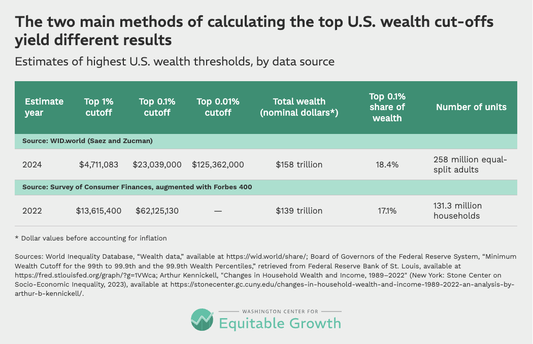
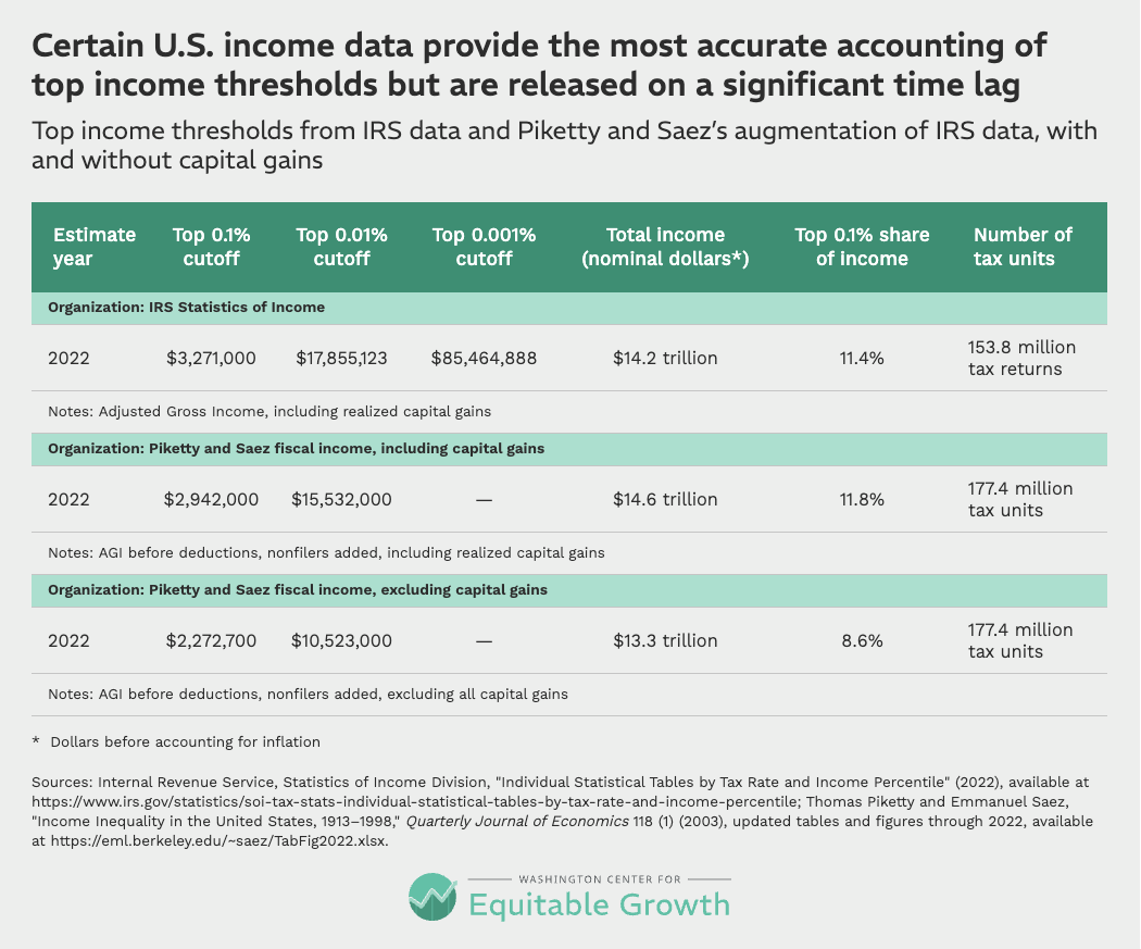

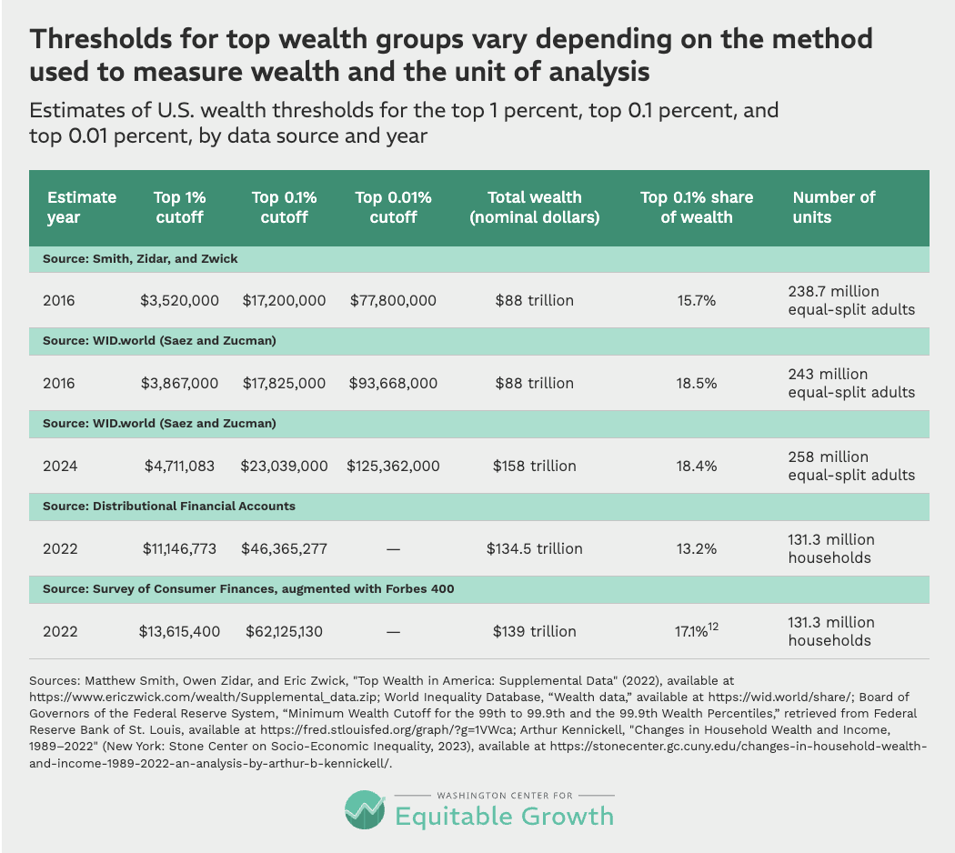
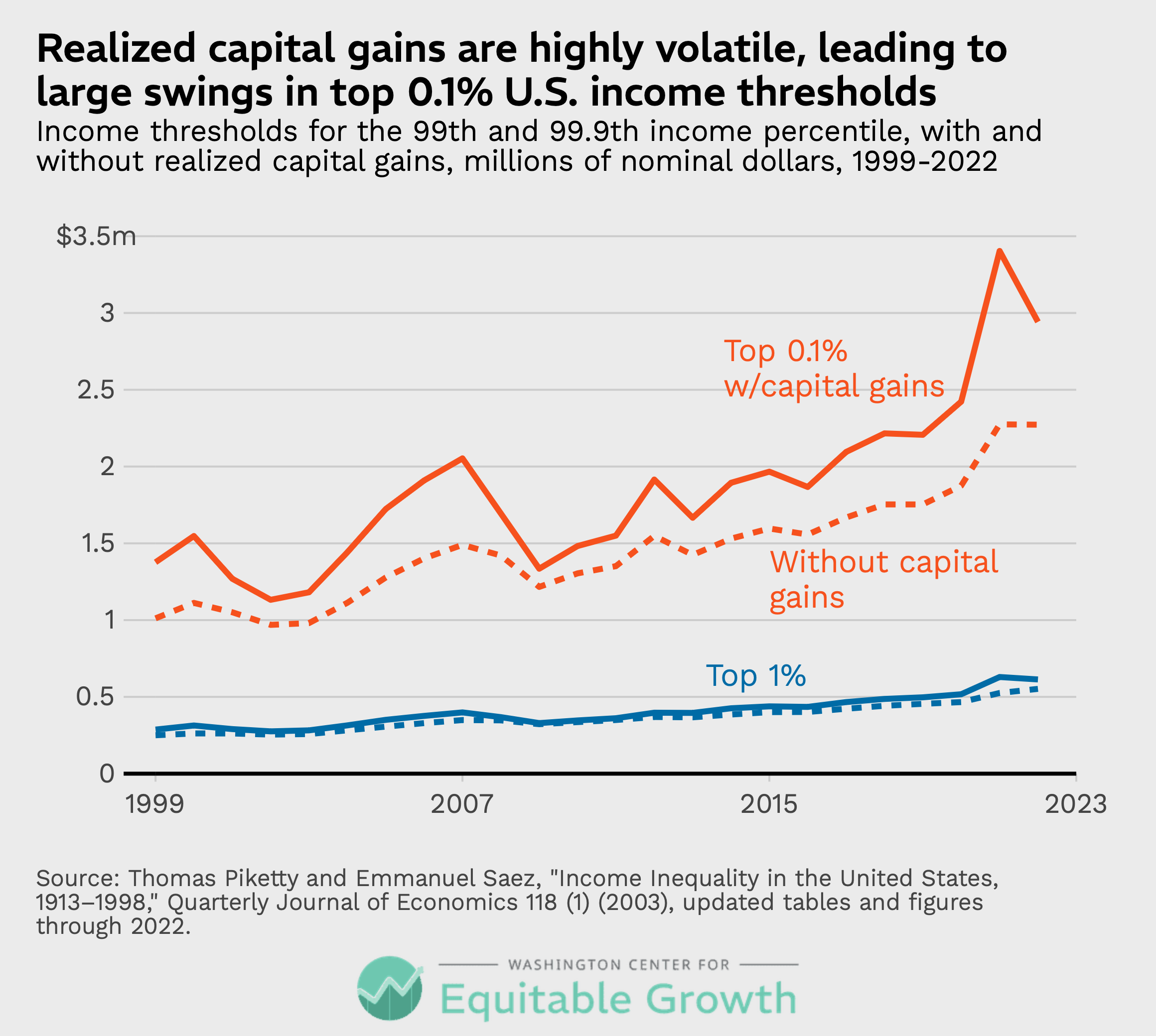
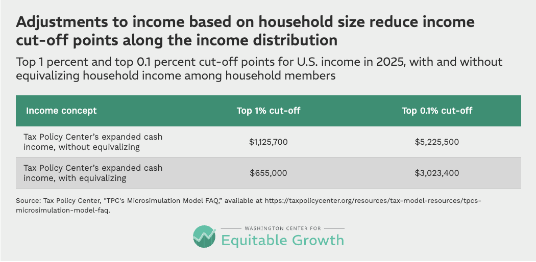
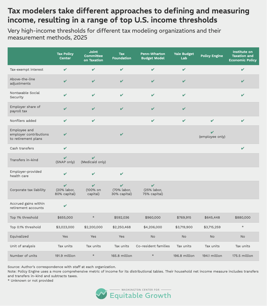
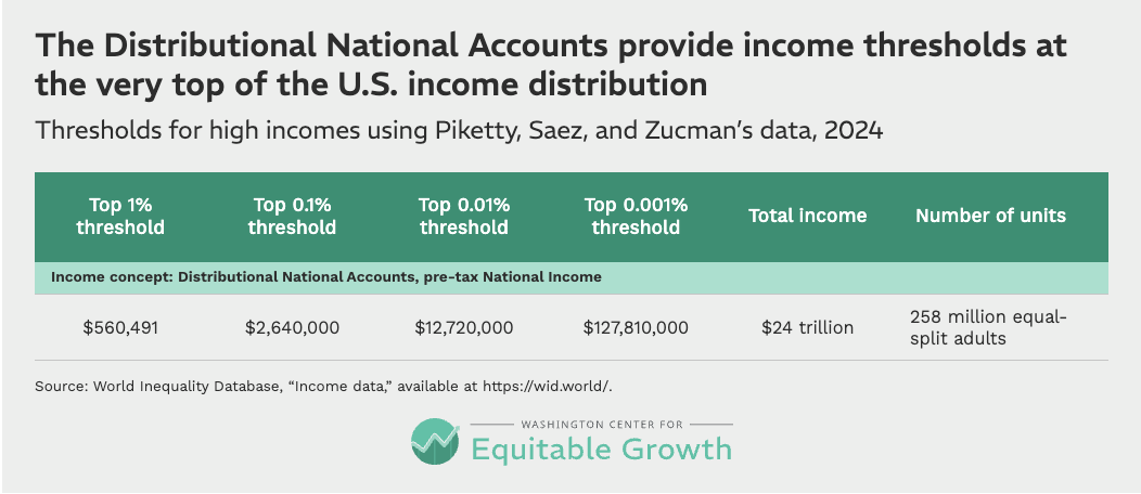

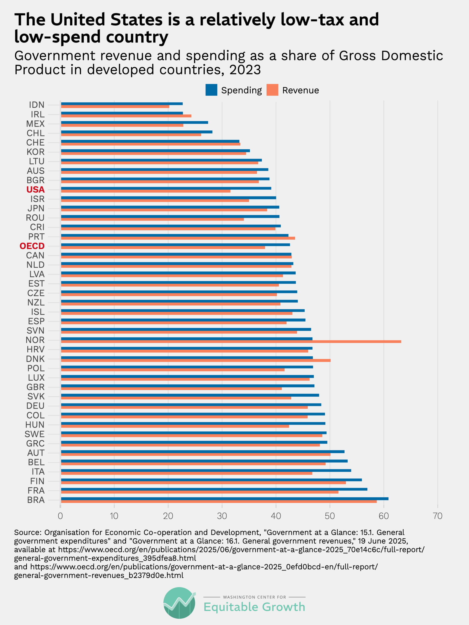
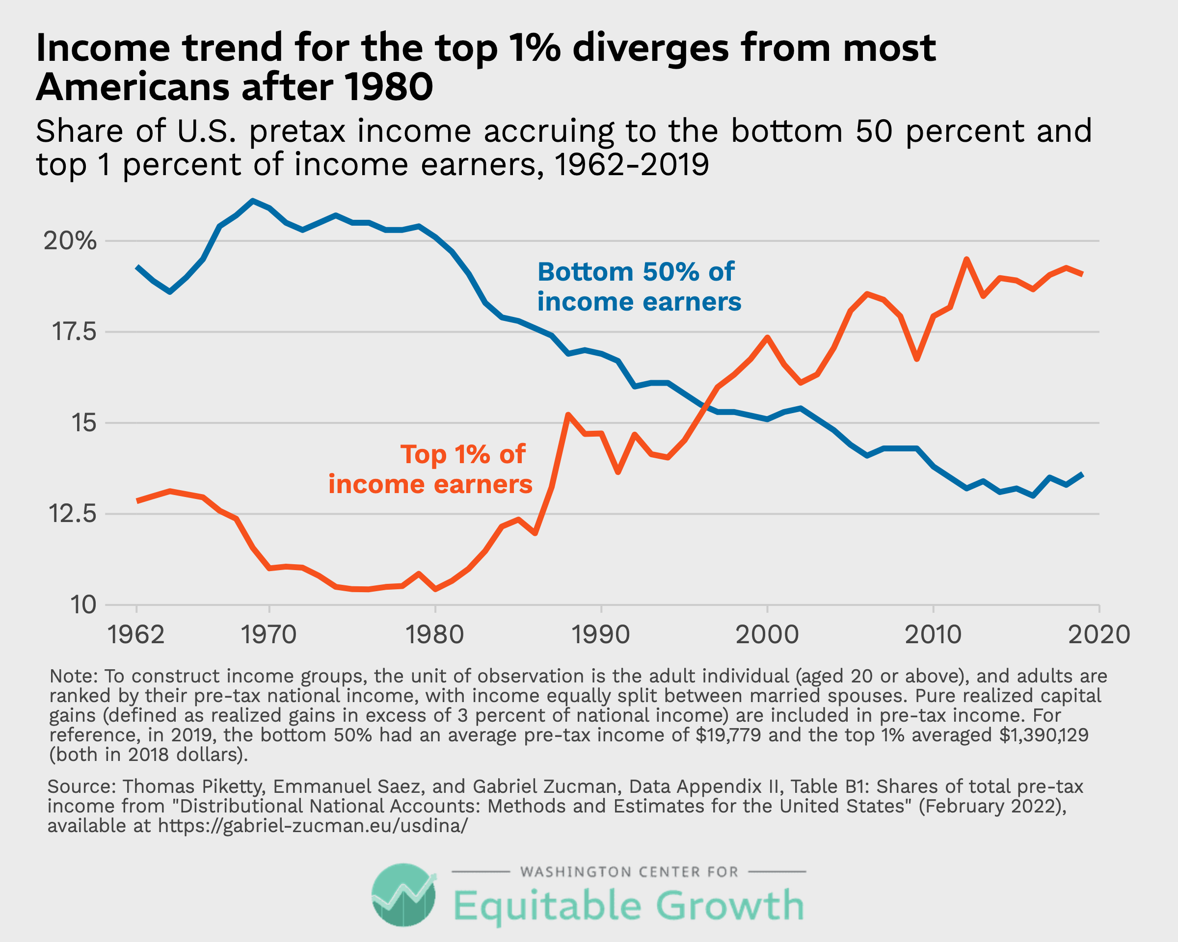
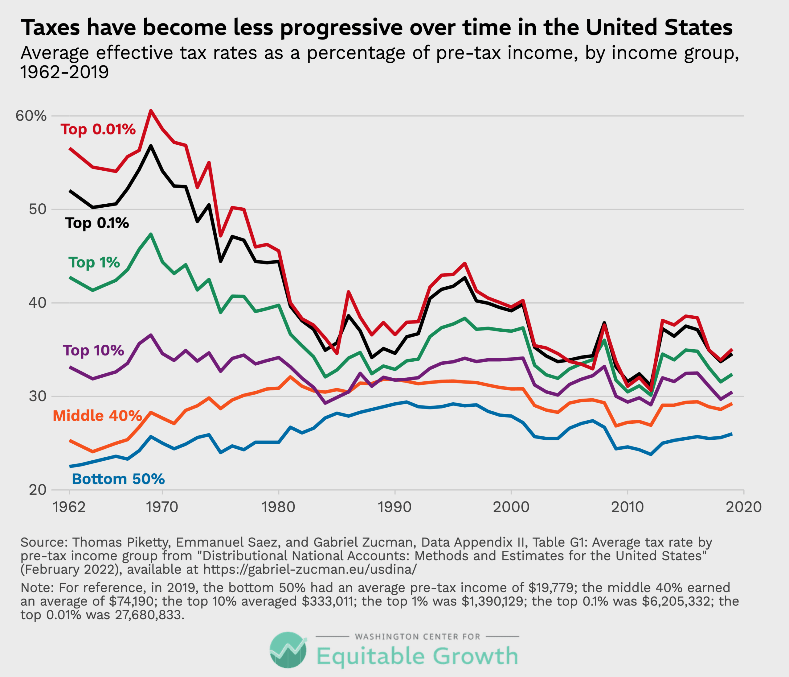
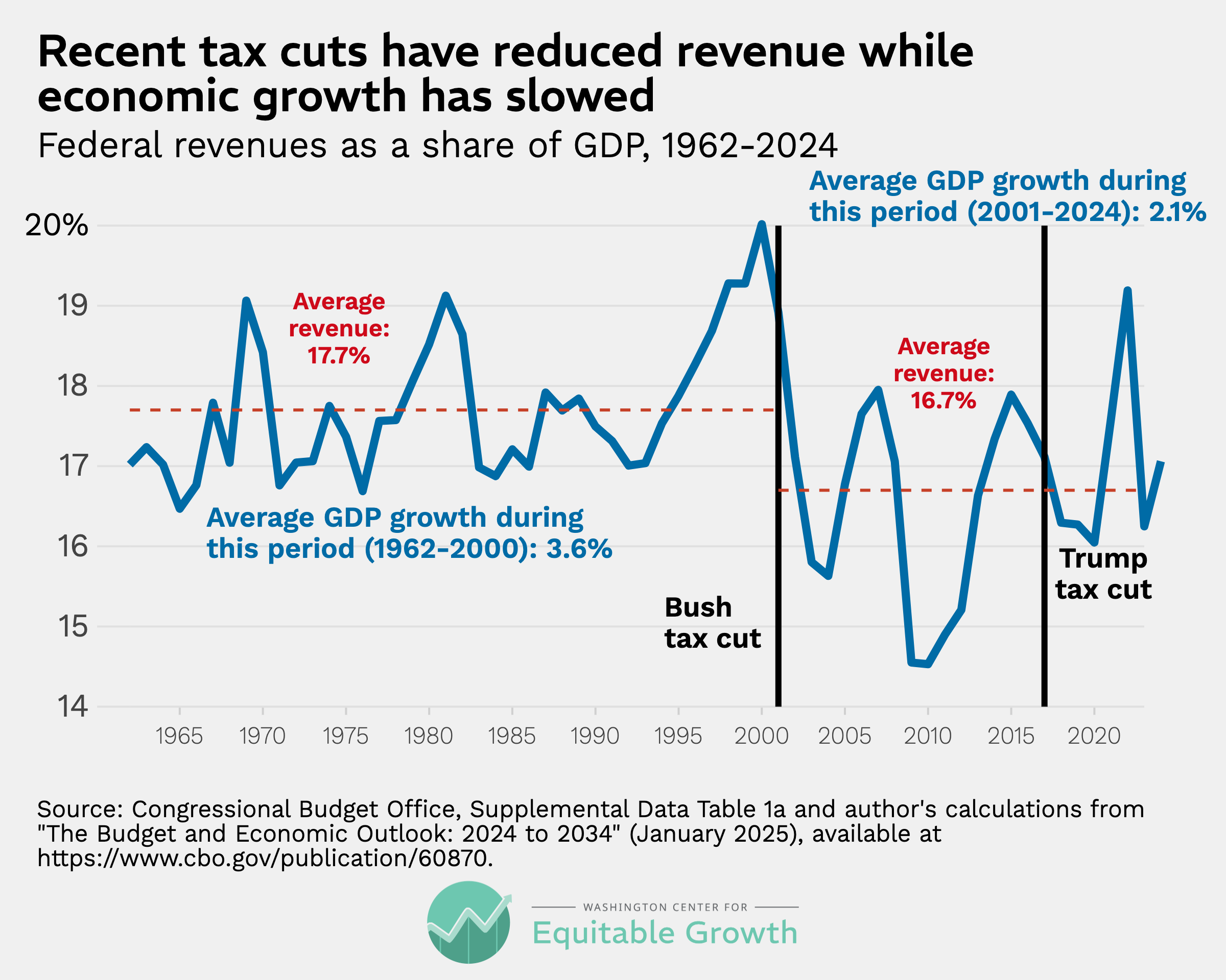
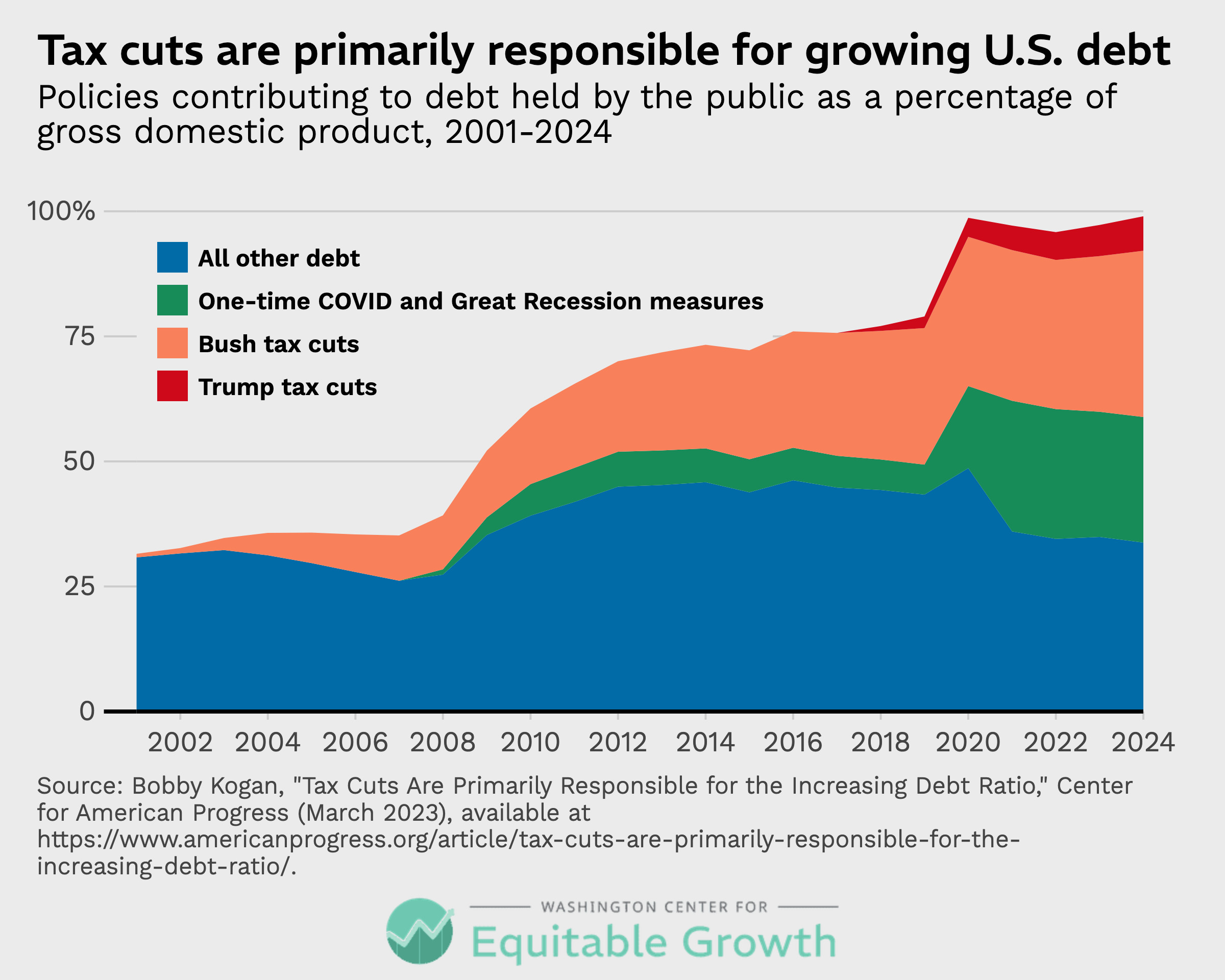
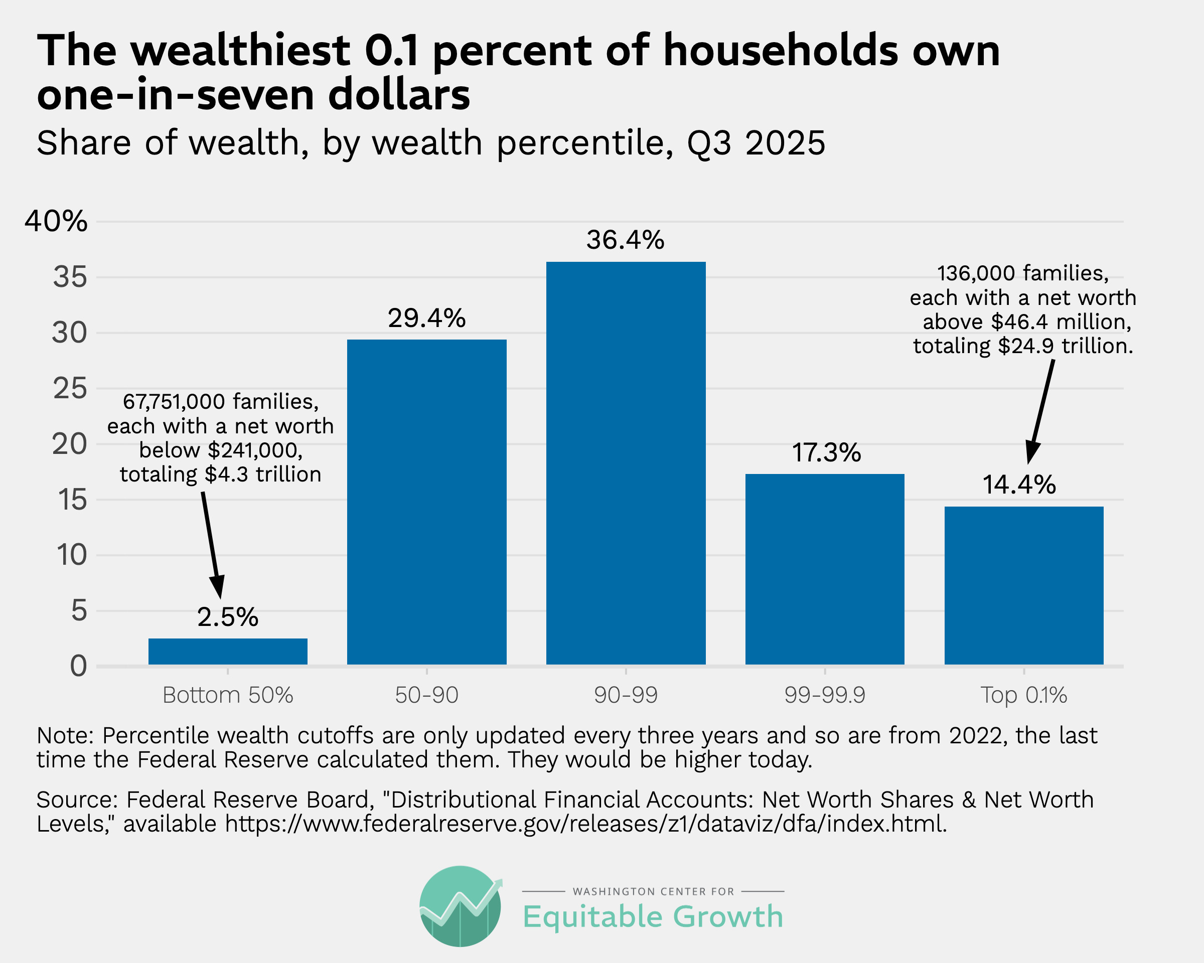
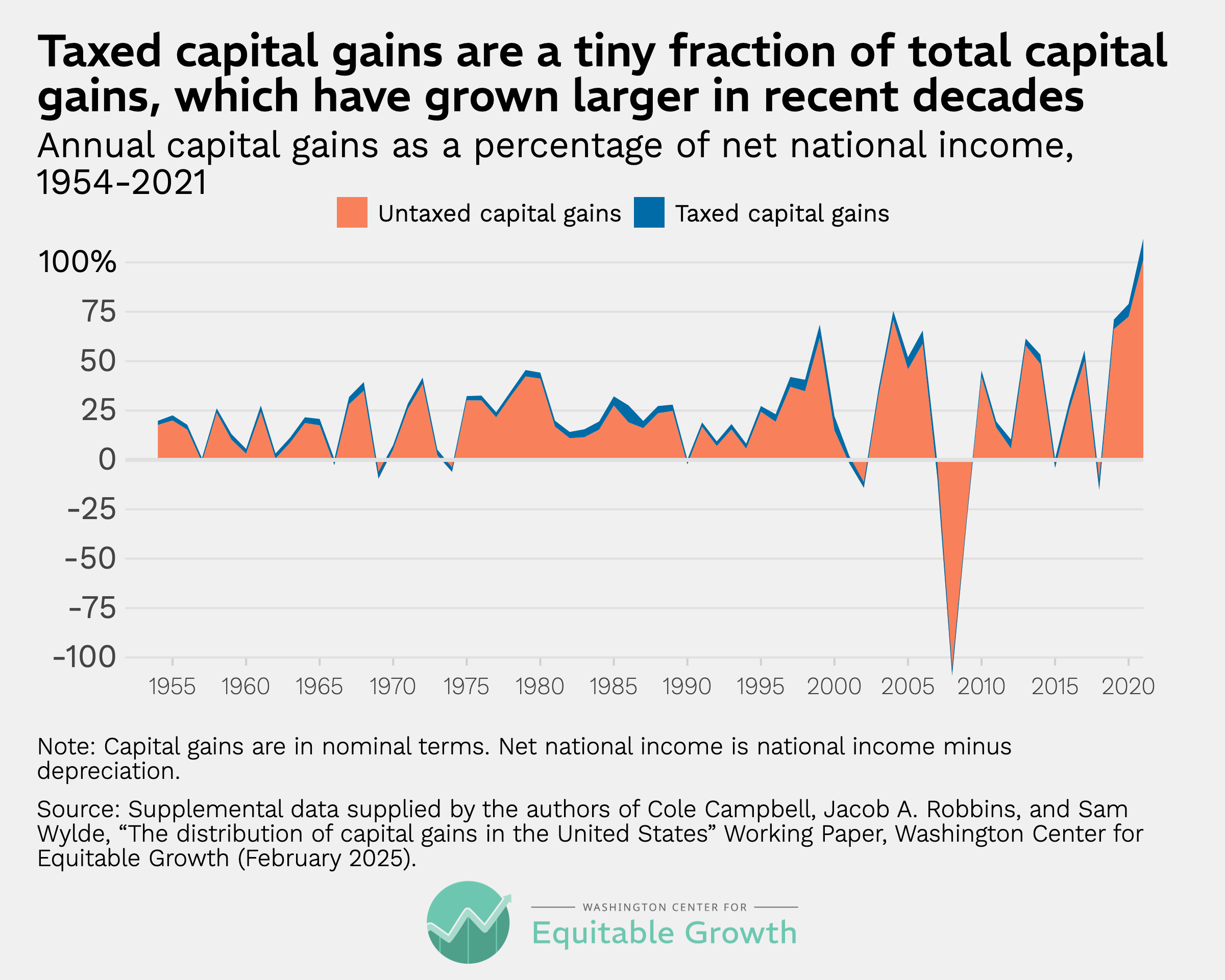
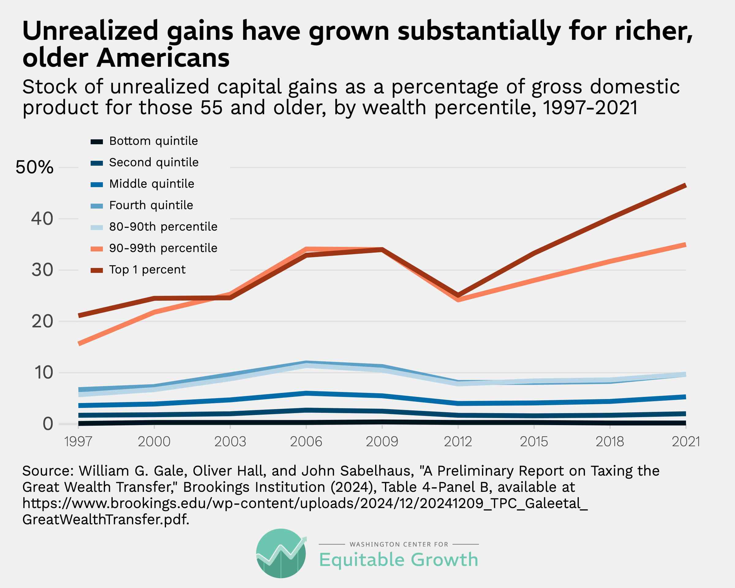
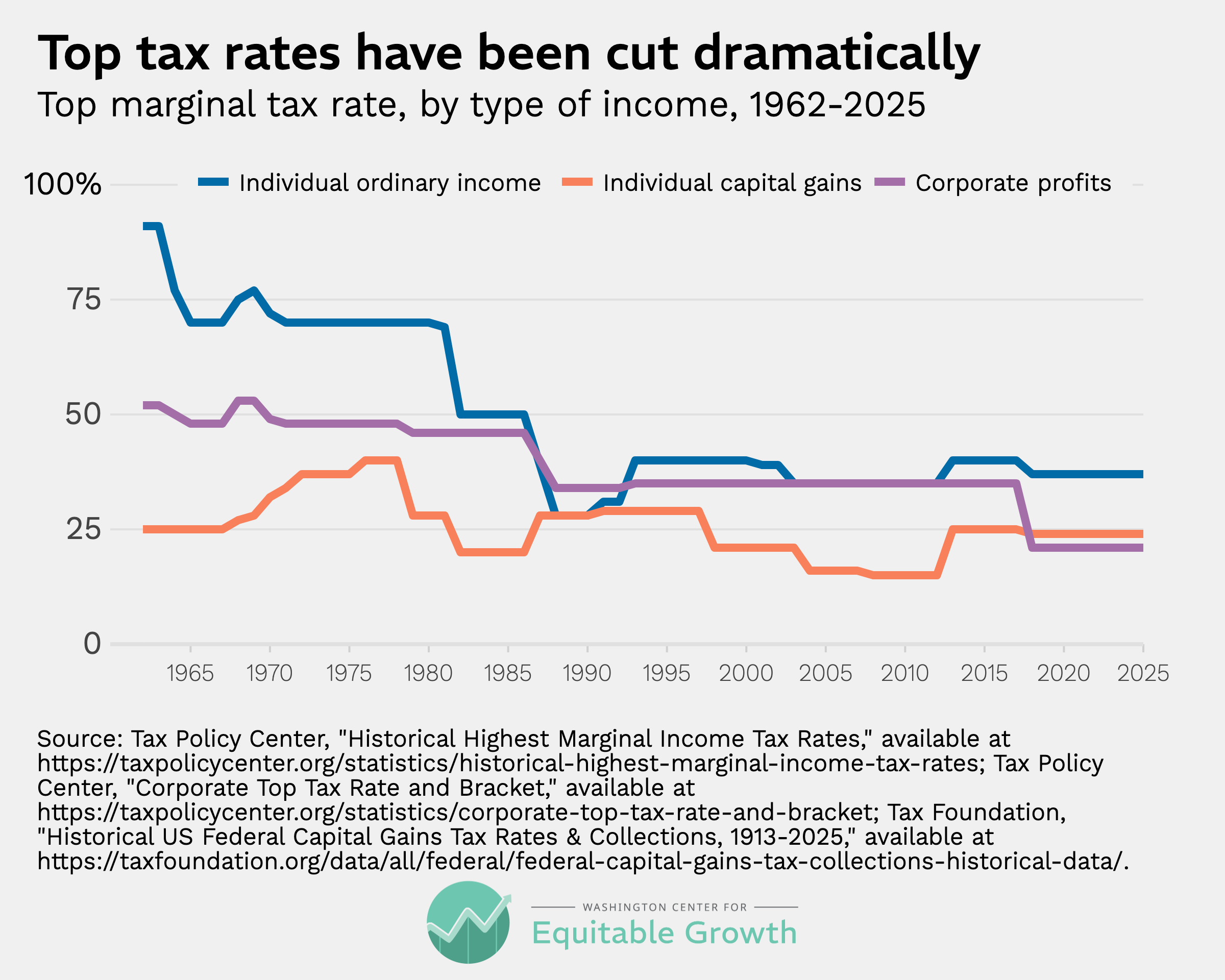

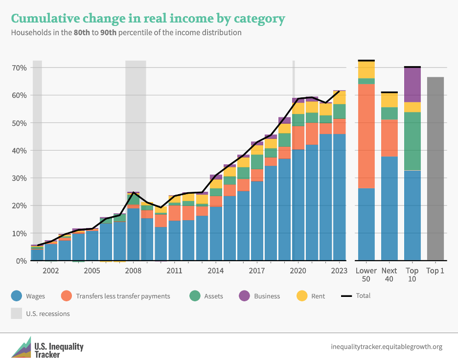
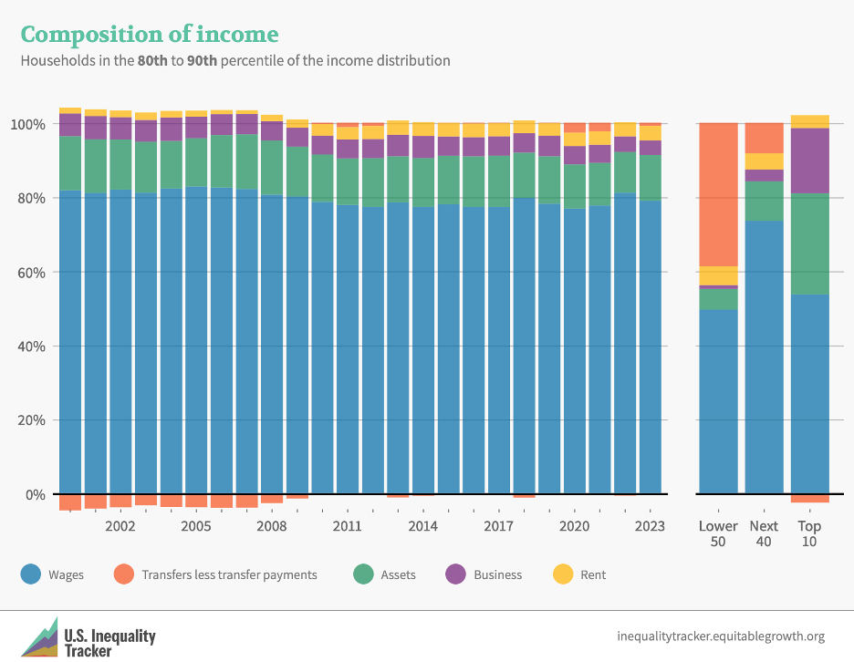
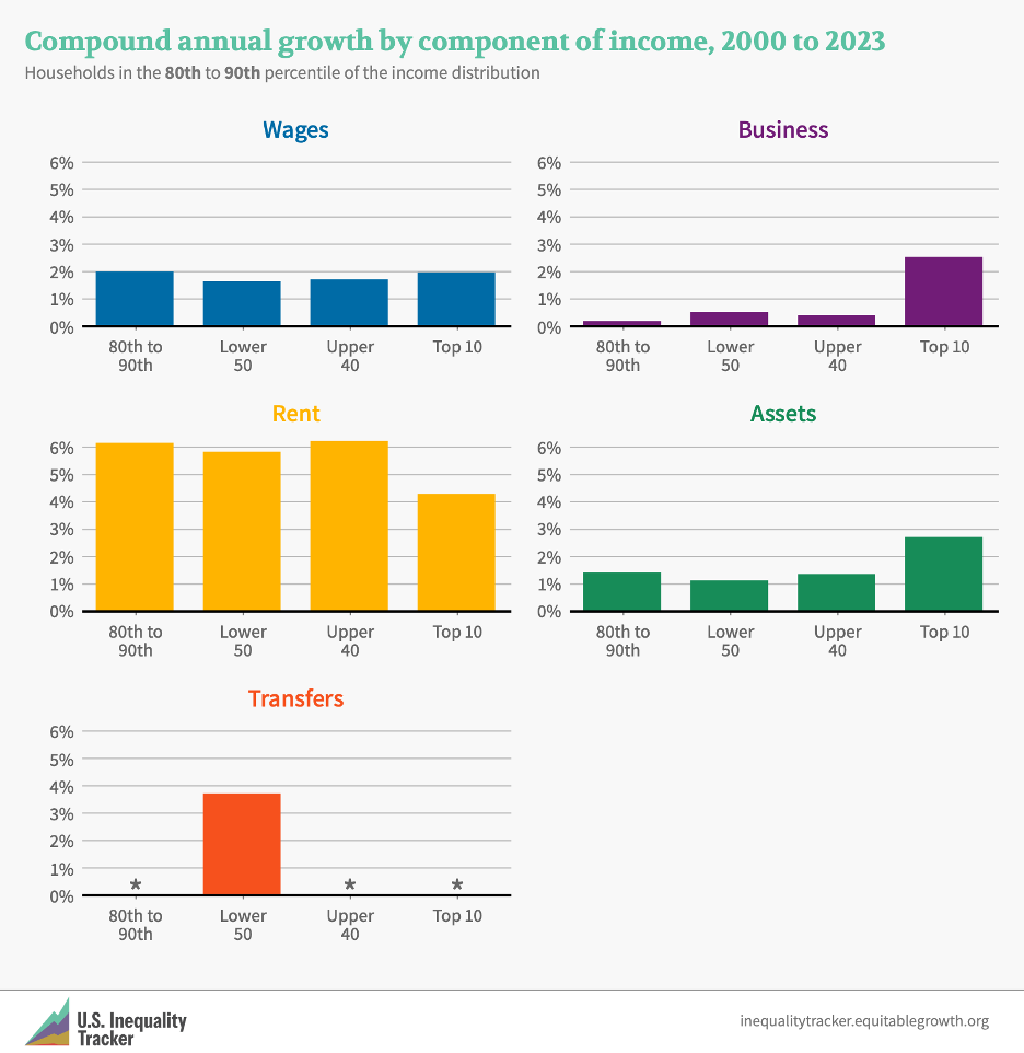
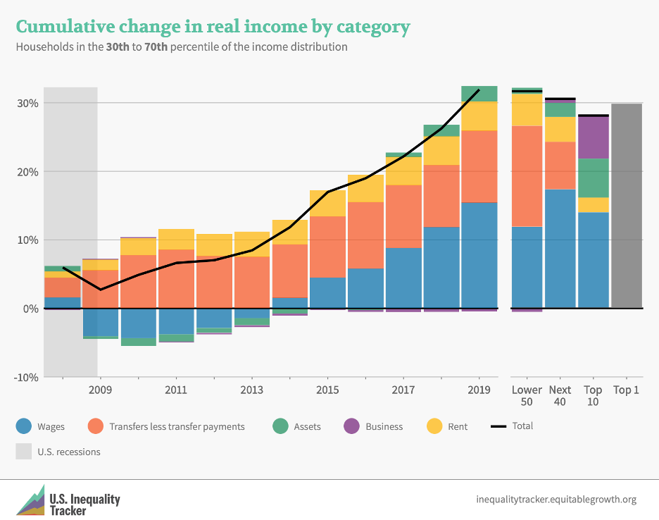
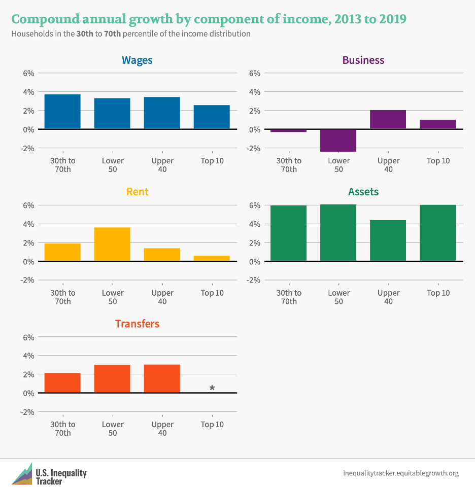
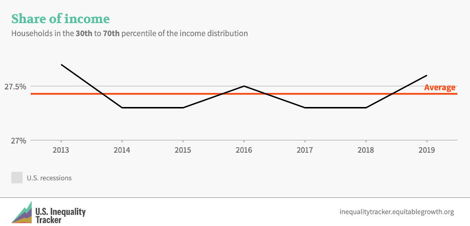
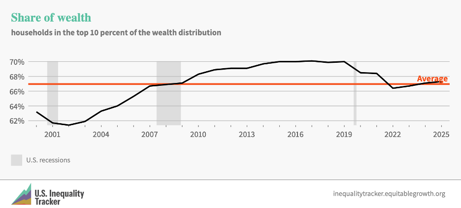
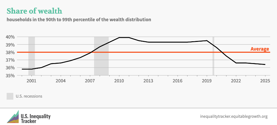
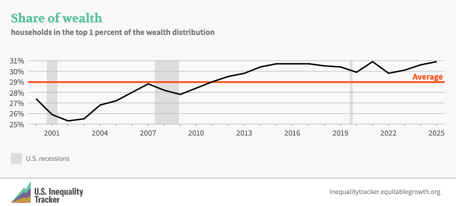

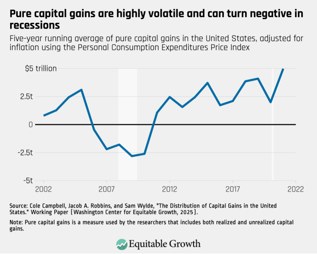
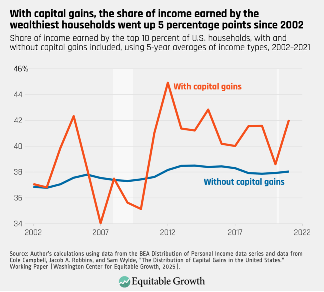

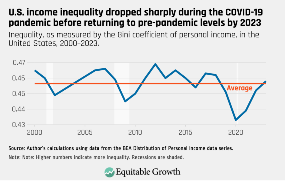
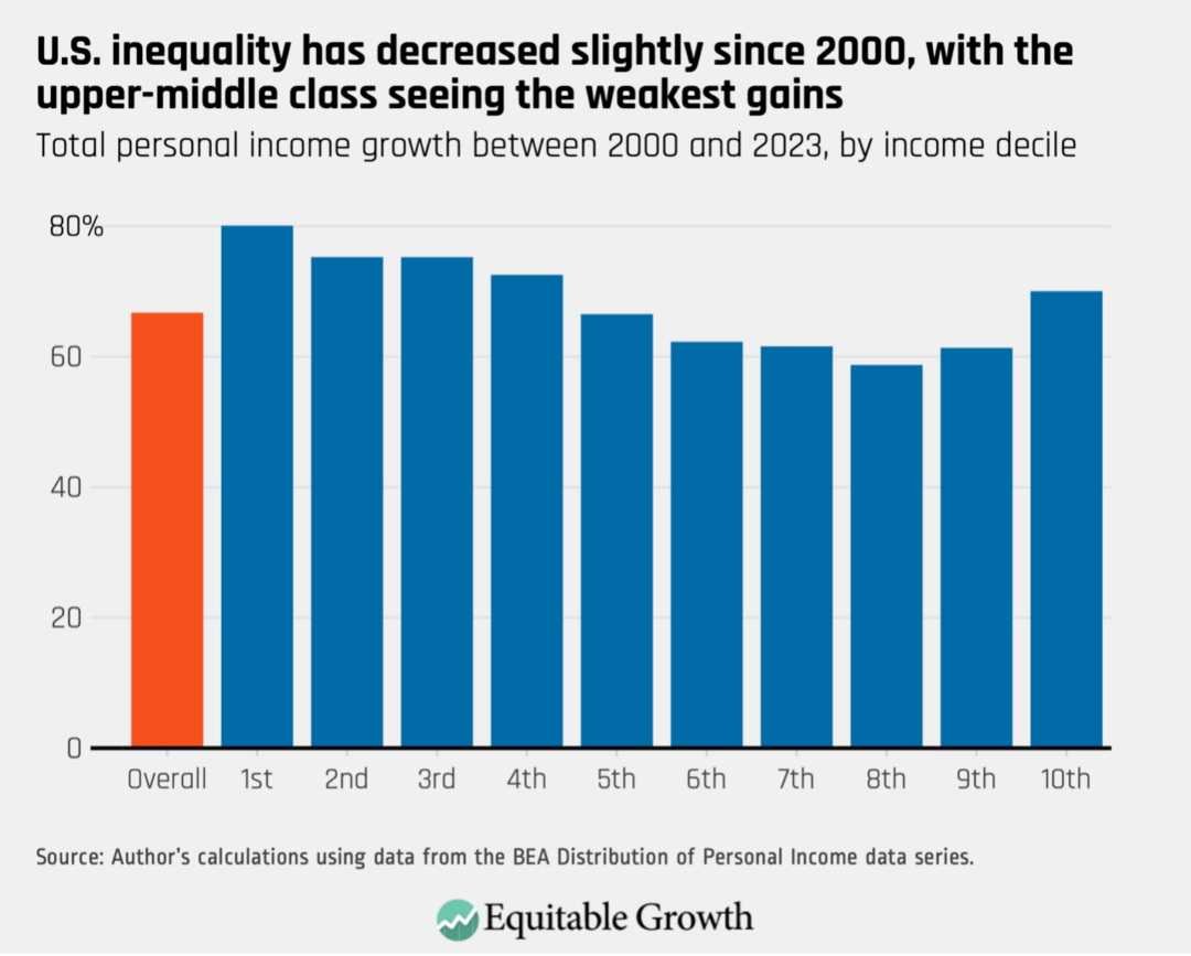
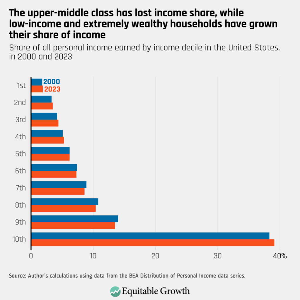
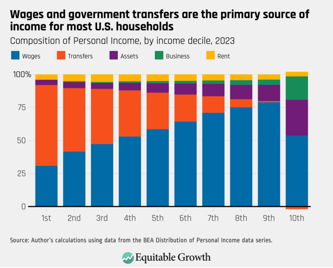
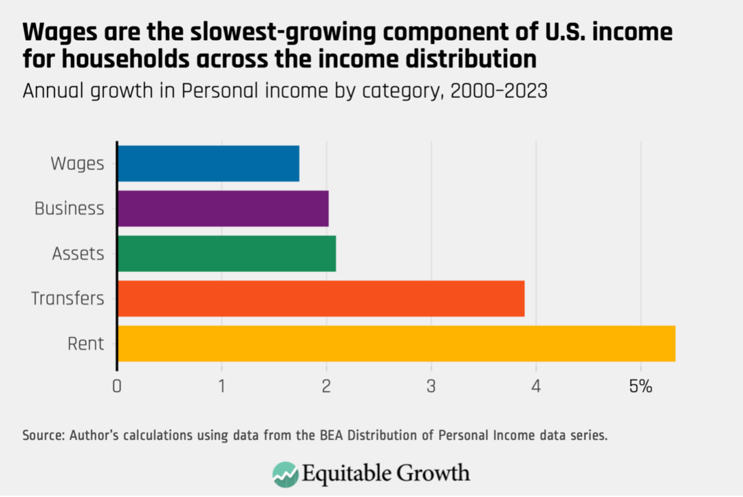
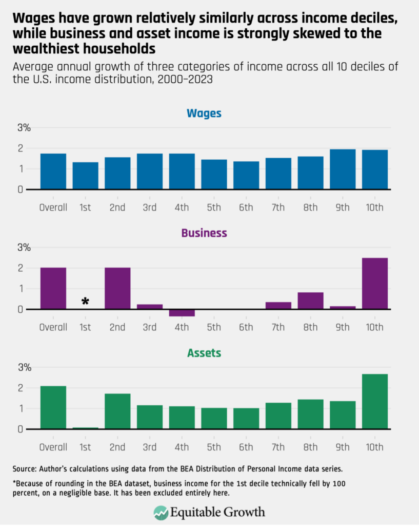
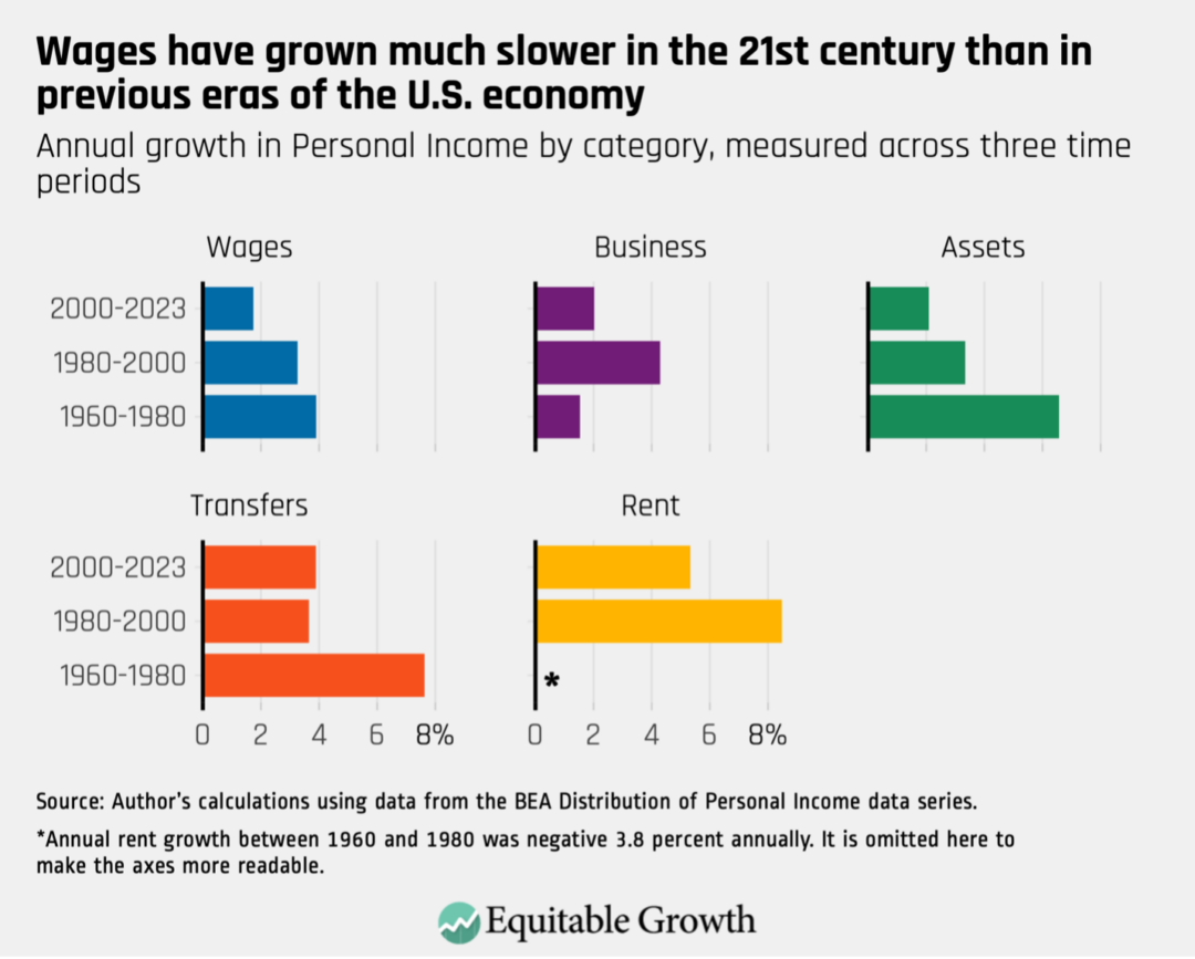
Stay updated on our latest research