Gender segregation at work: “separate but equal” or “inefficient and unfair”

PepsiCo Inc. chairman and chief executive Indra K. Nooyi, left, and Jill Beraud, PepsiCo president of sparkling brands, meet with Barclays Capital investor relations representative Carmen Barone, right, at the post that trades Pepsi on the floor of the New York Stock Exchange Monday, Feb. 1, 2010. (AP Photo/Richard Drew)

Fifty years after the arrival of the contemporary women’s movement on the national stage, the U.S. workforce and the U.S. economy are the beneficiaries of the enormous strides in gender equality. Women are working in nearly all occupations that once were exclusively the domain of men, and many are in prominent leadership roles in business and government. Yet sex segregation in the workplace remains a problem as social norms continue to restrict occupational choices by women and men, thereby distorting labor markets, depressing wages, and hurting business innovation and productivity.

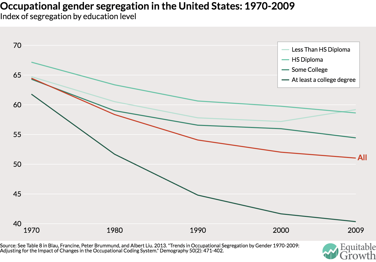
Despite the early gains of women in professional and service jobs that require a college education, many such occupations remain disproportionately male, particularly at the highest levels. Furthermore, most technical and manual blue-collar jobs have undergone little to no integration since the 1970s. Economists Francine Blau at Cornell University, Peter Brummund at the University of Alabama, and Albert Yung-Hsu Liu at Mathematica Policy Research, Inc., examined trends in occupational segregation between 1970 and 2009 and found that the process of desegregation has slowed significantly in recent decades, regardless of the education level necessary for a job. (See Figure 1.)

Why does occupational segregation by gender persist

Traditional economic theory explained occupational segregation by gender as an inevitable consequence of “natural differences” in skills between women and men, but contemporary economists have refocused the blame on gender discrimination by employers, coworkers, and other actors. According to the standard model, levels of segregation should be constant over time as they are determined by occupations’ supposed compatibility with “male” and “female” labor market preferences. Contradicting this prediction, economist Jessica Pan at the National University of Singapore finds that men abandoned formerly all-male professions in droves after women’s participation reaches “tipping points,” fearing the social stigma and wage penalties associated with belonging to “feminine” occupations.

Contemporary economic research has sought to better understand the causes of this male aversion to working with female colleagues. On one hand, the discrimination in hiring and promotion that reinforces segregation is based on stereotypes about women’s skills. As Harvard University economist Claudia Goldin argues in her “pollution theory of discrimination,” men often underestimate women’s skills based on their current underrepresentation in certain occupations and thus discriminate against women in these occupations on the false assumption that increasing their representation would lower overall productivity.

On the other hand, economists George Akerlof at Georgetown University and Rachel Kranton at Duke University argue that discrimination in male-dominated professions is caused by social pressures, interpreting women’s inclusion as a threat to the professions’ masculinity. By this account, men don’t discriminate against women because they view women as less qualified but rather because they are trying to protect the social power men hold through membership in the “boys’ club.” In a similar model of “stratification economics,” economists Sandy Darity of Duke, Darrick Hamilton of the New School for Social Research, and James Stewart of Pennsylvania State University detail how socially dominant groups create and reinforce prejudices against other groups in order to protect their economic, political, and social advantages.

Despite a decline in explicit sexism, researchers argue that gender discrimination today, whether in the form of stereotypes or social pressures, is perpetuated by a new, “egalitarian” form of gender essentialism—the belief that women and men’s social, economic, and familial roles are and should be fundamentally different. While most people now support women’s access to all economic opportunities, they simultaneously expect men and women to pursue traditionally “male” and “female” jobs and regard parenting as the primary responsibility of mothers. Sociologist Paula England at New York University and other researchers note that the resurgence in differential expectations is responsible for the recent stagnation in occupational desegregation and in other indicators of women’s economic inclusion.

Assuming different roles for men and women at work and at home, male-dominated occupations remain mostly structured to meet the needs of a stereotypical male who is expected to have a spouse at home, a work-schedule issue that not only fails to accommodate women but also often actively pushes women out. The idea that women are freely “opting out” of workforce opportunities because they have different career aspirations than men has been thoroughly debunked. Instead, women usually leave their jobs because of negative experiences in the workforce, especially in male-dominated fields. In particular, jobs in these fields often demand a culture of long hours, which does not accommodate flexibility for caregiving, forces many mothers to quit, and likewise discourages fathers from helping out at home.

To make matters worse, male-dominated workplaces are often hostile work environments for women, featuring the highest rates of sexual and gender-based harassment. Overt forms of sexual harassment remain part of the “culture” of many male-dominated jobs, particularly given the limited of application of anti-discrimination laws in many blue-collar occupations, as the late Barbara Bergmann, a pioneering feminist economist, once observed. Subtler forms of gender-based harassment in which men exclusively hire, socialize with, and promote each other are even more common in the STEM (science, technology, engineering, and mathematics) professions, in finance, and in other professional environments and have been demonstrated to limit women’s prospects for advancement, decrease female labor force attachment, and reinforce segregation.

How occupational segregation drives down wages and slows economic growth

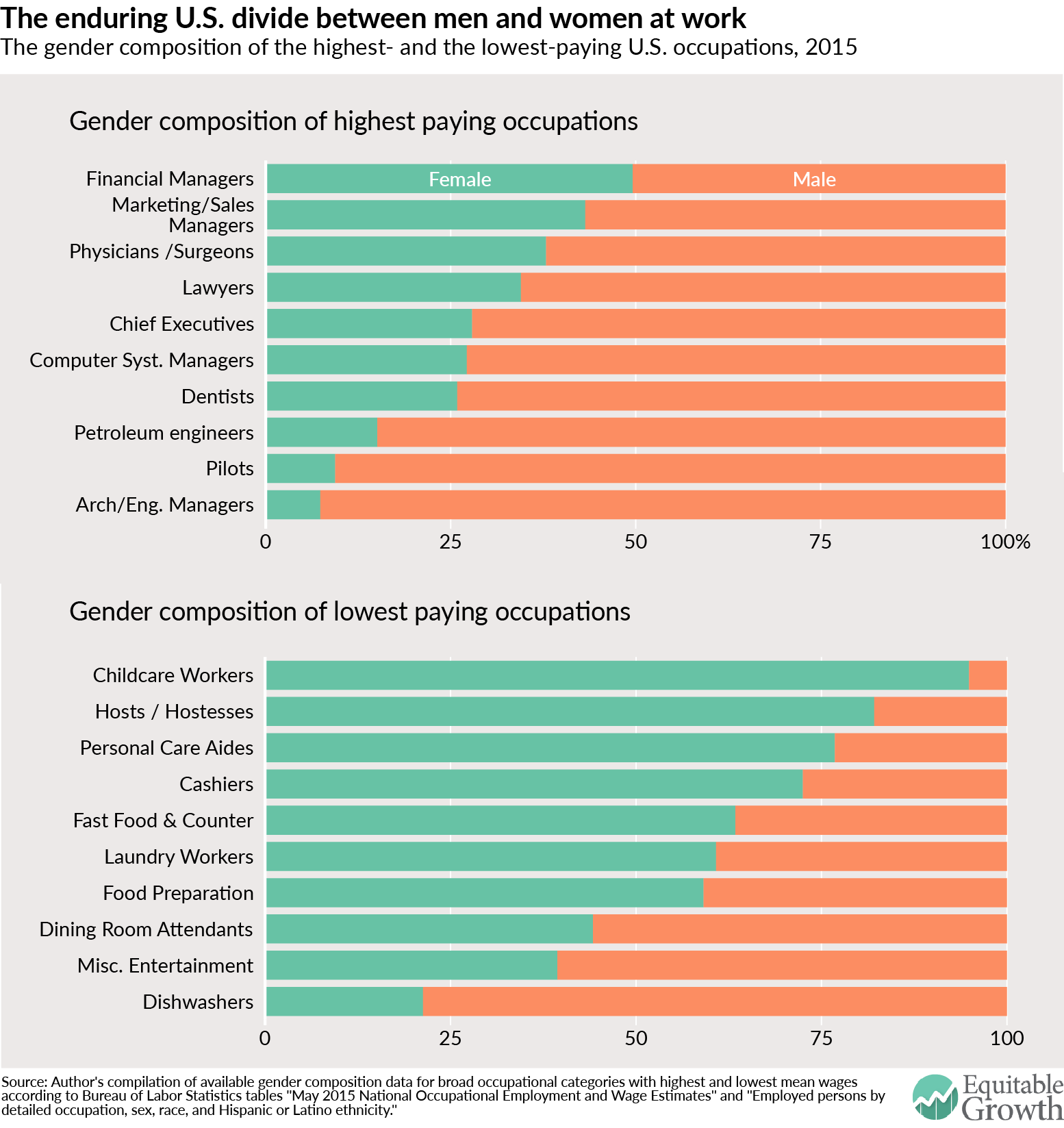
At the microeconomic level, occupational segregation by gender substantially depresses female wages and contributes to the gender wage gap. Most of the U.S. economy’s highest paying occupations are predominantly male while most of the lowest paying occupations are predominantly female. (See Figure 2.)

By pushing women into lower-paying occupations, occupational segregation depresses female wages and hurts family economic security. A recent empirical review on trends in the gender wage gap since 1980 by economists Blau and her colleague at Cornell, Lawrence Kahn, attributes half of the present gap to women working in different occupations and industries than men. In addition to keeping women out of the highest-paying occupations, a report by the Institute for Women’s Policy Research authored by Heidi Hartmann, Barbara Gault, Ariane Hegewisch, and Marc Bendick details how segregation also excludes women from the best-paying middle-skills jobs in information technology, logistics, and advanced manufacturing, even though these jobs require similar skills as predominantly female jobs with worse pay. Other researchers clearly demonstrate that this “wage penalty” for occupational feminization is a product of discrimination against women’s labor as opposed to productivity differences between predominantly male and female jobs.

As AFL-CIO chief economist William Spriggs and Case Western University historian Rhonda Williams argue, these trends also are highly racialized: women of color at all education levels are segregated into jobs with lower wages than their white female peers of similar skill level. Conversely, occupational integration produces huge wage increases for women and people of color: econometric analysis by Chang-Tai Hsieh and Erik Hurst at the University of Chicago and Charles Jones and Peter Klenow at Stanford University shows that occupational integration since 1960 was responsible for 60 percent of real wage growth for Black women, 40 percent for white women, and 45 percent for Black men (after accounting for inflation). These patterns indicate that the persistence of segregation today results in a significant loss of income for working women and their families, which should be disconcerting to policymakers given the ameliorative effects of lifting women’s wages on poverty, unemployment, and inequality.

Beyond its effect on individual workers, occupational segregation limits optimal matching of workers with jobs where they can best leverage their skills and fulfill their ambitions. If men and women are pushed into careers based on societal definitions of “masculinity” and “femininity” then they aren’t able to choose the labor market opportunities that best match their skills and ambitions. Most of this issue brief is focused on how segregation limits women’s ability to contribute to traditionally male occupations, but it also limits men’s ability to contribute to traditionally female occupations—a significant policy issue as globalization and technology continue to decrease the availability of many predominantly male blue-collar jobs in the United States.

Indeed, a growing body of evidence demonstrates that occupational integration helps both sexes contribute their human capital to enhancing the productivity of firms. A variety of studies show that establishing a “critical mass” of at least 30-percent women in corporate leadership enhances firm innovation and overall performance. This is consistent with behavioral research that gender integration improves teams’ “collective intelligence.” In the financial sector in particular, occupational integration decreases systemic risk driven by masculine-stereotyped behaviors encouraged in sex-segregated environments, argues economist Julie Nelson at the University of Massachusetts-Boston.

These individual- and firm-level gains can have a massive impact on overall productivity and growth. Research by economists Hsieh, Hurst, Jones, and Klenow demonstrates that occupational integration was responsible for driving 15 percent to 20 percent of the increase in aggregate output per worker since 1960.

Where policymakers can jumpstart integration

To counteract gender discrimination, firms should set explicit targets for increasing female representation at all levels. Because children’s labor market preferences are largely shaped by the representation of women in leadership roles, increasing women’s representation in private- and public-sector institutions can decrease stereotypes and expand opportunity for women at all levels. According to research by economists Marianne Bertrand at the University of Chicago, Sandra Black at the University of Texas-Austin, Sissel Jensen at the Norwegian School of Economics, and Adriana Lleras-Muney at the University of California-Los Angeles, Norway’s 40 percent minimum requirement for women on corporate boards increased female representation, attracted female board members with greater qualifications, and reduced gender wage gaps on boards. While it may take time for these effects to trickle-down to entry-level workers, a study by Lori Beaman at Northwestern University, Esther Duflo at the Massachusetts Institute of Technology, Rohini Pande at Harvard University, and Petia Topalova at the International Monetary Fund, shows that a law mandating increased representation for women on municipal councils in India dramatically decreased bias against women in the population as a whole while expanding girls’ educational opportunities and career aspirations.

In addition to interventions at the top, researchers, including Harvard’s Rosabeth Moss Kanter, argue that by establishing a critical mass of women in all work environments employers can dramatically reduce the prevalence of discriminatory behaviors and force their workplaces to adapt to their female employees’ needs and demands. As Yale Law professor Vicki Schultz argues, anti-discrimination law and policy should thus emphasize increasing women’s numerical strength across occupations and dismantle the workplace structures discussed above that create sex differences in labor market choices—as opposed to simply reflecting them. Sociologists Sheryl Skaggs of the University of Texas-Dallas, Kevin Stainback of Purdue University, and Phyllis Duncan of Our Lady of the Lake University find significant “bottom-up” effects of increasing women’s general representation on their representation in managerial positions, complementing the “top-down” effects of increasing their numbers on corporate boards.

While work-life reforms benefiting both fathers and mothers are essential to developing an inclusive workplace, setting explicit targets for women at all levels would help reverse discrimination against women in promotion decisions based on their greater probability of taking leave, as Cornell economist Mallika Thomas documents. Furthermore, while male-dominated occupations can and must change to include women, it is equally important to elevate and integrate female-dominated occupations by mandating equal pay for jobs of equal value or “comparable worth,” as noted by, among others, economist and IWPR president Heidi Hartmann as well as economist and former Bennett College President Julianne Malveaux.

Beyond reforms within labor markets, ending occupational sex segregation will require a comprehensive strategy to prevent the formation of gender stereotypes at a young age that later “spillover” into the workplace. Cultivating inclusion must start early in order to have a lasting impact on children’s beliefs and experiences. Research demonstrates, for example, that unnecessarily segregating boys and girls in educational or social activities creates arbitrary categories of “us” and “them,” sending a message that children’s opportunities should be determined by their gender. Efforts to counteract gender stereotypes can also help women later on in their careers. Indeed, the IWPR report by Hartmann, Gault, Hegewisch, and Bendick argues for public-private partnerships to train and match women from “on-ramp occupations” to higher paying traditionally male jobs that require similar skills.

Achieving successful integration at all levels will take work. However, social scientists including legal scholar Joan Williams at the University of California’s Hastings School of Law and behavioral economist Iris Bohnet at Harvard are proposing a variety of strategies for decreasing bias, overcoming difference, and advancing women throughout their educational and professional careers. As Goldin and Princeton University economist Cecilia Rouse argue in their seminal study on the gender equity benefits of blind auditions for symphony orchestras, these strategies should focus on results-based approaches that decrease the influence of social networks and gender biases in evaluation, hiring, and promotion of women.

Leveraging these behavioral changes to promote gender equity and inclusion in all institutions boasts enormous potential to raise wages, boost productivity, drive innovation, and expand opportunity for women and men across the economy.

Will McGrew is an intern at the Washington Center for Equitable Growth and a Dahl Research Scholar at the Yale Institution for Social and Policy Studies. He is studying Economics and Political Science at Yale University.

U.S. top one percent of income earners hit new high in 2015 amid strong economic growth

The top 1 percent income earners in the United States hit a new high last year, according to the latest data from the U.S. Internal Revenue Service. The bottom 99 percent of income earners registered the best real income growth (after factoring in inflation) in 17 years, but the top one percent did even better. The latest IRS data show that incomes for the bottom 99 percent of families grew by 3.9 percent over 2014 levels, the best annual growth rate since 1998, but incomes for those families in the top 1 percent of earners grew even faster, by 7.7 percent, over the same period. (See Figure 1.)

Figure 1

Overall, income growth for families in the bottom 99 percent was good again in 2015 as it had been last year, marking the second year of real recovery from the income losses sparked by the Great Recession of 2007-2009. After a large decline of 11.6 percent from 2007 to 2009, real incomes of the bottom 99 percent of families registered a negligible 1.1 percent gain from 2009 to 2013, and then grew by 6.0 percent from 2013 to 2015. Hence, a full recovery in income growth for the bottom 99 percent remains elusive. Six years after the end of the Great Recession, those families have recovered only about sixty percent of their income losses due to that severe economic downturn.

In contrast, families at or near the top of the income ladder continued to power ahead. These families at or near the top of the income ladder did substantially better in 2015 than those below them. The share of income going to the top 10 percent of income earners—those making on average about $300,000 a year—increased to 50.5 percent in 2015 from 50.0 percent in 2014, the highest ever except for 2012. The share of income going to the top 1 percent of families—those earning on average about $1.4 million a year—increased to 22.0 percent in 2015 from 21.4 percent in 2014.

Income inequality in the United States persists at extremely high levels, particularly at the very top of the income ladder. Figure 1 shows that the incomes (adjusted for inflation) of the top 1 percent of families grew from $990,000 in 2009 to $1,360,000 in 2015, a growth of 37 percent. In contrast, the incomes of the bottom 99 percent of families grew only by 7.6 percent–from $45,300 in 2009 to $48,800 in 2015. As a result, the top 1 percent of families captured 52 percent of total real income growth per family from 2009 to 2015 while the bottom 99 percent of families got only 48 percent of total real income growth. This uneven recovery is unfortunately on par with a long-term widening of inequality since 1980, when the top 1 percent of families began to capture a disproportionate share of economic growth.

The 2015 numbers on income have been built using the new filling-season statistics by size of income published by the Statistics of Income division of the IRS. These statistics can be used to project the distribution of incomes for the full year. We have used these new statistics to update our top income share series for 2015, which are part of our World Top Incomes Database. These statistics measure pre-tax cash market income excluding government transfers such as the disbursal of the earned income tax credit to low-income workers.

Timely statistics on economic inequality are key to understanding whether and how inequality affects economic growth. Policymakers in particular need to grasp whether past efforts to raise taxes on the wealthy—in particular the higher tax rates for top U.S. income earners enacted in 2013 as part of the 2013 federal budget deal struck by Congress and the Obama Administration—are effective at slowing income inequality.

The latest data from the IRS suggests the 2013 reforms proved to be fleeting in terms of reducing income inequality. There was a dip in pre-tax income earned by the top one percent in 2013, yet by 2015 top incomes are once again on the rise—following a pattern of growing income inequality stretching back to the 1970s.

—Emmanuel Saez in a professor of economics at the University of California-Berkeley and a member of the Washington Center for Equitable Growth’s steering committee.

Photo by Steve Johnson, via flickr

Working mothers with infants and toddlers and the importance of family economic security

Anne Quirk and her 11-month-old son Kieran play in the front yard of their home in Providence, R.I.

Overview

For families in the United States with children ages five and under—whether in married- or single-parent homes—mothers have been essential to bolstering economic security. Mothers’ increased working hours helped stabilize and boost family income. In the face of decreasing economic security, though, these large increases in hours worked by mothers, especially in households with young children who require physical and emotional care and nurturing, comes at a price: time.

As more mothers spend their days outside of the home trying to deliver much-needed financial stability, we need to understand the consequences of their work. As Heather Boushey documents in her book, “Finding Time: The Economics of Work-Life Conflict,” families now rely on those added hours and earnings of women. But for different types of families the transformations in the women’s role at home and at work mean different things. Especially for families with an infant or pre-school aged child, the challenges of how to address work-life conflicts can be acute. Without sufficient social infrastructure to help while parents are at work —such as paid family leave, paid sick days, flextime, predictable schedules, childcare, or universal high-quality prekindergarten programs—families are increasingly struggling to balance economic security with caregiving at home.

Download File
Working mothers with young children and family economic security (pdf)

Read the full pdf in your browser

This issue brief builds on the findings from “Finding Time” and explores how women’s increased hours of work and higher earnings have affected the incomes for families with young children. We unpack the role that women have played in helping stabilize family incomes across married-parents and single-parents with children age five or younger. Our findings are telling:

  • Across the board, married-parent families with young children have higher incomes than single-parent families, although between 1979 and 2013 both married- and single-parent families increased their incomes at similar low rates.
  • While in both 1979 and 2013 women from married-parent families worked more hours than single-mothers with young children, both groups of women saw similar and significant increases in their hours of work across all income groups.
  • The rise in women’s hours have been important for trends in family income. Between 1979 and 2013, in both married- and single-parent families, women’s earnings from higher wages and added hours have been positive across all income groups. In fact, for families with young children, women’s earnings from more working hours in particular was substantially large.

The changing role of women and the composition of families

Over the past four decades in United States, the composition of families with children has changed markedly. Most importantly, there is an increase in diversity of family types. There is no longer a dominant “typical” family, especially not one with a breadwinning father, a care-taking mother, and their dependent children. Instead, there is a wide array of family types. Our definition of who comprises a family now—more than ever before—has expanded to include singles living alone, biologically unrelated individuals, or even a boarder who joins in on family dinner and helps out with homework.

Trends in marriage and fertility have both contributed to greater family complexity. Marriage (if it happens at all) happens later in life, and the median age of first marriage is now 29 for men and 27 for women—higher than at any point since the 1950s. And, of course, same sex marriage is now legal across the nation. At the same time, many women are delaying childbearing and the typical woman has her first child now at age 26. Further, children are increasingly being born into families with unmarried parents; in 2014, 40.3 percent of all births in 2014 were to an unmarried mother. What this means is that there is more complexity of family types.

A second set of changes is who works and what this looks like across the income spectrum. While it used to be that most children were raised in married-couple families, be they at the top or the bottom of the income ladder. Now, however, while families at the top continue to raise children inside marriage—typically with both parents holding down a fairly high-paying job—children in families at the bottom of the income distribution—and now many in the middle—are living with a single, working parent, most often a mother. (See Figure 1.)

Figure 1


While families have become more complex, incomes have become more unequal. Faced with greater economic insecurity, families had to find ways to cope. One strategy was for women to increase their engagement with the economy. Initially, the “American wife” with school-age children migrated to the workforce, and soon after those with even younger children joined in. As women became more integrated into the workforce, they eventually became their families’ breadwinners, with two-thirds now either the main breadwinner or sharing that responsibility with their husband.

Using data from the Current Population Survey, we chronicle how family incomes changed between 1979 and 2013 for low-income, middle-class, and professional families by family type. Specifically, we decompose these changes over time into differences in male earnings, female earnings from higher wages, female earnings from more hours worked, and other sources of income, which include Social Security and pensions. (See Box.)

Defining income groups and family types

The analysis in this issue brief follows the same methodology presented in “Finding Time.” For ease of composition, we use the term “family” throughout the brief even though the analysis is done at the household level. We split households in our sample into three income groups:

  • Low-income households are those in the bottom third of the income distribution, earning less than $25,440 per year in 2015 dollars.
  • Professional households are those in the top fifth of the income distribution who have at least one household member with a college degree or higher; these households have an income of $71,158 or higher in 2015 dollars.
  • Everyone else falls in the middle-class category.

In this issue brief, we also refer to two different family types who have “young” (age five or less) children:

  • Married-parent families: The parents are married and at least one own young child is present in the household. (Unfortunately, at this time, the data limit our analysis heterosexual couples only.) Within these households, other, older children or adults, related or not and including adult-age children may be present and may contribute to the family’s income. Most families in this category, however, have two parents and their children alone.
  • Single-parent families: Either the mother alone or the father alone and at least one young child is present within the household. Within the household, there are no other adults related or unrelated adults who have earnings from a job or income from other sources.

Our sample only includes working-age families, where at least one person in the household is between the ages of 16 and 64.

In the United States, only 19.1 percent of families have a child under age six. Table 1 shows the distribution of married parent and single-parent families across the income spectrum with and without one or more young children at home. Due to small sample sizes for certain groups, we were unable to conduct our analysis for a variety of family types, but we can break down the shares of different types of families by income group. For the purposes of this analysis, we select households where both parents are married from the “both parents only” and “both parents living with other adults” categories to get our “married-parent” families. For our “single-parent” families, we select households from the “single-parent” category. These are bolded in Table 1.

Table 1


Table 2 breaks down the sample for this analysis, showing the share of each of these family types across the three income groups for 2013. Notably, the share of single-parent families decrease as we move up the income ladder. We exclude single-parent families with young children from our analysis of professional families as the sample size is too small.

Table 2


Setting some context

Before turning to the decomposition analysis, let’s first set some broad context for how family incomes and women’s hours changed between 1979 and 2013 for low-income, middle-class, and professional families with young children.

How did income change between 1979 and 2013 for families with young children?

Between 1979 and 2013, while married-parent families had higher family income than single-parent families with young children, both types of families saw similar rates of growth in their income. (See Figure 2.)

Figure 2


Low-income families

Figure 2 shows that between 1979 and 2013, low-income families with young children—both married and unmarried—saw a slight rise in their incomes. Married-parent families with young children earned substantially more than single-parent families. In 1979, low-income married-parent homes, on average, brought in $32,965 annually compared to the $22,443 earned by single-parent families with children age five and under. By 2013, these disparities still persisted, with married-parent families earning $36,606 and single-parent families earning $21,848 annually.

The gap in average annual income between married-parent and single-parent family types can be often—but not always—explained by simple addition: Married-couples, now more than ever before, often have two sources of income. Although low-income single-parent families had a smaller annual income, on average, than married-parent families, between 1979 and 2013, both their incomes grew at relatively small rates (1.9 percent and 11.0 percent, respectively). These rates of income growth for families with young children indicate that income stalled.

Middle-class families

Figure 2 also shows that for middle-class families with young children, income rose between 1979 and 2013. As was the case for families across the low-income group, middle-class married-parent families with young children earned more, on average, in 1979 and 2013 than single-parent families. Yet, despite earning more, married-parent families’ income had similar rates of growth to single-parent families’; between 1979 and 2013, both married- and single-parent families with children age five and under grew their incomes by 26.4 percent and 29.0 percent, respectively.

Professional families

Across the board, Figure 2 also shows that between 1979 and 2013, professional families with young children have seen their incomes soar, and married-families with young children, in particular, have seen outstanding gains. In 1979, professional married couple families with young children earned, on average, $143,099. By 2013, their average annual income had grown by 65.2 percent to $236,400. The gap between married-parent professional families’ income and low-income and middle-class families’ income has widened markedly over the past four decades.

How did women’s working hours change between 1979 and 2013 for families with young children?

Taking a look at the hours that women from different families and income groups work gives us some insight into why families with young children increased their incomes between 1979 and 2013. Across the board, over the past four decades, women from married-parent and single-parent families grew their hours of work markedly. (See Figure 3.)

Figure 3


Low-income families

Figure 3 shows that in 1979, mothers of young children (and other working women) in married-couple families worked 590 hours annually (about 11.4 hours per week) and single-mothers worked 394 hours (7.6 hours per week). By 2013, women from both low-income married- and single-parent families with young children had grown their annual hours of work by 67.0 percent and 89.8 percent to 937 hours (18.0 hours per week) and 747 hours (14.4 hours per week), respectively.

Middle-class families

Just like women from low-income families, Figure 3 shows that women from middle-class families with young children greatly increased their hours at work between 1979 and 2013. In 1979, women from middle-class married-parent and single-parent families with children age five and under worked an annual average of 965 hours (or 18.6 hours per week) and 343 hours (6.6 hours per week), respectively. In 2013, women from married-parent families with young children had increased their hours of work by 58.1 percent to 1,525 hours annually (29.3 hours weekly), and mothers in middle-class single-parent families had more than doubled their hours (an increase of 114.5 percent) to 736 (14.2 hours weekly).

Professional families

Again, like we noted for other income groups, for professional families, women from homes with children age five and under had large increases in their hours of employment. Figure 3 shows that among professional families in 1979, women in married-couple families worked an annual average of 1,072 hours (20.6 hours per week), growing their hours by 67.0 percent to 1,791 annually (34.4 hours weekly) by 2013.

Though mothers (and other women) in professional married-couple families work more hours than middle-class and low-income, the rates of increase are relatively comparable across the board, corroborating the narrative that more and more women with young children have joined the workforce.

Decomposing the changes in income for families with young children

In Figure 2, we saw that between 1979 and 2013, across the board, married-parent families have higher incomes but similar rates of increase in income to single-parent families with young children. Figure 3 highlights that women from families with young children have been working more hours and perhaps have seen some of the largest increases in their hours at work.

Given these broad trends, a natural question arises about how the large increases in women’s hours relate to the large increases in family income for these families with young children. To unpack this correlation, we decompose the changes in families’ average household income between 1979 and 2013 into male earnings, female earnings, and income from other non-employment-related sources, which include Social Security and pensions and other sources.

Specifically, we divide female earnings into two parts: the portion due to women working more hours per year and that due to women earning more per hour. To calculate female earnings stemming directly from the additional hours worked, we take the difference between the 2013 female earnings and the hypothetical earnings of women if they earned 2013 hourly wages but worked the same hours as women did in 1979. (For more on how we did this calculation, please see our Methodology.) We find that within families with young children across the income ladder, the added hours of mothers have near single-handedly been a large and positive factor for income growth for low-income and middle-class families while women’s earnings overall have outweighed men’s positive earnings at the top. (See Figure 4.)

Figure 4


Low-income families

Figure 4 shows that for low-income families with young children, both women’s earnings from more hours and from higher wages protected against falling family incomes between 1979 and 2013. For married- and single-parent families with children five and under, men’s earnings pulled income down at varying degrees. Men in married-parent families and fathers in single-parent families lost $1,748 and $1,938 in earnings between 1979 and 2013, respectively.

In contrast, women’s added hours and higher pay boosted incomes in both low-income family groups. For low-income married-parent families with young children, women’s higher wages increased family incomes by an average of $1,013 while women’s added hours grew family income by an average of $3,541. Single-parent families saw similar substantial gains in mother’s economic contributions: Between 1979 and 2013, women’s higher wages contributed $224 to earnings and added hours boosted incomes by $4,114.

The changes in “other income” are also of interest. For low-income married-parent families, other income grew by $860, but for single-parent families, other income decreased by $1,997. For single-parent families, this decrease in reliance on other sources of income—which could include federal transfers such as supplemental nutrition assistance and Temporary Assistance for Needy Families as well as Social Security benefits—indicates that these policies may not be adequately supportive or sensitive to the needs of parenting alone.

Middle-class families

Across the board, middle-class families, like low-income families, saw positive increases in their income largely due to the contributions of women and their increased labor force participation. Figure 4 shows that for both middle-class married- and single-parent families of young children, male earnings made a relatively small, positive addition of $1,205 and $3,706, respectively.

Women’s earnings, in contrast, were positive and large. Women’s earnings from higher wages added $6,041 and $2,768 for married-parent and single-parent families, respectively. The additions due to women’s added hours at work were more impressive, as women from married- and single-parent homed secured an additional $11,380 and $11,482, respectively.

Other income across the the two middle-class family types with also helped increase income.

Professional families

As we saw in Figures 2 and 3, not only do mothers in professional married-parent families with young children work the longest hours but also their family incomes have also grown considerably. These changes are well-captured when we decompose family income, where we find that both women’s added earnings from higher wages and hours are important. At the same time, we see that men have made near-equal contributions to their families’ income growth, as well.

Figure 4 shows that between 1979 and 2013, men in professional married-parent families with young children added $39,540 to family income. Despite the immense boost from male earnings, female earnings added the most to family income—a total of $52,738, which breaks down into $21,965 from higher wages and $30,773 from more hours worked.

Conclusion

Our findings tell is that working mothers with children ages five and under are indispensable to their families’ bottom line. So what does that mean for the other indispensable role played by mothers—as caregivers? Policymakers need to consider how a full panoply of policies, such as universal high-quality childcare and prekindergarten programs, paid family and medical leave, and flexible scheduling at work can help them balance the lives of these mothers as productive members of our workforce and caregivers.

It’s not enough just to have these policies in place, though. How we address the time-squeeze on U.S. families must be sensitive to the changing definitions of what it means to be a family in the United States and what that tangibly means for the way in which they give care.

—Heather Boushey is the Executive Director and Chief Economist at the Washington Center for Equitable Growth and the author of the book from Harvard University Press, “Finding Time: The Economics of Work-Life Conflict.” Kavya Vaghul is a Research Analyst at Equitable Growth.

Acknowledgements

The authors would like to thank John Schmitt, Ben Zipperer, Dave Evans, Ed Paisley, David Hudson, and Bridget Ansel. All errors are, of course, ours alone.

Methodology

The methodology used for this issue brief is identical to that detailed in the Appendix to Heather Boushey’s “Finding Time: The Economics of Work-Life Conflict.”

In this issue brief, we use the Center for Economic and Policy Research extracts of the Current Population Survey Annual Social and Economic Supplement for survey years 1980 and 2014 (calendar years 1979 and 2013). The CPS provides data on income, earnings from employment, hours, and educational attainment. All dollar values are reported in 2015 dollars, adjusted for inflation using the Consumer Price Index Research Series available from the U.S. Bureau of Labor Statistics. Because the Consumer Price Index Research Series only includes indices through 2014, we used the rate of increase between 2014 and 2015 in the Consumer Price Index for all urban consumers from the Bureau of Labor Statistics to scale up the Research Series’ 2014 index value to a reasonable 2015 index estimate. We then used this 2015 index value to adjust all results presented.

For ease of composition, throughout this brief we use the term “family,” even though the analysis is done at the household level. According to the U.S. Census Bureau, in 2014, two-thirds of households were made up of families, defined as at least one person related to the head of household by birth, marriage, or adoption.

We divide our sample into three income groups—low-income, middle-class, and professional households—using the the definitions outlined in “Finding Time.” For calendar year 2013, the last year for which we have data at the time of this analysis, we categorized the income groups as follows:

  • Low-income households are those in the bottom third of the size-adjusted household income distribution. These households had an income of below $25,440 (as compared to $25,242 and below for 2012). In 1979, 28.3 percent of all households were low-income, increasing to 29.7 percent in 2013. These percentages are slightly lower than one third because the cut-off for low-income households is based on household income data that includes persons of all ages, while our analysis is limited to households with at least one person between the ages of 16 and 64. The working-age population (16 to 64) typically has higher incomes than older workers, and as a result, the working-age population has somewhat fewer households that fall into this low-income category.
  • Professionals are those households that are in the top quintile of the size-adjusted household income distribution and have at least one member who holds a college degree or higher. In 2013, professional households had an income of $71,158 or higher (as compared to $70,643 or higher in 2012). In 1979, 10.2 percent of households were considered professional, and by 2013, this share had grown to 16.8 percent.
  • Everyone else falls in the middle-class category. For this group, the household income ranges from $25,440 to $71,158 in 2013 (as compared to $25,242 to $70,643 in 2012); the upper threshold, however, may be higher for those households without a college graduate but with a member who has an extremely high-paying job. This explains why within the middle-income group, the share of households exceeds 50 percent: The share of middle-income households declined from 62 percent in 1979 to 53.4 percent in 2013.

Note that all cut-offs above are displayed in 2015 dollars, using the inflation adjustment method presented earlier.

In our analysis, we limit the universe to persons with non-missing, positive income of any type. This means that even if a person does not have earnings from some form of employment but does receive income from Social Security, pensions, or any other source recorded by the CPS, they are included in our analysis.

These data are decomposed into income changes between 1979 and 2013 for low-income, middle-class, and professional families. The actual household income decomposition uses a simple shift-share analysis to find the differences in earnings between 1979 and 2013 and calculate the extra earnings due to increased hours worked by women.

To do this, we first calculate the male, female, and other earnings by the three income categories. To calculate the sex-specific earnings per household, we sum the income from wages and income from self-employment for men and women, respectively. The amount for other earnings is derived by subtracting the male and female earnings from total household earnings. We average the household, male, female, and other earnings by each income group for 1979 and 2013, and take the differences between the two years to show the raw changes in earnings by each income group.

To find the change in hours, for each year by household, we sum the total hours worked by men and women. We average these per-household male and female hours, by year, for each of the three income groups.

Finally, we calculate the counterfactual earnings of women. We use the 2013 earnings per hour for women and multiply it by the 1979 hours worked by women. Finally, we subtract this counterfactual earnings from the female earnings in 2013, arriving at the female earnings due to additional hours.

We repeated this analysis for families of different family types that had children age five and below (young children). The first family type we analyze was married-parent families—households that have both a mother and father who are married and their own young child. These married-parent households may also include older children or adults, both related and unrelated, including adult children, some of whom may be earning and contributing to household income.

The second family type we observed was single-parent families—households where either a mother and her own young child or a father and his young child is present. This family type excludes other adults if they are contributing personal income of any type to household income. Because of small household sample sizes, single-parent families were excluded from the analysis of professional families. While these family type categories do dissect some of the nuance in family structures, we acknowledge that they are oversimplifications of complex family inter-relationships and that they do not capture the diversity of family types that exist today. However, breaking the categories down smaller does not give us enough of a sample size for our analysis.

One important point to note is that because of the nature of this shift-share analysis, the averages don’t exactly tally up to the raw data. Therefore, when presenting average income, we use the sum of the decomposed parts of income. While economists typically show median income, for ease of composition and the constraints of the decomposition analysis, we show the averages so that the data are consistent across figures. Another important note is that we make no adjustments for changes over time in topcoding of income, which likely has the effect of exaggerating the increase in professional families’ income relative to the other two income groups.

Equitable Growth in Conversation: An interview with Claudia Goldin

“Equitable Growth in Conversation” is a recurring series where we talk with economists and other social scientists to help us better understand whether and how economic inequality affects economic growth and stability.

In this installment, Equitable Growth’s Executive Director and Chief Economist Heather Boushey talks with economist Claudia Goldin about the gender wage gap and some of its implications. Read their conversation below.


Heather Boushey: I want to focus on your work on the gender wage gap. Lots of us have been thinking about this for a long time and noticed that you have gotten a lot of attention in the press for your recent research on this, so I wanted to ask you some questions teasing out both what it is and what some of the implications are.

In your paper, “A Grand Gender Convergence: Its Last Chapter“—and I love the title of that—you argue that the gender wage gap cannot be explained by differences in productivity between men and women. Instead, when we look at occupations, we see that there is a price paid for flexibility in the workplace. And given what people are thinking about in terms of policy, that seemed like a really good place to start our conversation today. Can you tell me a little bit more about this result?

Claudia Goldin: So the key finding is that there is a gender wage gap. But the question is why? We know from lots of people’s work that we used to be able to squeeze a lot of the gap away due to differences in education—differences in your college major, whether you went to college or not, whether you have a Ph.D., an M.D., whatever. We were also able to squeeze a lot away on the basis of whether you had continuous work experience or not.

Today, we are not able to squeeze much away. In fact, women on average have more education than men. The quantities [of women with college degrees] are higher, and even the qualities [of degrees] aren’t that much different anymore. And the extent of past labor force participation is pretty high. Lifecycle labor force participation for women is very, very high. So we can’t squeeze that much away anymore.

What’s also really striking is that, given lots of factors such as an individual’s education level, many occupations have very large gender gaps and some occupations have very small gender gaps. Looking at occupations at the higher part of the income spectrum, which is also the higher part of the education spectrum — so occupations where about 50 or 60 percent of all college graduates are—we see that the biggest gaps are in occupations in the corporate and finance field, in law, and in health occupations that have high amounts of self-employment. And the smallest gaps are found in occupations in technology, in science, and in lots of the health occupations where there is a very low level of self-employment.

That’s sort of a striking finding.

Then when we dig deeper and look at particular occupations—in law, for example, and in the corporate and finance field—we see a couple of things. We see that differences in hours have very high penalties even on a per hour basis. Differences in short amounts of time off have very high penalties, unlike in other fields. And many of the differences occur at the event of or just after the event of first birth. So there is something that looks like women disproportionately, relative to men, are doing something different after they have kids.

When we look at men and women in the finance and corporate fields who haven’t taken any time off and among the women who don’t have kids, we find that the differences are really tiny. So those are the differences that are coming about, not surprisingly, from the fact that women are valuing predictability, and flexibility, and many other aspects of the job that many men are not valuing.

So, looking at data for the United States, we find that this change from being an employee, a worker, and a professional, to being an employee, a worker, a professional, and a parent has a disproportionate impact on women.

Now one might say, isn’t that because the United States has really lousy coverage in terms of parental leave policy, and in terms of subsidized daycare? Well, there are two very interesting papers, one for Sweden and one for Denmark. Both countries have policies that are just about the best in the world, and these studies, using these extraordinary cradle-to-grave data that they have, look at the widening in the — what men are getting versus women is occurring at — they can do an event study at that [having a child].

And women are moving into occupations that have more flexibility, but they are working fewer hours and getting less per hour. And the same sorts of things are going on even in countries that have incredibly good parental leave policies, subsidized daycare, schools that appear to us to be better, and what we think of as social norms that are better.

Boushey: One of the things that you found in your research that you haven’t mentioned yet is this idea that some workers are more substitutable—this idea that the industries with a high level of self-employment play some role in the gender pay gap. Could you explain that a little bit?

Goldin: Well, it would be very nice for us to go to each one of these occupations and take part in each one of these occupations and learn something about them. We can’t do that so instead we use the O*NET database, which gives us a lot of information about what goes on in these occupations.

And in O*NET, there are certain characteristics of the occupations that seem to map very nicely into aspects that would appear to be important, such as how predictable the job is, what the time demands are, whether you have to deal with clients, or whether work relationships are important.

And much of that is related to the issue about whether if an individual wants to leave work at 11 o’clock in the morning but do the same task at 11 o’clock at night, whether that’s severely penalized. That would be penalized if the individual can’t easily hand off work to someone else if it is needed at 11 a.m. That would be important if the fidelity of the information would be altered, if the client would feel that the individual wasn’t a very good substitute, and so on.

So using this information from O*NET, I find that the occupations that have the largest gender gaps are those that have the least predictability and the greatest time demands. And the occupations that have the smallest gender gaps are on the other side. It’s not necessarily causal, but it’s pretty good evidence that there is something going on.

And then I drill down deeper into particular occupations, such as the work that I have done on MBAs in the corporate and finance sector, and the longitudinal information that exists on lawyers. And finally, there’s a very interesting occupation that went through tremendous change during the 20th century and into the 21st century, and that’s pharmacy.

Pharmacists used to own their own businesses by and large, and they hired other pharmacists to work with them, often part-time. Many of these part-time workers were women, but there were few women who were owners. Well, ownership involves lots of responsibility, and as the owner, you are the residual claimant [the person with the last claim to the firm’s assets]. So in 1970 or so, women got about 66 cents on the male dollar in terms of pharmacy. Today, women working full-time full-year get 92 cents on the male dollar, uncorrected for any other differences and a lot more adding other relevant factors.

There are three things going on here. One is that there is no longer a lot of self-employment. Pharmacists by and large are not working for independent pharmacies anymore. They are working for big chains, national chains, regional chains, world chains. So the residual claimant now is the owner of the stock. There is professional management, and then there are just people who work there who are pharmacists.

The second thing is that there is very good use of IT. Every pharmacist now knows all the prescriptions that you have under your health plan, not just the ones that were filled in that pharmacy. And the third thing is that the drugs themselves are highly standardized by and large, so it isn’t that you are very attached to a particular pharmacist because they fill your prescriptions better or because they know you better. Pharmacists are highly paid professionals, but they are very good substitutes for each other.

Boushey: I’m glad you brought that study up, because I was going to ask you about it. My great uncle was a pharmacist, so I also just find it personally a fascinating example.

If you look at O*NET and the kinds of things that you are measuring, it seems like there are some cases where it seems very logical—especially in the case of pharmacists—that the substitutability is related to the profitability of the firm. It seems like a real strong business case.

Have you found in your research examples where perhaps not the substitutability but the job requirements around predictability or schedules may be more about keeping some workers out than they are about what’s good for the firm?

Goldin: Well, I’m all ears. (Laughter.)

Boushey: Yeah, I don’t know that I have answers there. I just think it begs the question. And I don’t know if you have thought about how to discern that difference in terms of —

Goldin: It’s that firms are leaving very large amounts of money on the ground. And so, if they are able to do that, they are able to pay for their taste for discrimination, then they can [discriminate]. And so that’s what one would look for, whether there are invaders standing at the gates. And if there aren’t, then they can do that and get away with it.

But the question is, where are the invaders that should be standing at the gates?

Boushey: And if part of what you have found is that a lot of this happens right after a child, that’s an invader of a different kind, perhaps.

Goldin: What’s interesting in the case of the MBAs is that it’s not right after the kid. It’s like two years later.

Babies are easier to take care of than 2-year-olds, and so it’s not that the firm then says, “Aha, we have one of those that has kids. We’ll just make certain that she doesn’t get the clients.” And one hears a lot of those stories, and those are the ones that the HR people are always talking about and making certain that people in their firm don’t do that—don’t have sexist paternalism, as it’s called.

But that doesn’t seem to be what is going on. I’m not doubting that there isn’t some of that, but what seems to be going on is that the individual tries and tries—in our data at least, in the Chicago Booth [School of Business] data—and eventually it’s just too much. There are too many demands, so they decide to scale back somewhat.

Boushey: Then I guess there are two questions. It sounds like it is that scaling back that causes the gender pay gap, right?. And what can we do about it?

Goldin: If a firm somehow believes, or it’s the case that right now, its production function is such that working 80 hours a week is worth a lot more than having two workers work 40 hours a week, then that produces non-linearities in pay and it leads to exactly what we are seeing. End of story.

Boushey: And on the policy side, it sounds like there isn’t a lot of incentive from the firm’s side to fix that

Goldin: No, there’s a lot of incentive on the firm’s side. If I’m paying someone more than twice as much to work 80 hours a week than I’m paying two people to work 80 hours a week, then I should think about ways of reducing my costs.

And if I am working people 80 hours a week and that leads people with skills, very expensive skills, to leave, then I should want to do something to keep them there and to figure out how to make certain that they aren’t working 80 hours a week.

I often hear how the CEO of a company has said, “We really want to keep our talent—women as well as men who don’t want to work 80 hours a week, who don’t want the pressure of being called up when they are at a soccer game with their kids, on a Sunday or a Saturday or an evening, or whatever.” The CEO will set down a policy to ensure that doesn’t happen, but then there are a lot of managers who don’t hear that or who claim they don’t hear that. So lots of firms hire HR people to go around and make certain that this is policed.

And these issues are present even in the military. Some time ago at a conference on workplace flexibility, Adm. Mike Mullen, former Chairman of the Joint Chiefs of Staff, essentially said “I’m having trouble doing it, and I’m the head of the entire military.”

So there are principal-agent problems that firms would like to rein in. So they are losing money.

Boushey: Yeah. Well, the federal government implemented a “right to request” policy in one of the agencies—I believe it was OPM, the Office of Personnel Management. I talked to them when they were starting to implement that and the folks we were talking to were super excited, and then they told me, “Oh, yeah, we had some problems with middle management actually implementing it.” And then they stopped the experimenting and I never heard about it again.

Goldin: Yeah.

Boushey: And I think it’s a real challenge how firms are making that connection between that profit motive that the big guys are thinking about and what’s actually happening.

Goldin: Right. But there are lots of firms that have what they call work-life balance, or work-family balance; where, if you work at 11 at night versus 11 in the morning, that’s perfectly fine with them.

I was talking with a very senior partner at a well-known consulting firm once and I asked, “Well, what do you do when clients [call people up at 11 p.m.]?” And she said, “I call up the clients and I say, I have staff and they are not your slaves.” Well. (Laughter.)

Boushey: Good for her.

Goldin: Good for her, and right. But let’s just say that there are cases in which we don’t want someone to have a perfect substitute. I do not want my president, for example, to turn around and say, “oh, by the way, I really don’t like this unpredictability business. You know? That little red button on the phone—every now and again, I say, you know, I’m really not here right now.” (Laughter.)

Because there are cases in which that person better be on 24/7 and that’s it. And we know that in the world of work, those people get higher pay—or, in the case of our president, just get better ratings.

So there are going to be cases in which individuals who are willing to work long hours, work unpredictable hours, be on call, whatever we want to call it, are going to get more. And they are not going to be substitutable. And information is not going to flow perfectly, with total high fidelity.

The question is, what fraction of the occupations in the economy are like that? And I think you and I would agree that the fraction is probably a lot lower than appears to be the case right now.

Boushey: So what should folks who are thinking about policy do about this? Is there a role for us, or is this just a business case? Do they all have to learn this lesson on their own, or is there something policymakers can do?

Goldin: Yeah, we have a policy. It’s called public schools. We’ve had it for a very, very long time. We have public schools that get out nationwide at about 2:30 or 3:00, that end sometime in June, that begin school at 5 years old or 6 years old. None of that was ever discussed as being the optimal way to run schools.

It is suboptimal with respect to individuals who have kids, because kids are not one- or two-year capital goods. Family leave policy is not the only thing that’s going to help families with kids, because the kids live, I hope, for many, many years after they are 2 years old. That’s the policy.

Boushey: I love it. That’s a fantastic way to end this interview, and something I will take with me in my travels here in Washington. Thank you so much, Claudia.

Goldin: Thank you.

This interview has been edited for length and clarity.

Another interactive look at changes in U.S. labor force participation

Last week we published an interactive graph showing trends in U.S. labor force participation since 1975, using data from the Current Population Survey. While that graph lets you select which time period you want to look at, we thought it might be informative to be able to pick which age group you want to look at. That’s what the interactive below allows you to do.

Select an age bracket and see trends in the share of U.S. workers who are:

• Employed part-time or full-time
• Officially unemployed
• Disabled
• In-home caregivers
• Students in school
• Retired

History of Labor Participation by Age Bracket
A history of labor market participation by age bracket
Choose an age bracket to see how labor participation within that bracket has changed over time. Click on an area of the chart to isolate that category.
Recessions are shaded, red lines indicate a major change to the CPS survey.
Note: This chart is updated monthly. Data is from the Census Bureau's Current Population Survey. Basic monthly data are used and all months are averaged together for each year. The survey was revised in 1989 and 1994; changes to both question wording and survey weights result in discontinuities in these years that may not be attributable to real changes in the economy. Recession data from: Federal Reserve Bank of St. Louis, NBER based Recession Indicators for the United States from the Period following the Peak through the Trough [USREC], retrieved from FRED, Federal Reserve Bank of St. Louis https://research.stlouisfed.org/fred2/series/USREC, March 1, 2016.

Methodology

The data assembled span three versions of the Current Population Survey, with new surveys being instituted in 1989 and 1994. All three surveys feature a labor force participation item that is generated based on responses to a series of yes/no questions on the survey. This variable is called ESR, LFSR, and PEMLR, respectively, on the three versions of the survey. A second variable—called major activity, or MAJACT, on the first two surveys and PENLFACT on the post-1994 survey—was used to distinguish between certain categories of non-labor force respondents. Finally, a question on total hours worked was used to distinguish full-time workers from part-time workers.

The results are fairly consistent across surveys for certain age groups but there are important discrepancies. Most notably, the pre-1989 survey did not allow respondents to specifically identify themselves as retired. Instead, the “other” category included retirees. The wording and question order of the 1989-1993 survey appears to bias respondents in favor of choosing “carer” over “retired,” so another break in the retired series is evident in 1994. Minor changes in the survey may also have contributed to the uptick in respondents identifying as “disabled” in the most recent version of the survey.

This project’s github includes the Python code that was used to analyze the raw monthly CPS data, including our survey-weighting procedure and all coding decisions made.

An interactive history of U.S. labor force participation

If you want to know how the labor market has changed over time, you usually look at the unemployment rate or maybe the employment-to-population ratio. But while those summary statistics are important, they don’t tell us about what people outside the labor force are doing. Are they in school? Acting as a primary caregiver? Disabled? Retired from the workforce?

The chances a worker is in any of those roles at a specific age during their life has changed quite a bit over the years. Inspired by Matt Bruenig of Demos, we looked at the trends in labor force status by age since 1975, using data from the Current Population Survey.

The interactive graph below shows the share of U.S. workers at different ages who are:

  • Employed part-time or full-time
  • Officially unemployed
  • Disabled
  • In-home caregivers
  • Students in school
  • Retired
History of Labor Participation Interactive
An interactive look at participation in the labor force by age
Click an area on the chart to isolate that category. Slide along the GDP growth graph under the chart to look at a different time period.
Slide to pick a year (recessions are shaded), red lines indicate a major change to the CPS survey.
Note: This chart is updated monthly. Data is from the Census Bureau's Current Population Survey. Basic monthly data are used and all months are averaged together for each year. The survey was revised in 1989 and 1994; changes to both question wording and survey weights result in discontinuities in these years that may not be attributable to real changes in the economy. GDP data from: US. Bureau of Economic Analysis, Gross Domestic Product [GDP], retrieved from FRED, Federal Reserve Bank of St. Louis https://research.stlouisfed.org/fred2/series/GDP. Recession data from: Federal Reserve Bank of St. Louis, NBER based Recession Indicators for the United States from the Period following the Peak through the Trough [USREC], retrieved from FRED, Federal Reserve Bank of St. Louis https://research.stlouisfed.org/fred2/series/USREC, March 1, 2016.


Methodology

The data assembled span three versions of the Current Population Survey, with new surveys being instituted in 1989 and 1994. All three surveys feature a labor force participation item that is generated based on responses to a series of yes/no questions on the survey. This variable is called ESR, LFSR, and PEMLR, respectively, on the three versions of the survey. A second variable—called major activity, or MAJACT, on the first two surveys and PENLFACT on the post-1994 survey—was used to distinguish between certain categories of non-labor force respondents. Finally, a question on total hours worked was used to distinguish full-time workers from part-time workers.

The results are fairly consistent across surveys for certain age groups but there are important discrepancies. Most notably, the pre-1989 survey did not allow respondents to specifically identify themselves as retired. Instead, the “other” category included retirees. The wording and question order of the 1989-1993 survey appears to bias respondents in favor of choosing “carer” over “retired,” so another break in the retired series is evident in 1994. Minor changes in the survey may also have contributed to the uptick in respondents identifying as “disabled” in the most recent version of the survey.

This project’s github includes the Python code that was used to analyze the raw monthly CPS data, including our survey-weighting procedure and all coding decisions made.

Can school finance reforms improve student achievement?

This brief is cross-posted at the Institute for Research on Labor and Employment at the University of California, Berkeley.

Introduction

The achievement gap between rich and poor students in the United States is large—roughly twice as large as the gap between black and white students—and growing. On average, children from low-income families have lower test scores and rates of high school and college completion, and eventually lower earnings than their peers from higher income families. Addressing these disparities is key to breaking the cycle of poverty and inequality across generations.

Recent education policy discussions have started from the premise that one can’t just “throw money at the problem.” Instead, solutions to the achievement gap must come from accountability, school choice, or other reforms designed to obtain better outcomes using a fixed set of resources. But largely outside of the public eye, a number of states have made dramatic changes to their finance systems to redirect funding to low-income school districts. Taken together, these reforms are the largest anti-inequality education effort in this country since school desegregation. Are school finance reforms merely a waste of effort? Or does money really matter, and does funding reform have the ability to make a dent in the achievement gap?

Download File
School finance reform Issue Brief

Read the full PDF in your browser

Our recent paper, “School Finance Reform and the Distribution of Student Achievement,” explores these questions. We examine the impacts of so-called “adequacy”-based finance reforms, designed to ensure that low-income schools have adequate funding to achieve desired outcomes. These reforms began in 1990 in Kentucky, with the Kentucky Education Reform Act. Since then, 26 additional states have enacted their own reforms. We draw on rarely used student-level data from the National Assessment of Educational Progress, or NAEP, to identify the effects of these reforms on the relative achievement of students in high- and low-income school districts.

The importance of additional school resources for student achievement has long been debated, with many researchers arguing that school resources do not matter much in explaining differences in student achievement between schools, and therefore that money does not matter. But these studies have generally compared districts or states that spent more to those spending less, without the ability to control for the factors that determined the disparities in funding. As a result, the estimated effect of resources is confounded by other factors (such as student need) and may not identify the true causal effect of additional funding. By examining state-level reforms, we are able to identify the causal effects of funding through reform-induced changes in the resources available to districts. Importantly, these changes in funding are driven by shifts in state policy rather than unobserved local determinants that might confound the effect of funding. We are therefore able to identify the policy-relevant effect of funding: What is the impact of changes in state policies that send funding to low-income districts, often with few or no strings attached?

We show that school resources play a major role in student achievement, and that finance reforms can effect major reductions in inequality between high- and low-income school districts. Accordingly, while states that did not implement reforms have seen growing test score gaps between high- and low-income school districts over the last two decades, states that implemented reforms saw steady declines over the same period. The effect is large: Finance reforms raise achievement in the lowest-income school districts by about one-tenth of a standard deviation, closing about one-fifth of the gap between high- and low-income districts. There is no sign that the additional funds are wasted. On the contrary, our estimates indicate that additional funds distributed via finance reforms are more productive than funds targeted to class size reduction.

School finance reforms increase school spending in low-income districts

Traditionally, U.S. public schools have been funded through local property taxes. Because wealthy families tend to live in communities with larger tax bases and fewer needs, their children’s schools have typically spent much more per student than have schools in poor districts.

Beginning in the 1970s, many states reformed their school finance systems to address this inequality. Often reacting to mandates from courts that found local finance systems unconstitutional, states have moved away from funding based primarily on property taxes and have implemented state aid formulas that direct more money to low-income and low-tax-base school districts.

These reforms can be divided into two waves:

In the 1970s and the 1980s, state school finance reforms were focused on equity, or on reducing funding gaps between districts. These reforms often involved redistribution from high income or high tax base districts to low income or low tax base districts. They have been much studied, and some scholars have argued that they induced political dynamics that led to reduced funding across the board.

In 1989, the Kentucky Supreme Court ruled in Rose v. Council for Better Education that “each child, every child … must be provided with an equal opportunity to have an adequate education.” This set off a second wave of reforms, beginning in Kentucky and followed by 26 other states, focused on “adequacy” rather than on “equity.” The goal was to ensure an adequate level of funding in low-income school districts, regardless of whether that was more than, the same as, or less than funding levels in high-income districts. As a consequence, states facing adequacy standards were much less prone to achieve equality by reducing overall funding; instead, they were forced to raise absolute and relative funding in the poor districts. However, there has been little evidence available about their actual impacts. Our new paper helps to close that gap.

Average revenue per pupil in elementary and secondary schools in the United States amounts to roughly $13,000 a year. In 2011, low-income districts spent an average of 8 percent more per pupil than did high-income districts in states that have implemented reforms. This is a dramatic reversal from historical experience—as recently as 1990, low-income districts in these states averaged 9 percent less than high-income districts.

In order to estimate how much adequacy-based school finance reforms have contributed to this reduction, we use an “event study” design, which essentially looks at the result of three successive differences for each school finance reform. We compare outcomes in high-income and low-income districts (difference #1), in states where school finance reforms have been implemented and where reforms haven’t been implemented (difference #2), and before and after the reform (difference #3). This identification strategy allows us to disentangle the impact of school finance reforms from other contemporaneous changes in school funding and from other differences between states that did and did not implement finance reforms.

The following interactive provides a state-by-state look at how funding gaps between high- and low-income school districts evolved from 1990 to 2011. Specifically, it shows what low-income districts in each state received in funding per pupil relative to high-income districts over those two decades.

Separate panels show revenues received from the state government and total revenues. Low-income districts in Ohio, for example, received $1.41 in state aid for each dollar that high-income districts received in 1990. By 2011, state aid was more progressive: For every $1 of state aid for high-income districts, low-income districts received $1.94. The progressivity of state aid in Ohio offset local revenues, which in Ohio and elsewhere are quite regressive. Combining all sources, low-income districts received 75 percent as much funding as high-income districts in 1990, and 101 percent as much in 2011.

Choose a state:
Note: Low income districts are those with average household-income in the bottom 20% of all in the same state districts. High-income districts are those with average household-income in the top 20% of all districts in the same state. Hawaii was excluded as there is only one school district in Hawaii. "Progressive" school funding means that a state's low-income districts are receiving more funding per student than high-income districts. "Regressive" school funding means that a state's low-income districts are receiving less funding than the high-income districts.
Source: Authors' calculations using our database of school finance reforms, district level finance data from the National Center for Education Statistics' Common Core of Data school district files, the Census of Governments, demographics from the CCD school universe files, and household distributions from the 1990 Census.

In 1990, rich districts in both groups of states were spending an average of $750 more per year per pupil than poor districts. (Average spending between 1990 and 2011 was about $10,000 per pupil.) Over the next two decades, not much changed in the states that did not reform their finance systems: The gap remained $800 in 2008, narrowing only during the 2009-2011 state fiscal crisis and never doing better than parity. By contrast, the states that implemented reforms saw dramatic reversals, so that by 2011 they spent an average of $1,150 more per pupil in low-income than in high-income districts.

Our more formal event study analysis confirms this basic pattern, while zeroing in on the timing of school finance reforms to ensure that we distinguish the effects of these reforms from other factors. It shows that state-level school finance reforms markedly increased the progressivity of school spending, and that this increase was not accomplished by redistributing money from rich to poor districts, but rather by increasing state funding across the board, with larger increases in low-income districts.

Increasing school spending helps students achieve better outcomes

Did this sharp and immediate increase in funding for low-income school districts lead to better student outcomes? This is the most important question about school finance reform, but has been the hardest to answer due in large part to a shortage of nationally comparable student achievement data. We take advantage of rarely-used student-level data from the National Assessment of Educational Progress, which are ideally suited for this purpose.

We find that finance reforms did indeed produce higher achievement for students in low-income school districts, helping to reduce the achievement gap between high- and low-income districts. (See Figure 1.) In states that did not implement reforms, test scores in low-income districts deteriorated relative to high-income districts between 1990 and 2011, a reflection of rising inequality over this period. But in states that implemented reforms, the gap closed slightly.

Again, the event study strategy confirms this basic story. Ten years after a reform, test scores in low-income school districts had risen by about 0.08 standard deviations relative to those in higher-income districts. Reforms raised relative funding in the low-income districts by about $500 per pupil, which implies that increasing funding by $1,000 per pupil—about 10 percent of average funding over the period—raises test scores by 0.16 standard deviations.

One way to get a sense of the size of this impact is to compare it with the effect of other investments of similar size. The effect that we estimate of school finance reforms is twice as large as the effect implied by a $1,000 investment in class-size reduction, as measured by Project STAR—a much-studied four-year experiment in the state of Tennessee in the mid-1980s. The school finance reform impact is also large when we compare the costs of the extra funds to the additional earnings that students benefitting from those funds can be expected to earn later in life.

One important result of our study, therefore, is that granting additional funds to school districts, largely without strings, does not lead to the money being wasted—the funds are used productively. This does not necessarily mean that districts spend the money as efficiently as possible—it is possible that some alternative use would have been even more productive. But their usage compares favorably to other activities that might have been thought to contribute importantly to student achievement (and that, indeed, the cost of the additional funds is outweighed by the benefits on student learning). The extra funding has important impacts that, while not enough to close the achievement gap between high- and low-income districts, can contribute toward narrowing it. Indeed, we find that a reform closes about one-fifth of the pre-reform gap. There are no other policies that have been implemented at a large scale that have had impacts of this size.

Figure 1


A final result of our study is less encouraging. While school finance reforms did successfully reduce achievement gaps between high- and low-income districts, they did not have measurable impacts on gaps between high- and low-income students. This is because low-income students (and, for that matter, minority students) are not overwhelmingly concentrated in low-income school districts, so an improvement in the relative performance of those districts does relatively little for the relative performance of low-income students. To make substantial progress on closing overall achievement gaps, policies to address disparities in outcomes within school districts are still needed.

Conclusion

School finance reforms are perhaps the largest national effort we have made to increase equality of educational opportunity since the school desegregation movement. Although national attention has been focused elsewhere, there have been dramatic improvements in equality of school funding over the last two decades, many spurred by a series of state court rulings demanding more adequate school funding. We show that these reforms translated into sharp and immediate increases in funding in low-income districts.

We also find that reforms lead to improvements in student achievement in low income districts—that money matters for student achievement. Our findings are consistent with a new strand of research revisiting the impact of school resources on student achievement, and generally finding positive effects.

There are still 22 states that have not implemented school finance reforms since 1990. These states in general have larger gaps in funding between high- and low-income districts that have not shrunken much in two decades. By moving aggressively to ensure adequate funding in low-income districts these states could markedly reduce funding gaps and move toward equal opportunity and more equitable outcomes.

Julien Lafortune is a Ph.D. candidate at the University of California, Berkeley Economics Department.

Jesse Rothstein is a Professor of Public Policy and Economics at the University of California, Berkeley and the Director of the Institute for Research on Labor and Employment.

Diane Whitmore Schanzenbach is an Associate Professor of Human Development and Social Policy at Northwestern University, Chair of the Program on Child, Adolescent, and Family Studies at Northwestern’s Institute for Policy Research, and a senior fellow at the Brookings Institution.

Featured photo from veer.com

How the student debt crisis affects African Americans and Latinos

A student hugs family during the procession at commencement ceremonies at Hampton University in Hampton, Virginia. (AP Photo/Steve Helber)

Our first Mapping Student Debt interactive released this past December revealed a striking negative relationship between income and delinquency across zip codes. Not surprisingly, we found that higher levels of income are associated with fewer problems with student loan delinquency. In this second installment of the Mapping Student Debt project, we document that the geography of delinquency is highly racialized.

Zip codes with higher shares of African Americans or Latinos show much higher delinquency. What’s more, our analysis finds that among minority student borrowers, those most adversely affected are the middle class—those who have taken out debt to go to college but who haven’t been able to find jobs or don’t have sufficient family wealth to pay it back.

Delinquency disproportionately affects minority communities

Our findings are stark. They show the strong relationship between a zip code’s minority population and its delinquency rate at both the city and national levels. In the Washington, D.C. metro region, for example, zip codes in the northeastern part of the District of Columbia and east of the Anacostia River and adjacent suburbs—all of which have the largest shares of African Americans and Latinos—also have delinquency rates that range from somewhat high to extremely high. The same pattern holds in Los Angeles, where areas with large African American or Latino populations, such as Compton, Linwood, and Huntington Park, are also where delinquency is highest. (See Figure 1.)

Figure 1

At the national level, too, we find that zip codes with higher shares of African Americans or Latinos have much higher delinquency rates. This relationship suggests that minority communities disproportionately suffer from student loan delinquency. (See Figures 2 and 3.)

Figure 2

Figure 3

Controlling for income

The geography of race and of income are similar, so a natural question that arises is whether race has an independent effect on delinquency, and, if so, what is it? The answer turns out to depend on income, but not in an obvious way.

In order to investigate the effect of race independent of income, we first ranked zip codes by median income and divided them into 100 groups of equal size. Within each of these income groups, median income levels are nearly identical, which means we can look at how delinquency varies across zip codes with different shares of African Americans or Latinos but otherwise very similar income levels. In Figures 4 and 5, we plot how an increase in the minority share of the zip code population changes the rate of delinquency. Points above zero mean that as a zip code’s minority population increases (relative to zip codes with a similar income), so does the share of delinquent loans in that zip code. Conversely, a negative number implies that zip codes with larger minority populations have lower loan delinquency rates.

Figure 4

Figure 5

In both Figures 4 and 5, the positive correlation between the share of minorities in a zip code and loan delinquency rates is highest for the middle of the income distribution. Among zip codes with a median income of about $20,000, for example, zip codes with a large share of Latinos and those without have approximately the same rates of delinquency. But among zip codes with a median income of around $60,000, those with large Latino share have much higher rates of loan delinquency than those without.

We see a similar pattern for the share of African American in zip codes, and there the effect is even more pronounced. For zip codes with median incomes above $60,000, the effect of race on delinquency either stays roughly constant or declines slightly.

Another interesting feature of the data is that among the zip codes with the poorest populations, an increase in the share of African Americans is associated with a decline in delinquency rate, whereas the share of the Latino population has no impact on delinquency. We do not think our data are rich enough to meaningfully address this particular fact, which merits further research.

The role of race in student loan delinquency

Minority populations disproportionately suffer from high delinquency, and, within minority populations, the middle class seems most adversely affected. What can we make of these findings? We believe that these two facts reflect the impact of structural racism in the U.S. higher education system, credit and labor markets, and distribution of wealth.

African Americans and Latinos are, on average, less likely than white students to complete college once they start. According to the National Center for Education Statistics, in 2013 roughly 57 percent of recent African American high school graduates and 60 percent of recent Latino high school graduates were enrolled in college compared to 69 percent of white students. Yet the National Center for Education Statistics reports that for the 2005 starting cohort of college students, about 21 percent of African Americans and 29 percent of Hispanics complete a four-year institution within four years compared to a four-year completion rate of 42 percent for white students.

The college enrollment gap between whites and minorities is narrowing, but the college completion gap is not. One likely explanation for higher student loan delinquency among African Americans and Latinos is that the borrowing is concentrated among those who either attended for-profit or other non-traditional institutions or who dropped out—exactly the population at the margin of attending college in the first place. Furthermore, we know that higher education is racially segregated, with minorities less likely to attend—or even consider applying to—selective institutions.

Even after controlling for key risk factors, African Americans and Latinos are disproportionately served by high-cost credit providers who provide less generous terms and more onerous repayment requirements, implying that discrimination occurs through market segmentation and sorting.

Another explanation for high delinquency rates among minorities is that after college, graduates still confront significant discrimination in labor markets, with minority applicants less likely to get job offers, even after factors such as education are taken into account. Even minority students who successfully complete college suffer from higher unemployment rates and lower earnings than their white counterparts. These disadvantages extend across college majors, occupations, and the type of higher education institution that these recent graduates attended. In combination, these factors leave minority students and their families substantially more vulnerable to delinquency than comparably situated white students and their families.

A closely related issue is that, holding income constant, African American and Latino households have substantially lower levels of wealth than do white households, including financial assets that can act as a buffer against student loan delinquency in the event of job loss or some other misfortune.

Middle-class minorities are hurt the most by student loan delinquency

Why are middle-class African American and Latino students and their families the most adversely affected by student debt delinquency? The poorest minority populations generally lack access to any kind of formal credit, instead relying on payday lending and other types of informal credit access. This means that they cannot be delinquent by our measure that is based on credit reports. What’s more, they rarely go to college, so in many cases, they do not acquire student debt.

The housing crisis revealed a similar dynamic in the late 2000s. The poorest minority households lost relatively little wealth because they didn’t have any to begin with, whereas somewhat richer minority households were among the biggest losers from the Great Recession. That was because they earned enough to have bought a house under the relatively generous terms available before the housing market crash, but then they were more likely to lose their jobs and less likely to have any cushion of family wealth. It is out of these very dynamics that persistent, multi-generational racial wealth gaps are born. And it seems likely that student debt is on the same path now—a signpost of relative economic success among minorities, but also a threat. Many young people of color have gone into debt to ascend to the middle class, and been supported by their families to do so, yet it’s not having the intended effect.

These data tell us that at least with respect to longstanding group and individual income and wealth gaps between minorities and the overall population, debt-financed higher education is not the solution, and may even be contributing to the problem. The fact that, among minorities, the middle class is most strongly affected implies the problem is structural racism, not poverty. Any solution to the student debt crisis has to recognize that.

Methodology

This geographic analysis uses two primary datasets: credit reporting data on student debt from Experian and income data from the American Community Survey.

The Experian data includes eight key student debt variables (see Figure 6) aggregated from household-level microdata to the zip code level. The underlying household data are a snapshot of the entire U.S. population at a single point in time—in this case, the autumn of 2015.

Figure 6

There are a number of caveats regarding the Experian data file that have guided our methodology for constructing variables and analyzing results:

  • The universe of households contains only those with “any type of credit” and which, therefore, have a credit report. Relative to the population as a whole, this likely excludes the poorest households without any official credit access whatsoever.
  • It is unclear how Experian constructs “households” since credit reports pertain to an individual’s credit history.
  • If the same student loan has more than one signatory, then the loan may be assigned to multiple households and hence to multiple zip codes or even counted more than once within the same household.
  • Experian claims that the universe of their geographically-aggregated data is all households with credit, but the levels of the data on loan balance and delinquency are more consistent with the idea that the universe is only households that have student loans. In other words, Experian claims their data include households that have credit but no outstanding student loans, but if that is the case the reported levels for average delinquency are much higher than other sources would suggest. Average delinquency rates, however, are comparable to reliable outside estimates if interpreted as delinquency among only those households with student debt.

For these reasons, we do not report any student loan data in rate amounts. Instead, we have used the Experian variable to construct an analog to relative delinquency.

To create the delinquency variable, we calculate a “delinquency rate” for each zip code by dividing the average number of student loans that are delinquent by 90 or more days per household by the average number of outstanding loans per household. Then, after winsorizing the top 1 percent of observations to the 99th percentile value, we project the “delinquency rate” onto a scale that ranges from 0 to 10.

For user-friendliness, we assign the student debt scale variable a qualitative category. If the delinquency reads “very low,” for example, it corresponds to a scale level between 0.067 and 0.091. Figure 7 summarizes the relationship between the delinquency scale variable’s levels and its qualitative descriptions.

Figure 7

Next, we merge zip code-level household median income with data from the 2013 American Community Survey on the share of African Americans and Latinos in those zip codes along with our imputed scaled delinquency variable in order to construct choropleth maps.

The actual map uses two different techniques to display the variables on a choropleth scale. For delinquency, we created 10 quantiles (or equal counts) to account for the right-skewed data. And for the two minority share variables, we used 10 jenks (or natural breaks in the data) to assign the color scale. Higher numbers and darker shading correspond to higher shares of outstanding loans that are delinquent by 90 or more days in the previous 24 months and higher shares of African Americans and Latinos in a zip code.

Additional reading

Adam Looney and Constantine Yannelis, “A crisis in student loans? How changes in the characteristics of borrowers and in the institutions they attended contributed to rising loan defaults.”

Benjamin Backes, Harry J. Holzer, and Erin Dunlop Velez, “Is It Worth It? Postsecondary Education and Labor Market Outcomes for the Disadvantaged.”

Caroline M. Hoxby and Sarah Turner, “What High-Achieving Low-Income Students Know about College,” American Economic Review.

Devah Pager, Bruce Western, and Bart Bonikowski, “Discrimination in a Low-Wage Labor Market: A Field Experiment.”

Fenaba R. Addo, Jason N. Houle, and Daniel Simon, “Young, Black, and (Still) in the Red: Parental Wealth, Race, and Student Loan Debt,” Race and Social Problems.

Janelle Jones and John Schmitt, “A College Degree is No Guarantee.”

Jeffrey P. Thompson and Gustavo A. Suarez, “Exploring the Racial Wealth Gap Using the Survey of Consumer Finances.”

Jess Bricker and others, “Changes in U.S. Family Finances from 2010 to 2013: Evidence from the Survey of Consumer Finances.”

John Schmitt and Heather Boushey, “The College Conundrum: Why the Benefits of a College Education May Not Be So Clear, Especially to Men.”

Joshua Angrist, David Autor, Sally Hudson, and Amanda Pallais, “Leveling Up: Early Results from a Randomized Evaluation of Post-Secondary Aid.”

Martha J. Bailey and Susan M. Dynarski, “Gains and Gaps: Changing Inequality in U.S. College Entry and Completion.”

Marianne Bertrand and Sendhil Mullainathan, “Are Emily and Greg More Employable Than Lakisha and Jamal? A Field Experiment on Labor Market Discrimination.”

Neil Bhutta, Paige Marta Skiba, and Jeremy Tobacman, “Payday Loan Choices and Consequences.”

Patrick Bayer, Fernando Ferreira, and Stephen L. Ross, “Race, Ethnicity and High-Cost Mortgage Lending.”

Rakesh Kochhar and Richard Fry, “Wealth inequality has widened along racial, ethnic lines since end of Great Recession.”

Stephanie Chapman, “Student Loans and the Labor Market: Evidence from Merit Aid Programs.”

Paid leave is good for our families and our economy

Heather Boushey, Executive Director and Chief Economist at the Washington Center for Equitable Growth, testifies before the Committee of the Whole, Council of the District of Columbia on the Universal Paid Leave Act of 2015 (Bill 21-415).

Thank you, Chairman Mendelson, for calling this hearing. And thank you to the D.C. Council for extending an invitation to speak to you today. I am honored to be here.

My name is Heather Boushey and I am Executive Director and Chief Economist at the Washington Center for Equitable Growth. We seek to accelerate cutting-edge analysis into whether and how structural changes in the U.S. economy, particularly related to economic inequality, affect economic growth.

I am also the author of a forthcoming book from Harvard University Press, Finding Time: The Economics of Work-Life Conflict, where I go into great detail on the need for policies such as the Universal Paid Leave Act of 2015. What I’ve learned through my research is that the economic evidence points in one direction: Smoothing and securing people’s participation in the economy is good for families, good for firms, and good for the economy. Family and medical leave insurance would help all D.C. workers be less economically vulnerable when balancing work, illness, and family care.

I recognize that there are some added costs for businesses when implementing paid family leave—most importantly, the expenses incurred when coping with an employee’s absence. However, the cost of coping with an employee’s absence is not new to businesses in the District of Columbia since the District of Columbia Family and Medical Leave Act of 1990 already grants employees 16 weeks of family leave and 16 weeks of medical leave within any 24-month period. The additional step of universal paid leave will enable workers to meet the needs of their families and of the firms they work for in better and more productive ways. This will help make the District of Columbia more—not less—economically competitive and broadly benefit families.

I will make four points in my testimony today:

  1. Paid family leave is a necessary policy for modern families.
  2. Family economic security is important for our overall economic strength and stability.
  3. Localities—like the District of Columbia—should consider action because neither private employers nor federal policymakers have thus far addressed this urgent economic issue.
  4. There are models from three states that have led the way that show paid family leave is good for the economy.

Download the full pdf for a complete list of sources

Paid family leave is a necessary policy for modern families

The majority of families do not have a stay-at-home parent to provide care for children or for ailing family members. At the top of the income ladder, families are more often comprised of two earners, while at the bottom, they typically have one earner, often someone playing the dual role of sole earner and sole caretaker/parent. Among children, 71 percent live in a family with either two working parents or a single working parent, and the percentage of adult children providing care for a parent has tripled over the past 15 years. Among workers who were employed at some time while caregiving, one in five reported that they took a leave of absence from work in order to address caregiving responsibilities.

Because of the changes in how families interact with the economy, when a new child comes into the family, when a family member is seriously ill, or when a worker himself is ill, an employee needs a few weeks or more to be at home. Most families no longer can rely on a stay-at-home caregiver to provide this care, and firms cannot assume that families have someone at home. Instead, employees must negotiate time off with their employer. The District of Columbia was at the forefront of addressing the need to better balance family care and work responsibilities when it established the right to 16 weeks of unpaid leave in 1990.

However, for many low-, moderate-, and even high-income families, unpaid leave is nice, but unaffordable. The loss of income—even for just a few months—can cause a serious economic pinch for most families. Most families’ savings will cover barely a few months’ expenses.  Families must have the money to pay the rent or mortgage and put food on the table (and pay the utility bill, the health insurance copayments, and everything else), which is possible only with a regular paycheck, or at least a portion of it. This leads many to refuse unpaid leave, even when it would help them and their families address their care needs. According to a recent survey by the U.S. Department of Labor and Abt Associates, 46 percent of those who need leave but don’t take it cited an inability to afford the time off.

Paid family leave addresses a key conflict caused by the lack of a full-time, stay-at-home caregiver and keeps caregivers in the workforce. Over the past 40 years, this added employment of women has been responsible for much of the gains in family income across the income distribution. From 1979 to 2007, low-income women were responsible for all of the growth in their family income. Their earnings as a source of total family income increased by 156 percent, which more than made up for the 33 percent decrease in men’s contribution during the time. Families cannot afford to go back to having a stay-at-home caregiver.

Family economic security is important for our overall economic strength and stability

The economy is a system in which both firms and families matter. Each is a key player in our economy. Families buy goods and services from firms and, in turn, supply firms with workers by selling time. Firms buy people’s labor, or time, to produce goods and services, which they then sell to families, completing the cycle.

However, where the very purpose of a firm is to engage in the economy, the purpose of families is both economic and non-economic. Families are where we raise children and care for one another. These roles may be subjectively more important to family members than their role in the economy, which raises the importance policies such as paid family leave play in our economy.

In order to see how paid family leave will affect the D.C. economy, we need to look at all kinds of costs and benefits. Costs include all the hidden costs that may be hard to see. Costs aren’t only what firms pay out of pocket, and benefits aren’t only about more money. We also need to look at the long-term effects. Upfront costs might be obvious, but benefits may take a while to show up, especially those that affect productivity.

Policies that keep good people in their jobs save firms money. Sociologist Sarah Jane Glynn and I conducted a review of the literature on the cost of job turnover and found that up and down the pay ladder, businesses spend about one-fifth of a worker’s salary to replace that worker. Among jobs that pay $30,000 or less, the typical cost of turnover was about 16 percent of the employee’s annual pay, only slightly below the 19 percent across all jobs paying less than $75,000 a year.

Paid family leave improves wages and earnings for caregivers. In my research, I found that women who had access to paid leave when they had their first child had wages years later that were 9 percent higher than similar women who had not had access to paid leave. Other researchers have found that women who had access to job-protected maternity leave were more likely to return to their original employer. This reduced the gap in pay that mothers experience relative to nonmothers. The Rutgers University Center for Women and Work found that working mothers who took paid family leave for 30 days or more for the birth of their child are 54 percent more likely to report wage increases in the year following their child’s birth, relative to mothers who did not take leave.

Economists find that the lack of paid family leave is one reason that the United States ranks 17th out of 22 OECD countries in female labor force participation. In one recent study, Cornell University economists Francine D. Blau and Lawrence M. Kahn found that the failure to keep up with other nations and adopt family-friendly policies such as parental leave is a reason for this lack of employment.

A lower employment rate for caregivers has dramatic economic consequences. In my work with Eileen Appelbaum and John Schmitt, we estimated that, between 1979 and 2012, the greater hours of work by women accounted for 11 percent of the growth in gross domestic product. In today’s dollars, had women not worked more, families would have spent at least $1.7 trillion less on goods and services—roughly equivalent to the combined U.S. spending on Social Security, Medicare, and Medicaid in 2012.

The economic effects of paid leave are also important for families caring for an elder. According to the Bureau of Labor Statistics, about one in six Americans (16 percent) cares for an elder for an average of 3.2 hours a day. Most unpaid family caregivers—63 percent—also hold down a job; most of those with a job are employed full time. The National Alliance for Caregiving’s 2015 survey found that among those caring for an aging or ailing loved one, 61 percent reported that this negatively affected their paying job, because they needed leaves of absence, had to reduce their work hours, or received performance warnings. The survey also found that 38 percent of caregivers reported feeling high stress. This means that the “family” part of family and medical leave is important for large swaths of the U.S. workforce. This is especially true since, unlike in other countries, few elders receive support from government—about 6.4 percent of seniors are in long-term care in the United States compared with 12.7 percent across other developed economies.

Because paid family leave protects families from suffering financial setbacks when working, parents are not forced to take unpaid leave or exit the labor force entirely in order to provide care for their children. This can reduce long-term costs for state and local governments. Researchers from Rutgers University’s Center for Women and Work found that paid family and medical leave reduced the number of women who relied on public assistance. In the year after they had their child, women who took paid leave were 39 percent less likely to receive public assistance, like TANF, compared with mothers who did not take leave but returned to work. They were also 40 percent less likely to receive food stamp income in the year following a child’s birth.

Paid family leave improves a family’s ability to care for the next generation. The economists Raquel Bernal and Anna Fruttero explain that paid parental leave can increase a child’s average human capital as parents use their leave to spend time with their new baby, which, as research indicates, increases a child’s future skill level. Parental leave also enhances children’s health and development and is associated with increases in the duration of breastfeeding and reductions in infant deaths and later behavioral issues. Similarly, returning to work later is associated with reductions in depressive symptoms among mothers.

Localities—like the District of Columbia—should consider action because neither private employers nor federal policymakers have thus far addressed this urgent economic issue 

Private employers do not typically provide paid family leave. A paid family leave program covers only about 13 percent of employees. There are a number of high-profile exceptions, such as Google, which now provides 18 weeks of paid maternity leave and 12 weeks of paid paternity leave for its employees, but they are rare.

When firms do provide leave, they often only give it to their higher-paid employees. Only 5 percent of workers in the bottom quarter of earners have paid family and medical leave through their employer, compared with 21 percent in the top quarter. The trends look similar across educational categories. Unlike pensions and health insurance, uniform leave policies are not mandatory. Low-income families are least likely to be able to afford paid help to care for loved ones, so this lack of leave can quickly lead to an exit from employment or a sharp reduction in family spending.

There is no federal guarantee of paid family leave. In the absence of federal action, there is an opportunity for states and localities to develop programs and policies that provide this increasingly critical piece of help to working families. The United States is the only advanced industrialized nation without a federal law providing workers access to paid maternity leave, and one of only a handful of nations that does not offer broader family and medical leave insurance. In fact, among OECD countries, mothers are, on average, entitled to 17 weeks of paid maternity leave around childbirth alone, so the D.C. proposal is modest.

Three states—California in 2002, New Jersey in 2008, and Rhode Island in 2013—provide a model for this kind of program. In these states, paid caregiver leave for new parents and workers who need to care for a seriously ill family member was an expansion to their longstanding statewide temporary disability insurance programs. Benefits are for six weeks in California and New Jersey, four weeks in Rhode Island, and typically cover about half or more of an employee’s pay, capped at around what the typical, or median, worker earns in a week. Benefits in those states are paid for through an employee payroll deduction for family leave, though the New Jersey temporary disability insurance plan, the most expensive portion of their paid leave program, is two-thirds employer funded.

In the current bill, D.C. employers pay the insurance premium for paid leave, which makes it different than in these three states. This is due to the unique nature of our city’s ability to tax. However, like in the three states, the program spreads the costs of leave through an insurance pool. While the tax is on employers, economic research tells us that they will pass on this additional cost to either consumers, through minimal price increases, or to employees through nominal salary adjustments over time.

Paid family leave is good for the economy

Research on the effects of paid leave policies finds that leave periods up to a reasonable length of time is positive for employment outcomes, and those positive employment outcomes are consequently beneficial to the entire economy. In an extensive survey of employers and employees, the sociologist Ruth Milkman and the economist Eileen Appelbaum found that in California, the overwhelming majority of employers—9 out of 10—reported that the paid family leave program has had either no effect or positive effects on profitability or performance. Further, the researchers found that 9 out of 10 employers (87 percent) reported no increase in their costs.

Some might also argue that paid leave is bad for business because it hurts their bottom line. The truth of the matter is that this argument fails to consider the opportunity costs of not providing paid leave, the costs that businesses here in the District and around the United States face currently. Further, a standard that provides workers with paid leave that is funded in a fair, administratively effective way levels the playing field and gives all businesses the ability to compete for talent, not just those that are large and can treat paid leave as a perk rather than a right.

Paid family and medical leave fosters economic security—boosting local demand—by making it possible to sell time in a way that works for families. After California implemented paid family leave, researchers found workers, especially low-wage workers, who took paid family leave through the state program were more likely than those who did not to transition back into their job and remain in the labor force. Among workers in low-paying jobs, 88.7 percent of those who used the leave returned to their jobs, compared with 81.2 percent of those who did not use the leave. The economist Tanya Byker found that the paid family and medical leave programs in California and New Jersey increased the number of mothers in the labor force around the time when they had a child. This was particularly the case for women without a college degree. Similarly, access to family leave to care for an elder can keep people in the workforce.

Paid family leave helps close the gender pay gap because it gives both men and women time to care for their families, boosting family incomes. The percentage of leave taken by men in California has increased since the institution of the state’s paid leave program. Men’s share of parent-bonding family leave—as a percentage of all parent-bonding family leave claims—increased from 17 percent in the period from 2004 to 2005 to 30.2 percent in the period from 2011 to 2012. In addition, men in California are taking longer leaves than they did before family and medical leave insurance was available.

Conclusion

As a District resident, I am proud that the D.C. Council is considering legislation that would help not only families across the income spectrum, but our entire economy. Families living in the District and considering moving here are different from those decades ago. They don’t often have the luxury of having a parent who doesn’t have to work, but they still have to deal with the challenges of welcoming a new baby or caring for an aging spouse or parent. And helping these families stay connected to the workforce helps businesses retain quality employees and keep people who otherwise might drop out connected to the workforce. That means these families can still spend time shopping at D.C. stores and paying income taxes, rather than cutting their budgets or relying on public assistance. We know from experience in states that have implemented paid leave that these changes are benefiting both workers and businesses. I, again, am honored to be here testifying about the Universal Paid Leave Act of 2015, and I thank you for the opportunity.

Allow me to restate two key points from my testimony. First, with an added cost per employee, it is less important whether the employer or the employee pays the bill. In the end, the cost will in all likelihood be passed onto employees through either changes in nominal pay over time or a marginal addition to consumer prices.

Second, the key economic point is that having families with working caregivers isn’t just nice, it’s an economic imperative for families and for our economy more generally. This is the kind of policy that keeps people in the workforce and sustains family income. This will, in turn, sustain consumer buying power, boost local tax revenues, and lower government expenditures on programs to support the unemployed and caregivers who have trouble addressing conflicts between work and life.

Interactive: A new look at who earns what in the United States

Discussions of how wages vary for different workers are often abstract. Most analyses focus on just wage levels, paying little attention to who the workers are, what they do, or other factors—such as gender and race—that play a critical role in shaping the wage distribution. This interactive offers a new and more concrete look at the wage distribution in the United States, using data from the Current Population Survey to reveal how a worker’s wage is connected to their job as well as their gender and race.

The interactive divides the U.S. workforce into “deciles”—10 groups of equal size—ordered from least paid to highest paid. The simplest version of the interactive shows the top hourly wage paid within each tenth of the workforce. The bottom tenth of workers all make less than $8.76 per hour. The next tenth of workers make more than $8.76 but less than $10.37, and so on until the top tenth, where we report only the minimum pay required to enter the tenth decile.

To give an idea of the kinds of workers in each wage group, we list the three most common occupations within each decile. These occupations are a broad description of the jobs that workers perform (cook, nurse, or lawyer, for example). To give a sense of how much different jobs pay within each wage group, we also list each occupation’s wage ranges.

The interactive further lets you look separately at wages and occupations across gender (men and women) and race (whites, African Americans, Hispanics/Latinos, and Asians) and see comparisons between these demographic groups.

How it works

To begin, let’s take a look at just the distribution for “all workers.” Here, you’ll learn that the lowest-paid workers (most commonly cashiers, waiters and waitresses, and retail salespersons) earn less than $8.76 per hour. Median-wage workers (such as first-line retail supervisors, drivers, and secretaries and administrative assistants) earn between $15.00 and $17.71 per hour. The highest-paid workers (managers, chief executives, and software developers, for example) make at least $42.13 per hour (and, in our data, up to well over $300 per hour).

You can also get more detail on the common occupations by clicking on a specific decile. When selecting the bottom decile, for instance, you’ll see that the three most common occupations in this lowest wage group—cashiers, waiters and waitresses, and retail salespersons—all have a wage range that rises above the bottom group. This is because the pay varies within each occupation, not just across occupations. Take the retail sales workers, for example. The lowest-paid retail workers earn $8.00 per hour, while the highest-paid salespersons can earn $28.00 per hour. Some occupations, such as retail salespersons, can span multiple wage groups. In fact, retail salespersons show up again as one of the most common occupations in the second and third deciles, as well.

Now, suppose you’re interested in seeing the wage distribution for women. The left-most dropdown menu in the interactive allows you to select “women,” or any other demographic group of interest, to find out what different wage groups get paid, what the most common occupations are in each wage group, and how pay varies across and within occupations.

You can even compare two demographic groups to each other. If you want to contrast the highest-paid white worker’s occupations to the highest-paid black worker’s occupations, for example, you can select “white” and “African American” respectively from each dropdown menu and click on the top decile to see just how much occupations and pay differ between the two groups.

Eager to start exploring the distribution all over again? Just hit the reset button at the top left of the interactive.

Methodology

The data behind this interactive is derived from the Center for Economic and Policy Research extracts of the Current Population Survey Outgoing Rotation Group. The CPS provides data on hourly wages, three-digit occupation categories, gender, and race and ethnicity, all of which were used to determine three key components:
1. A wage decile distribution

2. The top three occupations in each wage decile

3. The 10th, 50th, and 90th percentile hourly wage for each top occupation across the distribution

Each of these components is produced for all people, men, women, whites, African Americans, Hispanics/Latinos, and Asians, allowing us to compare the results across different demographic groups.

First, to ensure we had a sufficiently large sample size for all the demographic groups, we pooled together the 2011, 2012, 2013, and 2014 CPS survey results. We further limited our sample to working-age persons (age 16 to 64). Next, we assigned a wage decile to each observation in the dataset based on their real (2014 dollars) hourly wages; this hourly wage variable includes earnings from overtime work. Using the maximum hourly wage in each decile, we constructed a wage threshold distribution. We use wage thresholds because the CPS does not capture earnings at the very top well. Using the average of the wage deciles would, therefore, be misleading for the top wage decile.

In order to determine the top three occupations in each wage decile, we relied on a qualitative approach. To find the share of people in each three-digit occupation group by decile, we used a weighted frequency tabulation. We then manually sorted through these occupational shares to ascertain the top three largest occupations for each decile. Finally, for each occupation across the distribution, we calculated the 10th, 50th, and 90th percentile real hourly wage; these measures allow us to see the wage range of occupations that span multiple deciles.