Must-Read: Jared Bernstein: September Jobs

Must-Read: Jared Bernstein talks about the firm establishment survey, but there is also information in this month’s employment release from the household survey. The employment-to-population ratio is now back to 59.2%–a level it reached last October. No progress in raising the anemic and disappointing share of Americans with jobs in 11 months:

Civilian Employment Population Ratio FRED St Louis Fed

Now some of this is demography: the aging of the very-large baby-boom generation into retirement. But not much of it is demography: since 2000, the total employment-to-population rate has fallen at a faster pace than the prime-aged rate, but that faster pace is only 0.07%/year faster:

Graph Employment Rate Aged 25 54 All Persons for the United States© FRED St Louis Fed
Jared Bernstein: September Jobs: “Someone asked me the other day what the Fed would have to see…

…in this jobs report to make their mind up one way or the other about a rate hike in either their October or December meeting. The answer is: no one report could have that effect. If the report was a large outlier… it would be considered… um… a large outlier. If it was somewhat off trend, like today’s report, it would raise eyebrows…. If… suspicion is reinforced by the next two jobs reports, the Fed will very likely incorporate that into their evaluation at their December meeting and hold their target rate near zero…. ‘High-frequency’ data is but a dot on a painting by Georges Seurat. It’s not enough by itself to paint a picture of what’s going on in the job market, but if you combine it with a bunch of other dots, you may be onto something.

The cruel game of musical chairs in the U.S. labor market

Musical chairs by Paolo, flickr, cc

Last year, our colleague Elisabeth Jacobs referred to the fate of young people in today’s slack labor market as “a cruel game of musical chairs” because there aren’t enough jobs to employ everyone at their full earning potential. Workers with college degrees tend to win out in the competition for the few jobs that are available, but many must settle for lower-paying jobs than similarly credentialed workers entering the workforce in previous decades. Those without college degrees, in turn, are driven into even lower paying work or pushed out of the labor market entirely. Economists refer to this phenomenon as “filtering-down,” with the best-educated workers increasingly filling jobs lower and lower on the job ladder.

The dire experience of these workers with college degrees displacing workers with less formal education stands in strong contrast to the widelyheld view in economic and policymaking circles that the main problem facing the U.S. economy is a shortage of highly-educated workers. If college-educated workers were in short supply, then we would expect their wages to rise as employers attempted to lure them away from their competitors. Yet the inflation-adjusted value of the wages of college-educated workers has barely increased in the 21st century.

What’s more, between 2000 and 2014 (the last year for which complete data are available), the employment of college-educated workers has increased much more rapidly in low-earning industries than in high-earnings ones. If there weren’t enough college graduates to go around, then the opposite should be happening because high-earnings industries would presumably be outcompeting low-earnings industries to hire college-educated workers. Our new analysis of the data from the U.S. Census Bureau’s Quarterly Workforce Indicators strongly suggests that college-educated workers are more likely to “filter down” the job ladder than to climb it.

The QWI dataset is a comprehensive administrative source for information on flows in and out of employment, collecting information on total employment, hires, “separations” (workers either quitting their jobs, getting laid off, or fired for cause), and earnings. The data are disaggregated along many dimensions, including workers’ education level and the industries where they work. We can, for example, look at the share of employees in restaurants and bars that have a Bachelor’s degree or more, or the share of workers on Wall Street who have less than a high school degree.

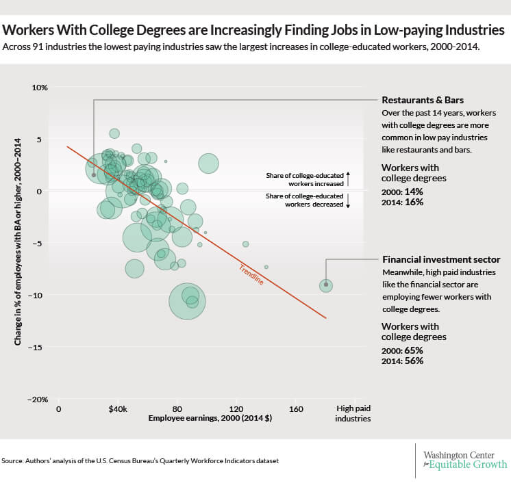
Our analysis examines the average earnings of workers in the 91 industry groups—identified by their 3-digit coding in the North American Industrial Classification System–which together account for nearly all employment in the United States, alongside the share of workers in each industry with a college degree or more. While not definitive, the most striking finding is that the industries with the lowest earnings for all employees are experiencing the largest increases in the share of workers with a college education or higher. Our analysis, for example, finds that 16.3 percent of all workers who work in restaurants and bars in the United States have attained a Bachelor’s degree or more, compared to 14.2 percent in 2000. In contrast, high-paying industries such as the financial sector saw their share of college-educated workers decrease, from 65.2 percent in 2000 to 56.1 percent in 2014 (See Figure 1).

Figure 1
08XX15-filtering-down-01-3

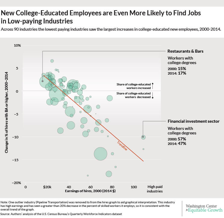
This “filtering down” trend in the employment of college-educated workers is even more acute when we look at recent hires rather than overall employment. The trend line over 2000-2014 is even more steeply downward sloping for hires than for all employees, highlighting the cruel game of musical chairs. In short, a college degree is becoming increasingly less predictive of employment in a high-earnings industry. (See Figure 2.)

Figure 2
If instead of plotting the change in employment of college-educated workers or the change in recent hires of college-educated workers on the vertical axis—as we have done in Figures 1 and 2—we had alternatively plotted the share of college-educated workers in total employment, or the share of college-educated workers in recent hires, then we would see that industries with higher average earnings tend to employ more credentialed workers. In other words, the trend line we would see in the alternative charts would slope up, not down. Findings of that kind, which depict the higher average earnings of college-educated workers, are typically trumpeted as evidence that the only thing preventing young, under-employed workers from finding a good job is their lack of a Bachelor’s degree. But what our analysis demonstrates is that this relationship has gotten less positive since 2000. (See the data appendix below for a complete description of the data and our methodology.)

This means that the changing share of workers with a college degree or more across industries is unlikely to be due to “skill-biased technical change” in low-earnings industries, since by and large workers in those industries are less prone to technological substitution. Think bartenders and busboys. Those workers perform what economists call “non-routine, manual” tasks that can’t easily be performed by pre-programmable machines. Nor does the rise in the share of college-educated workers in lower-paying industries merely reflect that there were fewer such workers in these industries prior to 2000, because the same trend is true among recent hires as among employees overall.

Finally, the increased hiring of workers with college degrees has not boosted the relative pay in those low-paying industries. The patterns are quite similar whether we calculate industry average earnings in 2000 or in 2014 because average earnings across industries haven’t changed very much. What’s changed is the education mix of workers.

The implication of all of these findings is that the U.S. labor market doesn’t lack for college-educated workers. Workers who have degrees are already taking jobs further and further down the job ladder. Encouraging or subsidizing higher education attainment will not solve the fundamental problem facing workers in the current job market: There are not enough jobs.

Data appendix

The U.S. Census Bureau’s Quarterly Workforce Indicators is a comprehensive administrative dataset of employment “matches,” meaning labor market relationships between employers and employees. The existence of a match (employment), the beginning of a match (hires), and the end of a match (separations) are observed in a given quarter, along with average earnings of workers in each group of hired workers, employed workers, and separated workers. The QWI is disaggregated by geography, industry, and many demographic characteristics, including, for our purposes, education attainment (discussed more completely below).

There are two predominant underlying sources of the QWI data: U.S. Census data and state unemployment insurance filings by businesses. QWI is the publically available version of a dataset called Longitudinal Employer-Household Dynamics, or LEHD, which follows individual workers from job to job over the course of their careers. QWI, however, does not track individual workers over time. Instead, quarter-by-quarter, it counts up all the flows described in the previous paragraph, for each detailed sub-population and employer category.

Because state-provided data from the unemployment-insurance system are critical to constructing LEHD and hence the QWI, and because states only began to participate in the LEHD at different points in time, the data are available as an unbalanced geographic panel. Every state except Massachusetts is currently providing data to the program, but the start dates vary by state. Enough states have joined by about 2000 that the literature has labeled QWI nationally representative from that point forward, which covers all the data reported in this exercise. We aggregate the data across states to create our industry-education disaggregation.

LEHD does not actually observe the education levels of most workers. For those it does not observe, education is imputed from other worker characteristics using Census Bureau microdata (mostly from the 2000 Decennial Census). That is the most likely reason why the QWI-reported share of college-educated workers has decreased by slightly more than one percentage point overall, and by substantially more in some industries. The imputation procedure works best around the date when its source data was collected (2000), and increasingly less well as we get further away from that date. The Current Population Survey, a representative sample of the population collected continuously, reports that the overall share of college-educated workers in the economy increased by approximately five percentage points between 2003 and 2012, and has only declined by a small amount in a very few industries.

The education imputation in QWI complicates the inference from exercises such as the one we present here, because the whole point of our interpretation is that educational attainment has become less predictive of workers’ experience in the labor market, and in particular, of their earnings, as better-educated workers are forced to take worse jobs. The effect of the data imputation, however, is most likely to mute the phenomena we highlight: if credentialed workers are taking jobs further down the labor market hierarchy, then workers who take jobs further down the hierarchy than they did in the past would be more likely to be misidentified as lacking educational qualifications. For that reason, we believe the imputation of education data means that our results understate the effect of filtering-down.

Tentative confirmation for this can be found in a regression of the change in the share of young workers on industry average earnings, which yields an even-more-sharply negative slope than Figures 1 and 2. In other words, young workers are filtering down the labor market even more starkly than BA-educated ones, according to QWI. Since young workers are more likely to have college degrees than retirees, the education-based regressions we present here probably understate the cruelty of the cruel game of musical chairs.

In order to construct Figures 1 and 2, we use a NAICS 3-digit Industrial Sector disaggregation of the QWI’s 2015Q3 Sex by Education files with all firm size and age categories for all available states and the District of Columbia. The data are smoothed using a four-quarter moving average, and nominal earnings are adjusted for inflation (to 2014 dollars) using the Consumer Price Index for all Urban Consumers, or CPI-U. We use the “stable jobs” concept, meaning only “full-quarter employment” is counted. A worker is “full-quarter employed” at a given match if and only if that worker has positive earnings from that match in the quarter itself and (at least) the ones preceding and subsequent. (Similarly, a “full-quarter hire” is one in which positive earnings are observed in the preceding, current, and subsequent quarters but not two-quarters-ago.)

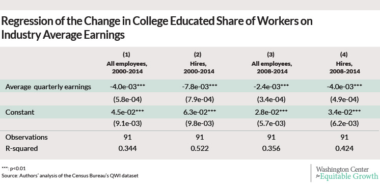
The dependent variables in the regression are calculated from either EmpS or HiraS (for employment and hires respectively), and the dependent variables are correspondingly EarnS or EarnHiraS. We use the education category corresponding to a “BA or more” to calculate college-educated shares of employment and hires, and we exclude workers aged 24 or under since QWI does not report education attainment for that age group. (See Figure 3.)

Figure 3
The raw data and the Python script we used to clean and reshape the raw data are available at Equitable Growth’s GitHub.

The prison boom and black-white economic inequality

Over the past 40 years, the observed earnings gap between African American men and their white counterparts closed slowly but steadily. The average black employed worker earned about a quarter less than the average white employed worker with similar experience in 2010 compared to about a third less in 1970. Such enduring earnings inequality is nothing to celebrate, but at least the trend line is encouraging.

Or is it?

Those reported earnings gains among black men fail to take account of different trends in incarceration and employment, which not only skews labor market statistics but also masks the debilitating economic consequences of the mass incarceration of African American men over the past several decades. When properly accounted, there is little reason to believe that the labor market prospects for black men relative to white men have improved over the past 40 years.

Let’s start with the “prison boom,” or more precisely, the trend in incarceration rates, which have more than doubled over the past 30 years. Today, more than 2.3 million people are locked up in local jails, state prisons, or federal prisons. Although this prison boom affected all racial and ethnic groups, it has had a disproportionate effect on African American men. In the 2010 Census, almost one in ten African American men ages 20 to 34 were institutionalized, while the corresponding rate for white men was only about one in fifty.

Further, on any given day in 2010, about one third of African American men who were high school drop-outs between the ages 20 and 34 lived in jails, prisons, mental health institutions, or nursing homes, and there is good reason to believe that the fraction in prison or jail exceeded the employment rate for this group. Of course, this is just at any given point in time. The fraction incarcerated at some point in life is even higher—about two-thirds by age 34, according to a recent book by sociologist Becky Pettit from the University of Washington.

While these statistics are not new to criminologists, they imply that a growing share of the U.S. population is missing from the government’s main source of information about the labor market: the Current Population Survey. The CPS only covers the non-institutionalized population, but the federal government uses it to calculate important measures of labor market outcomes such as wages, labor force participation, and unemployment rates as well as official poverty statistics, including the Census Bureau’s new Supplemental Poverty Measure.

As the missing data problem has become more severe, these measures have become more distorted, in particular with respect to trends in racial inequality. In a recent NBER working paper, economist Derek Neal and I argue that since 1970, the economic progress of African American men relative to white men has been quite anemic. We reach this conclusion by properly accounting for the growth of the prison population over this period, and hence the misleading picture derived from average labor market earnings for employed workers.

In our paper, we treat the median weekly wages of men in their prime working years as a proxy for their overall labor market prospects. Among the employed, the ratio of median weekly wages for African Americans relative to whites increased steadily from around 65 percent in 1970 to well over 75 percent in 2010, the most recent census year. Yet this statistic substantially overstates the recent relative progress of African Americans for two reasons. First, employment rates for working age men have declined much more among blacks than among whites, and growing numbers among the non-employed are incarcerated. Second, earnings prospects are now and have always been worse for those who are not currently employed.

Thus, we estimate what we call median potential wages for blacks and whites, making adjustments for changes in the numbers of non-employed and institutionalized persons over time. We find that the labor market prospects of black men relative to white men have not improved over the past 40 years. There have been slight ups and downs (with some noteworthy progress in the 1990s), but in 2010, the ratios of median potential wages among African American men to the median potential wages of their white peers were roughly at 1970 levels, across groups with different levels of experience.

Black-white economic convergence, then, has come to a halt after substantial progress throughout most of the past century, as documented in a seminal 1989 study by James Smith of the Rand Corporation and Finis Welch, then an economics professor at the University of California-Los Angeles. While it is difficult to quantify the exact contribution of mass incarceration to the lack of black relative progress in recent decades, some studies do find suggestive evidence that incarceration harms employment and earnings opportunities long after prisoners serve their time.

Our results concerning stalled relative progress for African American men are particularly noteworthy because we are also able to demonstrate that the prison boom was primarily the result of policy choices. At first glance, one might suspect that rising incarceration rates reflect increased criminal activity as a consequence of deteriorating legal labor market opportunities for people with little formal education. But the boom in crime is long over. Criminal activity and arrests for all non-drug-related offenses peaked in the early to mid-1990s and have been on the decline ever since. Drug-related arrests increased well into the late 2000s, but due to short average sentences, drug offenses on their own contributed relatively little to the overall boom in incarceration.

Instead, the main driver of the prison boom has been a move toward more punitive corrections policies across all offense categories, not just drug crimes. Such policies include so-called Truth-in-Sentencing laws, “Three Strikes” policies, and mandatory minimum sentences. As a result, arrested alleged offenders in each violent crime category are now at least twice as likely to spend more than five years in prison then they were in the mid-1980s. The pattern is perhaps even more striking for non-violent offenses: conditional on arrest, the probability of any given sentence length has increased—often by a factor of two or more.

Overall, an alleged offender in the 2000s can expect to spend about twice as long in prison as in the 1980s, conditional on the severity of the crime. Of course, not all of this shift necessarily reflects a change in policy. In particular, technological advances such as the use of DNA evidence may have increased the probability that an alleged offender is found guilty. But these new investigative methods have been adopted by other developed countries—and none of them have experienced changes in distributions of time-served among offenders that are even remotely similar to those we have seen in the United States. Therefore, it is hard to avoid the conclusion that sentencing and parole release policies have played the leading role. We estimate that the overall shift toward more punitive corrections policies probably accounts for between 70 and 85 percent of the growth in incarceration rates since 1985.

There is now substantial evidence that the boom in incarceration had an adverse effect on the relative economic progress of African American men, and that this prison boom was primarily a policy choice and not a result of deteriorating labor market conditions. Supporters of tougher corrections policies may argue that these policies have contributed to the decline in criminal activity over the past two decades. But even with our study, the costs of that crime reduction have not been fully counted and may not have been fully realized yet.

Some recent studies provide evidence that more punitive treatment of first offenders increases recidivism rates and prolongs criminal careers, and recent trends in the demographic characteristics of prisoners are consistent with this claim. Crime in our country was once almost exclusively a young man’s game, but arrest rates and prison admission rates for men ages 40 to 49 have risen disproportionately in recent years. In addition, we have not yet seen how policies that promote mass incarceration within particular communities will impact future generations from those communities.

—Armin Rick is Assistant Professor of Economics at Cornell University’s Johnson School of Management. His collaborator on this project is Professor Derek Neal of the University of Chicago Economics Department. Their paper, “The Prison Boom and the Lack of Black Progress after Smith and Welch,” was recently released by the National Bureau of Economic Research.

Nothing new under the labor market sun

The Bureau of Labor Statistics released new labor market data today showing that the U.S. economy added 209,000 jobs and that the unemployed rate ticked up slightly to 6.2 percent. Overall, the data show an economy continuing on its path of the past several years—a moderate recovery that is inadequate in light of the severity of job losses during the Great Recession.

The slight increase in the unemployment rate was due to an increase in the labor force and not a decline in the number of employed workers. According to the BLS household survey, the number of employed workers increased by 131,000 while the overall labor force increased by 329,000. This resulted in an increase in the labor-force participation rate to 62.9 percent in July from 62.8 percent in June.

The share of the population with a job, the employment-to-population ratio, was unchanged from 59 percent, still 4 percentage points below the most recent peak in December 2006. The ratio for the working age population (workers ages 25 to 54) slightly decreased to 76.6 percent from 76.7 percent.

The number of long-term unemployed workers (those without a job for 27 weeks or more) was essentially unchanged, according to BLS. This group continues to be a large share of the unemployed at 32.9 percent of all unemployed workers. The debate about the future of the long-term unemployed will continue. Some analysts, including economists at the Board of Governors of the Federal Reserve, claim that the long-term unemployed are getting jobs while others remain quite skeptical of the evidence.

Businesses added 209,000 total jobs during July, 198,000 coming from the private sector. The employment gains were less broadly based than in recent months. The diffusion index for private industries, a measure of how many industries added jobs, was only 61.9 percent in July compared to 65.3 percent in June and 64.4 percent in May.

Manufacturing added 28,000 jobs, and all of the gains (30,000) came from industries that manufacture durable goods. Specifically, 14,600 jobs came from the auto industry. Nondurable manufacturing industries shed 2,000 jobs in July led by food manufacturing (a loss of 3,600 jobs).

The data on wage growth, relevant to the current debate about slack in the labor market and the future of Federal Reserve policy, also showed little change. The year-on-year change in the average wage for all workers was 2 percent. Wage growth has hovered around this rate for the last year and shows no sign of acceleration. And the rate is well below its pre-recession level in 2007, which was closer to 3.5 percent.

080114-wage-growth-01

The data released today show a labor market that continues to heal from the Great Recession. But the recovery continues to come up short given the damage done in the past. With wage growth still subdued and no sign that the long-term unemployed are locked out from jobs gains, policy makers should be skeptical of calls to pull back on growth-boosting measures. Overly cautious policy would not only leave our economy weaker in the short run but undermine our long-term economic growth potential as well.

Morning Must-Read: Annie Lowrey: Recovery Has Created Far More Low-Wage Jobs Than Better-Paid Ones

Recovery Has Created Far More Low Wage Jobs Than Better Paid Ones NYTimes com

Annie Lowrey: Recovery Has Created Far More Low-Wage Jobs Than Better-Paid Ones: “The poor economy has replaced good jobs with bad ones….

‘Fast food is driving the bulk of the job growth at the low end…’ said Michael Evangelist…. Higher-wage industries–like accounting and legal work–shed 3.6 million positions during the recession and have added only 2.6 million positions during the recovery. But lower-wage industries lost two million jobs, then added 3.8 million…

Morning Must-Read: Evan Soltas: Wage Discrimination

Even Soltas: Yes, the Pay Gap Persists: “Mark Perry and Andrew Biggs… at the American Enterprise Institute argued… that no pay gap exists between men and women after you control for the different choices they make…. I took issue…. I found a persistent pay gap on the order of 4 to 10%…. And I also wrote that it’s probably wrong to take all these [controls] as unaffected by pressure or discrimination. Perry responded… that the pay gap might persist because of gender differences in risk tolerance…. [and] because professional athletes and musicians are paid well and tend to be men. Sadly, his argument makes no sense….

  1. My regression has ‘fixed effects’ for occupation. This means that it fully accounts for any occupation-level compensating differentials for risk. So everything Perry and Biggs write about men dying in forestry, or what have you–yeah, my analysis accounts for that. That’s what a fixed effect is.

  2. My analysis is of workers paid hourly wages. Professional athletes and musicians are not hourly workers….

Look, I understand why Perry and Biggs have to respond…. They misrepresented the research consensus on the gender pay gap in a major newspaper, and I called them out on it…. The 23-percent number reflects more than discrimination. But if they are going to try to explain away the pay gap, they’re going to need to try a bit harder than this.