Overview
Over the past half-century, the rise in women’s employment and earnings in the United States have boosted family incomes up and down the income ladder. Women’s increased time spent in paid employment means that families have lost time inside the home for caregiving, leaving many struggling to cope with the competing demands of work and life. Despite the time squeeze at home, however, women’s additional earnings have not meant that family incomes have increased faster than in earlier eras.
Changes in how women spend their time and its effect on family earnings look different based on where a family sits in the income distribution. Over the period from 1979 to 2013, women’s additional earnings made up for men’s declining earnings within middle-class families. Among low-income families, while women’s earnings helped, they were not enough to completely offset lower men’s earnings. The view is different at the top, where women’s earnings helped pull professional families to an even higher standard of living.
The United States is a nation where income trends also differ markedly across racial ethnic groups; families of color have lower incomes, on average, than white families. This issue brief explores the role that women’s added hours and earnings play in families across income and race and ethnicity.
Download FileAcross races, women bolster family economic security (pdf)
Read the full pdf in your browser
Using data from the Current Population Survey, this brief documents how family incomes changed between 1979 and 2013 for low-income, middle-class, and professional white, African American, and Latino families, decomposing the differences in male earnings, female earnings both from greater pay and more hours worked, and other sources of income over this time period. This analysis is an extension of the research presented in the forthcoming book, “Finding Time: The Economics of Work-Life Conflict,” authored by one of the co-authors of this issue brief, Heather Boushey.
Looking over the period from 1979 to 2013, our key findings are:
- Women from African American and Latino families work more hours, on average, than women from white families.
- While income grew at about the same pace for white, African American, and Latino families, actual levels of income are much smaller for families of color.
- Among low-income and middle-class families, the fall in men’s earnings meant that women’s added contributions were vital to ensuring positive—or less negative—changes in income across all racial and ethnic groups.
- Among professional families, women’s additional work hours improved family income more within white families than within African American and Latino families.
Introduction
Between 1979 and 2013, were it not for women’s rising work hours and earnings, low-income and middle-class families in the United States would have seen sharp drops in household income. Across families up and down the income ladder, women’s increased pay and work hours made the positive difference that American families needed in the wake of increasing instability and stagnant wage growth.
Though women have been vital for the economic success of their families, our analysis is also a reminder that soaring levels of income inequality in the United States—which may be further exacerbated by macroeconomic trends—have particularly harsh consequences for low-income and middle-income families. On average, between 1979 and 2013, low-income families lost income, middle-class families saw their income stall, and professional families experienced a nearly 50 percent income gain.
While we know that families of color—specifically African Americans and Latinos—face ongoing discrimination in the labor market and have lower earnings than their white counterparts, this issue brief explores whether these trends in the importance of women’s added work hours and earnings look different across families of different races or ethnicities.
This issue brief uses data from the Current Population Survey to calculate how incomes changed between 1979 and 2013 for low-income, middle-class, and professional families of different races in the United States. We decompose these changes into differences in male earnings, female earnings from more pay, female earnings from more hours worked, and other sources of income to find how much of a difference the transformations in female labor force participation have made to family incomes across income groups and races. As noted above, this analysis is an extension and update of the analysis presented in “Finding Time,” which covered the period from 1979 to 2012.
We find that while white, African American, and Latino families have all seen income growth at about the same pace, the changes in the actual levels of income are much smaller for families of color. Women’s earnings have made all the difference for low-income and middle-class families of all races, as men’s earnings fell. For professional families, however, women’s increased earnings from additional work hours has a much smaller positive role in the change in income for both African American and Latino families than for white families. Much of this disparity is driven by the fact that women’s earnings have traditionally played a larger role in total family income for African American families as compared to white families.
Defining income groups and family raceThis analysis follows the same methodology presented in “Finding Time.” For ease of composition, we use the term “family” throughout the brief, even though the analysis is done at the household level. We split households in our sample into three income groups. Low-income households are those in the bottom third of the income distribution, earning less than $25,440 per year in 2015 dollars. Professional households are those in the top fifth of the income distribution who have at least one household member with a college degree or higher; these households have an income of $71,158 or higher in 2015 dollars. Everyone else falls in the middle-class category. It’s more complex to define what race or ethnicity a family should be categorized as, especially considering the growing share of multiracial and multiethnic households in the United States. In this brief, we categorize a family as white, African American, or Latino based on the race and ethnicity of the person identified by the Census as the “household head.” We recognize this is an approximation and ideally the categories would be more inclusive. Breaking the category down smaller, however, does not give us a large-enough sample size for our analysis. Table 1 breaks down the distribution of racial and ethnic groups within each income group. Low-income families have a higher share of African American and Latino families, compared to middle-class or professional families. Table 1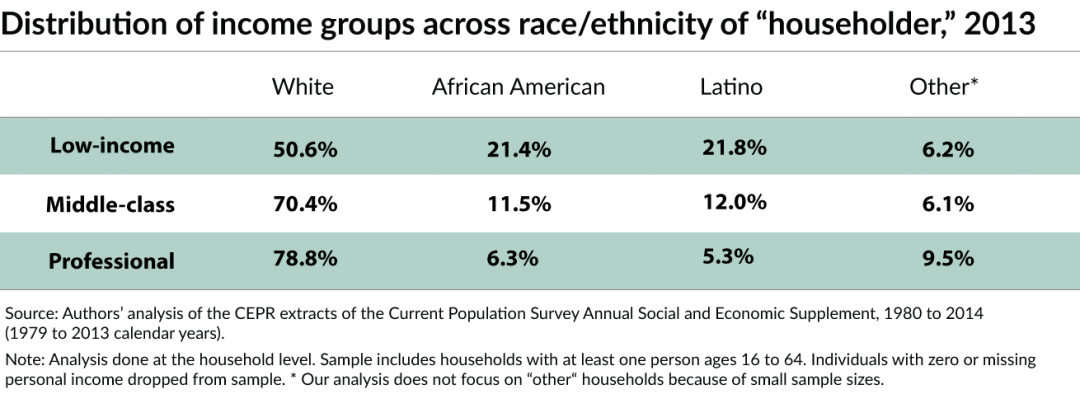
|
Setting some context
Before decomposing the changes in income, we will first set the broad context for how family incomes and women’s hours have changed across low-income, middle-class, and professional white, African American, and Latino families between 1979 and 2013.
How did family income change for different races across income groups?
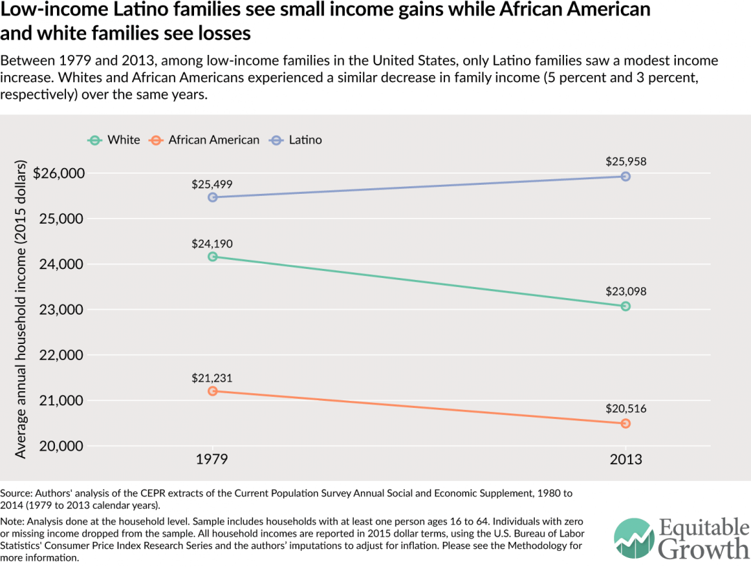
Between 1979 and 2013, across racial and ethnic groups, incomes for low-income families in the United States were either stuck or falling. Low-income white and African American families saw a fall in their income—4.5 percent and 3.4 percent, respectively. Latinos saw a modest increase in family income from $25,499 in 1979 to $25,958 in 2013, but these gains are fairly small—only a 1.8 percent increase over 34 years. (See Figure 1.)
Figure 1
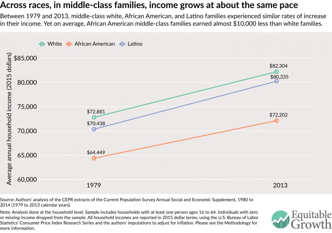
Middle-class families have seen parallel trends across all racial and ethnic groups. Between 1979 and 2013, incomes for white, African American, and Latino families grew by 12.9 percent, 12.0 percent, and 14.1 percent, respectively. (See Figure 2.) While all three groups saw modest gains, however, this growth did not close the income gap across racial and ethnic groups. In both 1979 and 2013, the average African American family had an income of nearly $10,000 less than the average white family. While Latino families also have a smaller family income than white families across the time period, the margin of difference (roughly $2,000) is much smaller.
Figure 2
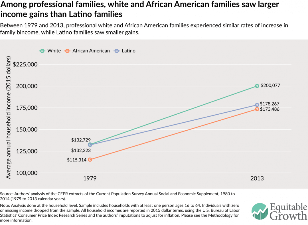
The biggest gains in income have been for professional families. Between 1979 and 2013, professional families saw substantial increases in family income across all three racial and ethnic groups. (See Figure 3.) White and African American families experienced similar rates of growth in their incomes (around 50.7 percent), while Latino families saw much slower growth (34.8 percent). As of 2013, Latino professional families had incomes closer to those of African American families compared to white families—a significant shift from 1979.
Figure 3
How did women’s working hours change for different races across income groups?
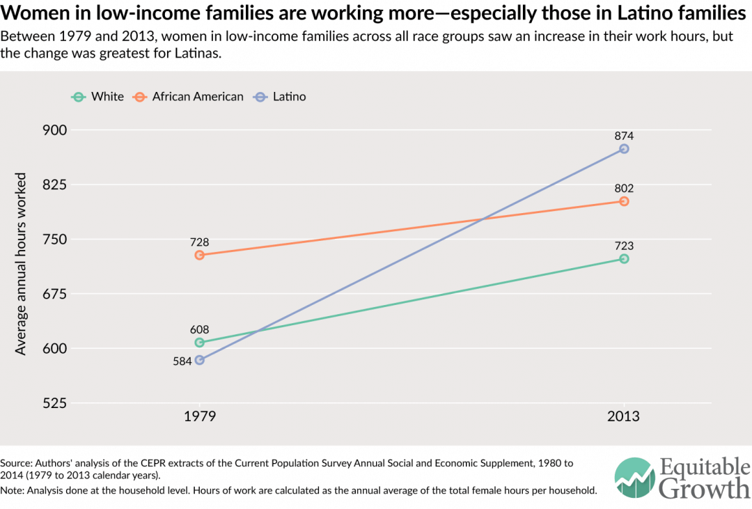
Between 1979 and 2013, low-income women from white, African American, Latino families put in more hours in paid employment. (See Figure 4.) Over this time period, women from white and African American families had similar increases in work hours. This meant that the employment gap between the two groups remained fairly steady: As of 2013, women in low-income African American families continued to work more hours than white women from low-income families.
Also noteworthy is the sharp increase in work hours for women from low-income Latino families over this time period. In 1979, these women worked an average of 584 hours per year—the lowest number among the three racial and ethnic groups—but by 2013, that number had risen by 50 percent, up to 874 hours. They now put in longer hours than either white or African American women in low-income families. This could be due to a variety of factors and was likely affected by the changing patterns in immigration and shifts in gender roles as these women acclimated to the U.S. workforce.
Figure 4
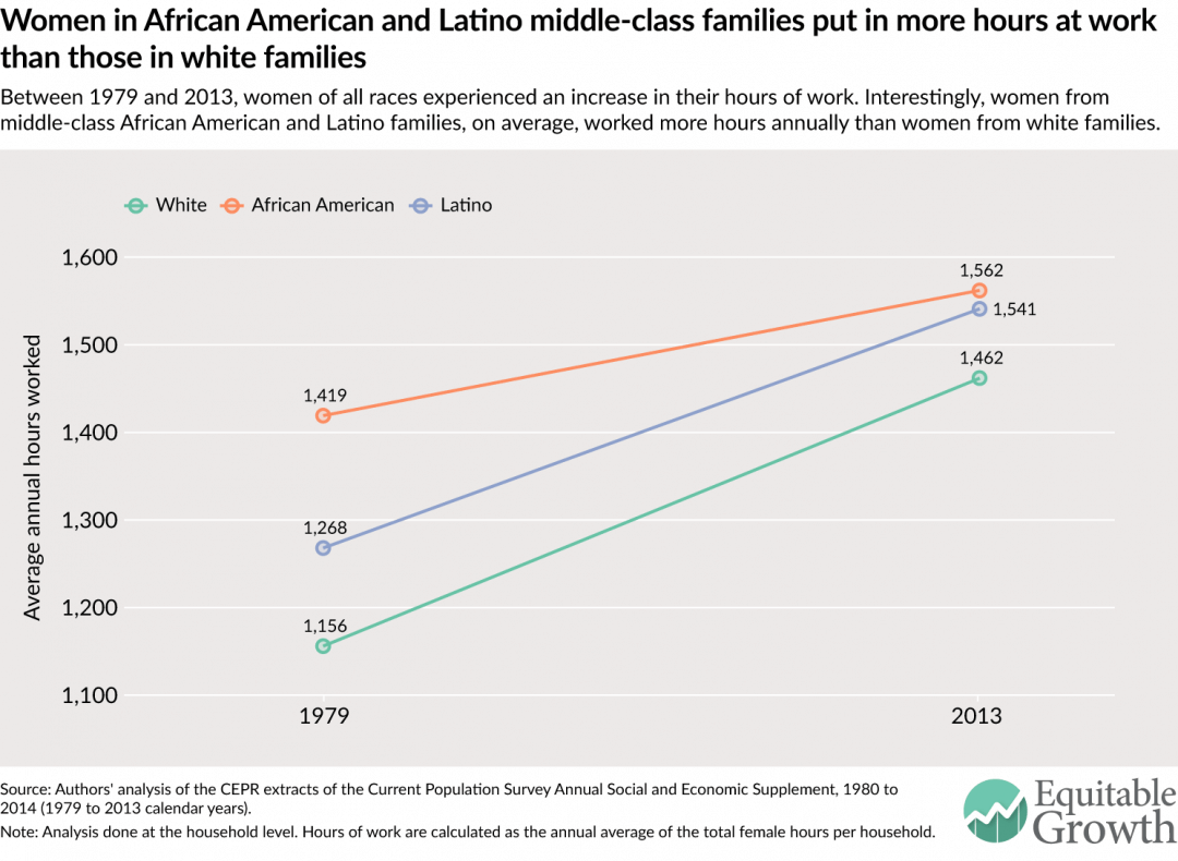
Between 1979 and 2013, women from middle-class households across all three racial and ethnic groups also increased their hours. (See Figure 5.) In both 1979 and 2013, within middle-class families, women from white families put in fewer hours than those from African American or Latino families. While the gap closed over time and women from white homes saw the largest percent increase in their work hours, the longest work hours among women in middle-class families in 2013 still came from African American families, followed by Latinos, then whites.
Figure 5
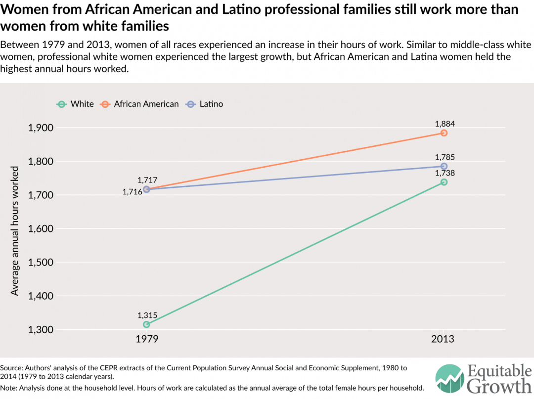
The trends in women’s hours of employment differ more across race and ethnicity for professional families than middle-class and low-income families. (See Figure 6.) Among professional families, between 1979 and 2013, women from white families saw the greatest rise in their work hours (32 percent). In 1979, they were putting in an average of 1,315 hours per year (25 hours per week), compared to 1,738 hours per year (33 hours per week) in 2013.
Yet women in professional white families still put in fewer work hours than women in professional African American or Latino families. Women from African American homes saw much slower rates of growth but still increased their work hours by close to 10 percent over the time period. Women from Latino homes experienced the smallest change (4.0 percent), raising their annual hours worked only by 69 hours.
Figure 6
Decomposing the changes in family income across income and race groups
We’ve seen that between 1979 and 2013, across all income groups and racial and ethnic groups, women increased their working hours. Women from African American and Latino families are working more hours on average than those from white families. Incomes have risen modestly for middle-class families across race and ethnic groups. In low-income families, incomes have fallen for African American and white families, while increasing marginally for Latinos. Professional families have seen their incomes rise across racial and ethnic groups, although white families continue to have the highest incomes.
Based on these broad trends, our question is: How did the changes in women’s work hours contribute to changes in family incomes across white, African American, and Latino families up and down the income ladder?
To unpack this, we decompose the changes in average family income into male earnings, female earnings, and income from Social Security, pensions, or any other non-employment-related source for each income group and racial and ethnic group. We specifically divide female earnings into actual wage differences between 1979 and 2013. We then use a calculation that finds the difference between 2013 female earnings and a counterfactual that holds 2013 hourly wages constant and multiplies them by the annual hours women worked in 1979 to arrive at the female earnings from additional hours.
As shown in the following breakdowns by income groups, the trends between white, African American, and Latino families are similar: On the whole, women’s increased earnings from both higher pay and additional hours worked has been a large positive factor in keeping family incomes steady. For professional African American or Latino families, women working additional hours has made a much smaller positive difference in boosting family income, undoubtedly because they started with higher average hours.
Low-income families
For white, African American, and Latino low-income households, female earnings from additional work hours shielded families from large decreases in income. (See Figure 7.)
Figure 7
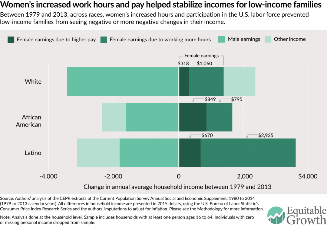
Women’s earnings from working more hours and earning more per hour boosted family income and were the only source of positive gains in African American and Latino families. For white families, women’s earnings from more hours contributed an average of $1,060 per year, and women’s earnings from more pay secured an extra $318. African American families saw much smaller changes in income over the time period, but here, too, women’s increased hours added $795 and women’s higher pay added $849.
Similarly, for low-income Latino families, women’s earnings were the only reason they experienced any income growth between 1979 and 2013. In these families, women’s added hours were especially important: Within Latino families, women’s increased work hours added an average of $2,925 and their higher pay added $670 to annual income.
It is notable that within low-income families across racial and ethnic groups, men’s earnings dragged down family income. Between 1979 and 2013, men in low-income families pulled down family income the most in white families, reducing overall family income by $3,446. This was larger than in Latino and African American families where declines in men’s earnings pulled down income by $1,624 and $1,825, respectively.
It’s also notable that between 1979 and 2013, African American and Latino families saw a decline in “other income.” This category includes any unearned income, such as interest payments or benefits, like Social Security or other income supports. While our data does not allow us to dig into the details, it is possible that this decline stems from the loss of income supports due to change in federal welfare policy in the mid-1990s.
Middle-class families
As in low-income families, across all three race groups for middle-class families, women’s earnings—both from more hours and more pay—and other sources of income have been the only components to increase family income. (See Figure 8.)
Between 1979 and 2013, women’s earnings and added hours accounted for the largest share of the gains for all three racial and ethnic groups. Women in white and Latino families added the most to income through their increased working hours ($5,750 and $4,884, respectively, in comparison to $4,880 and $4,425 from increased pay), while African American women’s earnings from increased work hours contributed much less to changes in family income than earnings from increased pay ($2,801 versus $5,925).
Figure 8
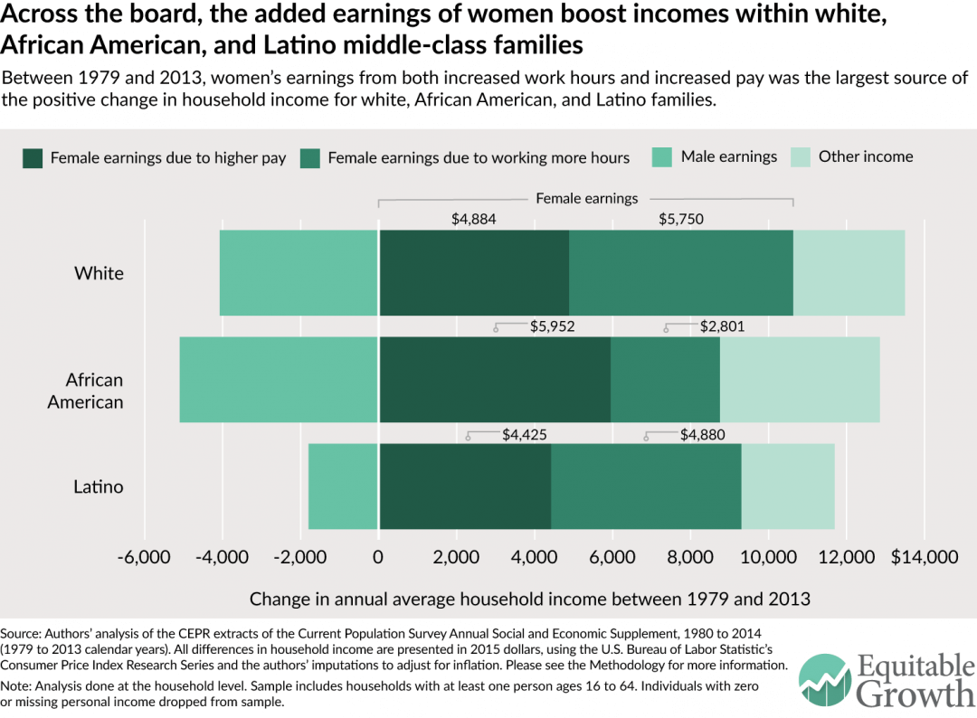
Like in low-income families, between 1979 and 2013, middle-class men’s average annual earnings fell across racial and ethnic groups. Without the added earnings of women, middle-class families of all races would have seen their incomes fall, all else being equal. The rising hours of paid employment among middle-class women documented in Figure 5 was a key factor in sustaining economic security for all kinds of families.
Professional families
While women’s earnings from working more hours have played a relatively large, positive part in supporting family incomes for both low-income and middle-class families across all three racial and ethnic groups, we document two different trends for professional families: Men’s earnings have boosted family incomes across all three racial and ethnic groups, and non-white professional family income hasn’t benefited as much from an increase in female labor force participation. (See Figure 9.)
Figure 9
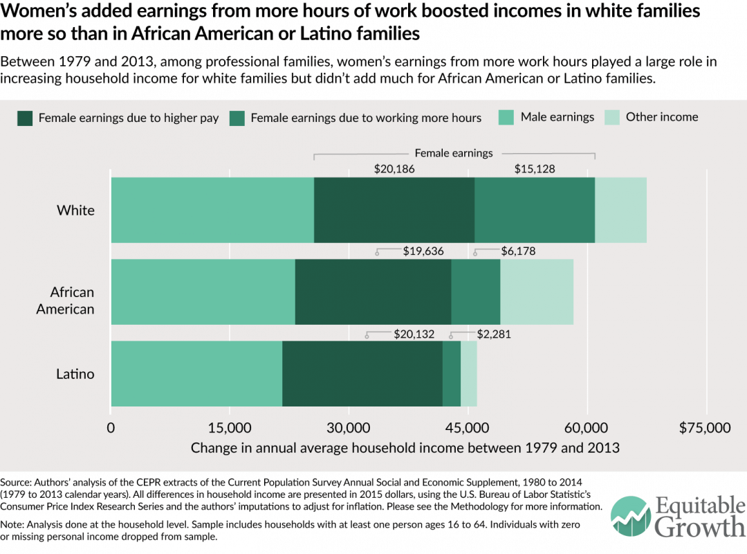
Between 1979 and 2013, among professional families across racial and ethnic groups, the combination of women’s added hours of work and more earnings per hour comprised the largest share of family income change. Within all these families, men’s earnings have also added to family income over time, unlike low-income or middle-class families.
When we decompose women’s earnings over this time period, women’s earnings from additional hours made up a larger portion of the change ($15,128, or 22 percent) in white families. African American and Latino families saw smaller gains from women’s increased work hours. African American women’s earnings from more work hours added $6,178 (or 11 percent of the total change) to family income, which was less than the changes brought in by other sources of income. And Latino women’s earnings from more work hours only added $2,281 (or 5 percent of the total change) to family income. This is consistent with Figure 6 where we showed a sharp rise in employment for women in white professional families and a fairly small increase for women in Latino families. It is notable, however, that that the gains from higher pay (as opposed to higher hours) are about the same across racial and ethnic groups.
Conclusion
Between 1979 and 2013, across income groups and across race and ethnicity, women’s increased working hours helped stabilize the family incomes of American families, though at varying degrees. Among low-income and middle-class families, women’s contributions were vital to ensuring positive—or less-negative—changes in incomes for white, African American, and Latino families. For professionals, women’s additional hours have made a larger difference for white families than for African Americans and Latino families, but women’s higher pay has improved incomes in all kinds of professional families.
What is clear is that all families have lost time. As women increasingly spend their days employed outside the home, we need to consider the variety of ways in which our labor market and social policies do—and often do not—support families. As one moves down the income ladder, workers are increasingly less likely to have access to employer-provided policies that help them address conflicts between work and life. Workers of color have additional barriers in accessing these policies, such as the ability to have a flexible schedule, controlling for a variety of factors.
As we consider solutions to help workers address conflict between work and family life, policymakers need to bear in mind the increase in average annual hours of work for women in families of color and the important role women’s earnings play within these families. We need policies to address the times when a worker needs to be at home to provide care for a few days or weeks; policies that ensure workers have access to predictable schedules and, ideally, some flexibility that works for employees and employers alike; policies that address the need for high-quality, affordable care for children and, increasingly, elders. And we also need to ensure that these policies are fairly implemented.
But it is not enough to just create more inclusive caregiving policies for workers of color. While generally, across race groups, women have made the difference for their families’ income, there’s also another important paradox at play here: Women from families of color have worked more hours on average than women from white families, yet their families still don’t enjoy the same incomes as white families, especially in the middle or at the top. To truly help women of color establish economic security for their families, we also have to endorse policies that help raise their wages.
When thinking about how to address the time squeeze for all families, caregiving and wage policies that are crafted to be equitable—especially across income and race groups—will go a long way.
Heather Boushey is the Executive Director and Chief Economist at the Washington Center for Equitable Growth and the author of the forthcoming book from Harvard University Press, “Finding Time: The Economics of Work-Life Conflict.” Kavya Vaghul is a Research Analyst at Equitable Growth.
Acknowledgements
The authors would like to thank John Schmitt, Ben Zipperer, Dave Evans, David Hudson, and Bridget Ansel. All errors are, of course, ours alone.
Methodology
The methodology used for this issue brief is identical to that detailed in the Appendix to Heather Boushey’s “Finding Time: The Economics of Work-Life Conflict.”
In this issue brief, we use the Center for Economic and Policy Research extracts of the Current Population Survey Annual Social and Economic Supplement for survey years 1980 and 2014 (calendar years 1979 and 2013). The CPS provides data on income, earnings from employment, hours, and educational attainment. All dollar values are reported in 2015 dollars, adjusted for inflation using the Consumer Price Index Research Series available from the U.S. Bureau of Labor Statistics. Because the Consumer Price Index Research Series only includes indices through 2014, we used the rate of increase between 2014 and 2015 in the Consumer Price Index for all urban consumers from the Bureau of Labor Statistics to scale up the Research Series’ 2014 index value to a reasonable 2015 index estimate. We then used this 2015 index value to adjust all results presented.
For ease of composition, throughout this brief we use the term “family,” even though the analysis is done at the household level. According to the U.S. Census Bureau, in 2014, two-thirds of households were made up of families, defined as at least one person related to the head of household by birth, marriage, or adoption.
We divide our sample into three income groups—low-income, middle-class, and professional households—using the the definitions outlined in “Finding Time.” For calendar year 2013, the last year for which we have data at the time of this analysis, we categorized the income groups as follows:
- Low-income households are those in the bottom third of the size-adjusted household income distribution. These households had an income of below $25,440 (as compared to $25,242 and below for 2012). In 1979, 28.3 percent of all households were low-income, increasing to 29.7 percent in 2013. These percentages are slightly lower than one third because the cut-off for low-income households is based on household income data that includes persons of all ages, while our analysis is limited to households with at least one person between the ages of 16 and 64. The working-age population (16 to 64) typically has higher incomes than older workers, and as a result, the working-age population has somewhat fewer households that fall into this low-income category.
- Professionals are those households that are in the top quintile of the and size-adjusted household income distribution and have at least one member who holds a college degree or higher. In 2013, professional households had an income of $71,158 or higher (as compared to $70,643 or higher in 2012). In 1979, 10.2 percent of households were considered professional, and by 2013, this share had grown to 16.8 percent.
- Everyone else falls in the middle-class category. For this group, the household income ranges from $25,440 to $71,158 in 2013 (as compared to $25,242 to $70,643 in 2012); the upper threshold, however, may be higher for those households without a college graduate but with a member who has an extremely high-paying job. This explains why within the middle-income group, the share of households exceeds 50 percent: The share of middle-income households declined from 62 percent in 1979 to 53.4 percent in 2013.
Note that all cut-offs above are displayed in 2015 dollars, using the inflation adjustment method presented earlier.
In our analysis, we limit the universe to persons with non-missing, positive income of any type. This means that even if a person does not have earnings from some form of employment but does receive income from Social Security, pensions, or any other source recorded by the CPS, they are included in our analysis.
These data are decomposed into income changes between 1979 and 2013 for low-income, middle-class, and professional families. The actual household income decomposition uses a simple shift-share analysis to find the differences in earnings between 1979 and 2013 and calculate the extra earnings due to increased hours worked by women.
To do this, we first calculate the male, female, and other earnings by the three income categories. To calculate the sex-specific earnings per household, we sum the income from wages and income from self-employment for men and women, respectively. The amount for other earnings is derived by subtracting the male and female earnings from total household earnings. We average the household, male, female, and other earnings by each income group for 1979 and 2013, and take the differences between the two years to show the raw changes in earnings by each income group.
To find the change in hours, for each year by household, we sum the total hours worked by men and women. We average these per-household male and female hours, by year, for each of the three income groups.
Finally, we calculate the counterfactual earnings of women. We use the 2013 earnings per hour for women and multiply it by the 1979 hours worked by women. Finally, we subtract this counterfactual earnings from the female earnings in 2013, arriving at the female earnings due to additional hours.
We repeated this analysis for families of different races, specifically white, African American, and Latino families. Defining what race or ethnicity a family should be categorized as more complex, especially as the share of multiracial and multiethnic households is growing. In this brief, we categorized a family as white, African American, or Latino based on the race and ethnicity of the person identified by the Census as the “household head.” In the CPS, this is coded as the first person observation within each household grouping. We recognize this is an approximation and, ideally, the categories would be more inclusive. However, breaking the category down smaller does not give us enough of a sample size for our analysis.
One important point to note is that because of the nature of this shift-share analysis, the averages don’t exactly tally up to the raw data. Therefore, when presenting average income, we use the sum of the decomposed parts of income. While economists typically show median income, for ease of composition and the constraints of the decomposition analysis, we show the averages so that the data are consistent across figures. Another important note is that we make no adjustments for changes over time in topcoding of income, which likely has the effect of exaggerating the increase in professional families’ income relative to the other two income groups.