What if we took equity into account when measuring economic growth?

Featured image from Flickr user Charles & Hudson. Image has been cropped.
Jason Furman’s provocatively titled new paper, “Should Policymakers Care Whether Inequality is Helpful or Harmful for Growth,” poses important questions about how we should think about the relationship between economic inequality and growth. Furman, the former chairman of the White House Council of Economic Advisers in the Obama administration (and new member of Equitable Growth’s steering committee), examines a key concept in economics dating back to the 1975 publication of Arthur Okun’s book Equality and Efficiency: that there is a tradeoff between an efficient, growing economy and an equitable economy. Furman questions several aspects of this basic premise.
Most subversively, Furman asks if economists are even measuring growth correctly. Forget the whole idea of “growth” for a moment and imagine instead that the question is simply “is inequality good or bad for society?” How can economists evaluate the good or bad part of this statement? Should they be interested in total economic output or something more granular such as wage growth for the middle class? Should they include noneconomic phenomena such as the health of citizens? Furman believes that insufficient thought has been given to this question as it relates to the study of inequality.
Traditionally, economists and policymakers measure the success of the economy using growth in Gross Domestic Product, which is a measure of all the goods and services produced within the United States. Growth in GDP means that there is a rise in the total economic output of the nation. But while journalists and policymakers alike often treat GDP growth as a sacred, inviolate marker of the health of our economy, economists know that GDP is just one measure among many that can be used to measure success. There is a vast universe of such possible measures, ranging from those that merely tweak the idea of GDP growth to those that upend it entirely. Those measures give us a very different picture of the economic progress of the nation. Importantly, the more these measures account for what economic growth looks like up and down the income spectrum, the less rosy the economic picture is in recent years.
How else can we measure success?
The question of how to measure success has been the subject of many book-length treatments and landmark reports. Some sociologists and economists have long taken the view that GDP isn’t measuring much of use.1 GDP does not measure the work of homeworkers, for example, or care about environmental quality or health outcomes. A country with high and increasing GDP could nevertheless be quite an unpleasant one to live in.
Furman focuses on one particular facet of this debate by noting that GDP growth places the same value on $1 of new income earned by the richest member of society as it does on $1 earned by the poorest member of society. But surely society would prefer to value more highly the $1 for the poor person because society values equity to some degree and because the rich person presumably values an additional dollar much less than the poor person does. And it might be better for growth too: The poor person is more likely to spend that $1, contributing to overall demand in the economy, while the rich person is likely to save it in ways that protect wealth but may not necessarily improve growth down the line. We can capture this moral and economic preference for equity by adjusting our measures of success. Furman gives three suggestions.
Median income
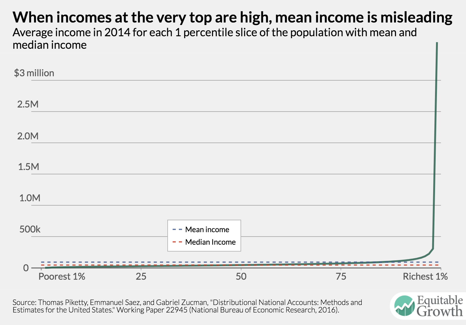
GDP growth is based on mean income—a simple average calculated by dividing total income (measured by GDP) by the number of people in the economy. When an economy includes many very rich people, this will pull up average income. Median income, which would be the income of the person in the exact middle if you lined up all the people in the United States from poorest to richest, doesn’t change if an already rich person gets significantly richer. It’s just the person in the middle. Thus, it’s an accurate indicator of success for someone in the middle of the income distribution. (See Figure 1.)
Figure 1
Growth for some particular slice of the income distribution
Furman suggests that economists and policymakers might simply look at only the slice of the income distribution they care about most. He suggests the bottom fifth of income earners, meaning the poorest 20 percent of society. While this is important, we focus in this analysis on what we call the upper 40 percent—that is, adults with incomes between the 50th and 90th percentile. This group represents the middle class and upper-middle class. Research shows that this group, though affluent, is losing ground relative to society’s truly rich in the top 1 percent of the income distribution. If overall growth outpaces growth in this group, then it suggests that growth is high for either the poorest earners or the very richest. This measure ignores other parts of the income distribution and cares only about growth in this slice. Income gained by someone in the top 10 percent—or the bottom 10 percent—will not impact this measure at all.
Mean log of income
This is an economic concept that requires a little explanation. Economists use this measure because it stretches out the bottom of the income distribution. For this measure, we transform the income of each person in the economy by taking the natural log of their income—we’re not going to explain here what a log is, but the figures below show how logging income affects its distribution. This will inflate small numbers and shrink large numbers relative to the rest of the numbers in the series because the log curve stretches the bottom of the chart out, increasing the importance of the gap between the poor and the middle class, and compresses the top of the curve, decreasing the importance of the gap between the middle class and the very rich. (See Figure 2.)
Figure 2
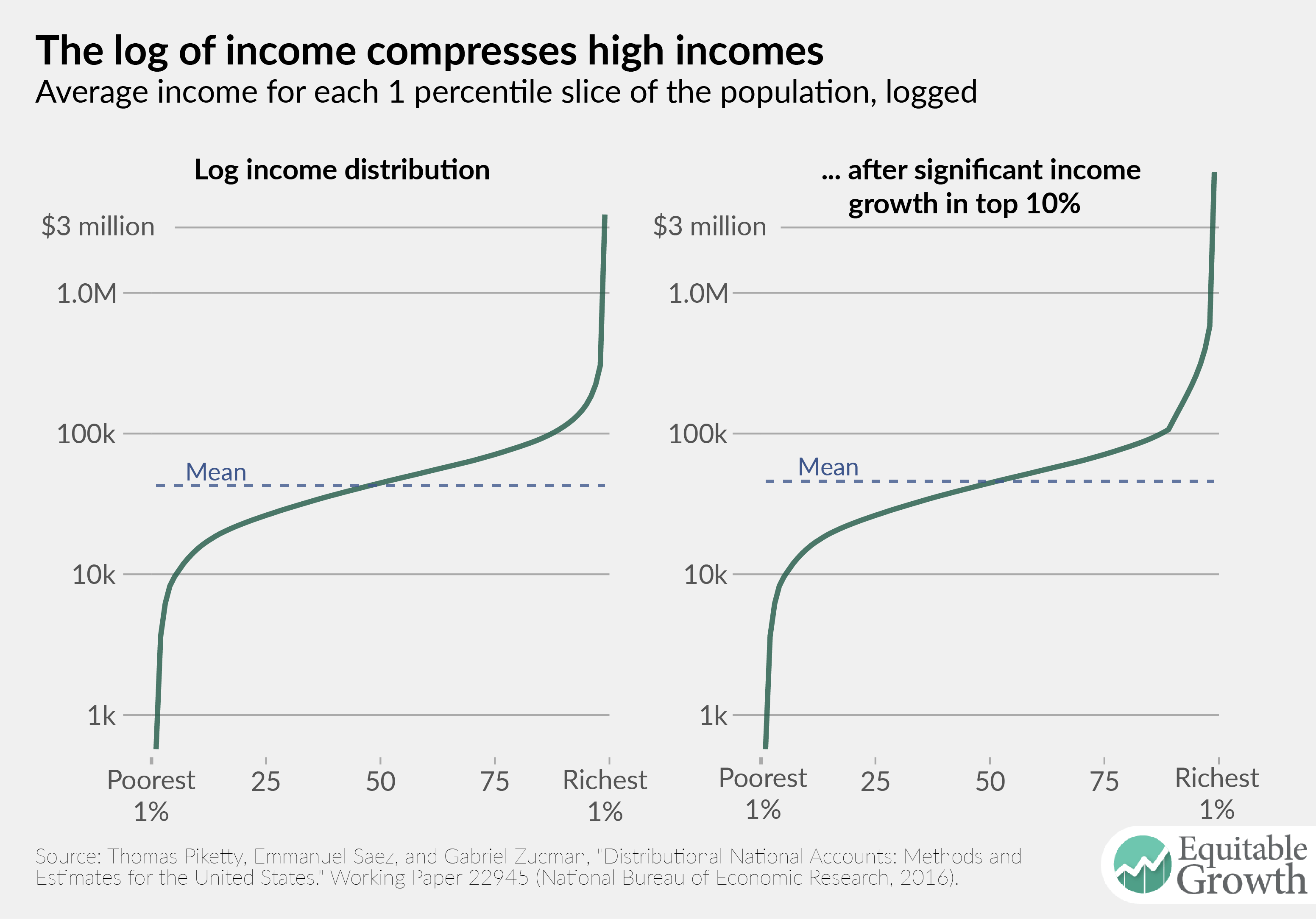
The graph on the left side of Figure 2 shows the 2014 U.S. income distribution logged. Notice how the incomes of the top 10 percent, which dominated the scale of Figure 1, are compressed. To show how mean log of income works, we massively inflated incomes of the top 10 percent in the second panel of Figure 2. Our manipulation represents a massive increase in total economic output: By traditional measures, we have increased economic output by 56 percent. But notice how little the mean moves in the second panel. The log of mean income increases just 7 percent in this scenario. Because this change in income was so inequitable, it had very little impact on the mean log of income.
Using mean log of income means that income changes for the poor will have a large impact on growth, whereas income changes for the rich will matter very little for growth. An additional $1 in the hands of a rich person matters less for overall growth than $1 in the hands a poor person, reflecting the intuition Furman advances about equal amounts of growth having different values to different people and to the economy as a whole.
Examining different measures of growth
How would economists and policymakers’ view of growth in the United States change if they looked at some of these alternate measures? We used the Distributional National Accounts dataset created by economists Thomas Piketty at the Paris School of Economics and Emmanuel Saez and Gabriel Zucman at the University of California, Berkeley to evaluate each of the alternative growth measures mentioned above. The Distributional National Accounts dataset takes aggregate GDP—about $19 trillion in the United States right now—and estimates how it is distributed between all adults in the economy.2 By disaggregating economic growth in this way, economists can use it to construct various national income measures from the dataset that might otherwise be difficult to observe and that are directly comparable to total output growth.
Distributional National Accounts is based on Net National Income, which is a bit different from GDP but exhibits similar patterns of growth.3 All the measures we have calculated here are for income after all government taxes and transfers are accounted for—think government programs such as Supplemental Nutrition Assistance or the Earned Income Tax Credit—which tend to reduce inequality in the United States.
1963–1980
Figure 3 shows the trend in overall Net National Income growth and our three alternative measures of NNI growth from 1963 to 1980. The thick green line shows overall NNI growth. For most of this period, all four lines are very close to one another. This suggests that growth was relatively even across all income groups. (See Figure 3.)
Figure 3
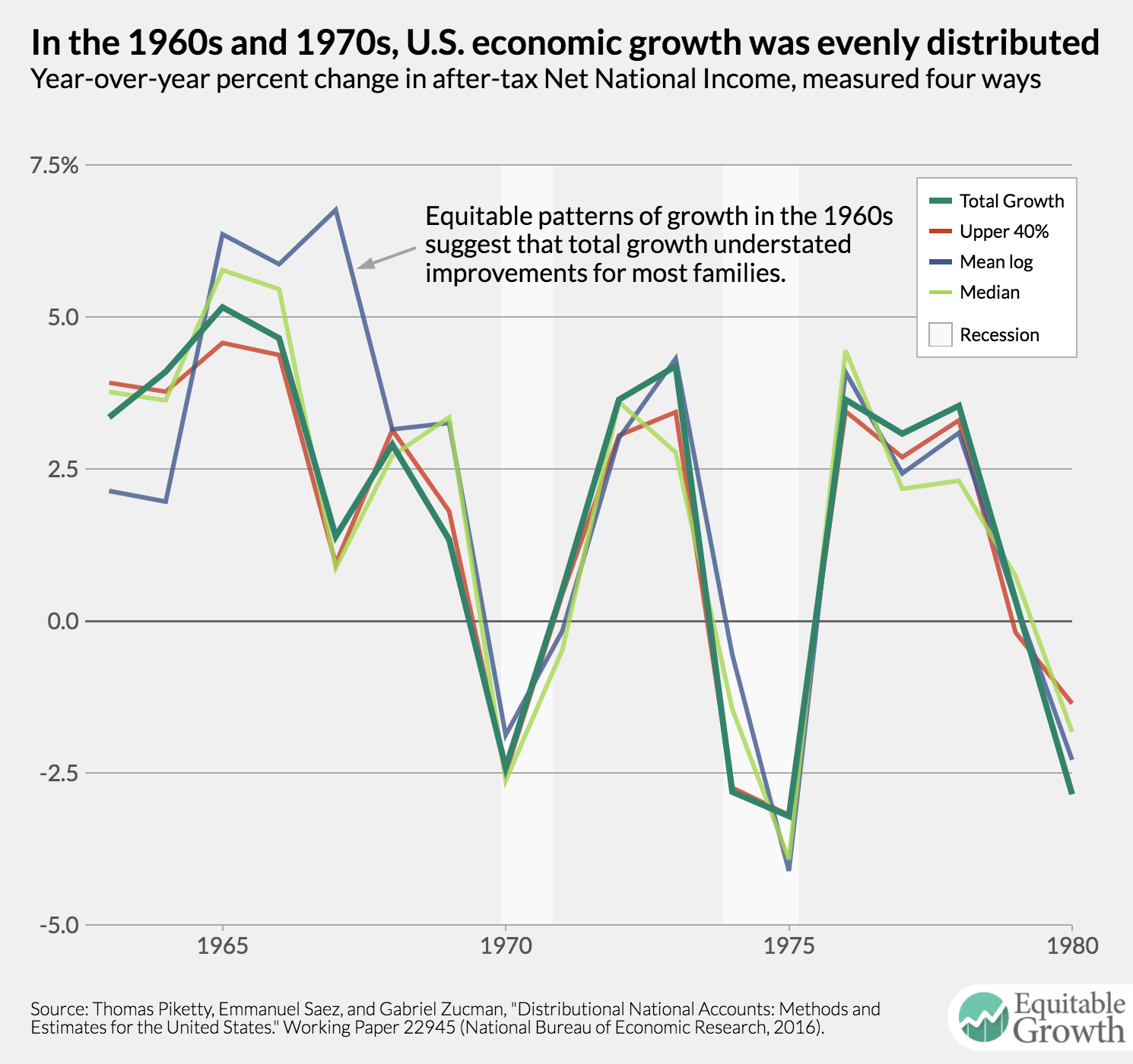
The one exception is in the mid-1960s, when growth in the mean log of income is much higher than growth in the other three measures. Remember that mean log of income will tend to highlight gains at the bottom much more than gains at the top. This discrepancy between 1965 and 1967 indicates that growth in those years was very strong for those below the median income.
1980–1990
In the 1980s, we start to see some real divergence in our measures of growth. Most notably, Figure 4 shows that at three growth peaks in 1981, 1984, and 1988, overall growth is higher than any other measure of growth. Those in the upper 40 percent of the income distribution registered growth running a little behind headline growth, with both running several percentage points ahead of the mean log of income. Income inequality started to take off in the 1980s. In 1984, for example, growth for the top 1 percent was a stunning 19 percent, while growth for the bottom 90 percent was just 4.2 percent. (See Figure 4.)
Figure 4
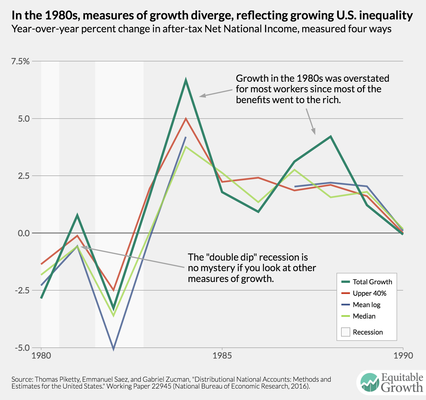
Our alternate measures of growth also solve the mystery of the “double dip” recession of the early 1980s highlighted in Figure 4. The recovery in 1981 was really only a recovery for those with high incomes. Any other measure of growth would have shown that the economy was still in recession during this period.
Compare Figure 4 to Figure 3. Notice that the booms of the 1980s that appear to surpass or equal those of the 1960s and 1970s would be much less impressive if economic growth were measured using the mean log of income or median income. The 1984 peak would be comparable to the 1973 and 1976 peaks, while the peak of 1987 and 1988 would be seen as quite weak in this historical context.
1990–2014
In the 1990s, the various measures once again move into relative alignment. As Figure 5 shows, however, overall growth continues to be about half a percentage point larger than growth by our alternative measures in most years. (See Figure 5.)
Figure 5
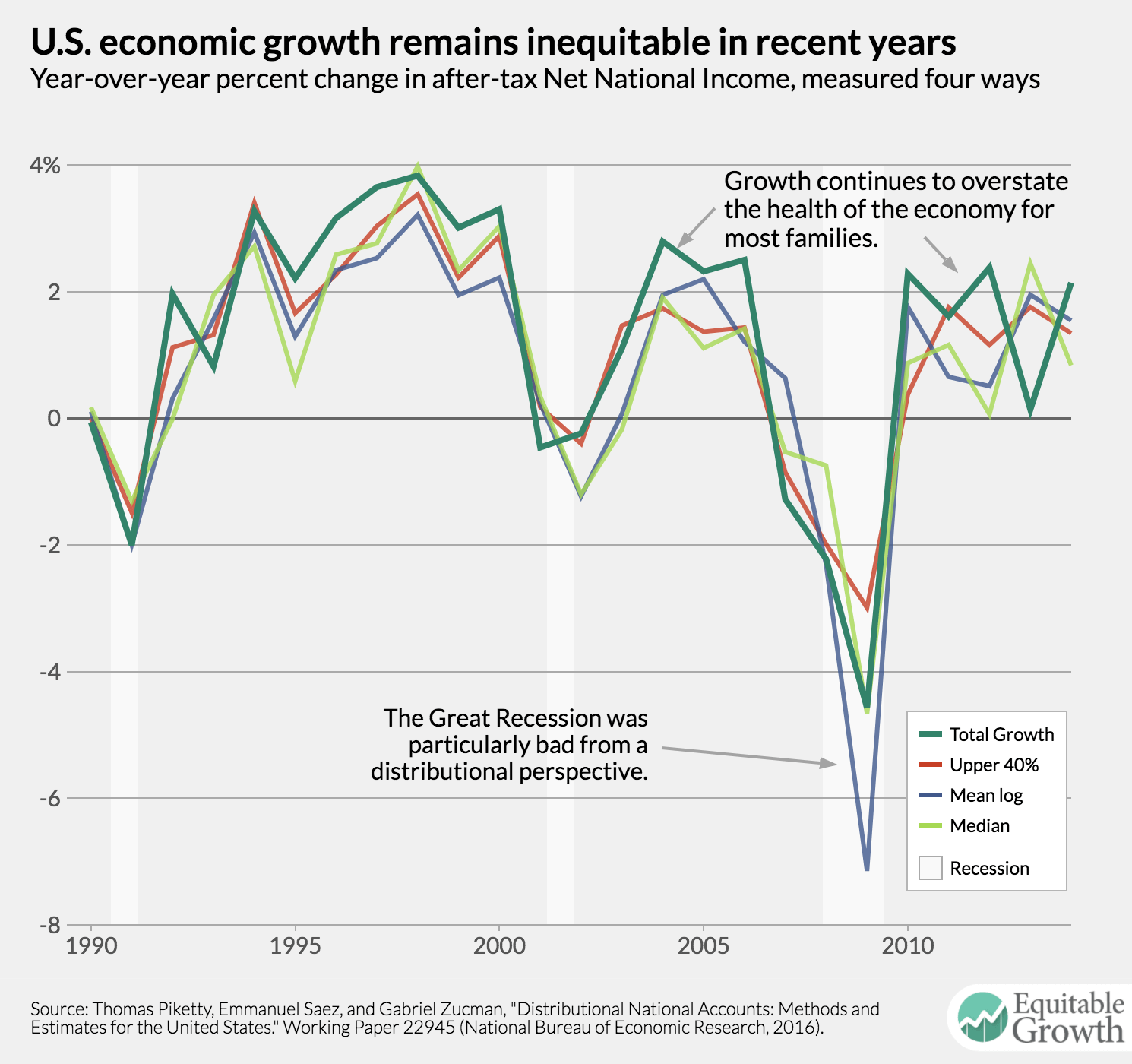
Of particular note in this time period is the Great Recession, spanning from the end of 2007 to mid-2009, when overall growth was significantly less negative than mean log of income growth. Although the Great Recession hit all income brackets hard, it was particularly damaging for those at the bottom of the income ladder. Earners in the bottom 50 percent of the income distribution saw income growth almost 3 percentage points lower than those in the top 1 percent.
What is the right measure of growth?
The four measures shown in the graphs above could all be reasonable ways of thinking about measuring progress in the U.S. economy. Each requires making a value judgement about what kind of growth we value. This is no less true of GDP growth. As Figure 4 demonstrates, GDP growth can paint a very misleading picture of the health of the economy, suggesting that we are in a robust recovery when, in fact, only a small number of households are benefitting.
Furman is right to suggest that this is a debate economists and policymakers should have. Unfortunately, the economic indicators reported by the U.S. Bureau of Economic Analysis do not provide sufficient detail to calculate, for example, the mean log of income. In fact, the quarterly GDP indicators, called the National Income and Product Accounts, provide no distributional information at all. The task of decomposing growth by income quantile has fallen to academic economists. Until the BEA takes up the task of reporting distributional income totals, decisionmakers will continue to lean on GDP growth, and they will continue to be misled by it.
End Notes
1. Marilyn Waring and Gloria Steinem, If Women Counted: A New Feminist Economics (San Francisco: Harper, 1990); Joseph Stiglitz, Amartya Sen, and Jean-Paul Fitoussi, “Report by the Commission on the Measurement of Economic Performance and Social Progress,” n.d.
2. Thomas Piketty, Emmanuel Saez, and Gabriel Zucman, “Distributional National Accounts: Methods and Estimates for the United States.” Working Paper 22945 (National Bureau of Economic Research, 2016), available at http://www.nber.org/papers/w22945.pdf.
3. Ibid, see page 7 for an explanation of why Piketty, Saez, and Zucman favor National Income.