The once and future measurement of economic inequality in the United States
A slew of research into economic inequality replete with serious looking graphs may give the impression that measuring inequality in the United States is a solved problem. This is misleading. Inequality is still measured incompletely because existing U.S. government statistics do not attempt to match their estimates to the National Income and Product Accounts. NIPA is the source of the most reported and well-understood economic statistics such as the nation’s Gross Domestic Product and quarterly GDP growth figures.
Because existing estimates of economic inequality are not pegged to NIPA, they don’t account for all sources of income. They may exclude, for example, fringe benefits provided by employers such as employer-provided health insurance and retirement benefits, government transfers such as supplemental nutrition assistance or the child tax credit, government services such as public education, and tax expenditures such as the home mortgage tax deduction and tax breaks for employer-provided insurance. These exclusions, big and small, make many existing estimates of inequality fundamentally incomparable to our most well-established measures of economic growth.
This wasn’t always the case. The Office of Business Economics—the precursor to the U.S. Department of Commerce’s Bureau of Economic Analysis—compiled inequality data decades ago, starting in 1947 and ending in 1971. These estimates were relatively simple: They divided households into five quintiles and reported the accumulated income of each quintile. The bottom 20 percent of households, for example, held 5 percent of all personal income in 1956, while the top 20 percent held 44.9 percent of all personal income. (See Figure 1.)
Figure 1
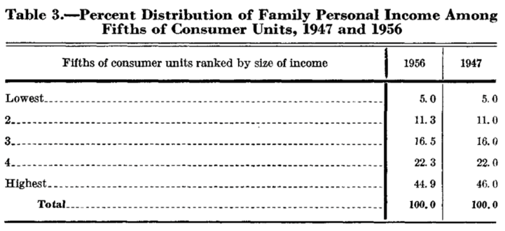
Inequality remained fairly stable during this period. Because economic prosperity was broadly shared from the end of World War II until the early 1970s, the distribution of income rarely changed. As one researcher noted, “the relative distribution of income has remained virtually constant over the post-war period.” Unfortunately, these estimates were discontinued due to a lack of resources at an inopportune time: Income inequality would increase slowly starting in the 1970s and more rapidly in the succeeding decades.
Today, with inequality increasing, there is rekindled interest within the Bureau of Economic Analysis in measuring inequality alongside growth. A new paper in the BEA’s Survey of Current Business attempts to reconstruct measures of inequality that are pegged to NIPA, similar to those compiled in the middle of the 20th century. The team of current and former government economists—Dennis Fixler at the BEA, David Johnson at the University of Michigan, and Andrew Craig and Kevin Furlong at the BEA—merge the Current Population Survey and the Consumer Expenditure Survey to construct estimates of income for each quintile of the U.S. population between 2000 and 2012.
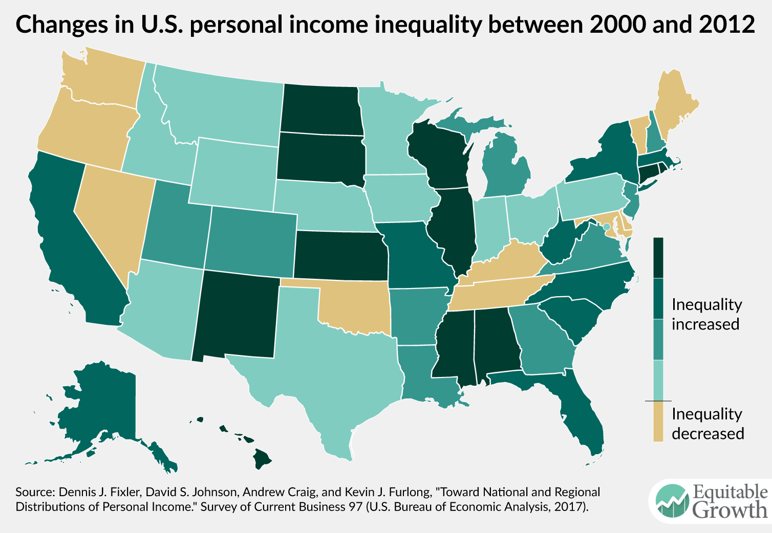
They find that the top 20 percent now hold about 52 percent of all personal income. Moreover, the paper moves beyond the BEA’s older efforts in key ways. The authors provide estimates of inequality for regions of the United States and for each state individually, as well as the change in inequality between 2000 and 2012. (See Figures 2 and 3.)
Figure 2
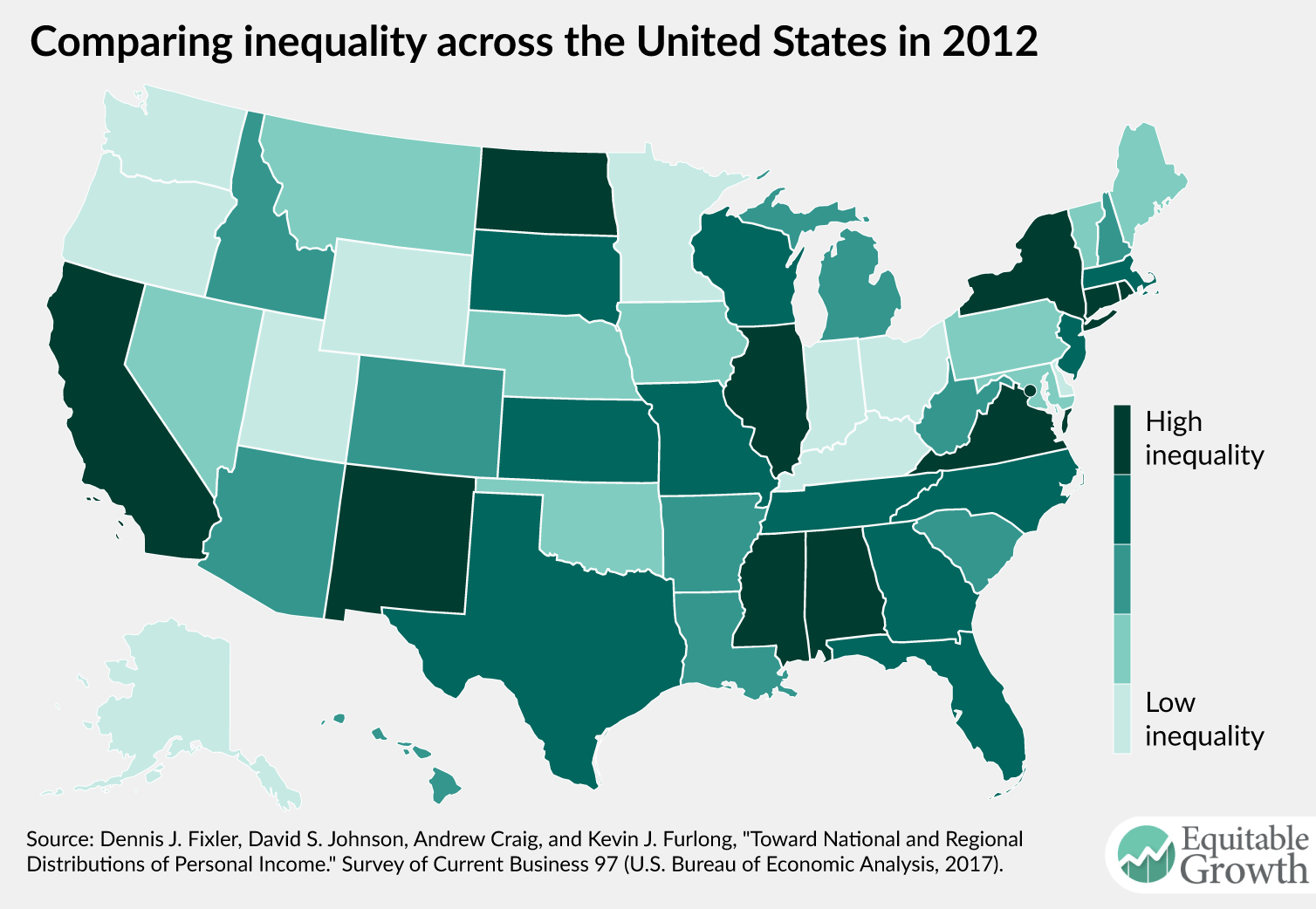
Figure 3
In the paper, “Toward National and Regional Distributions of Personal Income,” the four authors also decompose personal income by category, showing how Social Security income, Medicare benefits, and more are shared by each quintile of the income distribution. They find, for example, that 86 percent of all dividend income flows to the top 20 percent of U.S. households, highlighting the near-monopoly that upper-class households have over financial assets.
There are limits to what can be done with the tools that are currently available. Respondents to the surveys under- and over-report income, for example. Some components of income are missing entirely and must be estimated based on what clues are available. The two surveys used are linked using a procedure that introduces some error into the estimates. Other estimates of inequality show that it is important to break out the top 10 percent of income earners or even the top 1 percent of earners, and these groups are not addressed in this paper.
Another approach, by Thomas Piketty at the Paris School of Economics and University of California, Berkeley economists Emmanuel Saez and Gabriel Zucman, uses tax data to look at very high earners, showing that the top 1 percent and even the top 0.1 percent have been the foremost beneficiaries of recent increases in inequality. Ultimately, better surveys and more interagency access to U.S. government administrative data is necessary to address the challenges of providing better inequality statistics.
The ability to look at the geographic distribution of inequality and at slices of income within different income groups teases the possibilities of a more robust project to disaggregate the National Income and Product Accounts statistics that are currently the most referenced statistics of economic progress in the nation. Devoting federal resources to the project could allow us to track inequality not only by income bands, but also by age, geographic location, gender, ethnicity, and type of income.