
Key Takeaways
- The national debate over federal borrowing is dominated by a single number—debt as a share of U.S. Gross Domestic Product, which is now nearly eclipsing its World War II record. But the debt-to-GDP ratio compares a stock the country has accumulated over generations with the income accrued in a single year, missing many resources that a nation could draw on to manage its fiscal health.
- A complementary, long-underused measure—debt relative to total private wealth—compares a stock with a stock. As of 2024, U.S. federal debt held by the public equaled about 21 percent of all private wealth, a little more than half its World War II peak of roughly 38 percent, even as the debt-to-GDP ratio, at about 96 percent, had climbed back to within striking distance of its wartime high.
- The two measures diverge because private wealth has grown far faster than the U.S. economy. Private wealth in the United States rose from about 2.7 times GDP in the 1940s to roughly 4.6 times GDP today.
- Measured against the wealth of the richest households, today’s debt is modest by historical standards—roughly 0.6 times the wealth of the top 1 percent, about 1.1 times that of the top 0.1 percent, and about 2.2 times that of the top 0.01 percent. That bears directly on the common claim that there “is not enough money at the top” to bring our debt to a more manageable level.
- Internationally, the U.S. debt-to-wealth ratio sits in the middle of the pack among advanced economies—below Japan, Finland, Italy, and the United Kingdom, and above France, Canada, Germany, Sweden, and Norway.
- Debt relative to wealth does not define a “safe” level of borrowing, and it shares the central limitation of the debt-to-GDP measure: There is no agreed-upon benchmark for what counts as high or low. But widening the menu of options policymakers might weigh—including taxes on wealth and property—is important and also gives researchers a new variable for studying how debt, austerity, interest rates, asset prices, wealth inequality, and economic growth interact.
- What this means for growth: In some circumstances, high government debt can drag down growth by driving up interest rates and thus crowding out private investment. But there also is strong evidence that certain public investments, whether debt-financed or not, can “crowd-in” private investments, especially in areas where only the federal government has the means to create the legal and economic infrastructure to deliver stable markets and public goods—for example, by shepherding a green energy transition or building human capital. Giving policymakers and researchers new metrics by which to gauge fiscal risk, such as the debt-to-wealth measure detailed in this report, can help them manage and study that risk in a way that prioritizes strategic, pro-growth public investment over anti-growth, across-the-board austerity measures.
Overview

Few statistics shape the fiscal debate in the United States as powerfully as the ratio of federal debt-to-Gross Domestic Product. Debt held by the public recently surpassed 100 percent of GDP for the first time since the 1940s, increasing from 96 percent in 2024. The nonpartisan Congressional Budget Office projects that under current law, it will break the post-World War II record of 106 percent of GDP before the end of the decade.1
This comparison to the wartime peak has become a fixture of budget commentary, a shorthand for the idea that the country has entered fiscally uncharted and dangerous territory. Net interest on the debt is now among the fastest-growing items in the federal budget, on track to consume more than $1 trillion a year, potentially displacing critical public investments. The pressure is real—and so is the temptation to read a single ratio as a verdict.
There is a reason the debt-to-GDP measure dominates. It scales the debt by the size of the economy, offering a quick gauge of how hard repayment might be and a common yardstick for comparisons across time and across countries. It is certainly far superior to simply measuring the debt in nominal or even inflation-adjusted dollars. But it carries real limitations. The most basic is conceptual: It sets a stock of accumulated borrowing over decades against a single year’s flow of income. No one expects a country to retire decades of debt out of one year of output, and similarly one very good year for GDP does not mean the debt magically disappears. Moreover, income is not the only revenue base a government can tax.
The stakes are not abstract. The United States faces real pressure to raise revenue in the years ahead—not only to put federal debt on a more sustainable footing, but also to fund the kind of pro-growth public investments, especially in children and families, that pay dividends for decades. How large the existing debt appears, and how much room policymakers believe they have to act, depends heavily on the yardstick they choose.
This report develops a complementary lens to the debt-to-GDP ratio: debt relative to total private wealth, or the combined net worth of everyone living in the United States.2 By weighing the debt the country has accumulated against the wealth it has accumulated, the measure offers a more apples-to-apples picture of fiscal capacity. And because wealth has grown so much faster than income over the past four decades, it offers a markedly less alarming one.
We trace the U.S. debt and private wealth data back to 1940, break it down by wealth distribution, place the United States in international context, and discuss candidly what the measure can and cannot tell us. Briefly, we find the debt-to-wealth ratio could be a second yardstick for fiscal policymakers to consider—not a new answer about what is safe but a more complete picture of what is possible.
The debt-to-GDP ratio is useful but only part of the picture
Dividing what a government owes by the annual output of its economy produces a single, comparable number—one that lets analysts ask, at a glance, whether today’s debt is large or small relative to the past and how one country stacks up against another. As a rough proxy for the capacity of an economy to service or retire its debt, it is a reasonable starting point. But it is not a complete picture of a country’s available resources for addressing the revenues needed to service the public debt.
The first shortcoming is the stock versus flow mismatch. The numerator in debt-to-GDP is everything the country has borrowed and not yet repaid; the denominator is what the economy produces in 12 months. Comparing the two can be misleading because no one imagines a nation extinguishing generations of accumulated debt using a single year’s income, and focusing on the size of aggregate debt does not say anything about the current cost of servicing (paying interest on) that debt. Nor is taxing the annual income flow the only way to raise revenue. Taxes on wealth—state and local property taxes on homes and commercial buildings are the most familiar example—can raise money no matter whether the underlying asset generates income in a given year or whether it shows up in GDP at all (most income from home and other asset sales, known as capital gains, are not included in GDP).
The second shortcoming is missing context. The debt-to-GDP measure reveals nothing about who that income is accruing to, how willing the political system is to tax it, or how large other potential tax bases are, including wealth. Perhaps because of these omissions, decades of public-finance research using debt-to-GDP ratios have produced little consensus on the questions policymakers care about most: whether and when higher debt pushes up Treasury yields3 or raises the odds of an outright fiscal crisis in which investors refuse to absorb new debt issuance.4
The well-known dispute over whether debt higher than a 90-percent threshold reliably slows growth is emblematic of how unsettled the empirics remain.5 The influential 2010 study by Harvard University economists Carmen M. Reinhart and Kenneth S. Rogoff, which examined that threshold, found that economic growth drops off sharply once gross debt crosses that line—a finding invoked in austerity debates on both sides of the Atlantic. But since then, other economists working from those two authors’ own spreadsheet, traced part of the result to a coding error and contested data choices, after which the apparent cliff softened into something far more ambiguous.6 This episode is a cautionary tale against treating any single debt ratio as a bright line between safety and danger.
Two further complications muddy any simple reading. Governments that borrow in their own currency can, within limits, inflate part of their debt away. And because the U.S. dollar is the reserve currency of the global financial system, U.S. Treasury securities enjoy demand they would not otherwise command—loosening the constraints that bind other sovereign borrowers.7 None of this means the debt-to-GDP measure itself is wrong, but rather that the measure is incomplete. For researchers and policymakers alike, the goal should not be to pin down a single “safe” level of debt—probably an impossible task—but to assemble several complementary lenses that, together, produce a more textured analysis.
Debt relative to wealth is a stock-to-stock alternative measure
Total private wealth is the sum of the net worth of all U.S. residents,8 including homes and mortgages, businesses, stocks and bonds, pensions, and other assets, netted against what households owe.9 Setting the federal debt against this figure has two main appeals. First, it is genuinely an apples-to-apples comparison of one accumulated stock with another.10 Second, it captures the full base of private resources a government could, in principle, reach for raising revenue.11
The result reframes the headline story. As of 2024, U.S. federal debt held by the public equaled about 21 percent of total private wealth in the country. Its World War II peak, in 1945, was roughly 38 percent, so today’s debt is a little more than half as large, relative to the nation’s wealth, as it was at the height of the war effort.12
By placing this measure alongside the familiar debt-to-GDP ratio, the two lines reveal different stories about the present moment. By the conventional GDP yardstick, the United States is nearly back to a wartime emergency; by the wealth yardstick, however, it is well short of one. (See Figure 1.)
Figure 1
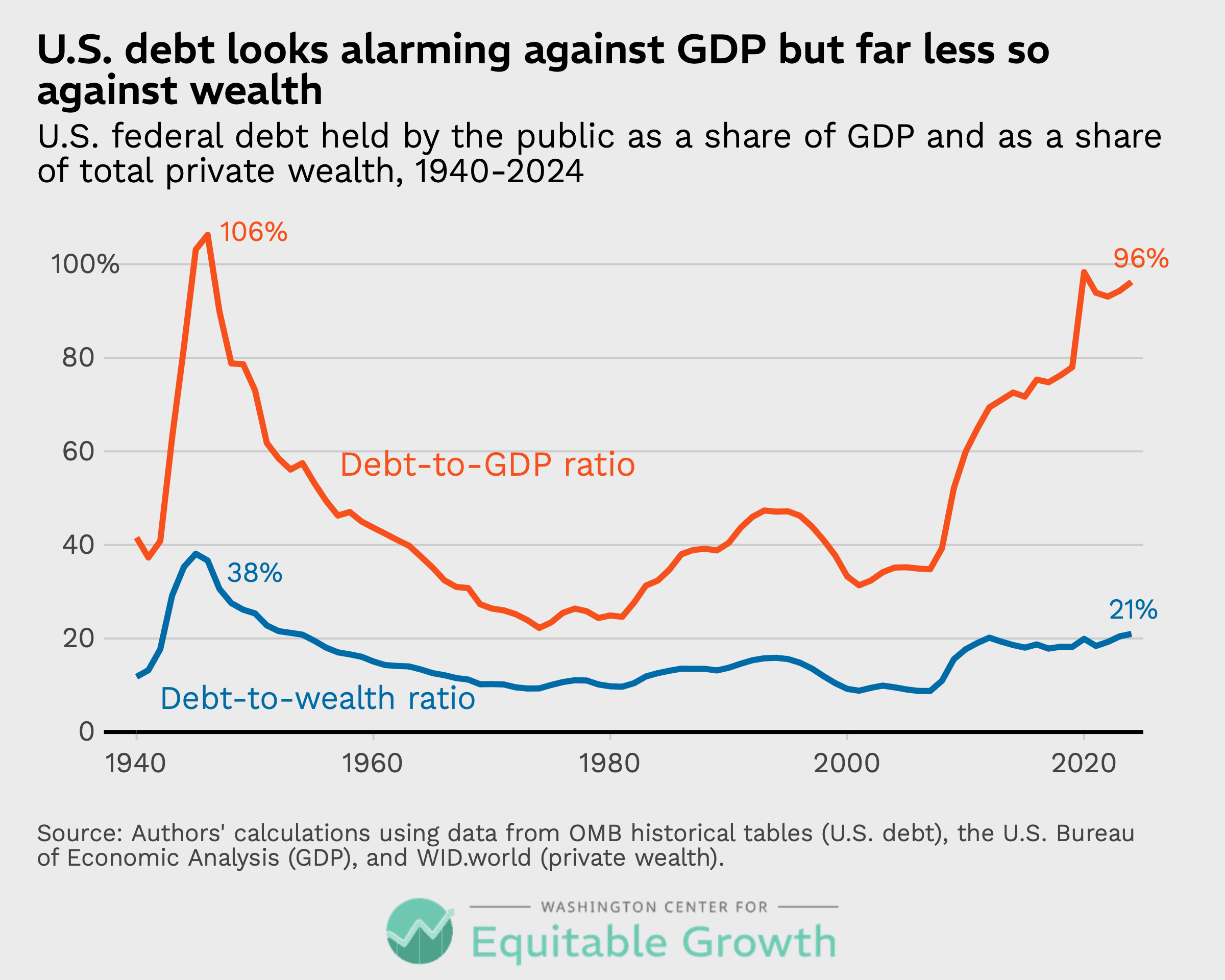
As Figure 1 shows, the measures track closely in the mid- to late 20th century and then diverge sharply later. In the 1940s, both ratios spiked together as wartime borrowing surged. Both then fell for decades as GDP grew quickly and postwar wealth was building more slowly. But after the early 1980s, the debt-to-GDP and debt-to-wealth ratios part ways. The GDP-based ratio climbs steeply through the 2008 financial crisis and the 2020–2023 COVID-19 pandemic, nearly reaching its all-time high, while the wealth-based ratio rises far more gently, settling around levels last seen in the early 1950s and again in the early 2010s. Debt relative to wealth remains elevated versus the lows of the late 1990s and mid-2000s but is nowhere near the record set in 1945.
Translating the ratio into dollar amounts, at the end of 2024, federal debt held by the public stood at nearly $28 trillion—an enormous sum on its own and the figure that drives the wartime comparison. The private wealth of U.S. households in 2024, however, totaled roughly $134 trillion.13 Set side by side, the debt amounts to about one dollar for every five dollars of private net worth.
That does not make the debt small, and it says nothing about whether any of that wealth could be tapped easily or fairly. What it does is reframe the scale of the problem. Against the resources the country has actually accumulated, the obligation is a fraction, not a multiple—precisely the intuition that the GDP comparison, with debt now nearly the size of a full year’s output, tends to bury.
The two measures diverge as wealth has outgrown income in recent decades
The divergence of these two ratios is not a paradox; it is arithmetic. When wealth grows faster than GDP—when the country’s balance sheet expands relative to its yearly income—then the debt-to-wealth ratio necessarily falls relative to the debt-to-GDP measure. And that is exactly what has happened in the United States.
To better understand this arithmetic, it helps to show total private wealth expressed as a multiple of GDP. For most of the postwar period, the ratio sat between roughly 2.5 times and 3 times the national output from the 1940s into the early 1980s. Then, it took off, climbing to about 4.6 times GDP by 2024 as house prices, equity values, and retirement account balances surged. (See Figure 2.)
Figure 2
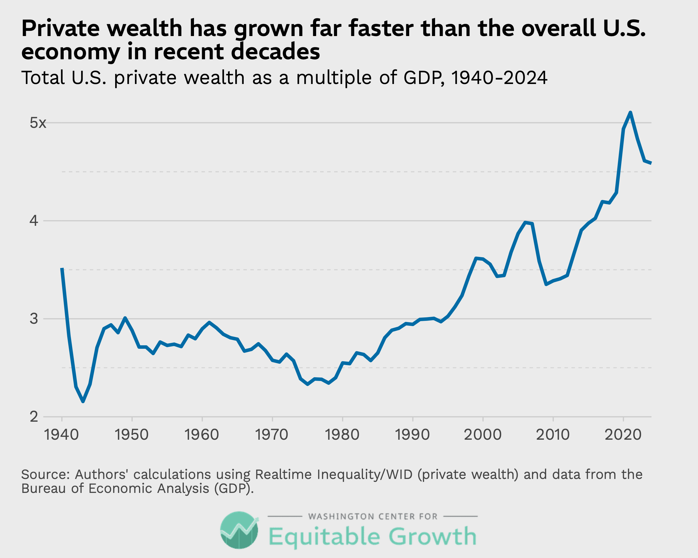
The United States is not unusual in this respect. The long-run rise in wealth-to-income ratios is a feature of nearly every rich economy.14 Economists trace the rise mainly to increasing asset prices and low interest rates, driven by some combination of slow growth, an aging population, and rising inequality.15 The mechanical consequence is that a dollar of debt simply weighs less against the wealth base today than it did a generation ago.
This is what makes the wartime comparison so misleading. In the early 1940s, the country leveraged a comparatively thin balance sheet to the hilt to finance—and win—World War II; the cushion of private wealth behind the debt was modest. Today’s debt, by contrast, rests atop a far deeper reservoir of private assets.
In other words, two eras can share nearly the same debt-to-GDP ratio and yet face very different fiscal cushions.
The view from the top: Where wealth—and potential revenue—reside
A recurring objection in debates about the federal debt is that there simply is not enough money at the top to make a meaningful dent—that taxing the rich, however popular, cannot move a total debt number measured in the tens of trillions of dollars. Breaking down the debt-to-wealth ratio by where wealth sits in the distribution lets us test that claim directly.
Let’s first examine federal debt measured against the wealth of the richest households. In 2024, that debt held by the public equaled about 0.6 times the wealth of the top 1 percent—meaning the richest 1 percent alone held enough wealth to pay off the entire publicly held debt nearly twice over. It equaled about 1.1 times the wealth of the top 0.1 percent and about 2.2 times the wealth of the top 0.01 percent.16 (See Figure 3.)
Figure 3
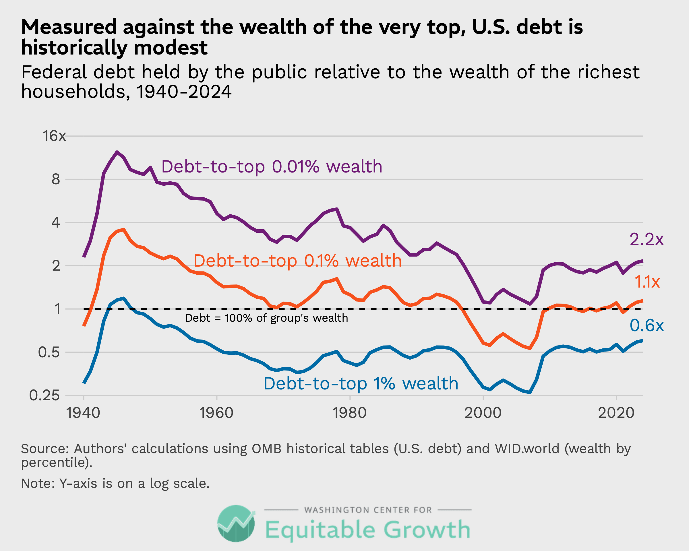
By historical standards, these are low readings. The ratio of debt-to-top 0.01 percent wealth stood near 12 in the mid-1940s and around 4 to 5 in the mid-1980s. Only the dot-com and housing-bubble years and the post-2020 asset surge produced lower figures than today’s 2.2.
Today, just 130,000 U.S. households possess as much wealth as the entire debt of the U.S. government. While it may not be possible to raise all the revenue needed solely from very high-wealth households, it looks more possible when wealth inequality increases rapidly. Ratios of top-household wealth-to-debt are at low levels because a rapidly increasing stock of overall wealth has coincided with much higher wealth concentration. The top 1 percent hold roughly 35 percent of all household wealth in the United States, compared to lows of around 23 percent in the late 1970s.17
Let’s next isolate the impact of rising wealth inequality by presenting the path of the ratio of debt to wealth of the top 0.01 percent over time but with an additional, counterfactual line after 1980 that holds the top 0.01 percent share of wealth constant at 1980 levels. This shows that without the explosion in top wealth after 1980, a much smaller chunk of the national debt today would be reachable by, say, a high-end wealth tax and would make today’s debt-to-high-end wealth inequality ratio similar to that of the early 1950s—a period of relatively fast economic growth but low income and wealth inequality. (See Figure 4.)
Figure 4
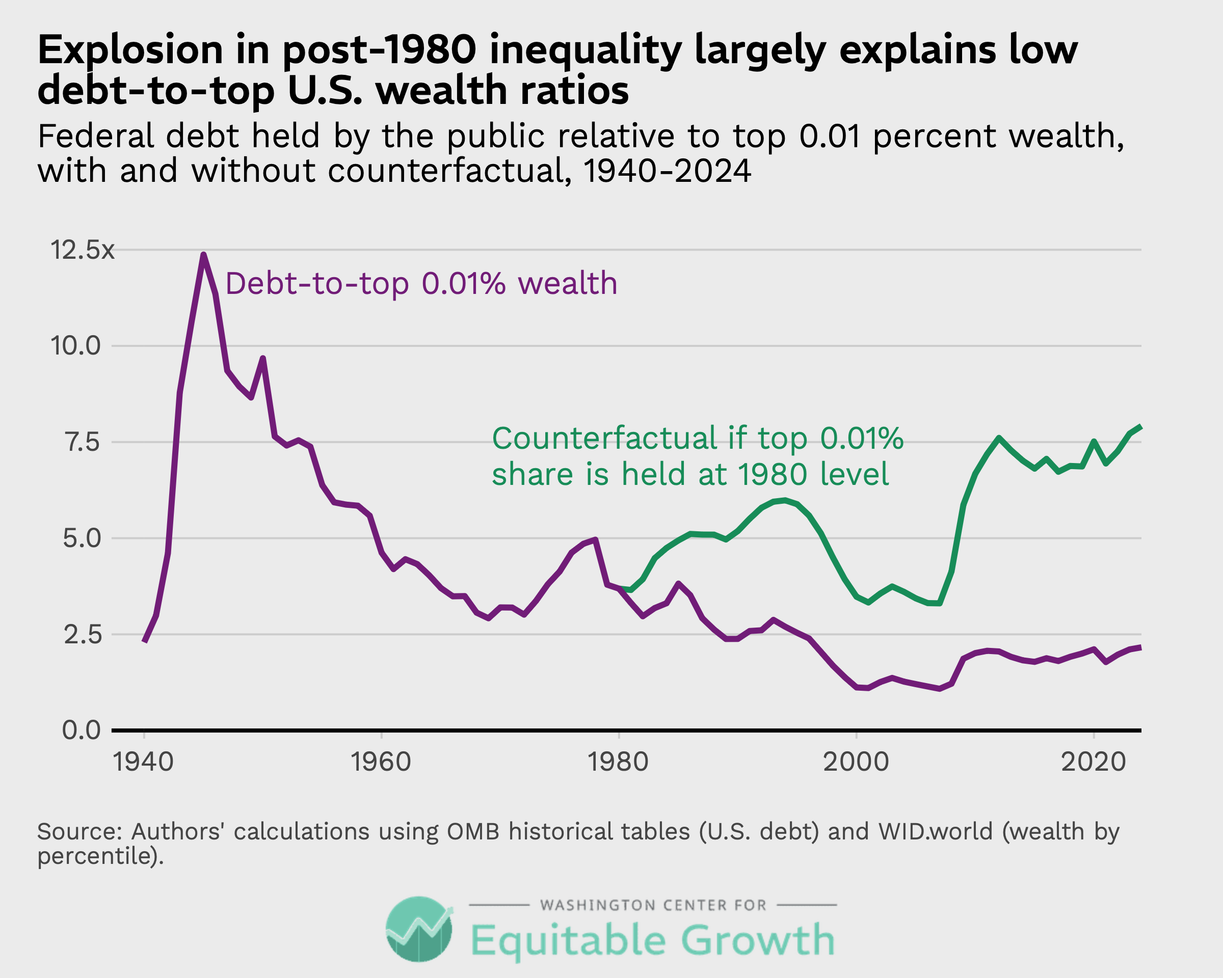
Figure 4 demonstrates that while there is mounting evidence that inequality is itself a drag on growth and can have deleterious effects on economic mobility—and even democracy—one irony of the recent rise in wealth inequality is that it makes managing the debt with taxes on very high-wealth households more plausible.
None of this implies that taxing the top 1 percent or 0.1 percent of wealthy households would be easy, costless, or sufficient on its own to stabilize the federal debt. The point is narrower: The data contradict the flat assertion that the money is not there.
A simple illustration makes the scale tangible. The combined wealth of the top 1 percent came to roughly $47 trillion in 2024. A one-time levy of 10 percent on that wealth—the kind of extraordinary, nonrecurring measure that governments have occasionally imposed or debated after wars and crises—would raise on the order of $4 trillion to $5 trillion, something close to one-sixth of the entire federal debt held by the public, in a single stroke. Raising this amount of revenue in previous eras would have required a much deeper and broader sacrifice. Simply knowing that the country has the economic capacity for such a large tax increase can, in itself, reduce the probability of a fiscal crisis, since interest rates on Treasury bonds are priced, in part, on bondholders’ confidence in the government’s ability to meet its obligations.
This is an arithmetic exercise, not a policy proposal. It sets aside the formidable legal, political, administrative, valuation, and behavioral obstacles such a levy would face, and it would do nothing about the structural deficits that push the debt higher year after year. But it makes a real point vivid: Tapping the wealth concentrated at the very top would be large enough to be fiscally meaningful at the scale of the national debt—an option the annual-income framing of the debt-to-GDP ratio tends to keep out of view entirely.
How the United States compares internationally
Because our nation’s debt-to-wealth measure is built from internationally available data, it also supports comparison across countries. And that comparison shows that the United States, in 2024, was squarely in the middle of 10 advanced economies in terms of central government debt as a share of total private wealth. (See Figure 5.)
Figure 5
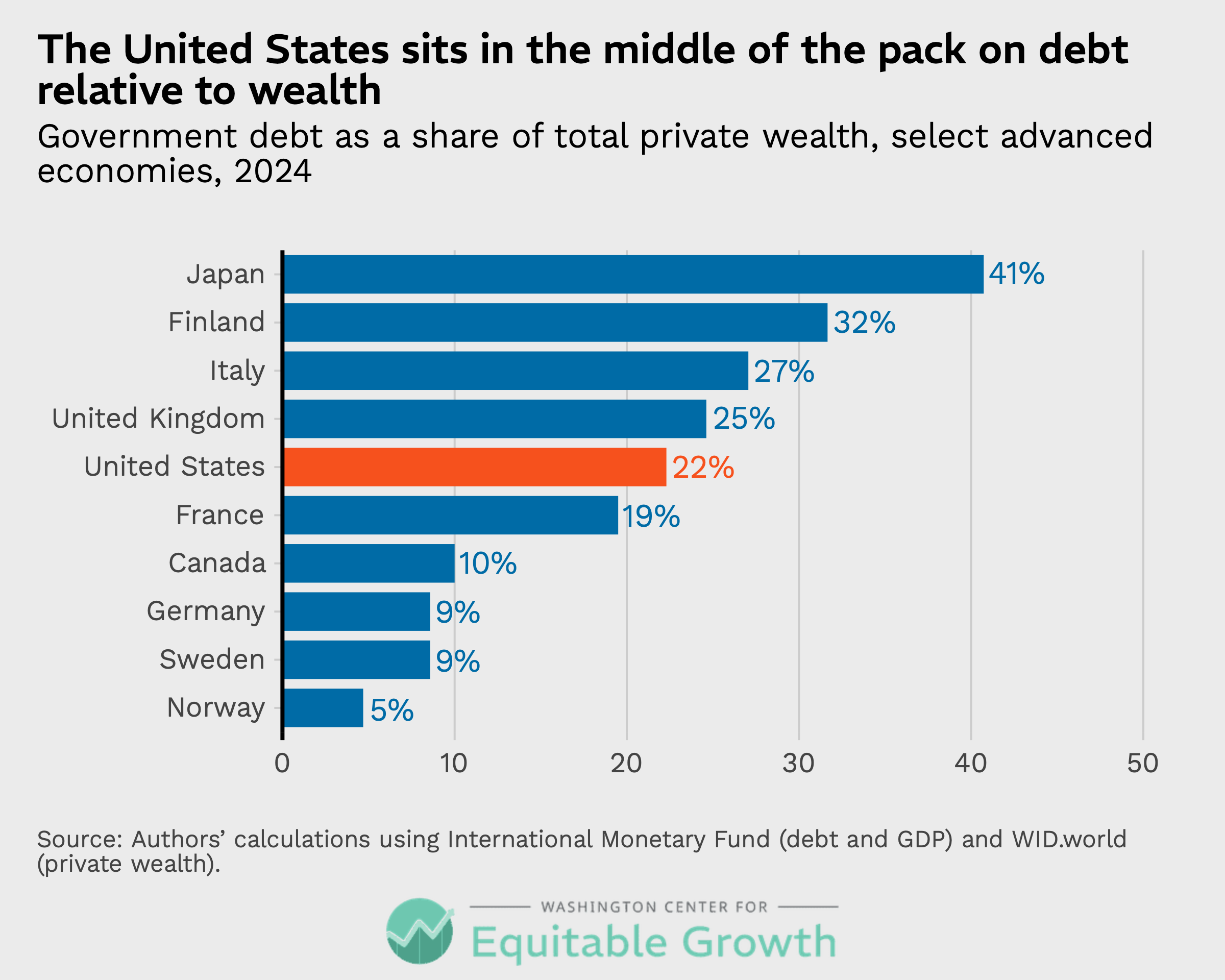
As Figure 5 shows, the United States, at about 22 percent on this basis, sits below Japan, Finland, Italy, and the United Kingdom and sits above France, Canada, Germany, Sweden, and Norway.18 The ranking does not map neatly onto the familiar debt-to-GDP ordering, which shows the United States at a higher level, on par with France and the United Kingdom but well above Finland—a reminder that the two lenses capture different things.19 Differences in estimates of wealth across countries can hinge on differences in those countries’ pension policies.20 But the broad message is clear: On this measure, the United States is not an outlier.
What the debt-to-wealth measure can—and cannot—tell us
Debt-to-wealth is a supplement, not a verdict, and honesty requires naming its limits. Like the debt-to-GDP measure, it offers no agreed-upon benchmark for what counts as “high” or “low,” so a modest ratio does not mean borrowing is free or that more borrowing is always fine. It reveals nothing about the political feasibility or desirability of taxing wealth, the liquidity of the assets in question, or how households would respond to new levies.
What’s more, wealth is more volatile than income. Asset booms and busts swing the debt-to-wealth ratio, and sharp increases in the ratio are common, as evidenced when the U.S. economy came out of the Great Recession of 2007–2009. A measure that improves in a bubble and worsens in a crash must be read with care.
A second caution concerns the underlying data. The distributional wealth estimates upon which these calculations rest are modeled rather than directly observed, and wealth at the very top—exactly where much of this potentially new source of government revenue resides—is notoriously hard to measure.21 Indeed, different sources make different choices: The Federal Reserve’s Distributional Financial Accounts and its Survey of Consumer Finances, for instance, put both the level of total wealth and its concentration somewhat differently than the series used in this report.22
These differences matter for precise figures but not for the broad contours, which are robust across sources. Private wealth has far outpaced income since 1980. Wealth is more concentrated than income. And the federal debt is a smaller share of the wealth base today than the 1945 comparison implies. Readers should treat the specific decimals as approximate, and the shape of the picture as reliable.
A third caution is that the wealth in the denominator is not independent of the debt in the numerator or of the policies that move both numbers. Part of the connection is mechanical: Federal debt is itself a form of private wealth. Every Treasury security that a U.S. household owns—directly or through a pension fund or mutual fund—is an asset on its balance sheet, so issuing debt does, in part, create the very wealth it is then measured against.23
But the effect is far from dollar-for-dollar. Roughly a third of the debt held by the public is owned by foreign investors, and a further seventh is held by the Federal Reserve.24 The U.S. Treasuries that do count as household wealth are only about a tenth of total private wealth, dwarfed by stocks, housing, and private businesses. The rising values of these forms of wealth—not the accumulation of government bonds—are what drove the divergence in wealth beginning in the 1980s.
More consequential is the role of interest rates. Much of the four-decade rise in wealth relative to income reflects not new productive capacity but a long decline in interest rates, which lifts the present value of nearly every asset. And the same low-rate environment that inflated those asset values also made the debt cheap to issue and easy to absorb. The two ends of the debt-to-wealth ratio have thus tended to move together, and a sustained shift to higher rates could worsen both at once, raising interest costs while pulling asset values down.25
None of this is unique to a wealth-based measure. The debt-to-GDP ratio is endogenous to fiscal policy in its own way, as the long-running debate over whether high debt slows growth, or whether weak growth and recessions are what drive debt upward, attests.26
What the debt-to-wealth ratio adds is twofold. The first contribution is to the imagination of revenue policy. By foregrounding the asset base rather than the annual income flow, the measure naturally invites options that the debt-to-GDP measure tends to hide from view—one-time capital levies, recurrent net-wealth taxes, taxes on unrealized capital gains, and reforms to property and estate taxation among them.27 These approaches need not be endorsed to be worth weighing—the value is in widening the menu, especially at a moment when the country needs revenue not only to stabilize the debt but also to make pro-growth investments.
The second contribution is to research. The debt-to-wealth ratio supplies a new explanatory variable for long-running questions on which the debt-to-GDP measure has yielded frustratingly little agreement. Those questions include whether and how borrowing feeds into interest rates and inflation, whether the resources standing behind the debt shape investors’ willingness to hold it, and how asset bubbles and episodes of austerity affect not just economic output and debt levels but also the wealth base itself.
Then, there is the question of the drivers of wealth inequality. How do policy and interest-rate environments reshape the size and distribution of that wealth base? A measure that captures the balance sheet, not only the income statement, may help explain phenomena that research focused on the debt-to-GDP ratio has struggled to pin down.
Moreover, there are several other measures worth adding to the conventional toolkit that deserve mention. One is interest payments as a share of GDP—a flow-to-flow comparison—to capture how much current consumption may be displaced by debt.28 The Congressional Budget Office projects net interest costs to exceed $1 trillion in 2026 and to keep rising as a share of the budget.29 Another useful ratio is the primary or total deficit relative to GDP, which also is a flow-to-flow gauge, measuring the trajectory rather than the accumulated stock. The debt-to-wealth ratio presented in this report complements these other measures but does not replace them.
Conclusion
The fiscal policy conversation in the United States has leaned on a single gauge for too long. The debt-to-GDP ratio is useful but incomplete and, when read in isolation, can make today’s government borrowing look like a wartime emergency. Measured against the wealth the country has accumulated, the picture is sober but not desperate. Federal debt is roughly a fifth of private wealth—a little more than half its World War II share and modest relative to the fortunes concentrated at the top.
That reframing does not make hard choices disappear, but it changes which choices come into focus. If the federal debt is understood only as a claim on next year’s income, then the debate can easily narrow to how much spending to cut or how much to tax wage earners. If it is understood as a claim against the nation’s entire accumulated wealth—wealth that has grown faster than income for 40 years and sits disproportionately at the very top of the income distribution—then a wider set of options, and a more honest accounting of where the resources actually are, comes into view.
None of this argues that federal budget deficits do not matter or that the debt can be ignored. Rising interest costs are real, and the projected trajectory is steep. The argument presented in this report is narrower and, we hope, clarifying. How heavy the debt looks depends on what you weigh it against, and a nation’s capacity to manage its obligations rests on its entire balance sheet, not on a single year’s paycheck. Adding the debt-to-wealth ratio to the fiscal policymaking toolkit—and showing where that wealth sits—gives policymakers a fuller map of their options and offers researchers a sharper lens. A bigger picture may be exactly what is needed to move past the current paralysis.
Appendix
About the data used in this report
In order to make our debt-to-wealth measure internationally comparable and to chart it back to the 1940s, we were forced to use specific datasets. But these choices have little impact on our estimates.
For debt, we used two different data series. For charts that only include U.S. data, we used the White House Office of Management and Budget’s historical tables (Table 7.1), which calculates total debt held by the public on the last day of the fiscal year (September 30).30 For international comparisons, we use data from the International Monetary Fund’s Global Debt Database.31 This data series tracks debt internationally on a comparable basis. The U.S. debt in this series is about 6 percent larger in 2024 than the OMB estimate of the debt. Following the System of National Accounts, the IMF uses a slightly broader definition of central government debt that includes some pension liabilities and government loan liabilities, which explains the difference.
For aggregate wealth, we use estimates from WID.world.32 These data are available in current local dollars for many nations, and they are available for the United States over a long span of time, with annual estimates starting in the early 1900s. We use WID.world’s personal wealth series, which excludes wealth held by nonprofits such as university endowments. The Federal Reserve’s Distributional Financial Accounts also exclude nonprofit wealth but are only available from 1989 forward.
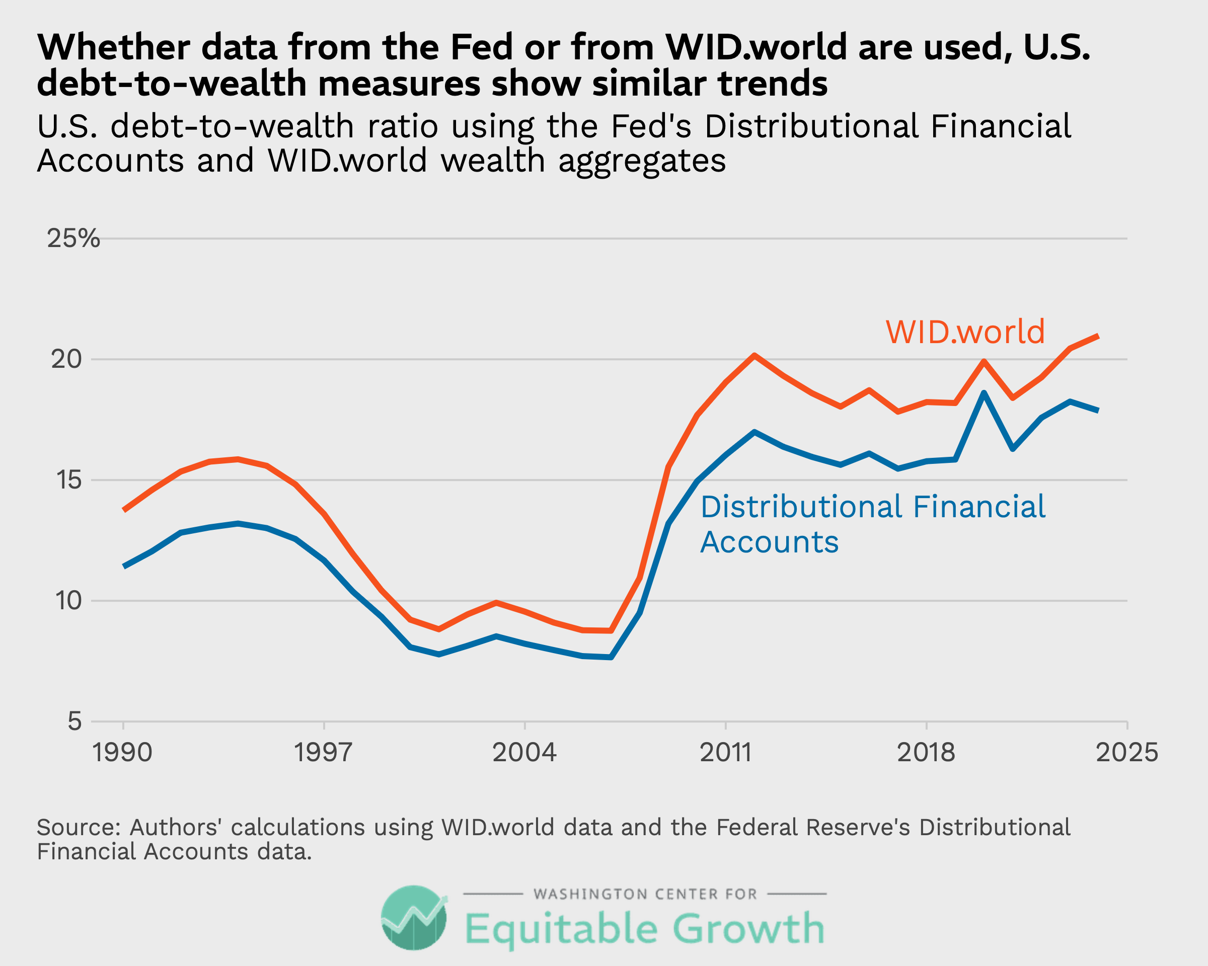
There are minor definitional differences between the two series. Most notably, WID.world excludes consumer durables (largely cars and household appliances) and unfunded defined-benefit pension obligations. The Fed’s Distributional Financial Accounts accordingly show a little more wealth, a difference of about 15 percent in recent years. Debt-to-wealth is therefore lower if the Fed data are used. Although the levels are slightly different, the trends since 1990 are very similar in both the WID.world and Fed data. (See Figure 6.)
Figure 6
Acknowledgments
The authors would like to thank John Sabelhaus and Michael Linden for sharing their expertise on this topic. In addition, Anthropic’s Claude AI tool helped with some of the research and early drafting of this report. Any errors are, of course, solely those of the authors.
End Notes
1. Congressional Budget Office, “The Budget and Economic Outlook: 2025 to 2035” (2025), available at https://www.cbo.gov/publication/60870. The Congressional Budget Office projects that federal debt held by the public will rise from roughly 100 percent of GDP to 118 percent by 2035, surpassing the 106 percent peak set in 1946.
2. Unless otherwise noted, U.S. debt figures are federal debt held by the public from the Office of Management and Budget’s historical tables. Gross Domestic Product is from the U.S. Bureau of Economic Analysis. See Office of Management and Budget, “Historical Tables” (n.d.), available at https://whitehouse.gov/omb/budget/historical-tables; U.S. Bureau of Economic Analysis, “National Income and Product Accounts” (n.d.), available at https://www.bea.gov/products/national-income-and-product-accounts. For more on this report’s methodology, see the appendix.
3. Eric M. Engen and R. Glenn Hubbard, “Federal Government Debt and Interest Rates.” In Mark Gertler and Kenneth Rogoff, eds., NBER Macroeconomics Annual 2004, vol. 19 (Cambridge, MA: MIT Press, 2005), pp. 83–138, available at https://www.nber.org/books-and-chapters/nber-macroeconomics-annual-2004-volume-19/federal-government-debt-and-interest-rates. Engen and Hubbard review two decades of empirical work and find mixed results, from no effect to much larger ones.
4. Atish R. Ghosh and others, “Fiscal Fatigue, Fiscal Space and Debt Sustainability in Advanced Economies,” The Economic Journal 123 (566) (2013): F4–F30, available at https://academic.oup.com/ej/article-abstract/123/566/F4/5079491. Ghosh and co-authors estimate country-specific debt limits that turn on each government’s primary-balance response to rising debt rather than on the debt-to-GDP ratio alone.
5. Carmen M. Reinhart and Kenneth S. Rogoff, “Growth in a Time of Debt,” American Economic Review 100 (2) (2010): 573–578, available at https://www.aeaweb.org/articles?id=10.1257/aer.100.2.573.
6. Thomas Herndon, Michael Ash, and Robert Pollin, “Does High Public Debt Consistently Stifle Economic Growth? A Critique of Reinhart and Rogoff,” Cambridge Journal of Economics 38 (2) (2014): 257–279, available at https://academic.oup.com/cje/article-abstract/38/2/257/1714018.
7. Barry Eichengreen, Exorbitant Privilege: The Rise and Fall of the Dollar and the Future of the International Monetary System (Oxford, UK: Oxford University Press, 2011), available at https://global.oup.com/academic/product/exorbitant-privilege-9780199931095?cc=us&lang=en&.
8. This includes immigrants, whether documented or not.
9. Estimates of total private wealth, and of wealth and income by percentile, are from Facundo Alvaredo and others, “World Inequality Database: WID.world” (2024), available at https://wid.world.
10. Another potential stock-to-stock comparison is debt relative to the present value of GDP. But this is a future-oriented measure that, as its proponents concede, is highly dependent on speculative projections about growth and interest rates, which is distinct from the historical and current snapshot exercise we are engaged in here. See Jason Furman and Lawrence H. Summers, “A Reconsideration of Fiscal Policy in the Era of Low Interest Rates” (Washington: Brookings Institution, 2020), available at https://www.brookings.edu/wp-content/uploads/2020/11/furman-summers-fiscal-reconsideration-discussion-draft.pdf.
11. We focus here on private rather than public assets because no one seriously expects the government to sell its aircraft carriers or national parks to pay down debt, and, in any case, public assets are small next to private ones. The government’s financialassets, which include cash, gold, and the value of loan assets that may eventually be repaid (e.g., student loans), for example, were worth roughly $2.8 trillion in fiscal year 2025. See Center for Budget and Policy Priorities, “Policy Basics: Deficits, Debt, and Interest” (2025), available at https://www.cbpp.org/research/federal-budget/deficits-debt-and-interest.
12. Authors’ calculations. In 2024, total U.S. private wealth was about $134 trillion while federal debt held by the public was about $28 trillion, for a ratio near 21 percent. In 1945, total U.S. private wealth was about $617 billion and federal debt held by the public was about $235 billion, for a ratio of 38 percent.
13. In calculating this figure, we exclude the wealth held by nonprofits, including universities and charitable foundations, because there is no easy way to determine which households have claim to or benefit from this wealth, which complicates the distributional analysis that comes later in the report. This nonprofit wealth is, of course, part of the nation’s total private balance sheet (and can be subject to tax) but including it in our measure would not substantially affect our results. Indeed, including the roughly $12 trillion in nonprofit wealth makes the U.S. debt situation look even better, moving the debt-to-wealth metric from 21 percent to 19 percent with little change to historical trendlines. For more on this report’s methodology, see the appendix.
14. Thomas Piketty and Gabriel Zucman, “Capital Is Back: Wealth-Income Ratios in Rich Countries, 1700–2010,” Quarterly Journal of Economics 129 (3) (2014): 1255–1310, available at https://academic.oup.com/qje/article-abstract/129/3/1255/1818714.
15. Ibid. Note, too, the importance of a fall in net government wealth since 1970, as governments privatized state assets, though the United States privatized little compared to other countries. See also Adrien Auclert and others, “The Race Between Asset Supply and Asset Demand,” paper prepared for the Jackson Hole Economic Policy Symposium, Federal Reserve Bank of Kansas City, Jackson Hole, WY, August 2025, available at https://www.kansascityfed.org/documents/11206/AMRS_Jackson_Hole_Final.pdf.
16. For context, according to the World Inequality Database that we rely on for these calculations, the threshold for entry into the top 1 percent in the United States in 2024 was $4.6 million per adult, the minimum to enter the top 0.1 percent was $12.4 million per adult, and the threshold for the top 0.01 percent was $22.4 million per adult.
17. Alvaredo and others, “World Inequality Database: WID.world.”
18. Because the international comparison uses a slightly broader debt concept than the OMB series used for the U.S. time series, the 2024 U.S. value here (about 22 percent) differs marginally from the 21 percent reported above.
19. International Monetary Fund, ” Global Debt Database: Central Government Debt, Percent of GDP” (n.d.), available at https://www.imf.org/external/datamapper/CG_DEBT_GDP@GDD.
20. In some instances, retirement savings will show up in net private wealth because those assets are owned by households, but in the case of pay-as-you-go public pension programs, such as Social Security in the United States, wealth is either held by the government (as in the case of the Social Security trust fund) or is purely a pay-as-you-go transfer program, with no underlying wealth to count.
21. See Austin Clemens, “Defining top wealth and income thresholds for U.S. tax policy design and analysis” (Washington: Washington Center for Equitable Growth, 2026), available at https://equitablegrowth.org/research-paper/defining-top-wealth-and-income-thresholds-for-u-s-tax-policy-design-and-analysis/.
22. For more on this report’s methodology, see the appendix.
23. Though we do so here, whether government bonds should be counted as net private wealth at all is a longstanding question. Under Ricardian equivalence, they are offset by the present value of future taxes and are not net wealth. See Robert J. Barro, “Are Government Bonds Net Wealth?” Journal of Political Economy 82 (6) (1974): 1095–1117, available at https://www.jstor.org/stable/1830663.
24. Committee for a Responsible Federal Budget, “Q&A: Gross Debt Versus Debt Held by the Public” (2026), available at https://www.crfb.org/papers/qa-gross-debt-versus-debt-held-public; Congressional Research Service, “Foreign Holdings of Federal Debt” (2026), available at https://www.congress.gov/crs-product/RS22331.
25. On the role of falling interest rates in raising asset values and wealth-to-income ratios, see Piketty and Zucman, “Capital Is Back.” On the interplay between rising top-end inequality, the resulting “saving glut of the rich,” downward pressure on interest rates, and government borrowing, see Atif Mian, Ludwig Straub, and Amir Sufi, “Indebted Demand,” Quarterly Journal of Economics 136 (4) (2021): 2243–2307, available at https://academic.oup.com/qje/article-abstract/136/4/2243/6164883; Atif Mian, Ludwig Straub, and Amir Sufi, “The Saving Glut of the Rich” Working Paper No. 26941 (National Bureau of Economic Research, 2020; rev. 2021), available at https://www.nber.org/papers/w26941. For a more comprehensive account in which aging, inequality, and foreign demand raised asset demand and pushed interest rates down—creating fiscal space for government debt to rise substantially without raising rates—see Auclert and others, “The Race Between Asset Supply and Asset Demand,” though note that this paper nonetheless concludes that rising entitlement costs will eventually require a substantial fiscal consolidation.
26. Andrew Pescatori, Damiano Sandri, and John Simon, “No Magic Threshold,” Finance & Development 51 (2) (2014), available at https://www.imf.org/external/pubs/ft/fandd/2014/06/pescatori.htm.
27. [1] For an overview of one-time capital levies and recurrent net-wealth taxes, see Organisation for Economic Co-operation and Development, “The Role and Design of Net Wealth Taxes in the OECD” (Paris: OECD Publishing, 2018), available at https://www.oecd.org/en/publications/the-role-and-design-of-net-wealth-taxes-in-the-oecd_9789264290303-en.html.
28. For an analysis of how such a measure is superior to debt-to-GDP for predicting the need for fiscal policies that reduce primary deficits, see Barry Eichengreen, Maxime Menuet, and Gregory Donnat, “From Stocks to Flows: Debt Service and Fiscal Sustainability.” Working Paper 35459 (National Bureau of Economic Research, 2026), available at https://www.nber.org/papers/w35459. See also Furman and Summers, “A Reconsideration of Fiscal Policy in the Era of Low Interest Rates,” who argue that keeping real interest payments below 2 percent of GDP is “a new guidepost for fiscal policy” in the United States.
29. Congressional Budget Office, “The Budget and Economic Outlook: 2025 to 2035.”
30. Office of Management and Budget, “Historical Tables.”
31. International Monetary Fund, “Global Debt Database: Central Government Debt, Percent of GDP.”
32. Alvaredo and others, “World Inequality Database: WID.world.”
Related






Explore the Equitable Growth network of experts around the country and get answers to today's most pressing questions!