The “Unified Framework for Fixing Our Broken Tax Code” recently released by the Trump administration and congressional Republicans proposes sharp reductions in the corporate tax rate—from 35 percent to 20 percent—and in the tax rate for income from pass-through businesses, from 39.6 percent to 25 percent. These two proposals and a related proposal to repeal the corporate alternative minimum tax would cost more than $2.5 trillion over the next decade, according to the Tax Policy Center’s preliminary analysis. Together, they account for more than all of the plan’s net cost.
While proposals for large rate cuts may seem consistent with the tax reformer’s mantra of broadening the base and lowering rates, these preferential rates for business income are better understood as two huge new tax expenditures. The broaden-the-base, lower-the-rate mantra applies to the tax system as a whole. Corporate income taxes and individual income taxes on income from pass-through businesses are constituent parts of the tax system. Preferential rates for specific types of income are appropriately viewed as tax expenditures.
There is no reason to accept the creation of these new tax expenditures as a necessary element of reform. Superior approaches exist that would—at much lower cost—achieve proponents’ stated objectives with respect to the financial incentives for profit shifting, inversions, and capital investment. However, if policymakers continue to place preferential business rates at the center of their proposals, recognizing that preferential rates would create new tax expenditures also points to a new class of offsets that should be considered: surtaxes on the domestic cash flow of U.S. businesses. A surtax on the domestic cash flow of U.S. businesses would scale back or eliminate the tax expenditure for excess returns that preferential rates create, while still providing the reduction in the headline rate and the change in financial incentives for which proponents advocate.
Preferential business rates should be viewed as tax expenditures
Tax expenditures are defined by the Congressional Budget Act as “revenue losses attributable to provisions of the Federal tax law which allow a special exclusion, exemption, or deduction from gross income or which provide a special credit, a preferential rate of tax, or a deferral of tax liability.” Of course, as noted by the U.S. Treasury Department in its annual summary of tax expenditures, the determination of which provisions of law are tax expenditures depends critically on the hypothetical tax system to which the actual tax system is compared.
The Treasury’s traditional approach uses two baselines, both of which are modeled after a comprehensive income tax. However, the baselines include certain features of the existing tax code that would not be present in a more conceptually pure comprehensive income tax such as taxing capital gains when assets are sold rather than as they accrue and taxing nominal gains and losses rather than adjusting those gains and losses for inflation. Importantly, both baselines assume the existence of a separate corporate income tax in addition to the individual income tax. Thus, while a preferential rate for pass-through income should be viewed as a tax expenditure against either of these baselines, a substantial reduction in the corporate tax rate might not be viewed as a tax expenditure.
In contrast to the income tax benchmarks used in the annual Treasury analysis, a true comprehensive income tax would tax all income once according to a single rate schedule. In other words, the corporate income tax would be integrated with the individual income tax. It does not necessarily matter whether income is taxed on a separate corporate tax return or the profits are allocated to owners on their individual tax return (or both), but the combined effect of the tax system would be to tax corporate income at the same rate as income from noncorporate businesses, wages, or any other source. (The Treasury Department has provided analysis using this type of benchmark as a supplemental analysis in the past.)
Judged against this true comprehensive income tax hypothetical, a sharply lower tax rate on corporate income would be appropriately viewed as a tax expenditure because the lower corporate rate would provide a preferential rate of tax for income earned by corporations compared to other sources of income such as wages.
Notably, the conclusion that preferential business rates are appropriately viewed as tax expenditures is unaffected by the debate over whether an income tax or consumption tax would be a preferable system of taxation, which frequently plagues tax expenditure analysis. (The same Treasury analysis providing estimates using a comprehensive income tax benchmark also provided analysis using a comprehensive consumption tax.) The key difference between a consumption tax and an income tax is the treatment of deductions for capital investment. A comprehensive consumption tax would allow businesses to write off capital spending when it occurs—also known as expensing. A comprehensive income tax would instead allow businesses to write off the cost of assets over time as they lose value. In either system, the same statutory rate would apply to business income as to other types of income.
Preferential business rates create a tax expenditure for excess returns—returns in excess of the risk-free return, including returns to risk, luck, market power, and labor when not paid out as wages. Excess returns would also include returns to tax avoidance and sheltering strategies that involve shifting income from the individual tax base into the business tax base motivated by preferential rates. As noted above, these returns are part of the tax base in both income tax systems and consumption tax systems. Judged relative to an income tax system, preferential business rates also create tax expenditures relating to the normal return.
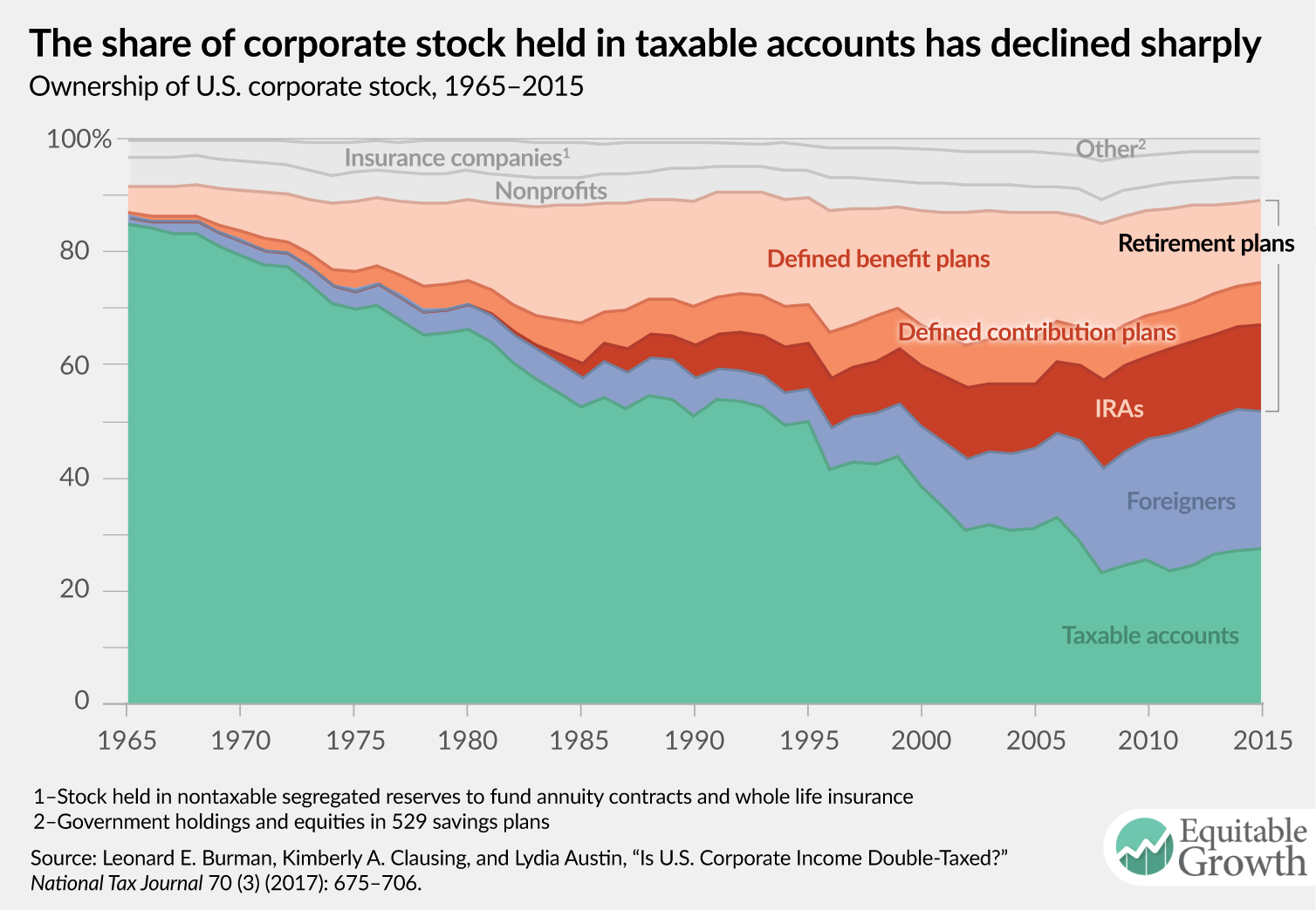
One criticism of this argument could be that the U.S. tax system creates the potential for double taxation of corporate income because corporations are subject to the corporate income tax and investors are subject to tax on capital gains and dividends. Thus, according to this view, a lower corporate rate could be a desirable step toward achieving the same rate of tax on income from all sources. However, recent research questions the practical relevance of investor-level taxes on average. Burman, Clausing, and Austin (2017), Austin and Rosenthal (2016), and the U.S. Treasury Department (2017) all find that the share of corporate equities held in taxable accounts is about 25 percent to 30 percent (see Figure 1). Moreover, even when investors are subject to tax, preferential rates generally apply. In addition, the Congressional Budget Office (2014) estimates that only 70 percent of interest payments deducted at the corporate level are taxable when received by lenders. Finally, the maximum corporate rate of 35 percent is already below the maximum individual rate of 39.6 percent. Thus, it is difficult to argue that a large reduction in the statutory corporate rate is necessary to avoid double taxation. A preferential rate for corporate income is appropriately viewed as a tax expenditure.
Figure 1

Superior alternatives to preferential business rates exist
Tax expenditures can be justified if they achieve a compelling policy objective at reasonable cost, but preferential business rates fail this test. A reform that includes preferential business rates would be more expensive, more regressive, and less economically beneficial (if not actively harmful) than one that focuses on the tax base.
Proponents of preferential business rates—or of a sharply lower corporate rate in isolation—tend to fall back on the idea that it is too politically difficult to pursue one of these superior approaches to reform. Yet, at the same time, it is a widely shared goal that tax reform be revenue neutral, and starting with statutory rate cuts means that policymakers aiming to achieve revenue neutrality will ultimately be looking for policies to offset the cost of those rate cuts, with only a very short list of politically difficult options to choose from. The major options include such controversial notions as restricting or repealing interest deductibility, the mortgage interest deduction, the deduction for charitable contributions, the state and local tax deduction, and the deduction for employer-provided health insurance premiums. There is little reason to think these offsets are easier to enact than a superior approach to tax reform would be in the first place. Moreover, even if legislation following this approach were enacted, a large portion of the gross revenue changes from the component policies would be attributable to swapping an existing set of tax expenditures for a new set of even more regressive tax expenditures.
However, if policymakers recognize that preferential business rates are appropriately viewed as tax expenditures, it expands the universe of offsets that should be considered and creates a third potential path for tax legislation. Under this approach, policymakers would offset the cost of preferential business rates with measures that have the effect of scaling back or eliminating the tax expenditures resulting from preferential business rates.
The essence of such an approach would be to combine reducing statutory business tax rates with the creation of new surtaxes on businesses’ domestic cash flow. Such a surtax is not a base-broadener in the traditional sense of repealing a tax expenditure on the annual lists put forth by the Treasury Department or the congressional Joint Committee on Taxation. Rather it would serve to offset the newly created tax expenditure resulting from the creation of preferential business rates, while still addressing the concerns about the international tax system and the cost of capital that motivate many to call for reductions in the statutory corporate tax rate.
In effect, rather than converting taxes on business income into a destination-based cash flow tax—as was proposed in modified form in the blueprint for tax reform released by House Republicans in 2016—this approach to reform would use a modestly scaled destination-based cash flow tax as an offset that scales back the tax expenditure created by cutting statutory tax rates.
The modified destination-based cash flow tax proposed in last year’s blueprint raised several major concerns in the public debate. First, it applied a preferential rate of tax to corporate income. As discussed above, a preferential rate for corporate income relative to other types of income would constitute a large and extremely regressive tax expenditure. Second, to neutralize the impact on the public of the border adjustment implicit in the proposal, the dollar would have needed to appreciate by roughly 25 percent. This required appreciation in the exchange rate naturally raised questions about the economic impacts of an appreciation at that scale, as well as questions of whether the exchange rate would, in fact, appreciate by 25 percent. And third, to comply with World Trade Organization rules, the border adjustment would have needed to be considered part of a consumption tax system. However, the blueprint contained an explicit denial that it included a value-added tax, or VAT, and a reinterpretation of the broader U.S. tax system as a subtraction method VAT would have been challenging.
To illustrate the advantages of using a surtax to avoid creating a tax expenditure for excess returns attributable to domestic operations, consider an alternative proposal that reduces the statutory corporate tax rate by 7.65 percentage points and creates a new 7.65 percent surtax on corporations’ domestic cash flow. All three of the concerns about the blueprint reviewed above would be moderated under this approach. First, by imposing a surtax at a rate equal to the reduction in the statutory corporate tax rate, it would eliminate the tax expenditure associated with preferential treatment of domestic profits. Second, a more modest tax on domestic cash flow would result in smaller exchange rate movements. And third, with a surtax at a rate that matches the employer portion of the payroll tax, U.S. tax law could be more easily amended to explicitly create a subtraction-method value-added tax that would be compatible with World Trade Organization requirements.
Conclusion
The proposals at the center of the “Unified Framework” are large cuts in the statutory tax rates on business income. While these cuts may seem consistent with the broaden-the-base, lower-the-rate mantra of tax reformers, they are more appropriately viewed as new tax expenditures. Ideally, the notion of making large statutory business rate cuts the starting point for reform would be discarded. But, failing that, reformers should add offsets that scale back or eliminate the very tax preferences they are creating to the list of those under consideration to pay for reform.