How does income inequality change over the business cycle?
Has income inequality risen in recent years? The obvious rejoinder to that question is “well, over what time period?” This seemingly simple clarification can spark quite a bit of debate among economists and researchers. A new paper looking at the changes in income inequality shows how important the time periods we choose can be in understanding trends in inequality and the overall economy.
The paper, by George Washington University professor Stephen Rose, argues that income inequality has not risen since the end of the Great Recession in 2009. In particular, Rose takes aim at research by University of California-Berkeley economist Emmanuel Saez showing that 95 percent of the income gains from 2009 to 2012 were captured by the top 1 percent of earners. Rose claims that any assertion that inequality has risen since the Great Recession is based upon a “statistical gimmick.”
Rose says that Saez’s statistics overstate the increase in income inequality since 2009. He does so by looking at changes in incomes since 2007, the peak of the last business cycle, through what he calls the “bounce-back years” since 2009. In other words, Rose measures income trends since the beginning of the recession, not the beginning on a new economic expansion (as Saez does). Another major point that Rose makes is that fluctuations in the incomes of the top 1 percent, and therefore inequality, are driven primarily by changes in realized capital gains on the sale of stocks and bonds and other assets. Because this kind of income is the result of a decision to sell an asset, the gains are “clumpy” and not evenly distributed over years. And they are also very volatile as these kinds of assets take a hit during recessions, resulting in lower realized capital gains and thus less income
(Another major complaint by Rose of research that shows rising income inequality is about using pre-tax incomes versus post-tax incomes, but that’s a topic for another day.)
So what do Rose’s findings say about those of Saez? A look at the top income data gathered by Saez and Paris School of Economics professor Thomas Piketty shows that the share of income excluding capital gains going to the top 1 percent dropped from 18.3 percent in 2007 to 16.7 percent in 2009, the year the recession ended. So it seems unlikely that capital gains are responsible for all that volatility. Even when capital gains are stripped out of measures of income growth, incomes at the top are quite volatile during recessions. So labor income appears to jump around quite a bit as well. A paper by economists Fatih Guvenen at the University of Minnesota, Serdar Ozkan at the U.S. Federal Reserve Board, and Jae Song at the U.S. Social Security Administration shows that labor income actually is quite volatile across the business cycle .
The paper looks at how incomes change over the business cycle. They use data from the Social Security Administration that lets them track the incomes of specific workers over several years. (Note that the SSA data does not include capital gains.) What they find is that that there is a large variation in how the incomes of workers grow over the business cycle.
During economic expansions, workers at the bottom of the income ladder see very large gains and those at the top see large gains as well. Those in the middle miss out. And during recessions, the incomes at both ends lose the most. In other words, incomes for those at the bottom and the top are very volatile. The chart below shows how this distinction held over the last full business cycle. (See Figure 1.)
Figure 1
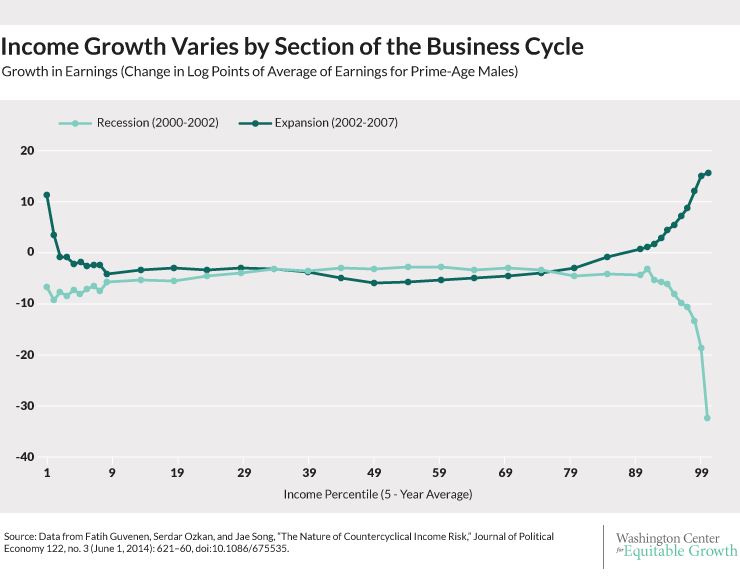
What does this means for Rose’s paper? Well, by starting his measurement from the peak of the last business cycle in 2007, Rose includes the years that have the most income reduction for those at the top. But the expansion beginning in 2009, when incomes jump up, is not over yet. As the chart above shows, there are very different dynamics during expansions and recessions. The full dynamics of the most recent expansion have yet to play out. So Rose doesn’t have an adequate comparison for 2007 yet. The Piketty and Saez data only go up to 2013, though last year’s data are preliminary, which means they have captured more of the expansion in their data but their analysis also does not include the entire business cycle because it hasn’t happened yet.
So the level of incomes for the top 1 percent might not have reached their 2007 level peak because the economy hasn’t reached a similar point in its growth cycle yet. This comparison is a bit like comparing the heights of a 12 year old and an 18 year old. Yes, one is taller than the other. But it’s incomplete to compare them without considering age. One person is still growing.
So yes, if 2007 is the benchmark year, incomes at the top have declined. And yes, if 2009 is the benchmark year, incomes at the top have increased dramatically. Reasonable people can disagree about the best benchmark. But what isn’t reasonable is using a peak as a benchmark to claim inequality hasn’t increased over an incomplete business cycle.
The lesson: A more complete evaluation of the extent of the increase in income inequality since 2009 will have to wait until this business cycle has completed its course.